


Project management status indicators powerpoint slide deck






Try Before you Buy Download Free Sample Product
 Impress Your
 Audience
 100%
100% Editable
 Save Hours
 of Time


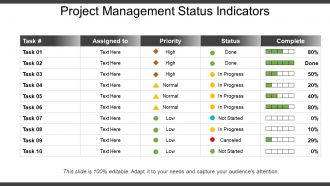
Now monitor your project’s progress with ease with our project management status indicators PowerPoint slide deck. Our PPT slideshow is designed using an elegant table format in which you can easily compare the different tasks and their status in a stylish and graphical manner. You can analyze which project is assigned to which team member, what is the frequency of priority related to that project and what is the status of completion of it. Using this project status reporting Presentation graphic, you can also address the importance of project communication, which is very important in any business organization. This PPT slide can help you to effectively and efficiently communicate the project status at regular intervals to project stakeholders. Also, this PPT tabular format is designed in a regular, formalized report form so that the progress of any project can be denoted against the project plan. The project status indicators PowerPoint template is completely amendable, so you can modify it as per your requirements. Incorporate our slide visual into your next business presentation and represent your project management status report to your team in an innovative way. Drive every activity with our Project Management Status Indicators Powerpoint Slide Deck. Get the controls firmly in your hands.
People who downloaded this PowerPoint presentation also viewed the following :
Project management status indicators powerpoint slide deck with all 5 slides:
Explain the jargon with our Project Management Status Indicators Powerpoint Slide Deck. Enable folks to comprehend the idea being conveyed.
FAQs for Project management status indicators
Honestly, you just need four things and they're pretty straightforward. Color coding is huge - red/yellow/green is classic for a reason. Pick metrics that actually move the needle for your project, not just busy work stuff. Real-time updates are clutch, or at least close to it. Here's where teams always mess up though - nobody agrees on what the colors mean! I've watched projects blow up because "yellow" meant "minor hiccup" to some people and "we're screwed" to others. So define that upfront and get everyone on the same page. Also throw in some context with each status. Colors alone don't tell the whole story - stakeholders need the "why" behind what they're seeing.
Dude, visual dashboards are game-changers for status updates. Red/yellow/green lights, progress bars, basic charts - anything that shows where you're at vs where you should be. People can spot issues immediately instead of hunting through boring text walls. Honestly, I cringe when teams still send those massive email updates nobody reads. Your stakeholders will actually pay attention when they can grasp the situation fast. Next time, swap your written update for a simple visual dashboard. You'll be shocked how quickly people jump in with real help instead of just ignoring your messages.
Look, start with the big three: schedule variance, budget burn rate, and scope creep. Those tell you if you're on track, not bleeding money, and actually building what you promised. Team velocity matters too - plus stakeholder happiness (seriously, angry stakeholders will torpedo your project faster than anything). Quality stuff like defect rates? Yeah, track those but don't get sucked into metrics that just look pretty on dashboards. I learned that one the hard way. Check these weekly and you'll spot trouble before it explodes.
Honestly, color-coded dashboards are a lifesaver for this stuff. Red/yellow/green cuts through all the email chaos - executives can glance at it and instantly know what's on fire. No more "how's the project going?" messages cluttering your inbox. Different people can filter for whatever they care about too. The key is keeping your color scheme consistent across everything so nobody gets confused about what yellow actually means. I learned this the hard way when our CFO thought yellow meant "good to go" while everyone else knew it meant "proceed with caution."
Oh dude, you'll love this - project management tools basically spy on all your other apps and pull updates automatically. When someone moves a task or misses a deadline, boom, it's already tracked. No more awkward Slack messages asking people where they're at (thank god). The software sends reports to your boss, flags late stuff, and some fancy ones even predict when things might go sideways. I spent maybe an hour setting up the rules and now it saves me like 3 hours every week. Plus everyone stays updated without me having to chase anyone down.
Honestly, ditch the exact dates - they're just setting you up to look wrong later. Try "launches March 10-20th (high confidence)" instead of "March 15th." Or throw in uncertainty flags like "on track but dependencies are messy." Traffic lights work too - yellow means progressing but timeline's wobbly because of X. Your stakeholders will actually appreciate the honesty over fake precision, trust me. Just be specific about what's making things uncertain. Oh, and always include your next step for getting clarity, like "we'll know more after the vendor call Friday."
Here's the thing - your status indicators are only as good as what your stakeholders actually care about. Figure out each group's priorities first. Executives want the big picture stuff like budgets and timelines, while your tech team needs detailed task metrics. Everyone thinks their stuff matters most (spoiler: it doesn't equally). Map your red and yellow flags to things people will actually do something about when they see them. Honestly, just ask each group what would make them immediately call you after reading a status report. That'll tell you everything you need to know about what to track.
Honestly, I always start with the hard numbers - budget, timeline, what's actually done. Stakeholders want those facts first. Then I dig into the messier stuff that numbers can't capture. Team morale tanking? Client being weird? Blockers you sense coming but can't prove yet? That context is gold. My go-to format is a traffic light summary with bullets explaining why each item gets its color. Data shows where you are right now, but the qualitative insights? That's where you'll spot trouble before it hits. Structure it like: "Here's what happened, here's what it actually means for us."
Update those status indicators weekly for regular stuff, daily if it's mission-critical. Here's what I learned the hard way - make your red/yellow/green criteria super clear upfront so nobody's guessing. Teams waste way too much time debating what "yellow" actually means! Always add a quick note when the status changes explaining why. Don't let them sit there getting stale either. Honestly, just set a calendar reminder or you'll forget. Oh, and review your criteria every few months since what matters to your team will probably shift over time.
So each industry tweaks their status tracking based on what actually matters to them. Healthcare projects? They're watching patient safety milestones right next to budget stuff. Construction teams obsess over safety incidents and weather delays - makes sense given how much outdoor work they do. Tech companies are totally addicted to velocity metrics and sprint burndowns, honestly it's kind of ridiculous sometimes. Manufacturing throws in quality gates and compliance checkpoints. Financial services tacks on regulatory approval stages because, well, regulations. You'll want to figure out what unique risks your industry has that basic indicators won't catch. What could totally derail your project that other sectors don't worry about?
Honestly, the main issue you'll run into is that every team has their own definition of what "yellow" means. Engineering might think something's no big deal while marketing is already panicking about the same issue. Some teams are just naturally more pessimistic in how they report stuff too. Plus time zones make everything worse - by the time you see an update, it's already old news. What worked for me was setting super clear criteria upfront for each status level. Then do regular check-ins where teams actually talk through what their flags mean in real life.
Honestly, status indicators are like having a smoke detector for your projects. Red flags pop up way before things actually catch fire, so you can fix stuff instead of panicking later. I always think of it like checking someone's pulse - tells you if everything's running okay or if you need to worry. The cool part is setting up triggers ahead of time. Yellow timeline? Bring in more help. Budget hitting 80%? Time to have that awkward conversation with your boss. Oh, and definitely set up alerts because nobody has time to stare at dashboards all day.
Honestly, status indicators are game-changers because they put everyone's work out in the open. Nobody can really hide when their stuff isn't getting done - those red/yellow/green lights tell the whole story at a glance. It's kinda like when your fitness app shares your steps with friends and suddenly you're actually motivated to walk more lol. The visibility creates this natural pressure where people communicate problems early instead of letting them pile up. I'd definitely set up some kind of shared dashboard. Makes a huge difference when the whole team can see real-time progress.
Honestly, feedback loops are a game changer for status reports. Instead of just throwing updates into the void, you're actually having conversations with people. Ask questions at the end of each report - "what else do you need to know?" or whatever. You'll figure out what info they actually want vs what you've been assuming they need. Catching confusion early saves you from those nightmare situations where everyone's been on different pages for weeks. I swear, half the project disasters I've seen could've been avoided with better two-way communication. Try setting up quick review sessions too.
Honestly, the whole project tracking game is changing fast. Predictive analytics can now spot delays before they even happen - which is pretty wild if you think about it. Those old traffic light dashboards? Yeah, they're getting replaced by smart ones that pull data automatically from all your tools. No more manual updates, thank god. Plus everything's integrating with Slack, Teams, whatever your team already uses daily. My take? Start playing around with automated reporting now because doing status updates by hand is gonna feel like using a flip phone soon. Trust me on this one.
-
Perfect template with attractive color combination.
-
Great quality product.