


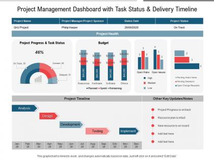
Project management dashboard with task status and delivery timeline




Try Before you Buy Download Free Sample Product
 Impress Your
 Audience
 100%
100% Editable
 Save Hours
 of Time


Our Project Management Dashboard With Task Status And Delivery Timeline are topically designed to provide an attractive backdrop to any subject. Use them to look like a presentation pro.
People who downloaded this PowerPoint presentation also viewed the following :
Project management dashboard with task status and delivery timeline with all 2 slides:
Use our Project Management Dashboard With Task Status And Delivery Timeline to effectively help you save your valuable time. They are readymade to fit into any presentation structure.
FAQs for Project management dashboard with task status
Okay so definitely track your milestones and budget - those are obvious ones. Resource utilization matters too, like are people actually working or just sitting around? Task completion rates give you the real picture of what's getting done. Risk indicators are huge - seriously, catch problems before they blow up. If you're doing agile, velocity is honestly where it's at for predicting when stuff will actually ship. Quality metrics like defect rates too, especially in software. Don't go crazy though - maybe 5-7 max that actually match what you're trying to accomplish. You can always add more later if your stakeholders start asking for specific things.
Dude, those dashboards are game changers. You'll actually see what's happening with your projects instead of flying blind until the next meeting. Bottlenecks become obvious. Resource problems? You'll catch them early. The whole team can make decisions with real data instead of guessing. Honestly, once you start using one, going back feels like working with a blindfold on. Set up some alerts for the stuff that matters most - trust me, catching issues early beats scrambling later. Way less stressful than constantly wondering if everything's on track.
Honestly, real-time data is a game changer. You'll catch problems while they're still fixable instead of finding out your budget's blown after it's too late. Stakeholders actually appreciate getting updates instantly rather than sitting through those dreaded weekly meetings where half the info is already stale. When deadlines start slipping or resources get tight, you can pivot fast. Projects always go sideways somehow - it's like Murphy's law or something. My advice? Figure out which metrics change most often in your work and focus on making those real-time first. Way more manageable that way.
So here's the thing - good visual design is what separates usable dashboards from total disasters. Color coding saves you tons of time when you're hunting for project updates. Red for urgent stuff, green for things on track, you know the drill. I've literally seen dashboards that looked like a spreadsheet exploded everywhere... nightmare fuel honestly. Clean spacing between project streams helps too. Your eye should immediately find the important stuff without digging around. Pick your top three metrics first and build everything around making those pop. Pretty colors won't save a confusing layout though.
Honestly, Monday.com and ClickUp are probably your best bets for drag-and-drop dashboards. Asana's pretty solid too. I've been messing around with Notion lately and it's way more powerful than you'd think, though it takes some getting used to. Smartsheet works like a souped-up Excel if that's your thing. Airtable's cool because it mixes database stuff with dashboard views. Power BI or Tableau if you need serious analytics, but they're overkill for most people. What exactly do you need to track? Gantt charts, time, budgets? That'll help you figure out which one actually makes sense for your team.
Dashboards are honestly game-changers for catching problems early. You'll see budget burn rates speeding up or tasks falling behind way before everything goes to hell. The visual stuff makes patterns super obvious - way better than digging through spreadsheets. Resource conflicts and bottlenecks become visible weeks ahead of time. Set up alerts for your big metrics so you get pinged immediately when things go sideways. I swear it's like having a crystal ball sometimes, though obviously not foolproof. Scope creep especially shows up clearly when you're tracking the right data points.
Honestly, stakeholder feedback makes or breaks dashboards. I've watched so many beautiful ones get ignored because nobody asked what people actually needed. Your executives want the big picture stuff - progress at a glance. But project managers? They're digging into task details and resource allocation. Talk to everyone before you build anything. What decisions are they making? How do they like consuming info? Then check in regularly while you're building it. Trust me, you don't want to spend months creating something that looks amazing but sits unused. It's way better to course-correct early than rebuild later.
Honestly, dashboards are a game changer because everyone finally sees the same info at once - no more endless email chains asking for updates. Those "what's the status?" meetings basically disappear (which is amazing). When stuff's visual like that, you can actually spot problems before they blow up. Like if someone's drowning in work, you'll notice and can jump in. The transparency thing is huge too - people just naturally stay more on top of their stuff when it's all out there. Oh, and definitely test it with just one project first instead of going crazy with everything at once.
Honestly, start with the basics - percentage of tasks done and your actual vs planned timeline (Gantt charts work great for this). Milestone dates are obviously crucial. Budget burn rate will save your butt since delays usually mean you're bleeding money. Critical path stuff and resource utilization matter too. Oh, and definitely track blockers or risks that could mess up your schedule - learned that one the hard way. Make sure at-risk milestones show up in red so they smack you in the face. You can always add more metrics later based on what your stakeholders actually obsess over.
Okay so first figure out what your team actually checks every day - like what 3-5 things do you guys obsess over? Then build your dashboard around those. Agile teams usually want sprint burndowns, velocity charts, story points, that kind of real-time stuff. Waterfall is more about milestones and Gantt charts since you're going step by step. Most tools nowadays are pretty drag-and-drop friendly which is nice. I'd honestly just start simple and add widgets as you figure out what's missing. The whole point is matching your dashboard to how you actually work, not the other way around.
Don't cram everything onto one screen - that's the biggest mistake I see. People get excited about all their data and throw it all up there, but honestly? It just becomes useless noise. Stick to maybe 5-7 metrics that actually help you make decisions. Skip the vanity stuff that looks cool but doesn't change what you do. Oh, and test it on mobile since everyone's always checking things on their phone now. Start by asking your team what they're actually trying to figure out each day - that'll guide you way better than guessing.
Mobile dashboards are honestly a lifesaver - your team can check project updates from literally anywhere. Quick status checks during your commute, approving stuff while you're traveling, updating things right from client meetings. No more being stuck at your desk for everything. The best part? When stakeholders have questions, they can pull up dashboards instantly instead of that annoying "let me get back to you when I'm at my computer" thing. Just make sure it actually works well on phones - I've seen too many "mobile-friendly" dashboards that are basically unusable on small screens. Responsive design isn't optional here.
Honestly, start with the basics that'll save your sanity - live commenting and @mentions so people aren't constantly asking "wait, what's happening with X?" Visual progress tracking is a lifesaver since you can't just walk over and check on stuff anymore. Your dashboard needs clear task assignments and deadlines, plus maybe a workload view. That way you know who's drowning vs who can take on more work. Timezone displays are clutch too - learned that one the hard way after scheduling way too many midnight calls for my European teammates. Build these first, then worry about fancy extras later.
Honestly, archiving your dashboards is a game changer for post-mortems. Screenshots of key metrics at milestones are clutch too - I learned that the hard way. When you're doing lessons learned sessions months later, you'll have actual data showing where deadlines slipped or budgets went sideways instead of everyone's selective memory. Compare your original estimates to what actually happened. Look for patterns across similar projects. Document wins too, not just failures. It's way better than sitting in a room going "I think we were late because..." The concrete data makes future planning so much easier.
Honestly, good visuals are a game changer for dashboards. Your team stops dreading those number-heavy spreadsheets and actually wants to check the data. I've watched teams go from weekly glances to checking multiple times daily just because we threw in some progress bars and clean status indicators. Charts and graphs let people spot problems right away instead of hunting through rows of data. When stakeholders can see the story your data's telling, they ask way better questions. Oh, and start with your biggest metrics first - make those really stand out visually. You'll be surprised how fast engagement jumps.
-
Innovative and attractive designs.
-
Appreciate the research and its presentable format.