


Project management task status budget and priority dashboard





Try Before you Buy Download Free Sample Product
 Impress Your
 Audience
 100%
100% Editable
 Save Hours
 of Time


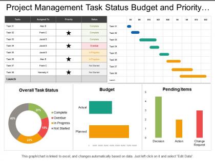
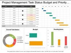
A project management deadline is critical for any business. Choose our project management task status budget and priority dashboard PowerPoint template to meet your business requirements. With the help of our project management task status Presentation graphic, you can represent the scope of your projects in a visually appealing manner. It is very important to have a well-defined project management timeline that will help you set clear priorities and directions for your business. Excel linked charts and graphs with text boxes have been used to decorate this project management task status budget and priority PPT diagram. This PowerPoint visual contains the concept of project scheduling and management which can be used for business related presentations. Our project management task status budget and priority dashboard Presentation slideshow is one of the many types of data visualizations used to organize and present the data in a way your audience can understand and act on. Do a good job with our Project Management Task Status Budget And Priority Dashboard. Bring your individual expertise to the fore.
People who downloaded this PowerPoint presentation also viewed the following :
Project management task status budget and priority dashboard with all 6 slides:
Forge enduring bonds with our Project Management Task Status Budget And Priority Dashboard. They create everlasting alliances.
FAQs for Project management task status budget
Start with the basics: timeline, budget tracking, and task progress. Resource allocation is massive - you'll want to spot who's drowning vs who can take on more work. Burn rate and completion percentages are clutch for seeing if things are actually going well or just look fine on paper. Risk indicators help too. Oh, and don't skip stakeholder updates because they'll bug you anyway if they can't find info. The whole point is seeing everything without jumping between a million different apps. Honestly, I'd rather have fewer widgets that actually get used than a cluttered mess nobody checks.
Honestly, it's a game changer for keeping everyone on the same page. No more digging through email chains to figure out what's happening. Everyone can check task updates, see who's doing what, and spot deadlines before they sneak up on you. You can comment right on stuff and tag people when you need their input - way better than scheduling yet another status meeting. The real win? Those annoying "hey what's the deal with project X" messages basically disappear. Just make sure your team actually uses it consistently or you'll be back to chaos. Oh and pick something simple - overcomplicated dashboards never stick.
Honestly, most teams I know swear by Microsoft Project, Asana, or Trello for basic project tracking. Monday.com's pretty solid too. If you're dealing with tons of data, Power BI and Tableau are your best bet for visualizations. Some folks get crazy creative with just Google Sheets - you'd be surprised what decent formatting can do. Smartsheet and Wrike have more advanced features if you need real-time updates and all that. Really comes down to team size and budget though. My advice? Start with free versions first. See what actually works for how your team operates before spending money.
Dude, visuals are a total game changer for dashboards. You'll spot problems instantly instead of scrolling through endless spreadsheets. Color-coded alerts show what's broken. Progress bars tell you if you're over budget. Gantt charts reveal bottlenecks right away. Your brain just processes visual patterns way faster than text - it's wild how much quicker you can make decisions. Pick the right format though: timelines for schedules, pie charts for budgets. Oh and traffic light systems are clutch for quick health checks. Start with whatever report takes you forever to read first.
Start with the basics - project timeline, budget tracking, and who's working on what. Task completion rates matter too, plus any roadblocks slowing you down. Don't go crazy with charts though. I've seen dashboards so cluttered they're basically useless. Team workload is huge - catch burnout before it happens. Focus on stuff that actually helps you decide things day-to-day, not vanity metrics that look pretty but tell you nothing. Build from these core ones first, then see what's missing as you go.
Honestly, just ask each group what they actually need to see first. Executives want the big picture stuff - budget burn, milestone progress. Team leads need the nitty gritty like task completion and who's working on what. Clients? They just want timelines and deliverable status. Nobody wants to dig through everything to find their relevant info. Most PM tools let you save custom views for each group, which is super handy. You can even automate reports if you're feeling fancy. The trick is showing people only what helps them make decisions - everything else is just noise.
Honestly, real-time data is what separates useful dashboards from fancy wallpaper. You'll catch problems before they explode instead of finding out your project's toast from last week's report. I've watched teams scramble because they were looking at old numbers while everything was falling apart. Live updates show you budget shifts, timeline changes, resource issues - all as they happen. Oh, and don't go crazy trying to connect every single tool at once. Start with your most critical systems first, then build from there.
Honestly, dashboards are like having a radar for your project - they catch problems while you can still fix them. You'll see budget overruns, timeline slips, and which team members are drowning before things get crazy. Way easier than hunting through endless spreadsheets every week (been there, done that). The visual stuff really helps too - red flags jump out immediately. Set up some automated alerts for the big stuff like missed deadlines or budget thresholds. Trust me, catching issues early beats scrambling to put out fires later.
Data quality is gonna be your first headache - everyone tracks stuff differently so good luck getting anything consistent. Then there's the adoption thing which is honestly worse than the technical problems. People will straight up ignore your beautiful dashboard if they think it's just more busywork. I've watched teams build these amazing setups that nobody uses. Oh and you'll probably go overboard at first and cram too much info in there. Makes it useless. Start with like 3-4 metrics max and actually talk to people before building anything.
Start with good data validation right at the source - honestly, this saves so much headache later. Set up automated checks to catch weird stuff before it hits your dashboard. I can't tell you how many times I've seen teams using month-old data because nobody noticed a broken API connection. Test your integrations regularly and create rules that spot outliers or missing values. Oh, and assign specific people to own different data areas - someone needs to actually verify this stuff is accurate. Document where everything comes from and when it updates so people aren't guessing what they're looking at.
Real-time updates are ideal, but daily refreshes work fine too - nobody wants to stare at old data. Focus on metrics that actually move the needle for your team. I used to throw everything onto one dashboard and it was a mess, honestly. Automated feeds save you tons of manual work if you can set them up. Weekly reviews help you figure out what's still useful and what's just taking up space. The people using it will tell you what sucks, so ask them. Sometimes you'll need to completely rearrange things based on their feedback.
Oh man, dashboards are seriously a game-changer for agile teams. You get instant visibility into sprints without waiting around for standup meetings. Burndown charts, velocity tracking, blockers - it's all right there. Your team can glance at what's done, in progress, or going sideways. Makes retrospectives so much better too since you're working with real data instead of just "how did everyone feel about last sprint?" Set it up to show sprint progress and team capacity - honestly saves you from those endless status check meetings that nobody wants to sit through anyway.
You'll want to set up layered dashboard views - start with a high-level exec summary showing key metrics and budget overviews for the big picture stuff. Then add drill-down options so people can click into specific projects for all the detailed breakdowns. Most dashboard tools handle this toggle pretty well (honestly saved me so many headaches). The real trick is structuring your data upfront so it rolls up nicely for executives but still keeps all the granular details intact. That way project managers can dive deep when they need to get into the nitty-gritty without overwhelming the C-suite types.
So my team swears by Asana for tracking our content calendar - makes campaign ROI super easy to see. Construction folks love budget vs actual cost dashboards, plus timeline stuff. Oh, and developers are weirdly obsessed with their Jira burn-down charts (seriously, they check them like social media). Healthcare projects track patient outcomes and compliance deadlines. Pick metrics your stakeholders actually care about, not just the flashy ones. Honestly, I'd start with your top 3-5 critical things first - way less overwhelming that way.
Honestly, getting feedback from your team is game-changing for dashboards. They'll tell you straight up which metrics actually matter vs what you assumed they needed. I've seen so many beautiful dashboards that nobody uses because they're confusing or missing the right data. Your team spots the weird usability stuff you'd never notice since they're in there every day. Quick 15-minute check-ins work great - you don't need formal meetings or anything. They'll point out if key info is hard to find or if the layout makes no sense. It's worth it because they know what helps them actually get work done.
No Reviews