


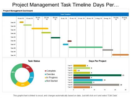
Project management task timeline days per project dashboard




Try Before you Buy Download Free Sample Product
 Impress Your
 Audience
 100%
100% Editable
 Save Hours
 of Time


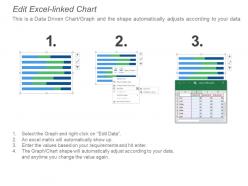
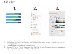
Download our project management task timeline days per project dashboard Presentation slide and improve upon your team’s abilities and talents so that they can meet their deadlines and targets on time. Our project management task timeline days per project dashboard PowerPoint template has been designed with beautiful colors and charts highlighting the concept of time, cost and quality management. Working without a proper project plan will not serve any of your business goals. It is very important to have a well-defined project management timeline that will help you set clear priorities and directions for your business. If you want to run your business smoothly then you must give proper training and development to your team so that they can perform their tasks and duties in an effective and efficient manner. So, use our project management task timeline Presentation diagram and enhance the output of your team by considering their performance. Heroes are born due to our Project Management Task Timeline Days Per Project Dashboard. It inspires individuals to be courageous.
People who downloaded this PowerPoint presentation also viewed the following :
Project management task timeline days per project dashboard with all 6 slides:
Allow your individuality to come to the fore with our Project Management Task Timeline Days Per Project Dashboard. Give accurate expression to your inner feelings.
FAQs for Project management task timeline days
So you'll want project milestones with dates, obviously. Task progress bars are clutch for showing what's actually done. Don't forget who's doing what - resource allocation saves so many awkward "wait, I thought you were handling that" moments. Critical path stuff matters too. Honestly, always add a risk section because projects never go perfectly. Budget tracking is boring but necessary - actual vs planned spend. Oh, and flag anything due in the next two weeks. Color code everything: green = good, yellow = eh, red = panic mode. Start simple though - you can always add fancy bells and whistles once people actually use the damn thing.
Honestly, visuals are a game-changer for timelines. Color-coding different phases or teams means you can instantly see what's going on. Progress bars are clutch too – way better than staring at percentages all day. I usually throw in some icons to separate milestones from regular tasks and deadlines. Spacing everything consistently makes dependencies super obvious. But here's the thing – don't go overboard or it'll look like a rainbow exploded on your screen. Start with maybe 2-3 visual tricks and see how it feels. You can always add more later if needed.
Honestly, Microsoft Project and Smartsheet are solid if you want all the bells and whistles with Gantt charts. But I've watched teams overcomplicate things when they don't need to. Asana's probably your sweet spot - good features without the headache. Monday.com works too. If your team's already comfortable with something else, just stick with that first. Even Trello with some add-ons can surprise you for basic stuff. Excel works better than people think, though don't tell the project managers I said that. You can always upgrade later when you actually need more features.
Okay so first thing - figure out your big milestones and work backwards from the deadline. Map out what depends on what (like which tasks can't start until others wrap up). Gantt charts are honestly your best friend here since everyone can see the critical path instantly. Add buffer time though because literally everything takes longer than you think it will. Oh and don't forget about holidays and when people are actually available to work. Also factor in any time you'll need stakeholders to review stuff. Start rough, then get your team's input on realistic timeframes to nail it down.
Don't cram everything onto one screen - seriously, people will take one look and just give up. Focus on what actually matters: big milestones, critical stuff, current roadblocks. I went overboard with color coding once and it was a disaster, so keep it simple. Your dates need to be realistic too. Build in some buffer time because there's nothing worse than a timeline that's always behind schedule. Oh, and definitely test it with your team first - they'll tell you what they actually want to see day-to-day. Start basic and tweak from there.
So most PM tools let you add resource stuff right on top of your Gantt chart - like who's assigned to what and their workload percentages. Color coding works great for different team members or departments. You can also do resource bars under the task bars or make separate swim lanes for each person. Honestly, the key is not making it look like someone threw up a box of crayons all over your timeline! I'd start simple - just show who's assigned to tasks first. Once everyone gets comfortable reading that, then you can layer in the workload data and other details.
Look, you've got to get feedback from your stakeholders or you'll just build something that looks nice but doesn't actually help anyone. Share a rough version with project sponsors and team leads first - they'll immediately tell you what metrics they actually need. Trust me, they always want something completely different than what you expected! Maybe it's more detailed milestone tracking or some risk indicators you never thought about. Their input shows you what to build first instead of wasting time on features nobody uses. Don't try to perfect everything upfront. Start basic and keep tweaking it based on what they say.
Honestly, it's a game changer for keeping everyone on the same page. No more digging through email chains trying to figure out what's actually happening. You'll spot problems way before they blow up, and your team meetings won't be those awkward "so... where are we?" disasters anymore. Everyone can just check the dashboard instead of constantly asking for updates. The trick is making sure people actually update their stuff regularly - otherwise you're just staring at stale data. Oh, and it's weirdly satisfying when people start communicating about delays before they happen instead of after.
Start with the basics - task completion rates and whether you're hitting milestone dates. Budget burn rate is huge too (learned that one the hard way). Resource allocation and critical path delays tell you where bottlenecks are forming. If you're running sprints, team velocity matters. Honestly, risk indicators are probably the most important thing - those issues always blindside you when they're buried in reports. Keep blockers visible upfront. Don't go crazy adding tons of metrics right away though. Your team will just ignore the dashboard if it's overwhelming. Build it simple first, then expand once people actually use it.
Weekly updates work for most projects, but honestly it really depends on your situation. Fast-moving stuff might need daily check-ins - super draining but sometimes you've got no choice. Longer projects? Bi-weekly is totally fine. The main thing is just being consistent about it. Your team needs to know when they'll get updates, otherwise people start bugging you constantly (learned that the hard way). Pick whatever matches your project's speed and don't overthink it. Crunch time is different though - that's when you'll probably end up updating way more often.
Start with critical path stuff and big milestones - that's what people actually want to see anyway. Different colors for each workstream help a ton. Don't go crazy with dependency arrows though, it just looks messy. I usually group tasks into phases or swim lanes to keep things clean. Honestly? Sometimes you're better off making two versions - executives get the high-level roadmap, your team gets the detailed Gantt chart. Oh and definitely build in buffer time visually so everyone knows you've planned for things going sideways. You can always dive into details if someone asks later.
Gantt charts are honestly your best bet here. They'll show you task dependencies, progress tracking, and who's working on what all in one spot. Super easy to catch bottlenecks before they become disasters. The trick is keeping them updated in real-time - otherwise you're just looking at fantasy timelines that don't match reality. Color-code by team or priority level, trust me on this. Set up automated tracking if you can swing it. I used to think they were overhyped until I actually started using them properly. Now they're kind of addictive? You'll spot critical path issues way faster than scrolling through endless task lists.
So static dashboards are basically like screenshots - you see the data but can't mess with anything. Interactive ones let you actually click around, filter by dates, drill into specific stuff, sometimes even update tasks right there. Way more useful honestly. It's like... okay this is a weird comparison but it's like looking at a photo vs actually being somewhere? Interactive dashboards save you tons of time when you're juggling multiple projects. You can spot problems fast instead of just staring at frozen data. Definitely go interactive if you have the choice.
Honestly, just show people what they actually need to see. Executives want the big picture stuff - milestones, budget, overall progress. Your team needs the nitty-gritty details about tasks and deadlines. Stakeholders? They care about deliverables and risks, not your boring daily meetings. Set up different views for each group - most project tools let you filter by role anyway. Here's what works: ask each group what decisions they're making, then only show data that helps with those decisions. Sounds obvious but you'd be surprised how many dashboards are just information dumps that nobody reads.
Look, timeline dashboards are basically your early warning system for when things are about to go sideways. Check it daily and watch for tasks hitting deadlines with zero progress - that's where disasters start brewing. You'll spot bottlenecks before they snowball into bigger problems, see which dependencies might screw you over, and figure out if you're spreading your team too thin. Honestly, it beats scrambling to explain missed deadlines to your boss. When you catch issues early, you can shift resources around or at least give people a heads up instead of delivering bad news last minute.
No Reviews