


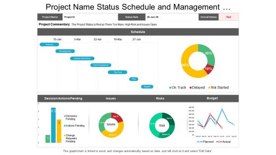
Project name status schedule and management dashboard





Try Before you Buy Download Free Sample Product
 Impress Your
 Audience
 100%
100% Editable
 Save Hours
 of Time


Are you in need of a pre-designed slide which can represent the status of your projects in an eye pleasing manner? If yes, then download our impressive project name status schedule and management dashboard Presentation slideshow and generate new ideas to maintain the schedule of your projects and measure the performance of your team and grow your business. This project name status schedule and management dashboard has been created keeping in mind the importance of project scheduling and management because it is an integral part of the project planning process. A project cannot run without a project plan. Scheduling establishes the timelines, delivery and availability of project resources, whether they be personnel, inventory or capital. This PPT slide can also be used to estimate what resources are needed at what time and for how long. Also, see other valuable project name status schedule and management dashboard PPT designs that are created just for your business needs. The chances will be greatly in your favor with our Project Name Status Schedule And Management Dashboard. You can blindly accept the bet.
People who downloaded this PowerPoint presentation also viewed the following :
Project name status schedule and management dashboard with all 6 slides:
Advise college graduates on choice of courses with our Project Name Status Schedule And Management Dashboard. Enlighten them on the host of avenues available.

FAQs for Project name status schedule
Start with the obvious stuff - project progress percentages, budget tracking, and timeline status. Those are non-negotiable. Resource utilization is huge too (seriously, nothing's worse than having half your team drowning while others are twiddling thumbs). Throw in risk indicators and milestone tracking. Stakeholder satisfaction scores are gold if you can swing it. Make everything visual - charts, not endless rows of numbers. You want to catch issues immediately, not hunt through data. Honestly, less is more here. Begin with these basics, then add whatever your specific team keeps asking about.
Honestly, visuals are game-changers for dashboards. You'll spot problems instantly instead of hunting through endless spreadsheets. Color coding is your best friend - red for overdue stuff, green when things are cruising, yellow for anything risky. Progress bars and charts show project health right away, which cuts meeting time in half (thank god). Icons help you quickly tell different task types apart. Oh, and visual timelines make those messy dependencies actually make sense. Just don't go overboard - I've seen dashboards that look like rainbow explosions. Focus on what your stakeholders actually care about first.
So many good options out there! Asana, Monday.com, and ClickUp are solid if you want something that works right out of the box. Notion and Airtable give you way more control but you'll spend time setting them up. Don't sleep on Google Sheets either - I actually use it for half my projects because it's simple and everyone knows how to use it. The biggest thing is picking whatever your team won't abandon after two weeks. Trust me, I've seen fancy tools gather digital dust while people go back to sticky notes.
Dude, real-time integration completely changes how you use dashboards. No more waiting around for weekly reports or updating spreadsheets manually. You'll see project health, budget burn, team workload - all live. Honestly, once you try it there's no going back. Bottlenecks become visible before they wreck everything. Resources can get moved around instantly. Stakeholders get accurate updates without you digging through five different systems (which is honestly the best part). I'd start with whatever metrics change most often - those work great for real-time feeds.
Honestly, the worst thing you can do is jam everything onto one screen. People get overwhelmed and just give up using it. Plus everyone thinks their metrics are super important, but that makes nothing stand out. Skip the fancy vanity stuff too - like those colorful charts that look cool but don't actually help anyone decide anything. I've seen so many teams waste time on that. Stick to maybe 5-7 metrics that actually matter for your project. Build something simple first, then add more once people get used to it.
Honestly, these dashboards are game-changers for keeping everyone on the same page. Your team can see who's doing what, track deadlines, and check progress without constantly bugging each other with "hey where are we on this?" messages. Real-time updates mean no more confusion about dependencies - like when Sarah's waiting on your stuff and you're clueless. Everyone can comment directly on tasks and tag people. The key is actually getting your team to use it consistently (good luck with that lol), so definitely set up notifications. Think of it as your team's digital command center where all the chaos gets organized.
Yeah, customization is huge for dashboards - honestly, it's what separates the ones people actually open from the ones that just collect digital dust. Think about it: developers and project managers care about totally different stuff, so why show them the same metrics? Let users move widgets around and pick what they see. When people can focus on their 3-4 key numbers instead of scrolling through irrelevant data, they'll actually check it daily. I'd start by figuring out what each role really needs, then build the customization from there.
Honestly, dashboard updates are a lifesaver - you'll stop getting bombarded with status check messages every five minutes. Your stakeholders can see budget burns and timeline changes themselves, which cuts down on so much back-and-forth. When problems come up (and they always do), people spot issues early instead of freaking out later. I've found the transparency makes getting approvals way easier too since nobody's caught off guard. Just set up weekly automated ones and forget about it. Trust me, your sanity will thank you later!
Honestly, start with your most important metrics first - don't try to fix everything at once. Set up whoever's responsible for each data source so there's no confusion later (seriously saves so much drama). Automate what you can for validation, but I'd still do manual checks on the stuff that really matters. Regular audits help catch weird inconsistencies before they mess up your reports. Oh, and make sure everyone's entering data the same way - sounds obvious but you'd be surprised. Real-time syncing is great when it works, but always have a backup plan.
Honestly, just swap your dashboard setup based on what you actually need. Planning phase? Show resource allocation and timelines. Once you're executing, switch to progress tracking and bottleneck alerts. Agile teams should focus on sprint burndowns and velocity stuff, while waterfall projects work better with Gantt charts and milestones. Most tools let you build different templates anyway - I'd make a few and just switch between them as things change. Pro tip though: don't go crazy with metrics. Your team will hate you if there's too much noise on screen.
Honestly, you'll kick yourself if you skip mobile access. Project work never stops just because you're away from your desk, right? Your team needs to approve stuff, check status updates, and deal with blockers whether they're in meetings or traveling. I've seen projects stall for hours just waiting for someone to get back to their computer - it's painful. Mobile dashboards let people update progress and flag problems instantly. Faster decisions, way fewer delays. Just make sure it actually works on phones though, not some cramped desktop version that's impossible to use.
Honestly, dashboards are game-changers because you can see what's actually going down with your projects in real time. No more guessing or scrambling when things go sideways. Bottlenecks and resource issues? You'll catch them early instead of dealing with full-blown disasters later. The visual setup beats scrolling through endless spreadsheets any day - patterns just jump out at you. When your boss starts asking pointed questions (and they will), you've got solid data to back up whatever you're recommending. Just make sure you're tracking stuff that actually helps you make decisions, not just numbers that look impressive in meetings.
Honestly, less is more with dashboards. Put your most critical stuff at the top and don't try to cram everything in just because there's space. I always use the same color system - red for behind, green for good, you know the drill. Automate the data updates or it'll just sit there getting stale (learned that the hard way). Group similar metrics together so people aren't hunting around. Oh, and definitely test it with whoever's actually gonna use it first - can't tell you how many "gorgeous" dashboards I've seen that nobody touches because they're basically useless.
So honestly, start simple - pick maybe 2-3 things to track instead of going crazy with metrics. Are people actually using it daily? That's huge. Check if you're hitting deadlines better or catching problems sooner than before. The best indicator though? Less complaining about being blindsided by issues. If your team stops griping about being out of the loop, you're winning. I'd throw in a quick team survey every few months too - sometimes dashboards just become pretty wallpaper nobody looks at. Focus on whether it's actually helping people make decisions, not just looking impressive.
Honestly, just ask your team what they actually use! Surveys work, but I get better feedback from casual one-on-ones. Ask them which metrics they check when making decisions and what info they're always hunting for. So many dashboards end up being these fancy art pieces that nobody touches - it's wild. Monthly check-ins are perfect for this stuff. Focus on whatever data they reference most and ditch the confusing charts. Oh, and don't rebuild everything at once. Small tweaks based on what they tell you work way better than massive overhauls.
No Reviews