


Project Management Plan Dashboard With Overdue Tasks




Try Before you Buy Download Free Sample Product
 Impress Your
 Audience
 100%
100% Editable
 Save Hours
 of Time


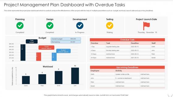
This slide represents the project plan dashboard which is useful to analyse the effectiveness of the project with the help of multiple parameters such as- budget, workload, launch date and upcoming deadlines.
People who downloaded this PowerPoint presentation also viewed the following :
Project Management Plan Dashboard With Overdue Tasks with all 7 slides:
Use our Project Management Plan Dashboard With Overdue Tasks to effectively help you save your valuable time. They are readymade to fit into any presentation structure.






FAQs for Project Management Plan Dashboard
Honestly, just track the basics first - project progress percentage, budget vs what you're actually spending, timeline stuff, and how your resources are being used. Risk indicators are huge too. Stakeholders eat up those red/yellow/green status dots because they don't want to think too hard about the details. I'd add task completion rates and team workload distribution for your own sanity. But seriously, don't go overboard with fancy charts and widgets - I've seen dashboards that look like they're monitoring rocket ships and nobody touches them. Start simple, then maybe add other metrics later if they actually help you make better decisions.
Honestly, it's a game changer for keeping everyone on the same page. No more "wait, where are we with that thing?" conversations every five minutes. Your team can actually see who's working on what and when stuff's due, all in one spot. Real-time updates mean less email chaos (thank god). People start flagging problems earlier instead of letting them snowball into disasters. Oh, and set up automatic status updates from the start - otherwise you'll spend half your time manually updating everything and that defeats the whole point. Makes those endless status meetings way less painful too.
Honestly, I'd go with Monday.com or ClickUp first - both have really nice drag-and-drop builders that aren't overwhelming. Asana's dashboard is solid too. Notion's actually amazing if you're into building stuff from scratch (total productivity nerd paradise), but it takes more work upfront. Power BI and Tableau are crazy powerful for pulling data from everywhere, though they're probably overkill unless you need serious reporting. I'd just start with free trials of Monday or ClickUp since they hit that sweet spot between easy and customizable.
Dude, your brain literally processes visuals like 60x faster than text - so those charts aren't just pretty, they actually work. I used to dread looking at project reports until I switched everything to dashboards and Gantt charts. Now I can spot if we're behind schedule in seconds instead of digging through endless spreadsheet rows. Budget issues? Resource problems? They jump out immediately when you visualize the data. Honestly, once you make the switch you'll be kicking yourself for not doing it sooner. You start seeing patterns that were totally invisible before.
Honestly, the worst thing you can do is cram everything onto one screen - it just becomes visual noise. Skip the vanity metrics too. Like, who cares about total logged hours if projects are still bombing? Make your critical stuff stand out more than the minor details. Budget variance shouldn't get the same attention as a missed deadline, you know? Oh, and definitely test it with your actual team first. They'll catch weird usability stuff you'd never think of. I learned that the hard way on my last project. Start basic, then build up complexity only when you really need it.
Start with basic roles - Admin, Project Manager, Team Member, Viewer. Each gets different permissions for creating projects, seeing sensitive stuff, managing users. Don't create a million custom roles right away, it becomes a nightmare to maintain. Map everything to what people actually need for their jobs, not what they think they should have access to. Oh, and use permission templates if your platform has them - saves you from doing everything manually. Get it right the first time and you won't spend half your day answering "why can't I open this?" messages.
Dude, real-time data is a game changer. You'll actually know what's happening instead of getting blindsided by problems weeks later. Like, imagine finding out your budget's blown when you could've caught it early and done something about it. Live dashboards let you jump on issues fast and make decisions based on current info, not some dusty status report. Plus your team won't need endless check-in meetings – though let's be honest, some people will still want them anyway. Set up alerts so you're not obsessively refreshing screens all day.
Honestly, less is more with dashboards. Pick maybe 5-7 metrics your team actually checks every day - I've seen way too many that look like someone threw every possible chart at the wall. Put the most critical stuff at the top so nobody has to scroll around hunting for it. Colors and icons should make sense, not just look pretty. Here's what I'd do: ask your team what three things they need to see first thing Monday morning, then build around that. Test it with real users because what makes sense to you might be confusing to everyone else. Simple beats fancy every time.
Honestly, dashboards are game-changers for messy projects with tons of people involved. Software launches, big marketing campaigns, construction stuff - you know, anything where deadlines are crazy and there's like five different teams doing their own thing. For simple solo tasks? Skip it, total waste of time. But when you're trying to track budgets AND timelines AND who's supposed to be doing what across different departments, that's when dashboards save your sanity. I'd start with whatever project is stressing you out most right now. Trust me, the difference is night and day once you can actually see what's happening.
Most dashboards connect through APIs and built-in stuff with Jira, Asana, Trello, Slack - you know, the usual suspects. Auto-syncing is clutch so you're not manually updating everything like some kind of data entry robot. Honestly, some platforms are way better at this than others though. The trick is finding one that actually works with what you're already using instead of making you do double work. Oh, and definitely check what integrations your current tools support first - learned that one the hard way. Then hunt for dashboards that have those specific connections ready to go.
Oh man, this is so important! Set up monthly or quarterly reviews depending on how fast things change. First thing - check if your KPIs actually match what you're trying to do now. Ditch the metrics nobody uses for decisions anymore. Honestly, I've seen dashboards turn into total data junkyards where everything just sits there collecting dust. Ask your team what's actually useful vs what's just noise. Your dashboard should evolve with your goals, not be some static thing you built once. Start by auditing what you have this week and get real feedback from stakeholders about what they'd tweak.
Talk to your stakeholders first - seriously, don't just guess what they want. I always do quick 15-minute sessions with mockups because people's faces tell you way more than their words. Build in feedback throughout, not just at the end (learned that one the hard way). Sticky notes and ranking exercises work great for prioritizing features. But here's the thing - test it with real users doing actual tasks. That's where you'll see the disconnect between what stakeholders think they need versus what actually makes their job easier.
Honestly, mobile access for project dashboards is a game-changer. Your team can't be stuck at their desks all day, and stuff comes up when you're out at client meetings or whatever. I've seen people miss critical updates just because they couldn't pull up the dashboard on their phone properly. Touch-friendly buttons are key – nobody wants to squint and tap tiny links. Test the mobile version yourself before you pick a platform. Sounds obvious but you'd be surprised how many "mobile-responsive" dashboards are actually trash on phones. Core features need to work smoothly without needing a full desktop setup.
Honestly, just switch up what you're tracking based on where you are in the project. Early on? Focus on scope stuff and getting stakeholders aligned. Mid-project gets more into progress bars, how you're burning through resources, risk flags - that kind of thing. If you're doing agile, you'll want those sprint burndown charts. Waterfall projects work better with Gantt charts and milestone views. Don't dump everything on one screen though - that's just overwhelming. Pick like 4-5 things that actually matter for your current phase. I learned this the hard way after staring at dashboards with 20 widgets that told me nothing useful.
Check if your team actually uses the thing - like, are they opening it daily or just ignoring it? Good dashboards make decisions happen faster and cut down on those annoying "what's the status?" meetings. I always tell people the best ones kinda disappear into your workflow, you know? Survey your users about whether they trust the data. Are project timelines getting better? That's the real measure. Oh, and if people are still constantly emailing you for updates instead of checking the dashboard... yeah, it's probably not working. The whole point is smoother projects and faster calls.
-
Awesome presentation, really professional and easy to edit.
-
This visual representation is stunning and easy to understand. I like how organized it is and informative it is.