


Monthly Project Status Report Dashboard


Try Before you Buy Download Free Sample Product
 Impress Your
 Audience
Editable
of Time


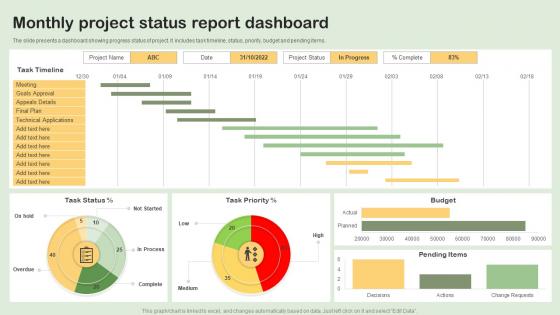
The slide presents a dashboard showing progress status of project. It includes task timeline, status, priority, budget and pending items.
People who downloaded this PowerPoint presentation also viewed the following :
Monthly Project Status Report Dashboard with all 7 slides:
Use our Monthly Project Status Report Dashboard to effectively help you save your valuable time. They are readymade to fit into any presentation structure.


FAQs for Monthly Project
Honestly, focus on stuff that actually moves the needle for your business - revenue, conversion rates, how much it costs to get new customers, retention. Traffic looks impressive but who cares if those visitors aren't buying anything? Don't forget operational stuff either, like support tickets or inventory if that matters for your job. I learned this the hard way - keep it simple with maybe 5-7 key metrics tops. Otherwise you'll drown in data and miss the important patterns. Just start with whatever you're already checking daily anyway.
Honestly, the secret is making your data actually tell a story instead of just sitting there looking boring. Interactive stuff works great - hover effects, filters, things people can click through and explore. Colors and animations help highlight the important bits, but don't go crazy or it'll look like a 90s website lol. Real-time updates are clutch because people love watching numbers change. Oh, and figure out the 3 main things your users want to know first, then design everything around answering those questions right away. Progress bars work too since they make people feel invested in what's happening.
Keep your color palette tight - 3-4 colors tops. High contrast is key for text/backgrounds, and stick to consistent meanings (red = alerts, etc). Honestly, I'm obsessed with blue/gray combos lately because my eyes don't hate me after staring at screens all day. Clean fonts like Arial work way better than anything fancy - your users aren't there for a typography lesson. Make text big enough that people can actually read it without zooming in. Bold text should be rare, otherwise it loses impact. Trust me, boring beats beautiful when it comes to UI.
So it really depends on what industry you're in. Retail dashboards are all about conversion rates and inventory stuff - basically what's selling and what's not. Healthcare gets way more complicated with patient metrics and compliance tracking. Manufacturing dashboards are honestly kind of overwhelming - they're monitoring every piece of equipment and quality metric you can think of. Finance focuses on risk and portfolio performance, which makes sense. The trick is figuring out what decisions your team actually makes every day, then put those numbers right up front. Don't try to cram everything into one dashboard - that never works well.
Okay so real-time data is game-changing for dashboards. You can actually catch issues as they happen instead of finding out about server crashes three hours later (been there, not fun). Stale data basically makes your dashboard decoration at that point. The trick is making sure your live feeds aren't garbage - fast decisions on bad info will wreck you. I'd set up alerts for the stuff that really matters so you're not glued to screens all day. When everything updates live, you can pivot immediately when sales spike or whatever's happening in your business.
Filters and drill-down features are game changers for dashboards. Users love clicking charts to see the details underneath. I'd throw in some dropdown menus too so people can customize their view - honestly way more useful than you'd think. Interactive tooltips save so much time when you're digging through data. Date range selectors are pretty much mandatory at this point. Oh, and export options because someone always wants to pull the data into Excel anyway. Just start with one or two features though. See what sticks before you go crazy adding everything.
So I've played around with a bunch of these dashboard tools. Tableau and Power BI are your heavy hitters - really solid for drag-and-drop stuff. Google Data Studio is free which is nice, but man the interface feels wonky sometimes. There's also Klipfolio and Geckoboard if you want something simpler. Most connect straight to your databases or sheets, so that's convenient. Honestly? Just grab free trials of like 2-3 different ones and see what feels right. Everyone's brain works differently with these interfaces.
Honestly, the worst thing you can do is cram everything onto one screen. Think about who's actually using this thing first. Don't use tiny fonts that make people squint, and those rainbow color schemes? Skip them. I've seen way too many dashboards with fancy charts that look impressive but are completely useless. Put your most important stuff where people can see it right away. Nobody wants to scroll sideways or dig around for basic buttons - that's just annoying. Oh, and test with real messy data, not perfect sample numbers. Start with what questions you're trying to answer, then build from there.
Start with your most important stuff in the top-left - that's where people look first. Then work clockwise with everything else by priority. Group similar metrics together and give each section some breathing room so it doesn't look cluttered. Your main KPIs should be visible without scrolling. Honestly, the newspaper comparison is pretty dated but the concept still works. Create a clear path so users can follow from one insight to the next without getting lost. And definitely test it with real people first - I've seen so many dashboards that made perfect sense to the designer but confused everyone else.
Honestly, follower count is kinda overrated these days - everyone gets caught up in it but it doesn't really matter. What you actually want to watch are engagement rates, reach, and conversions. Those show if people give a damn about your stuff. I always tell people to focus on clicks, saves, shares, comments... that's where you see real interest. Oh and definitely track when you're posting and how often. Don't go crazy with like 20 different metrics though. Pick maybe 4-5 that actually connect to what you're trying to accomplish business-wise, otherwise you'll just get overwhelmed and won't use any of it.
User feedback is basically gold for dashboard templates. It shows what actually works vs what you *think* works. People will straight up tell you when widgets are too cluttered or navigation sucks. They'll also point out missing metrics they use every day - honestly, users come up with the most creative use cases that blow my mind. Quick surveys or usage analytics work great for collecting this stuff. Their input helps you figure out which templates need fixing first and guides your future design choices. Oh, and always start with iterating your most popular templates - that's where you'll get the biggest bang for your buck.
Honestly, cloud dashboards are so much better than the old desktop stuff. You can check your data from anywhere - your phone, laptop, whatever. No more IT headaches with server maintenance either. The automatic updates are clutch because remember how annoying those old software patches were? Your whole team can collaborate in real-time too, which is pretty sweet. Money-wise, you just pay for what you use instead of dropping cash on expensive licenses upfront. I'd definitely test out some free trials first - see what feels right for how you work.
Honestly, dashboards are game-changers for team dynamics. When everyone's looking at the same real-time data, suddenly nobody can play dumb about project status. You'll spot problems early instead of scrambling later, and it's way easier to see who's actually pulling their weight. The weird thing is how much more invested people get when they see their work turning into actual numbers and charts - like it validates what they're doing? Make sure yours shows both individual stuff and the overall team progress. That way people own their part but still care about the big picture. Trust me, the transparency alone fixes most collaboration issues.
Okay so first thing I always do is double-check what data I'm actually about to share - you'd be shocked how often sensitive stuff just sits there in plain sight. Set up proper access controls so people only see their slice of things. Row-level security is clutch if your platform has it. Don't share raw credentials or internal metrics that could bite you later. Oh and do regular access reviews because teams change constantly and suddenly Steve from accounting can see engineering salaries or whatever. Honestly, I just start super restrictive then loosen things up as needed.
Honestly, you gotta build them flexible from day one or you'll hate yourself later. Modular pieces work best - think configurable filters and data sources that won't freak out when you need to connect new stuff. Don't hard-code your metrics! I did that once and everything broke when priorities changed (nightmare). Your framework should let you swap KPIs or add feeds without starting over. Oh, and schedule check-ins with stakeholders - they'll change their minds, trust me. Treat it like it's alive, not some finished project you never touch again.
-
Making a presentation has never been this easy for me. Thank you SlideTeam for offering a splendid template library.
-
Incredibly beautiful designs that will help you get noticed! These eye-catching templates are perfect for corporate presentations that can be altered to fit any occasion or taste.