


Monthly Project Status Report Powerpoint Ppt Template Bundles




Try Before you Buy Download Free Sample Product
 Impress Your
 Audience
 100%
100% Editable
 Save Hours
 of Time


Our Monthly Project Status Report Powerpoint Ppt Template Bundles are topically designed to provide an attractive backdrop to any subject. Use them to look like a presentation pro.
People who downloaded this PowerPoint presentation also viewed the following :
Monthly Project Status Report Powerpoint Ppt Template Bundles with all 17 slides:
Use our Monthly Project Status Report Powerpoint Ppt Template Bundles to effectively help you save your valuable time. They are readymade to fit into any presentation structure.
-
Monthly Project Status Report
-
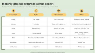
Monthly project progress status report
-
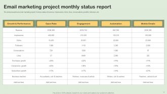
Email marketing project monthly status report
-
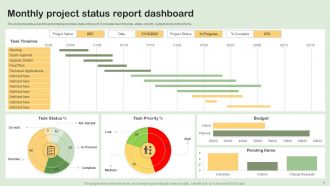
Monthly project status report dashboard
-
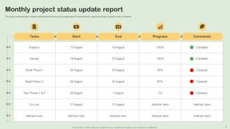
Monthly project status update report
-
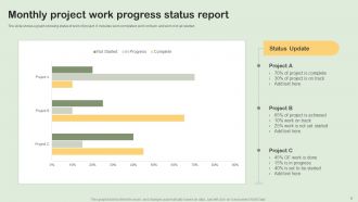
Monthly project work progress status report
-
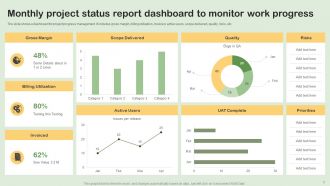
Monthly project status report dashboard to monitor work progress
-
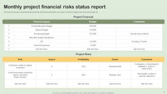
Monthly project financial risks status report
-

Website launch project monthly status report
-
Monthly project progress status report icon
-
Monthly project status report icon
-
Thanks for watching
-

-

-

-

-

FAQs for Monthly Project Status Report Powerpoint
So for your monthly report, hit the basics first - timeline stuff, budget, what you actually got done last month. Risks and issues are super important though, honestly that's what the higher-ups always flip to first. Include any roadblocks where you need executive help to move things along. Oh, and if your team changed at all, mention that. I'd throw in a "quick wins" section too because people eat that up, even tiny progress feels good. Just keep the same format each time so everyone knows where to look. Makes your life easier too when you're not reinventing the wheel every month.
Dude, visuals are a game changer for status reports. People zone out hard when you hit them with walls of text - I've watched it happen so many times. But charts and graphs? Suddenly everyone gets it. Traffic light colors (red/yellow/green) work great for quick updates. Gantt charts show timelines super clearly. Simple bar charts handle budget stuff. Honestly, even basic color-coded dashboards make everything click faster than paragraphs ever will. Your stakeholders will actually pay attention, and you'll get way better decision buy-in since people aren't confused about what's going on.
Okay so for milestone summaries, just hit the big three: what's done, what's next, and any date changes. Bullet points are your friend here - throw in percentages or just say "Done" or "In Progress." I'm obsessed with color-coding because honestly, stakeholders eat that visual stuff up. One line per milestone max though, people's attention spans are terrible. If something's delayed, just say why and give them the real new date. Don't make excuses but show you've got a plan. Oh and skip the corporate fluff - nobody has time for that.
Honestly, just focus on three things: what could go wrong, how likely it is, and your game plan. Red/yellow/green works great - executives eat that traffic light stuff up for some reason. Describe each risk in one sentence, then boom - right into how you'll handle it. Skip the long paragraphs and go with bullets or tables instead. Here's the thing though - don't sugarcoat timeline delays or budget hits. Being upfront about potential problems actually builds trust. Way better than having stakeholders blindsided when things inevitably get messy.
Honestly, your stakeholders are gonna tell you exactly what they want to see in those reports - you just gotta ask them first. Like when they say they need more budget details or couldn't care less about tiny milestones, that's gold right there. I totally bombed this once and kept sending reports nobody even read because I wasn't paying attention to what they actually needed. So now I always start by asking my key people what info would help them make decisions. Then I build my template around that instead of just filling out some random format. It's way more work upfront but saves you from being irrelevant later.
Look, data viz tools are game-changers for making sense of spreadsheet chaos. Your stakeholders can glance at a dashboard and immediately know if you're winning or falling behind - way better than staring at endless rows of numbers. Progress bars, trend lines, color coding... it all makes problems pop out instantly. Honestly, I've seen too many meetings where people squint at tables trying to decode budget variances. Charts just work better. Start with your core metrics - timeline stuff, budget burn, milestone tracking. Turn those into simple bar or line charts. Your next report will actually get read for once.
Oh man, the two big ones I always see: people either give way too little detail or they dump everything including what they had for lunch. Find that middle ground where your stakeholders actually understand what's happening. Don't avoid talking about risks either - I get it, nobody wants to be the bearer of bad news, but trust me, catching people off guard later is so much worse. Your timelines need to be honest too, not just what you're hoping will happen. Try to keep your format similar each week so people know what they're getting. Really focus on where you need decisions made or help.
Yeah, definitely stick with monthly - weekly will drive people nuts with information overload. I send mine first Friday every month, but any consistent date works. The trick is just being predictable about it. People need to know when your update's coming so they can actually plan for it. If something huge blows up mid-month, just fire off a separate email instead of messing with your schedule. Honestly, the reliability matters way more than the perfect date. Just pick something and don't budge from it.
Honestly, execs just want the headline stuff - budget, timeline, and whether you're hitting your goals. Don't bog them down with sprint details or task lists. They're probably reading this between back-to-back meetings anyway. Show them what you've delivered, what's next, and definitely call out anything that needs their sign-off or budget approval. Visual metrics work way better than paragraphs of text. The key thing? If there's a blocker that could derail the whole project, put that right at the top. They'll appreciate the heads up and you'll actually get the help you need.
So basically, you'll want to keep the main bones of any template - executive summary, progress updates, issues, next steps - but swap out the metrics for stuff that actually matters to your project. Software teams care about sprints and bug counts. Construction? Safety stats and material deliveries. Marketing focuses on engagement and campaign performance instead. Honestly, I always start with whatever basic template I can find online, then just delete the sections that don't make sense for what I'm doing. Way easier than building from scratch. The key is matching your KPIs to your industry - sounds obvious but you'd be surprised how many people forget that part.
So for tracking changes in your status reports, I'd start with a "Changes This Month" section where you note any scope additions, timeline shifts, or budget tweaks - include dates and why stuff changed. A basic change log table works well too. Honestly, even just a spreadsheet does the trick most of the time. Also reference version numbers when you update project docs, and maybe try color-coding new items vs ongoing ones? That visual difference helps. The main thing is picking one method and sticking with it so people aren't hunting around for updates.
Honestly, stop sugarcoating stuff in your updates. Be real about what's broken, what metrics actually suck, and how behind you really are. I've watched too many projects implode because people kept saying "we're on track" until suddenly they weren't. Document everything - who decided what, who owns what piece, deadlines that actually mean something. Anyone should be able to read your notes and understand what happened, even if they weren't there. Pick maybe 3-4 metrics that your stakeholders genuinely care about and track those religiously each month. Creates a solid paper trail and keeps everyone honest.
Honestly, status report templates are a game changer. Your team stops asking "wait, what's happening with that thing again?" every five minutes because all the info is right there in the same format. No more hunting people down for updates either - which, let's be real, nobody has time for. When someone goes on vacation or switches projects, the handoff is actually smooth instead of chaotic. I'd start super basic: progress made, what's next, and any roadblocks. You can tweak it later based on what actually works for your team.
Okay so here's what works - start with your exec summary but keep it super short, like 2-3 sentences tops. Then do key metrics, milestone updates, risks and blockers, next steps. Use bullet points everywhere because honestly, nobody wants to read dense paragraphs when they're managing a million things. Traffic light colors are clutch for status updates. Oh and put your biggest risks right at the top - don't hide them at the bottom hoping people won't notice! I swear stakeholders will actually thank you for reports they can scan in 30 seconds.
For status reports, focus on the big three: budget variance, schedule adherence, and deliverable completion rates. These give stakeholders what they actually need to know about project health. Resource utilization is clutch too - shows if you're burning through people too fast. Don't forget blockers and risks (seriously, nobody wants to be blindsided in meetings). Quality stuff like defect rates or client satisfaction can work if you can actually measure them for your project type. But honestly? Keep it to 5-7 KPIs max or people's eyes will glaze over. Pick metrics that tie directly to success and update them consistently.
-
Easy to edit slides with easy to understand instructions.
-
The designs are very attractive and easy to edit. Looking forward to downloading more of your PowerPoint Presentations.