


Monthly Project Status Powerpoint Ppt Template Bundles




Try Before you Buy Download Free Sample Product
 Impress Your
 Audience
 100%
100% Editable
 Save Hours
 of Time


Our Monthly Project Status Powerpoint Ppt Template Bundles are topically designed to provide an attractive backdrop to any subject. Use them to look like a presentation pro.
People who downloaded this PowerPoint presentation also viewed the following :
Monthly Project Status Powerpoint Ppt Template Bundles with all 18 slides:
Use our Monthly Project Status Powerpoint Ppt Template Bundles to effectively help you save your valuable time. They are readymade to fit into any presentation structure.
-
Monthly Project Status
-
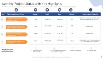
Monthly Project Status with Key Highlights
-
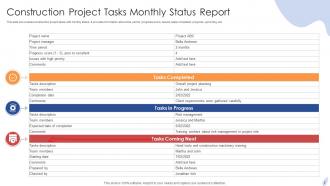
Construction Project Tasks Monthly Status Report
-
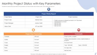
Monthly Project Status with Key Parameters
-
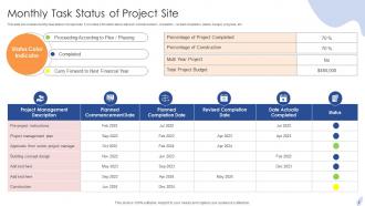
Monthly Task Status of Project Site
-
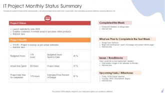
IT Project Monthly Status Summary
-
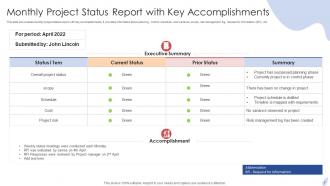
Monthly Project Status Report with Key Accomplishments
-
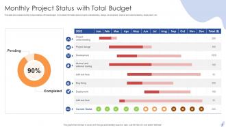
Monthly Project Status with Total Budget
-
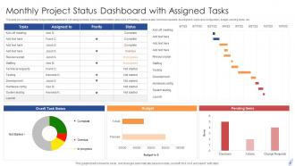
Monthly Project Status Dashboard with Assigned Tasks
-
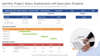
Monthly Project Status Dashboard with Execution Timeline
-
Monthly Software Project Status with Timeline Icon
-
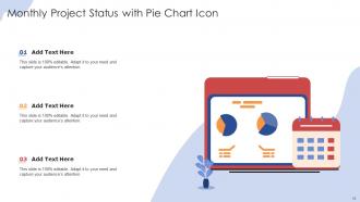
Monthly Project Status with Pie Chart Icon
-

Thank You
-

-

-

-

-

FAQs for Monthly Project Status Powerpoint
Here's what works for monthly project updates: hit the big stuff first - where you stand on milestones, budget tracking, and any risks (plus how you're handling them). Next month's deliverables should be in there too. Oh, and definitely flag any resource gaps or blockers early. I'm weirdly obsessed with adding a "quick wins" section because honestly? People need those small victories to stay motivated. Use red/yellow/green status indicators so your executives can skim without actually reading - they'll love you for it. Keep everything to one page though, or it'll just sit in someone's inbox forever.
Dude, visuals are game-changers for project updates. People's brains just process images way faster than text blocks. Red flags problems, green means you're golden - super obvious stuff. I swear, I've watched C-suite folks completely skip text reports but immediately dive into a simple dashboard or progress chart. Timeline graphics? They're clutch for showing dependencies without making people decode some nightmare spreadsheet. Icons and graphs basically tell people's eyes where to look first. Oh, and try one visual per important metric - seriously makes everything clearer. Your stakeholders will actually thank you.
Track budget variance first - actual vs planned spend. Schedule performance matters too (hitting those milestones?). Don't forget scope completion percentage and risk status. Oh, and if you're doing agile, throw in team velocity metrics. Honestly, those reports with just traffic light colors drive me nuts - give me actual numbers! Definitely call out any blockers that could mess up next month. The whole point is giving stakeholders enough info to decide stuff without drowning them in data. Just make sure each metric connects to something they actually care about.
Monthly's the way to go - pretty obvious from the name, right? End of month usually works best since you'll have all your data by then. Your stakeholders are gonna expect regular updates anyway, so pick a date and stick with it. Consistency beats perfection here. If it's a crazy high-priority project, maybe do bi-weekly, but honestly monthly hits the sweet spot for most stuff. Trust me, people would way rather know exactly when to expect your update than get random ones whenever you remember to send them. Makes everyone's life easier.
Stop listing every tiny problem - focus on what's actually blocking you and what you're doing about it. I learned this the hard way after burying my biggest issue in paragraph three once. Lead with your most critical stuff first. Include specific dates and who's dependent on what, but don't write a damn novel about it. Give stakeholders enough context so they get why this matters for the timeline. Each challenge should end with your solution or who's jumping in to help. Honestly, most people just want to know if they should be worried and what's next.
Honestly, set up specific sections for feedback right from the start. Don't do those generic "any thoughts?" prompts - they're useless. Instead ask for real stuff like "blockers from your perspective" or "what's actually working/not working." Make it a shared doc where people can edit their own sections directly before you compile everything. That way you're including their actual voices instead of just talking about them. Oh, and give them a solid deadline - maybe a week before it's due? People need that structure or they'll forget completely.
Honestly, just start with whatever project management tool you're already using - most have reporting features people never touch. Microsoft Project and Asana can pull data straight from your tasks to auto-generate status updates. Asana's dashboards are ridiculously clean looking, I kinda love them. Smartsheet works great too if you want that spreadsheet vibe but with automation. Or go super simple - set up recurring templates in Google Docs or Notion that auto-fill dates and your standard sections. Way easier than starting from scratch every month.
So basically, having a monthly template forces you to actually write down all your risks instead of just keeping them in your head. You'll see which ones actually happened, what new stuff popped up, and whether your plans to deal with them worked or not. I swear, risks just vanish from memory when they don't blow up in your face - the template saves you from that. Plus tracking them monthly helps you catch patterns before they bite you. Just make sure you include probability, impact, who's handling what, and deadlines. Otherwise things slip through.
Talk to your stakeholders first - seriously, this is where most people mess up. They just grab some random template online and wonder why nobody reads their reports. Your executives want the big picture stuff like risks and budget, but team leads need all the nitty-gritty details. Interview the key people upfront to figure out what they actually care about and how they'll use it. Then show them a draft before you finalize anything. Trust me, getting their input early will save you from doing a million revisions later when everyone complains it's not what they wanted.
Just match your status format to whatever methodology you're using. Waterfall? Show phase completions and milestone percentages - the sequential stuff. Agile is different though - focus on sprint goals, velocity, and backlog status. Burndown charts are honestly your best friend here. Hybrid projects are trickier but doable - show the big picture phases while drilling down into current sprint work. The real trick is speaking your stakeholders' language. They need to recognize how you're describing the work. Start simple with a basic template, then tweak the metrics until it clicks with your team's actual process.
Just be brutally honest about where your project actually stands - none of that "we're making progress" nonsense that tells people absolutely nothing. When you hit roadblocks, say so. Share real numbers and percentages instead of dancing around the issues. People need to know what delays actually mean for deadlines, and honestly? They'd rather hear bad news upfront than get surprised later. Give them specific wins too, not just problems. Trust me, being straight with stakeholders saves you from endless follow-up questions and that awkward "so... how are we really doing?" conversations.
Honestly, I just make two different versions of everything. Execs want the bird's-eye view - budget stuff, major roadblocks, quick visual dashboards they can skim in 30 seconds. They're basically asking "are we screwed and what do you need from me?" Your team needs the opposite though. Give them task breakdowns, blockers, sprint details - all that nitty-gritty stuff they actually use. I learned this the hard way after watching executives' eyes glaze over during detailed task reviews. It's kinda annoying maintaining duplicate templates, but way better than confusing everyone with the wrong level of detail.
Ugh, the worst thing you can do is dump every tiny detail on people - like, nobody cares that Susan updated the database schema on Tuesday. Stick to what actually matters: what's finished, what's screwed, and what you need them to decide on. Don't sugarcoat timelines either when things are already behind (guilty as charged). Half your audience won't know what "API integration" means, so skip the jargon. Use bullet points so people can scan it quickly. Honestly? Just write something you wouldn't immediately delete if it hit your inbox.
Set up a "Performance Trends" section with 3-6 months of data next to your current stuff. Budget variance, milestone rates, team velocity - whatever's crucial for your project. I just pull numbers from old reports and stick them in a basic chart. Don't do monthly snapshots though, that's pretty useless. Show the actual trend so people can tell if things are getting better or worse. Charts work way better than spreadsheets - honestly, stakeholders glaze over when they see raw data. The whole point is making it obvious whether you're on track or not.
Honestly, just steal from the big players - Microsoft and Google both have solid monthly templates that cover milestones, blockers, budget stuff. Asana's blog examples are pretty visual too, which stakeholders eat up. Oh and Trello has some good agile-focused ones. My advice? Grab like 2-3 different templates and mash them together based on what your people actually want to see each month. Way easier than starting from scratch, and you'll probably end up with something better anyway since you're cherry-picking the best parts.
-
“You have the structure in place that are easy to explore new opportunities.I will be recommending your services to other people.”
-
It is my first time working with them and that too on a friend's recommendation. I would say, I am not expecting such a worldly service at this low price.