


Daily report powerpoint ppt template bundles




Try Before you Buy Download Free Sample Product
 Impress Your
 Audience
 100%
100% Editable
 Save Hours
 of Time


Our Daily Report Powerpoint Ppt Template Bundles are topically designed to provide an attractive backdrop to any subject. Use them to look like a presentation pro.
People who downloaded this PowerPoint presentation also viewed the following :
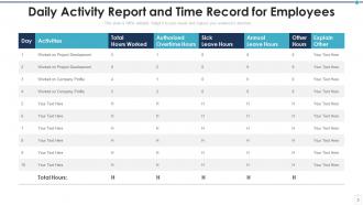
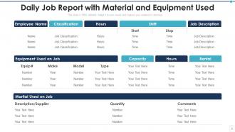
Daily report powerpoint ppt template bundles with all 15 slides:
Use our Daily Report Powerpoint Ppt Template Bundles to effectively help you save your valuable time. They are readymade to fit into any presentation structure.
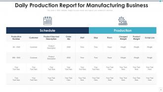
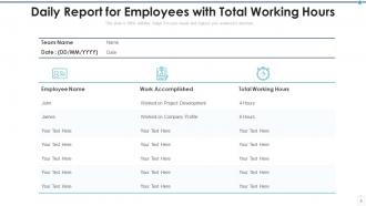
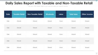
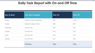
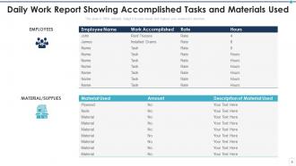
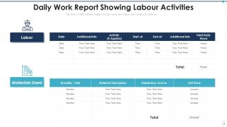






FAQs for Daily report powerpoint
So you want to hit the basics: what you knocked out yesterday, today's main priorities, and any roadblocks slowing you down. I always throw in a "quick wins" section - honestly, it's weirdly satisfying to see those little victories add up over time. Don't forget upcoming deadlines and any help you need from teammates or your manager. Oh, and toss in relevant metrics if you've got project updates. Keep each section super short though - like 2-3 bullets max. Nobody's got time to read a novel, and people will just skim right past if it's too wordy.
Honestly, daily report templates are a lifesaver. Your team knows exactly what to share every time - no more guessing games about what people are actually doing. Everyone documents their work, blockers, and priorities in the same format. Makes tracking progress way easier since you're not constantly hunting people down for updates. Sarah's working on what now? You'll actually know. Just keep it super simple though - like 3-4 sections tops. I've seen teams go overboard with these things and then nobody uses them. Defeats the whole purpose.
Honestly, just focus on clean section headers - stuff like "Yesterday's Wins" and "Today's Priorities." Makes scanning super easy. Bullet points are way better than paragraphs (nobody reads walls of text anyway). Give each section some breathing room with white space, maybe throw in light colors to separate things visually. Short input fields work better than those intimidating giant text boxes. I learned this the hard way when half my team kept skipping reports because they looked overwhelming. You want people to fill these out without thinking twice about it.
Yeah, so basically you can customize reports to match what you actually care about in your field. Construction crews need stuff like safety incidents and weather delays tracked. Marketing teams? They want campaign numbers and client feedback instead - completely different stuff. You'll save tons of time not trying to jam your needs into some random template. Honestly, generic templates are kind of useless anyway. Just figure out your top 3-5 things you check daily, then build sections around those. You can tweak layouts, add your own KPIs, whatever works for your flow.
Honestly, visuals are everything - charts and graphs beat boring number lists every time. Put your biggest KPIs right at the top so people don't have to hunt for them. I'd keep the same colors and layout each time so your team knows exactly where to look. Short story: I used to send these massive text blocks and literally nobody read them lol. Always explain weird spikes or dips though - don't leave people wondering what happened. Oh, and end with what actually needs to get done next or any red flags worth noting.
Daily reports actually work because nobody wants to look like they're slacking. Your team has to write down what they did, what's blocking them, and what's next - suddenly people can't just coast. You'll spot who's killing it and who needs help before stuff gets messy. I've seen people magically solve problems they've been "working on" for days once they realize they'll have to explain it again tomorrow. Keep the format dead simple though - like 5 minutes max to fill out. And actually read them or people will stop caring.
Honestly, most teams just wing it with daily reports and it shows. People write completely different stuff every time, important details get lost, and everyone wastes time staring at a blank page wondering what to say. A simple template fixes all that chaos - just make it fill-in-the-blank style with sections for progress, blockers, and what's next. Way faster than starting from zero each day. Your team will actually include the same key info instead of randomly forgetting half of it. I'd start basic and tweak it once you see what you're actually missing.
Honestly, automation is a game changer for reports. I used to spend forever copying yesterday's format every morning - such a waste! Now I just use templates that pull data automatically from whatever systems I'm already in. Dropdown menus beat typing the same stuff repeatedly. Google Forms works great, or even basic Excel macros if you're feeling fancy. The trick is finding something that actually talks to your current tools. Oh, and you can schedule reports to send themselves, which feels like cheating but isn't. Real-time data means way fewer stupid typos too.
Dude, seriously - throw some charts and graphs into those reports. People's brains just work faster with visuals than reading through endless paragraphs of data. I mean, would you rather stare at a spreadsheet or see a clean dashboard? Your team will actually pay attention instead of ignoring them completely. Color-coding is clutch too - like red/yellow/green for different project statuses. Progress bars work great for showing where things stand. Trust me, once you start breaking up those boring text blocks with some visual stuff, people will stop treating your reports like junk mail.
Honestly, the worst thing you can do is write these super vague, cookie-cutter reports that could apply to literally any project. I see people just phone it in all the time. Don't dump a bunch of random data points without explaining what they actually mean - your readers aren't mind readers. Oh, and keep writing even on boring days when nothing happens, because that's still useful info. The template thing is tricky too - use it as a guide but don't let it box you in when you've got something important to say. Mix up your writing style so it doesn't sound robotic.
Honestly, track whether people actually fill out your templates completely - that's your first clue. But completion rates aren't everything (I've seen teams obsess over this). What matters more is if the reports create real discussions or just get skimmed. Are stakeholders still pinging you with follow-up questions they should've gotten answers to? That's a red flag. Check if you're catching problems early or just creating busywork. I'd survey your team every few months - ask what's actually useful vs what feels like BS. Then actually change things based on their feedback, don't just collect it and ignore it.
Daily report templates are honestly such a lifesaver when your team's scattered everywhere. I mean, you can't just walk over and see what people are working on anymore, right? So these templates give you that visibility - who finished what, what's coming up next, and where people are stuck. Three sections is all you need: done, doing, and blockers. Simple as that. It creates this searchable history too, which sounds boring but trust me, you'll be grateful when someone asks "wait, what happened with that thing two weeks ago?" Remote work gets messy fast without some structure.
Oh man, daily reports are a game changer for agile teams. They catch issues before your whole sprint goes sideways. Basically you write down what you finished, what's coming up next, and any blockers - kind of like standup but with more meat on the bones. Super useful for remote work since you can't just walk over to someone's desk anymore (miss those days sometimes). Keep them short though - nobody wants to read a novel about your bug fixes. I'd go with three sections: done, today's plan, and where you're stuck. Trust me, your future self will thank you.
Honestly, set up a few different ways to get feedback since people communicate differently. Send a targeted survey with actual specific questions about what's working and what sucks - nobody responds to those vague "thoughts?" emails anyway. Then grab coffee with the main people who actually read these reports. Here's what I'd do though - when you get suggestions, try them out with just a couple people first. No point changing everything for the whole company if it makes things worse, you know? And this part's crucial: circle back to tell people what you changed based on their input. Makes them way more likely to help next time.
Healthcare teams should focus on patient outcomes, staffing, incident reports, and compliance stuff - basically anything that could bite you with regulators. IT needs system uptime, ticket resolution, security incidents, project milestones. I've watched teams go overboard with super complex dashboards they never actually use. Keep it simple but detailed enough to catch patterns. Start with maybe 5-7 metrics that actually impact your day-to-day work. Once that becomes second nature, you can always add more. The fancy bells and whistles can wait - trust me on this one.
-
Informative presentations that are easily editable.
-
Amazing product with appealing content and design.