

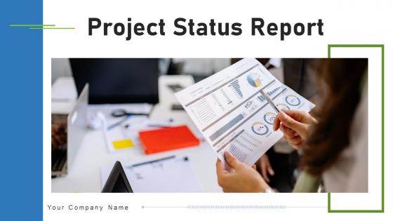
Project Status Report Powerpoint Ppt Template Bundles


Try Before you Buy Download Free Sample Product
 Impress Your
 Audience
Editable
of Time


Our Project Status Report Powerpoint Ppt Template Bundles are topically designed to provide an attractive backdrop to any subject. Use them to look like a presentation pro.
People who downloaded this PowerPoint presentation also viewed the following :
Project Status Report Powerpoint Ppt Template Bundles with all 16 slides:
Use our Project Status Report Powerpoint Ppt Template Bundles to effectively help you save your valuable time. They are readymade to fit into any presentation structure.


FAQs for Project Status Report Powerpoint
So you'll need the basics covered - where you are in the project, what got done since last time, what's coming up next. Budget stuff obviously. Oh and definitely call out any roadblocks because those always bite you later. I like adding a team shoutout section too, makes people feel good. Your exec summary has to be super quick - like 30 seconds max because honestly? That's all they'll actually read. Throw in some charts if you can. Action items need owners and dates or nothing happens.
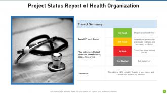
Honestly, visuals are a game-changer for status reports. People can instantly see where you're at with progress, timelines, budgets - way better than making them dig through paragraphs. I always use green/yellow/red color coding because it's foolproof. Charts help you catch trends that would totally get lost in regular text updates. Though I learned the hard way not to go overboard - my first report looked like a rainbow exploded on it. Stick to 2-3 clean visuals that actually tell your story. Trust me, your stakeholders will thank you.
Ugh, the worst thing you can do is be super vague. Like saying "we're making progress" without any actual numbers or what you've finished. People hate that corporate fluff - they see right through it when you try to sugarcoat problems too. Use bullet points so it's easy to scan. Include real metrics and what's actually done. Here's what I learned the hard way: send updates even when nothing big happens. Seriously, going quiet makes everyone panic and assume the worst. Oh, and don't bury bad news in fancy language - just be straight about it.
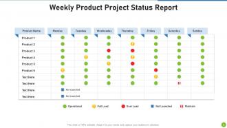
Weekly reports work best for most projects - keeps people informed without being annoying. For longer, stable stuff you can probably get away with bi-weekly. Daily updates during crunch time though, absolutely. Monthly? Too long unless you're doing one of those massive year-long migrations (ugh, those drag on forever). Pick whatever schedule works and then actually stick to it - people hate when they're expecting an update and it just... doesn't show up. Start weekly, see how it feels. You can always adjust if your team's drowning in emails or whatever.
Your stakeholders are literally the people reading these reports, so their feedback is everything. Ask them what's confusing or what they're totally ignoring - I swear, most templates look polished but are completely useless to the actual audience. Send a quick survey after your next couple reports asking which sections they find valuable vs. which ones they skip. That feedback helps you figure out the sweet spot between being thorough and actually readable. Also, don't be afraid to follow up with a few people directly - sometimes you get better insights in casual conversation than formal surveys.
Honestly, you gotta tailor those reports to whoever's reading them. Execs want the big picture stuff - budget, timeline, major risks. Skip the weeds with them. Your team needs all the details though: tasks, what's blocking progress, next steps. Clients? They care about how things affect their goals. I once sent our CEO this crazy technical report and... yeah, that didn't go well lol. Now I either do different sections or just write separate versions entirely. Best thing is to actually ask people what they want to see. Saves you time and makes everyone happier.
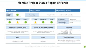
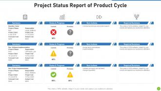
Honestly, just focus on the big four: schedule variance, budget burn rate, scope changes, and risk status. Resource utilization is huge too since people are usually your bottleneck anyway. Track deliverable completion and any blockers that actually matter - not every tiny issue that pops up. Six metrics max though, or you'll lose everyone in the weeds. I learned this the hard way on my last project when I was tracking like 12 different things and my stakeholders' eyes would glaze over in meetings. Pick what directly impacts success and update consistently.
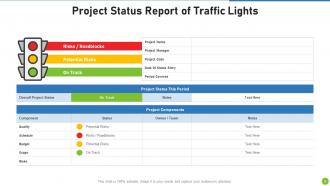
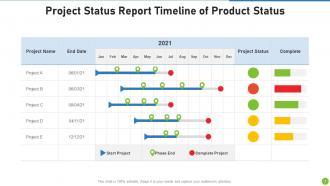
Make a visual timeline with a traffic light system - green for done, yellow for in progress, red for delayed. Executives eat this stuff up, honestly. For each milestone, show the original date, current status, and new deadline if things shifted. Here's the key part though: don't just say "it's delayed." Explain why and what you're actually doing to fix it. Maybe it's resources, maybe dependencies got weird. Your stakeholders will respect the honesty way more than sugar-coating, and it shows you're on top of problems instead of just pointing them out.
Here's what I'd put in there: current risks with impact levels (high/medium/low works great - complex matrices are honestly just confusing). Make sure you cover any new stuff that came up since last time, plus updates on the old ones. Did that vendor thing we worried about actually blow up? Fixed now? Each risk needs its mitigation plan and who's responsible. Oh, and definitely call out anything that needs the big bosses to weigh in. Keep it short but detailed enough so people actually get what might mess with your timeline or budget. Nobody wants to read a novel, but they need the real story.
Skip the boring play-by-play stuff and focus on what actually matters - your wins, problems, and decisions that'll move the needle. Most people just want to know if you're on track anyway. Use bullet points so they can scan quickly, and I really like that traffic light color-coding thing for different sections. Keep each part to 2-3 sentences tops. Always put the biggest news upfront since everyone's swamped and won't read past the first paragraph if you bury the important bits.
Honestly, PowerBI and Tableau are probably your best bet if you want something really interactive with live data feeds. Monday.com and Asana both have auto-updating reports built right in - total game changers when you're swamped. Google Data Studio is free and way better than it has any right to be. Even Canva works if you just need something clean and simple. Oh, and PowerPoint isn't terrible if you use their smart charts feature. The main thing is finding something that actually connects to whatever system you're already using. Trust me, manually updating reports every week will make you want to quit your job.
Honestly, just track if people actually *do* something after reading your reports. Response rates are huge - are folks asking questions or making decisions based on your updates? I'd also check if problems get fixed faster now. But here's the thing - most people won't lie if you ask them straight up whether your reports are helpful or not. Meeting times should shrink too since good status reports cut down on basic update chatter. Oh, and survey your key people every few months about clarity. That's probably the most telling metric you'll get.
Think of the executive summary as your project's elevator pitch. It's where you hit the highlights - current status, big wins, any fires that need putting out, and what's next. Most executives? They honestly just read this part anyway, so make it count. When you're dealing with senior leadership juggling tons of projects, they need to get your project's health in like 30 seconds. I'd stick to 3-4 bullet points max. Keep it tight but don't skip the important stuff - busy people will thank you for being able to scan and actually understand where you stand.
Dude, dig into your old project data - it's seriously underrated for fixing templates. Check which metrics actually predicted if things went well or crashed and burned. I bet you'll find weird stuff like "how happy the devs were" mattered way more than "how much code got written." Also look for what your stakeholders kept asking about that you weren't tracking yet. That's free intel right there. Add those sections and ditch the useless fields nobody ever cared about. Trust me, future you will be so grateful when your templates actually capture the stuff that matters instead of just... fluff.
Honestly, weekly check-ins are a game changer. Nobody wants to admit their task has been "in progress" for three weeks straight - that social pressure alone gets people moving. You'll catch problems early too, so teammates can actually help instead of everyone working solo. I've seen teams completely turn around just from this. The wins feel better when you celebrate them together. Just pick a simple format and stick with it. Trust me, you'll notice the difference pretty fast.
-
Great designs, really helpful.
-
Awesome use of colors and designs in product templates.