


Project Status Powerpoint PPT Template Bundles




Try Before you Buy Download Free Sample Product
 Impress Your
 Audience
 100%
100% Editable
 Save Hours
 of Time


Our Project Status Powerpoint PPT Template Bundles are topically designed to provide an attractive backdrop to any subject. Use them to look like a presentation pro.
People who downloaded this PowerPoint presentation also viewed the following :
Project Status Powerpoint PPT Template Bundles with all 17 slides:
Use our Project Status Powerpoint PPT Template Bundles to effectively help you save your valuable time. They are readymade to fit into any presentation structure.






FAQs for Project Status Powerpoint
Okay so you'll want to cover the basics first - project overview with key dates, where things stand right now (on track, behind, whatever), and your major milestones. Budget stuff is crucial too, obviously. I always add a "wins this week" section because honestly, stakeholders eat that up. Don't forget blockers and risks - those bite you if you ignore them. Oh and next steps with who's doing what. One slide, one main point - people's attention spans are terrible these days. This framework works pretty well, then you can tweak it based on who you're presenting to.
Honestly, design can totally save or kill your presentation. I learned this the hard way when I watched an entire room zone out during a meeting with hideous slides. Clean layouts with white space keep people awake - cluttered ones make everyone's eyes glaze over. Consistent fonts help, and color-coding different project phases actually works. Progress bars beat walls of text every time for showing status updates. Your template should be simple but look professional. People need to focus on your project updates, not spend time figuring out what the hell they're looking at on screen.
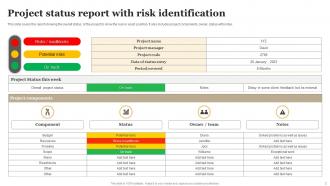
Go with simple visuals that hit immediately - progress bars, timelines, those red/yellow/green status lights. Gantt charts can work but honestly they get cluttered super fast. Keep your colors consistent (green = good, yellow = watch out, red = we're screwed). Don't stuff everything onto one slide - your audience needs to get the project health in like 5 seconds max. Show key milestones and where you actually are vs where you planned to be. Minimize text and let the charts speak for themselves. You can always explain the details when you're actually presenting anyway.
Honestly, bi-weekly is usually the sweet spot for most projects. Weekly works if it's high-stakes stuff, monthly if things are pretty routine. I've watched teams kill themselves doing daily PowerPoint updates - total nightmare and usually unnecessary unless everything's on fire. You don't want to become a professional slide-maker, trust me. High-stakes projects might need weekly check-ins. Start with every two weeks and see how your stakeholders react. They'll tell you pretty quickly if they want more details or if you're overwhelming them with updates.
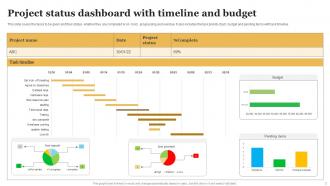
Gantt charts are your best bet for project milestones - they just work better than anything else I've tried. Milestone charts are solid too if you want something cleaner without all the detailed tasks cluttering things up. Progress bars for each phase are super straightforward. Traffic light dashboards (red/yellow/green) kill it in executive meetings, though honestly sometimes I think executives just like the colors. Don't bother with pie charts for timeline stuff - makes zero sense. Pick what clicks with your audience and stay consistent. Oh, and status dashboards with completion percentages always seem to impress stakeholders for some reason.
Look, just make different versions for different people. Executives want the big picture stuff - budget, major milestones, what could go wrong. They'll tune out if you get too detailed. Your actual team needs the opposite though - all the task breakdowns and who's doing what. Clients mostly care about timelines and when they're getting their deliverables. I swear, nothing's worse than watching someone present the same 20-slide monster to everyone. People just check out. Make like 2-3 clean versions instead. Figure out who you're talking to first, then what they actually give a damn about.
Oh man, color psychology is everything in those status meetings! Your brain automatically reads green as "we're good" and red as "oh shit, problem." Yellow means proceed with caution. Honestly, I've seen people use random colors like purple for critical issues and it just confuses everyone. Stick to what people already know - green for on track, red for blockers, yellow for risky stuff. Your stakeholders will get the project health instantly without having to actually think about it. Makes your life way easier too.
Honestly, it's such a game changer because everyone's on the same page about what to include. No more scrambling around trying to figure out the format or second-guessing if you missed something important. Your stakeholders will love you for it too – they can just jump straight to what they need instead of deciphering a totally different layout each time. I always make sure mine has spots for key metrics, risks, and what's coming next. Otherwise stuff definitely gets forgotten. Oh, and it saves you SO much time during those crazy deadline weeks when you're already swamped.
Ugh, don't cram everything onto one slide - nobody can read tiny text from the back anyway. Also skip the vague "project's on track" updates. Tell people what you actually did and what's blocking you. Those complex charts? Explain them first or people just zone out. I learned this the hard way lol. Break each slide into one main point with bullets, not paragraphs. Always end with next steps that have real names and dates attached. Trust me, your stakeholders will actually pay attention when things are clear.
Honestly, making your presentations interactive is a game changer because people actually stay awake. Click-through navigation between project phases works great, or add hover effects on your key metrics. I've seen people use embedded polls to get instant feedback on roadblocks - pretty smart. Instead of boring static charts, interactive ones let stakeholders dig into specific data points they care about. The whole thing becomes more like a real conversation instead of you just talking at people for 20 minutes. Even basic clickable buttons to jump around sections will make a huge difference. Trust me, your team will thank you.
Templates are honestly a lifesaver - all the layout and color stuff is already figured out for you. Just focus on your actual content instead of messing around with fonts for an hour. These things usually follow good design rules that I definitely don't know myself. Your slides end up looking way more professional and consistent. Yeah, you can't customize as much, but for status updates? Who cares about being super creative anyway. The clarity is what matters. Drop your data in and you're done - way better than starting from nothing.
Honestly, project status templates are a game changer. Everyone stops reporting things their own weird way and you actually get data you can compare. Budgets, timelines, risks - it's all consistent across projects so you can spot trends and figure out where to put your resources. The visual format is clutch too, especially when you're drowning in back-to-back meetings (ugh). But here's the real benefit: stakeholders make decisions faster because they're not wasting time trying to decode what everything means. Get your team using the same template and you'll see the difference right away. Trust me on this one.
Tell your story chronologically - what happened, what's going on now, what's next. Connect everything with smooth transitions like "building on this" or "we hit a roadblock when..." Group similar stuff together instead of bouncing around topics (trust me on this one). Put your executive summary first so the bigwigs get it immediately. Then get into the weeds. Oh, and here's the key part - end each section by telling people exactly what you need from them. Otherwise it's just a boring info dump and nobody knows what they're supposed to do about it.
Just throw feedback sections right into your template - stuff like "Key Feedback" or "Action Items from Reviews." Honestly, people are way more likely to actually use it when there's a dedicated spot instead of feedback getting lost in random email threads (which happens constantly). Make sure to note who said what and when stuff needs to get done. Your status updates become more interactive that way, showing you're actually listening to input rather than just dumping progress reports. Oh, and test it with a few people first. Different teams like different formats, so you'll want to see what clicks.
Definitely pack an appendix with backup data, project timelines, and risk registers. Budget breakdowns are clutch too - I learned that lesson when someone grilled me on costs and I had nothing ready. Throw in resource charts and maybe some alternative scenarios. Contact info and next steps should go in there as well, plus links to shared folders. The whole point is being ready for those "wait, can you show us more detail on..." moments that always happen. Oh, and organize everything logically so you're not scrambling through slides like an idiot when they ask follow-ups.
-
I have been using SlideTeam for the past six months. Very happy and satisfied!
-
“I always have a wonderful experience with SlideTeam. It's my ""go to"" when I need a template.”