

Survey Results Powerpoint Ppt Template Bundles




Try Before you Buy Download Free Sample Product
 Impress Your
 Audience
 100%
100% Editable
 Save Hours
 of Time


Our Survey Results Powerpoint Ppt Template Bundles are topically designed to provide an attractive backdrop to any subject. Use them to look like a presentation pro.
People who downloaded this PowerPoint presentation also viewed the following :
Survey Results Powerpoint Ppt Template Bundles with all 17 slides:
Use our Survey Results Powerpoint Ppt Template Bundles to effectively help you save your valuable time. They are readymade to fit into any presentation structure.

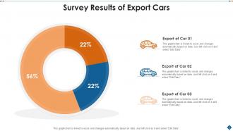
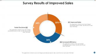
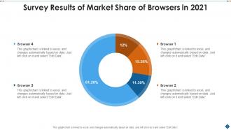
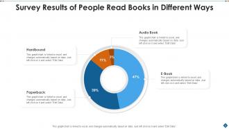





FAQs for Survey Results Powerpoint
Start with your methodology stuff - sample size, dates, who you surveyed. Then hit the key findings with good visuals and percentages. Honestly, nobody cares about boring charts so make it digestible. Don't forget response rates and limitations (I always space on this part). Break down demographics if it matters. The surprising insights are usually what people actually remember. Raw data dumps are the worst - your stakeholders will zone out immediately. End with concrete next steps based on what you discovered. Trust me, they'll appreciate not having to decode endless spreadsheets.
Charts and graphs are seriously game-changers for survey reports. Nobody wants to stare at endless spreadsheets - trust me on that one. Bar charts work perfectly for comparisons, while pie charts show proportions really well. Heat maps? They'll reveal patterns you'd totally miss in raw data. I swear, I've watched executives zone out during text-heavy presentations, but add some clean visuals and they're suddenly engaged. My old boss was terrible with numbers but loved a good chart. Pick the visual that makes your main findings obvious right away.
Honestly, just stick with bar charts or pie charts for survey stuff. Bar charts are clutch when you're comparing different categories or questions side by side. Pie charts work well for showing percentages, but seriously don't use them if you've got more than like 5-6 categories - they turn into a hot mess. Oh, and horizontal bars are actually pretty nice when your answer choices are super long and would look weird stacked vertically. I'd say start simple with a basic bar chart first. You can always get creative later if it'll actually help people understand your data better.
Honestly, just make it super scannable first - that's like 80% of the battle. Break everything up with headings and bullet points because walls of text are brutal. Charts help too. Put your biggest findings right at the top since that's what people actually care about. Skip the fancy jargon and explain things like you're talking to your neighbor. White space makes everything less overwhelming, trust me on this. Test it out on a couple coworkers before you send it around. They'll catch stuff that seems obvious to you but confusing to everyone else. The whole point is making data easy to digest, not showing off how smart you are.
Honestly, the worst thing you can do is dump everything into one chart - people's brains just shut off. Put your big findings right at the top too, don't make them hunt for it. Simple charts beat fancy ones every time, even if that spinning 3D thing looks amazing. Oh and definitely include your sample size somewhere visible because guaranteed someone will ask. I learned that the hard way lol. Keep colors consistent across slides. You'll save yourself from looking scattered.
Oh man, colors totally mess with people's heads when they're looking at data. Like, if you slap red on something positive, everyone's gonna think it's bad news even though it isn't. Red screams "problem" and blue feels safe and trustworthy - it's just how our brains work. I learned this the hard way in a presentation once. Green = good, red = issues is your safest bet. Don't forget about colorblind folks either. Honestly, just show your charts to someone else first - they'll catch the weird color choices you can't see anymore.
Think of the exec summary as your survey's elevator pitch. Most people are crazy busy and just want the main takeaways without digging through tons of data - especially actual executives. It helps you nail down your biggest insights first too. Start with your most interesting finding to grab attention right away. Honestly, this section can make or break whether people actually read the rest of your report. You're basically showing them why your research matters before they get lost in all the methodology stuff. Don't bury your best insights!
Oh totally depends who you're showing it to! Executives want the big picture stuff - clean dashboards with key numbers right up front. Technical people? They actually want all the messy details and breakdowns. I made this mistake once presenting crazy detailed charts to our board. Talk about crickets. Academic folks love seeing your methodology and stats, but regular stakeholders just want simple charts they can actually understand. The rhythm thing matters too - some audiences read fast, others need time to digest. Honestly, just think about what decisions they're trying to make and build your template around that.
Look, raw percentages are forgettable but stories stick. Nobody cares that 73% said whatever - they'll remember hearing about customers getting pissed off at your broken checkout flow. You're basically finding the "why" behind your data and turning it into something people actually want to read. Pick 2-3 big themes from your results first. Then build little stories around each one - give context, show the problem your data uncovered, walk them through what it means. Honestly, this approach works way better than just throwing charts at people and hoping they figure it out.
So here's what works really well - add comment boxes right in your survey template where people can react to the findings. Include a quick rating system too, like how useful each section was. Oh, and definitely throw in a "what questions does this raise?" part. You'd be surprised how much good stuff comes out of that. Set up fields for next steps and who's gonna own each action item. The whole point is making it a living document that actually gets used, not something that dies in someone's email. Otherwise you're just collecting data for the sake of it.
Start with the boring stuff first - sample size, how you got the data, what went wrong. People need that context or they'll misread everything. I've watched so many presentations where someone brags about "80% approval!" from like 5 people. Ugh. Highlight your big findings visually, but don't get carried away claiming one thing caused another when you just have correlation. Be honest about uncertainty too - stakeholders actually respect that more than fake confidence. Oh, and always end with what to DO about it. Data without next steps is just expensive trivia.
Don't just dump data on people - tell them what to actually DO about it. After each big finding, add a "what this means" section that breaks down the numbers into real next steps. Trust me, nobody wants 15 action items thrown at them at once. Stick to your top 3-5 changes that'll make the biggest difference. Say stuff like "we recommend" instead of just rattling off percentages. Oh, and wrap up with a timeline showing who's handling what by when. Makes everything way less overwhelming.
Definitely start with your methodology section - sample size, how you collected responses, margin of error. Most people honestly just skim past it, but that's what makes research look legit instead of like some random Twitter poll. Break down your respondent demographics too. Be upfront about data limitations (there's always some). Confidence intervals help if you've got them. Oh, and cite your sources when you're benchmarking against other studies. Basically just show your work so people can see how you got there and actually trust your conclusions.
Put your demographic stuff right after the executive summary - that's where people expect to find it. Break it down by age, gender, location, whatever matters most for your project. Bar charts are honestly your best friend here, way cleaner than trying to cram everything into paragraphs. Always include percentages alongside the raw numbers because nobody wants to do math while they're reading. Oh and stay consistent with your labels across questions - like if you use "18-25" in one place, don't switch to "18-24" somewhere else. Put your most important demographics first, then tack on the rest. Makes it super easy for people to scan and actually understand your sample.
Canva's probably your easiest bet - they've got tons of survey templates you can just tweak. If you want something more polished, Adobe Creative Suite is great but honestly might be overkill unless you're already familiar with it. PowerPoint works fine too, just more basic looking. I've been seeing some cool stuff made in Figma lately, though that's definitely more of a learning curve. Even Excel can look decent if you get creative with the formatting - I know that sounds weird but I've seen it work. Start with Canva though, you'll have something decent in like 20 minutes.
-
Great quality product.
-
Excellent products for quick understanding.