
Multiple Project Status Report Powerpoint Ppt Template Bundles


Try Before you Buy Download Free Sample Product
 Impress Your
 Audience
Editable
of Time


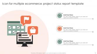
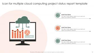
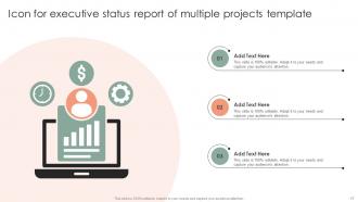
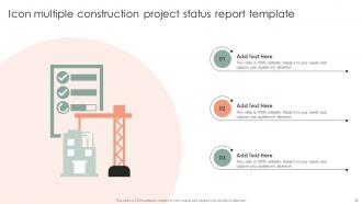
Our Multiple Project Status Report Powerpoint Ppt Template Bundles are topically designed to provide an attractive backdrop to any subject. Use them to look like a presentation pro.
People who downloaded this PowerPoint presentation also viewed the following :
Multiple Project Status Report Powerpoint Ppt Template Bundles with all 24 slides:
Use our Multiple Project Status Report Powerpoint Ppt Template Bundles to effectively help you save your valuable time. They are readymade to fit into any presentation structure.


FAQs for Multiple Project Status Report Powerpoint
Hey! So for your project status report, hit these main points: where you stand vs milestones, budget stuff, what you've knocked out recently, and what's coming next. Always call out risks and blockers - honestly, leadership hates surprises way more than bad news upfront. Throw in actual numbers when you can ("75% done" beats "almost there"). Oh and I always add a quick team vibe check because stakeholders eat that up. Keep it tight though - one page if possible. Nobody's reading a novel, trust me.
Just swap out the boring generic stuff for what actually matters to your team. Construction? Track safety incidents and material delays. Software people obsess over sprint velocity and bugs - totally makes sense. Healthcare projects need patient safety metrics instead, obviously. Honestly, most templates are way too cookie-cutter anyway. Keep the basic bones though - timeline, budget, risks, what's next. But ditch those useless KPIs nobody cares about. Replace them with metrics your stakeholders actually understand and you're golden. Same structure, different focus.
Stick with traffic light colors for status stuff - red/yellow/green just makes sense. Progress bars work great for showing completion percentages. Clean charts for budget and timeline data, but honestly? Execs are gonna skim anyway, so less is more. Keep everything consistent across reports so people instantly know what they're looking at. Cluttered dashboards are the worst - nobody wants to decode some complex graph. Let colors and shapes do the heavy lifting instead of tons of text. Quick test: if you can't tell project health in 10 seconds, it's too complicated.
Honestly, weekly is usually your best bet for most projects. Keeps people in the loop but doesn't drive everyone crazy with constant updates. If things get hectic or you're dealing with some major issue, maybe bump it to twice a week. For those super long-term projects that move at a snail's pace? Bi-weekly works fine. Daily reports are just annoying unless something's literally on fire. Oh, and whatever you pick, stick with it - people like knowing when to expect stuff. I'd start weekly and see how it goes. You can always tweak it later if you're reporting the same nothing every time.
Honestly, the worst thing you can do is jam-pack it with unnecessary details. Nobody's reading a dissertation every Friday. Also skip the vague "on track" updates - like what does that even mean? I see this constantly and it drives me nuts. Don't get fancy with formatting either, it'll just slow you down. Oh and make sure it's not super rigid - teams need wiggle room to call out project-specific stuff. Focus on the basics: what shipped, what's coming, blockers, risks. Maybe test with 2-3 projects before you force everyone to use it.
Honestly, visual indicators are your best friend here - red/yellow/green makes everything obvious at first glance. Put the scary stuff right at the top because people have zero attention span for buried problems. Each risk needs three things: impact, likelihood, and your actual plan to fix it. Here's what I learned the hard way though - always add a "here's what YOU need to do" section for stakeholders. Otherwise they'll just sit there nodding like bobbleheads while nothing gets done. Keep descriptions short but specific enough that someone could actually jump in and help. A simple dashboard works wonders too.
So the executive summary is basically your hook - it's what makes busy people actually read your report instead of just ignoring it. Put your biggest updates there: milestones you hit, what's blocking you, budget stuff, decisions you need from the higher-ups. Some executives honestly only read this part and skip everything else (which is kinda annoying but whatever). Keep it short but packed with info - maybe 3-4 sentences tops. Lead with your most important point first, and definitely mention what you need from them if anything.
Dude, formatting is EVERYTHING for stakeholder engagement. I've watched solid projects die because the reports looked awful. Wall of text? People won't even bother reading it. But throw in some clean headers, bullet points, maybe some charts with color-coded risks - suddenly everyone's paying attention. Executives are drowning in updates all day, so yours better stand out quick. Keep the layout consistent so they know where to find their stuff. Oh, and make it scannable - nobody has time to hunt for info anymore. Do this right and you'll actually get useful feedback instead of crickets.
Honestly depends what your team's already using. Microsoft Project and Smartsheet are pretty solid if you need all the fancy project management stuff. But like, I've literally seen teams spend forever arguing about software when they could've just used Google Sheets or Excel. Sometimes simple is better, you know? PowerPoint works too if you want something visual for presentations. Oh and Google Slides is decent for that too. My take? Just start with whatever tool your team actually knows how to use. You can always switch later if it's not cutting it.
Seriously, reviewing feedback from your old reports will totally change how you write new ones. You'll start noticing what people actually pay attention to - like maybe they skip your whole risk section but always have budget questions. That's gold right there! Their comments show you what format works, what metrics they want, and honestly what stuff you can just cut out. I keep a basic feedback log (nothing fancy) and check it before writing the next update. Makes each report way more targeted. It's kind of obvious once you start doing it, but most people don't bother tracking this stuff.
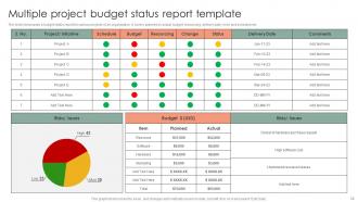
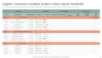
Honestly, keep it simple - budget variance is your bread and butter (actual vs what you planned to spend). Track schedule progress too, like which milestones you're hitting or missing. Resource utilization matters, plus risk status. I always add something about quality - defect rates work, or customer satisfaction if that fits better. Here's the thing though: don't overwhelm people with a million numbers. Pick maybe 4-6 things that actually matter to whoever's reading it. Consistency is key when updating these each time. Your stakeholders just want the financial picture, timeline status, and delivery progress without having to dig for it.
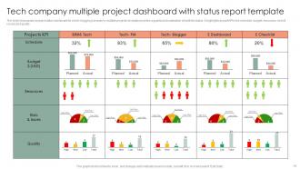
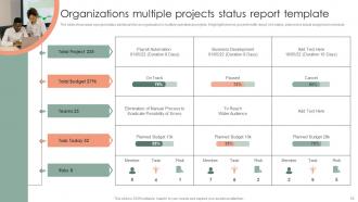
Honestly, these templates are lifesavers for tracking where your time and money actually go versus your original plan. You'll spot problem areas fast - like when one task is completely blowing your budget or someone's drowning in work while their teammate has nothing to do. Having everything standardized makes comparing different projects so much easier (wish I'd learned this sooner). The real win is catching bottlenecks early. You can move people around before small issues turn into total disasters. It's basically your project dashboard instead of just winging it and hoping for the best.
Bullet points are your best friend here - trust me, nobody's reading giant text walls. Start with an executive summary because half your readers won't make it past that anyway (harsh but true). Keep everything super simple and ditch the corporate speak that confuses people from other teams. I'd focus on three things: what you finished, what's coming up, and any roadblocks. Structure it the same way every time so people know where to look. Oh, and cut anything that doesn't actually affect decisions or deadlines - be brutal about it.
Yeah, totally works with agile! Just switch from monthly to sprint cycles or bi-weekly updates. Focus on sprint goals, completed stories, and blockers instead of those old-school milestones. Honestly, stakeholders love staying informed without sitting through endless meetings (those are the worst). Update it right after retrospectives when everything's still fresh. Track your velocity and team health too - not just budget stuff. Short cycles make it way more useful than traditional reporting anyway.
Honestly, the next steps part is what separates useful updates from those boring reports that just recap what already happened. I've watched projects completely fall apart because nobody knew what was supposed to happen after reading the update. Make yours specific with actual dates - like "John will review the design by Friday" instead of just "design review pending." Stakeholders need to walk away crystal clear on what you're doing next and what you need from them. Otherwise you're just wasting everyone's time with backwards-looking summaries that don't move anything forward.
-
Very unique, user-friendly presentation interface.
-
Excellent template with unique design.