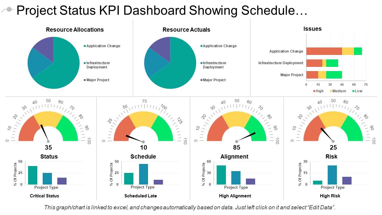
Project Status Kpi Dashboard Showing Schedule And Alignment

Rating:
100%
Slide 1 of 6
Favourites Favourites

Try Before you Buy Download Free Sample Product

Audience Impress Your
Audience
Editable 100%
Editable
Time Save Hours
of Time
The Biggest Sale is ending soon in
0
0
:
0
0
:
0
0
Rating:
100%
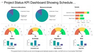
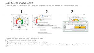
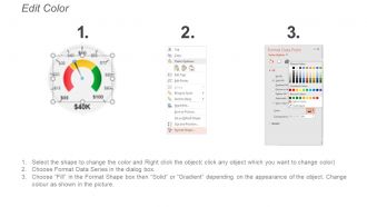
Presenting this set of slides with name - Project Status Kpi Dashboard Showing Schedule And Alignment. This is a seven stage process. The stages in this process are Project Health Card, Project Performance, Project Status.

People who downloaded this PowerPoint presentation also viewed the following :

FAQs for Project Status Kpi Dashboard Showing

Okay so for your dashboard, you'll definitely want schedule stuff - like how much you've actually finished versus what you planned. Budget tracking is huge too, comparing what you're spending to what you budgeted. Resource utilization and risk counts are sneaky important - I've seen projects tank because nobody was watching those. Quality metrics matter if you're building something physical. Honestly though, don't go crazy with like 15 different charts. Pick maybe 5-7 things that'll actually help you decide what to do next, not just make you look productive. Start simple and only add more if there's a real problem you need to solve.

Honestly, KPI dashboards are game-changers because you can actually see what's happening with your projects in real time. No more waiting around for those weekly meetings that drag on forever. You'll spot budget issues, delayed milestones, and resource problems way before they blow up. Makes it so much easier to shift things around quickly when stuff goes sideways. Way better than just winging it based on hunches, you know? Oh, and don't go crazy with metrics - pick like 3-5 that actually help you make decisions. More than that gets overwhelming fast.

Put project health, budget, and timeline stuff right at the top - that's what everyone actually cares about. Red/yellow/green works because people get it instantly. Don't be like my old PM who crammed 47 different metrics on one screen (total nightmare). Group similar things together and stick with the same chart styles so people aren't constantly figuring out what they're looking at. Oh, and make sure you can click through to see details when someone inevitably asks "but why is it red?"

Honestly? I'd go with weekly updates minimum, but daily is way better if you can pull it off. Your stakeholders need fresh info to actually make decisions, and weekly hits that sweet spot without drowning your team in busywork. Though let's be real - some execs will bug you for updates every two days regardless. Daily tracking really pays off when you're dealing with tight deadlines or critical projects since you'll catch problems before they explode. Just pick a schedule and stick with it so people know what to expect. Oh, and make sure whoever's updating the dashboard doesn't burn out from it.

Honestly depends on your budget and how tech-savvy you are. Power BI and Tableau are amazing if you want something really polished - they're what most companies use. Google Data Studio is free and works great for tracking projects. Don't sleep on Excel or Google Sheets either, I've seen people build crazy good dashboards in plain Excel. Monday.com and Smartsheet have dashboard stuff built right in if you're already using them for projects. My advice? Start with whatever your team actually knows how to use. No point getting fancy software that'll just sit there collecting digital dust.

Raw data is honestly just overwhelming to look at. Charts and color coding let you spot problems instantly instead of digging through spreadsheets forever. Like, seeing two progress bars at 85% vs 23% hits way different than reading those percentages in a table. Traffic light colors are clutch - red means fix this now, green means you're good. Bar charts work great too, nothing fancy needed. Your executives will actually pay attention when they can glance at a dashboard and immediately know what's broken. Way better than making them decode numbers.

Dude, you absolutely need stakeholder feedback or your dashboard will just collect dust. I've watched teams build these beautiful dashboards that literally no one checks during meetings - such a waste. Monthly feedback sessions are clutch here. Ask people what they actually click on versus what they completely ignore. You'll be surprised how off your assumptions can be sometimes. The metrics you think are game-changing might be totally confusing to users. They'll tell you which visualizations actually make sense and what critical stuff you're missing. Without their input, you're basically designing in a vacuum.

Okay so first thing - map each KPI back to your actual project goals. No clear connection? Trash it. I've watched teams drown in fancy-looking metrics that are basically useless. You want stuff that'll actually make people change how they work. Get your stakeholders to sign off on your shortlist too. Cap it at 5-7 KPIs max or nobody will pay attention to any of them. Oh and don't forget to check back quarterly - projects shift and your metrics should too.

Don't cram everything onto one screen - people get overwhelmed and can't focus on what matters. Those vanity metrics are the worst too. You know, the ones that look all impressive but totally miss that your project's actually falling apart? Been there! Stick to maybe 5-7 metrics that actually connect to whether you're succeeding or not. Clean design helps a ton. Oh, and context is huge - show targets or trends so people know if that number's good or terrible. Way more useful than random stats that just look pretty.

Look at your past project data - timelines, budgets, how much stuff cost. You'll start seeing patterns that help predict what's coming next. Similar projects usually hit the same snags, so compare apples to apples, not random different stuff. I'd grab at least 6 months of data to get a decent baseline. Set up some trend lines in whatever dashboard you use - honestly makes spotting problems so much easier. My old team caught delays like 3 weeks early doing this. Way better than just winging it and hoping for the best.

Honestly, budget variance is your best early warning system - anything over 10% and you should be worried. Schedule slippage and resource burn rates are huge too. Like if your team's chewing through hours way faster than expected, you're headed for trouble. Milestone completion rates matter, plus watch for scope creep and quality issues trending up. Though tbh, most problems eventually show up in the budget numbers first anyway. Set up dashboard alerts for these thresholds so you're not manually checking constantly. Way easier than babysitting spreadsheets all day.

Yeah totally! Construction folks obsess over safety incidents and weather delays - makes sense since rain can kill a whole schedule. Tech teams are all about sprint velocity and bug counts. Healthcare projects? They're laser-focused on regulatory compliance because one missed milestone can shut everything down. Manufacturing watches equipment uptime religiously. The trick is figuring out what could actually torpedo your specific project. Put those metrics right at the top of your dashboard so you can catch issues before they blow up. Don't bury the important stuff under vanity metrics nobody cares about.

Honestly, go for like 70/30 quantitative vs qualitative - numbers are just way easier to deal with. Your bread and butter should be stuff like budget variance, timeline hits, completion rates. But don't totally ignore the fuzzy stuff either - team morale surveys, how happy stakeholders are, risk levels. I'm obsessed with color-coding everything green/yellow/red because it works for both types. Quick tip though - even your "soft" metrics need some kind of scale, even if it's just 1-5 or whatever. Otherwise you'll be stuck trying to explain "pretty good vibes" to your boss.

So you'll want to learn the key stuff first - project completion rates, budget variance, timeline tracking, that kind of thing. The dashboard itself is pretty straightforward to navigate, maybe spend like 30 minutes just clicking around the views and filters. Here's the thing though - understanding what the numbers actually mean for your projects is where it gets tricky. Plus knowing when to actually do something about changes in the KPIs. Honestly, just log in regularly so it becomes automatic. Do a team walkthrough first, then start using it for weekly updates. Works way better than trying to figure it out solo.

Honestly, KPI dashboards are kind of a lifesaver. No more awkward "so... what's happening with that project?" conversations because everyone's looking at the same real-time data. You'll spot bottlenecks way earlier instead of scrambling when deadlines hit. The best part? Less finger-pointing when things go sideways - though let's be real, some people will always find a way to blame others. Teams actually start helping each other out instead of staying in their little bubbles. Set up alerts so people get notified automatically when numbers look sketchy. Trust me, it beats those endless status meetings where half the info is already outdated.

Ratings and Reviews

100% of 100
Review Form
Write a review
Most Relevant Reviews
  1. 100%

    by Doyle Andrews

    Editable templates with innovative design and color combination.
  2. 100%

    by Cliff Jimenez

    Great quality slides in rapid time.

2 Item(s)

per page: