Project delivery dashboard with service level agreement status
Try Before you Buy Download Free Sample Product
Audience
Editable
of Time
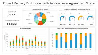
This slide outlines KPI dashboard which cover details of project delivery metrics. The metrics covered in the dashboard are total investment, revenue generated, total days spent on projects, service level agreement status by individual project etc.
People who downloaded this PowerPoint presentation also viewed the following :
Project delivery dashboard with service level agreement status with all 2 slides:
Use our Project Delivery Dashboard With Service Level Agreement Status to effectively help you save your valuable time. They are readymade to fit into any presentation structure.
FAQs for Project delivery dashboard with service
Track the basics first: are you hitting milestones on time, staying on budget, and using your team efficiently? Quality stuff matters too - defect rates, how happy customers are. I'm big on watching risk indicators because catching problems early beats scrambling later. If you're doing agile, definitely monitor team velocity and deliverable status. Charts with color coding are your friend - makes spotting issues way easier. Oh, and customize based on what your stakeholders actually give a damn about, not just standard metrics everyone says you "should" track.
Dude, visuals are a total game-changer for dashboards. People can instantly see what's happening instead of hunting through boring spreadsheets. Charts and color-coded stuff help everyone spot problems right away – honestly, getting stakeholders to actually *look* at data is like 90% of the challenge. Red/yellow/green is your friend for status updates. Interactive charts keep people clicking around longer too, which is clutch. Put your most important numbers front and center where they can't miss them. When everything's clear visually, people feel way more confident making decisions since they actually get what they're looking at.
Connect your source systems through APIs instead of doing manual uploads - saves you from those annoying delays and random mistakes. Set up automated pipelines that refresh every 15-30 minutes (depends how fast your projects move). Don't pull every single metric available though - honestly, you'll just overwhelm yourself. Stick to the ones that actually help you make decisions: milestone completion, budget burn rate, resource utilization. Add some data validation rules so weird stuff gets caught before it hits your dashboard. Oh, and definitely test everything thoroughly first. Always have a backup plan because systems crash at the worst possible times.
Set up different views for each role - saves everyone's sanity. Executives get the high-level stuff: budget summaries, overall status. Project managers need the nitty-gritty: detailed tasks, timelines, resource charts. Developers? Just show them their assigned work and blockers. Trust me, they don't want to wade through executive fluff when they're trying to debug something at 2am. Team leads should see performance metrics and capacity planning. Use permissions so people automatically land on what they actually need to act on. Way better than dumping the same generic dashboard on everyone.
Honestly, **Power BI, Tableau, and Smartsheet** are your best bets. Most companies already have Microsoft licenses so Power BI's usually the easiest sell. **Jira** and **Monday.com** work great too if you're already using them - why complicate things, right? Look for something that plays nice with whatever project management tools you're currently stuck with. I always tell people to match it to your team's tech skills though. No point picking something fancy if half your team will hate using it. Start with whatever connects to your existing setup without a massive headache.
Honestly, these dashboards are game-changers for catching problems early. Budget overruns, missed deadlines, resource issues - you'll see them coming instead of getting blindsided. Set up alerts for your key metrics so you're not manually checking every five minutes (learned that the hard way). The visual layout makes spotting trends way easier than staring at spreadsheets. Track your fixes too - helps you figure out what actually moves the needle. I'd say review everything weekly with your team and make those risk indicators prominent on your main view.
So here's the thing - your KPIs are gonna dictate literally everything about your dashboard. Figure out your key metrics first (timeline stuff, budget variances, resource tracking, whatever matters most to you). I learned this the hard way, but building a dashboard without knowing your KPIs is backwards as hell. Once you know what you're measuring, the design follows naturally. Tracking milestones? You'll need progress bars. Budget-focused? Real-time spend tracking becomes obvious. Honestly, just pick your top 5-7 metrics before you even open the dashboard tool. Trust me on this one.
Honestly, dashboards are a game-changer for agile teams. You get real-time updates on sprint progress and burndown charts right there. Daily standups become way less painful when everyone can actually see where things stand. The trick is setting up automated updates - otherwise you're just looking at what people *think* they finished, not reality. Your stakeholders will stop pestering you every two seconds since they can check progress themselves (thank god). User stories, blockers, team velocity - it's all visible. Makes sprint planning decisions actually based on data instead of guesswork. Just don't go overboard with fancy widgets nobody uses.
Honestly, the worst part is dealing with messy data from everywhere. Teams use totally different formats and some people just forget to update their stuff - or they round numbers however they feel like it that day. Then you've got systems that don't sync properly, so your dashboard looks like a hot mess of conflicting info. Real-time updates? Good luck with that when half your tools can't even talk to each other. I'd definitely try to automate data feeds where you can and maybe set some actual deadlines for updates that people will stick to.
First thing - duplicate your current dashboard before changing anything. Trust me on this one, I've accidentally nuked perfectly good setups before. Most platforms have pretty decent drag-and-drop for adding new widgets, so that part's easy enough. The tricky bit is making sure your new data sources are actually feeding in correctly first. Otherwise you're just adding empty boxes that look professional but show nothing useful. Oh, and definitely give your team a heads up about any layout changes. Nobody likes opening their morning reports and wondering if they clicked the wrong link.
Test it with real users quarterly - their feedback is gold for catching navigation issues. Clean layout with clear labels is everything. Don't cram stuff onto one screen (I see this mistake constantly and it drives me nuts). Put your most critical metrics front and center, then tuck detailed views behind clickable elements. Make sure color coding actually makes sense to normal humans, not just you. Tooltips help when metrics get confusing. Oh, and group related things together logically - sounds obvious but you'd be surprised how many dashboards feel like someone just threw data at a wall.
Honestly, user feedback is what separates dashboards that actually get used from ones that just look nice. Your team will tell you straight up which metrics they check every day versus what's just clutter. Those complaints about missing features? Pure gold - maybe they need better project status indicators or filters you hadn't thought of. I've seen so many dashboards that look great but don't match how people actually work. Set up quick check-ins or a simple feedback channel so you can keep tweaking it. Otherwise you'll end up with something pretty but useless.
Honestly, your dashboard is perfect for digging into past project data to see what keeps going wrong. Pull info from maybe 10-15 recent projects and look for the weird patterns - like which team members always hit deadlines vs who doesn't, or where budget overruns happen most. Average delivery times by project type are super telling too. I'd focus on the trends that actually surprise you because those are goldmines for better planning. It's way better than just guessing timelines based on hope, which let's be real, never works out.
Honestly, mobile dashboards are a game-changer for remote work. You can check project updates while you're literally anywhere - coffee shop, couch, wherever. Real-time access means catching problems early instead of finding out about disasters when you finally open your laptop. Your team stays on the same page even across different time zones, which is clutch. Just make sure the thing actually loads quickly on your phone though. I've dealt with dashboards that take forever to refresh and it's honestly worse than not having mobile access at all. Fast loading = actually useful.
Start with role-based access - that's where you'll get the biggest bang for your buck security-wise. Multi-factor auth for dashboard users is a must. HTTPS everywhere, obviously. I've watched too many teams blow this off early on and then scramble later when things go sideways. Encrypt your sensitive stuff at rest too. Oh, and audit those user permissions regularly - people love hoarding access they don't need anymore. Consider masking budget numbers or client info based on who's looking. Honestly though? Just nail down those access controls first and you're already doing better than half the projects out there.
-
Awesome presentation, really professional and easy to edit.
-
Unique design & color.
-
Attractive design and informative presentation.
-
I discovered this website through a google search, the services matched my needs perfectly and the pricing was very reasonable. I was thrilled with the product and the customer service. I will definitely use their slides again for my presentations and recommend them to other colleagues.