


Maintenance Dashboard Powerpoint PPT Template Bundles




Try Before you Buy Download Free Sample Product
 Impress Your
 Audience
 100%
100% Editable
 Save Hours
 of Time


Our Maintenance Dashboard Powerpoint PPT Template Bundles are topically designed to provide an attractive backdrop to any subject. Use them to look like a presentation pro.
People who downloaded this PowerPoint presentation also viewed the following :
Maintenance Dashboard Powerpoint PPT Template Bundles with all 17 slides:
Use our Maintenance Dashboard Powerpoint PPT Template Bundles to effectively help you save your valuable time. They are readymade to fit into any presentation structure.






FAQs for Maintenance Dashboard Powerpoint
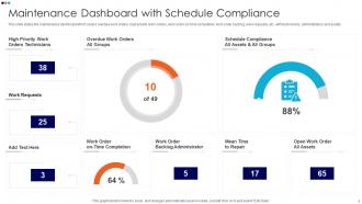
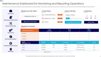
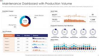
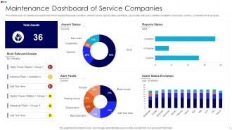
Focus on uptime/downtime percentages first - that's your bread and butter. MTBF and MTTR are next, then definitely track planned vs unplanned maintenance (seriously, this ratio will probably shock you). Work order completion rates matter too. Don't forget maintenance costs as percentage of asset value and parts inventory levels. Nothing kills productivity like a tech standing around waiting for some random $5 part that should've been in stock. Oh, and keep your dashboard dead simple. If it takes more than 30 seconds to figure out what's going on, you've overcomplicated it.
Dude, visualization is seriously worth it for maintenance data. Raw spreadsheets are brutal - who has time to hunt through endless rows? Charts and graphs show you the good stuff instantly: which equipment's acting up, if your preventive maintenance actually works, seasonal patterns you'd totally miss otherwise. Honestly, I wish I'd started using dashboards sooner instead of being stubborn about it. Just begin with the basics like MTTR and equipment availability. Way better than squinting at numbers all day trying to spot trends that should be obvious.
So for maintenance dashboards, there's honestly a bunch of good options out there. Power BI and Tableau are probably your best bet if you want something really polished - Tableau's visualizations are gorgeous but yeah, it'll hit your wallet hard. Grafana's pretty sweet if your team's technical, and it won't cost you anything since it's open source. Don't sleep on Excel though - I know it sounds basic but pivot tables can actually do a lot. Google Data Studio works too if you want something free and online. My take? Just go with whatever your team already uses. Way easier than learning something totally new from scratch.
Honestly, daily updates are your sweet spot - that's what I'd go with. Real-time is obviously better if you can swing it, but I've watched too many maintenance teams get totally screwed when equipment craps out and they're working off yesterday's data. Every 4-6 hours works too if daily feels like too much. The main thing? Pick something and actually stick to it. Your team needs to trust what they're seeing. I'd probably start daily and see how it goes - you can always ramp up later if things get more hectic.
Honestly, the biggest mistake is cramming everything onto one screen. Users get overwhelmed fast. Skip the vanity metrics too - like "total repairs completed" without showing what's actually overdue or critical. Those urgent items need to pop out immediately, not hide somewhere users have to hunt for them. I've literally seen dashboards that are just data graveyards (such a waste). Keep your colors consistent and intuitive. Here's what actually works: ask your maintenance team what decisions they're making every day, then build the dashboard around those specific workflows. Don't just show everything you can measure - that's tempting but wrong.
Hook up your sensors and old maintenance records to dashboard widgets that show failure odds and when stuff's likely to break. Set automated alerts for when risk gets too high - trust me, way better than scrambling when things actually fail. Clean data is crucial though, and your algorithms need training on real failure patterns from your equipment. I'd start with whatever assets would hurt most if they went down. Real-time displays work best when maintenance guys can quickly see what's happening and know what to do about it. Makes the whole process way smoother.
Honestly, user feedback is everything when building a maintenance dashboard. Without it, you'll just create another tool that sits there unused. Your techs and managers will tell you exactly what's broken - confusing layouts, missing info, way too many clicks to get anything done. I've watched perfectly designed dashboards fail miserably because nobody actually tested them in real situations. Short sentences work better here. Get their input on which metrics actually matter and what's slowing them down. Oh, and those random bugs that only show up during actual work? They'll catch those too. Schedule regular check-ins and actually listen - these people use your system every single day.
Mobile compatibility is honestly a total game-changer for field workers. They can pull up the maintenance dashboard right from their phones while they're actually on-site dealing with problems. Real-time updates mean no more running back to the office just to log an issue or check what work orders are waiting. Your team can snap photos of broken stuff and upload them instantly, then mark everything complete from wherever they are. Response times drop like crazy. Just make sure the interface doesn't suck on smaller screens - nothing's worse than trying to navigate a clunky mobile site when you've got actual work to do.
Start with your CMMS data - that's got all your work orders and asset histories. Real-time stuff from sensors helps too if you've got it (vibration, temps, pressure). Don't forget inventory levels and financial data like labor costs and parts spend. Operator logs are actually gold even though they're manual - sometimes people catch what sensors don't. Pull asset info from your ERP system too. Here's the thing though - just use what you can actually access consistently. I've seen too many people plan these amazing dashboards with data they can't even get reliably. Start simple.
Dude, these dashboards are game-changers for seeing what's actually happening with your equipment in real time. You can finally spot which machines are constantly breaking down and whether your preventive maintenance is worth a damn. Costs become way more transparent too - like where you're hemorrhaging cash on repairs. The visual aspect really helps everything click, honestly. My buddy at the plant says his team went from constant crisis mode to actually planning ahead once they started using the data properly. Just pick your biggest 3 headaches first and track those. Don't try to boil the ocean right away.
Dude, your techs need to see work orders and asset alerts immediately when they open the thing - no hunting through menus. Mobile is non-negotiable since they're always moving around. Simple beats flashy every time, trust me on this. I've seen gorgeous dashboards that nobody actually uses because they're confusing as hell. Quick updates and integration with your current systems are must-haves. Real-time data visibility keeps everyone on the same page. If it takes more than 30 seconds to figure out, you've lost them.
Your dashboard's got all that historical data just sitting there - use it to spot when stuff usually breaks down. Check out failure patterns, seasonal trends, what parts crap out most often. That predictive analytics thing can forecast maintenance needs months out (when it actually works lol). Pull reports on your critical equipment first - you'll start seeing when to schedule preventive work during downtime. Way better than scrambling when something dies at 2am on a weekend. Plus you can budget for parts ahead of time instead of paying rush fees.
So the big ones are manufacturing, healthcare, and transportation - anywhere downtime costs a fortune. Picture a factory line shutting down or a hospital's critical equipment failing. Airlines lose crazy money when planes sit grounded. Oil & gas companies are obsessed with this stuff too, plus utilities and food processing. Honestly, it's pretty much any industry with expensive equipment that can't just break randomly. My advice? Don't try to monitor everything at once. Pick your most critical machines first and build from there. Way less overwhelming that way.
Honestly, maintenance dashboards are a game-changer for compliance stuff. They track all your inspection schedules and work orders automatically - no more digging through random spreadsheets for hours. Real-time updates show you which assets are compliant and which aren't. When audit time comes around, the reports generate themselves instead of you scrambling to piece everything together. Set up alerts for deadlines so you're not stressed about missing something important. Everything gets timestamped properly, which auditors love. My old job would've been so much easier with one of these things.
For tracking maintenance stuff, line charts are clutch - you can spot seasonal patterns or see if your equipment's actually getting more reliable. Bar charts are perfect when you're comparing downtime between different machines or cost breakdowns by department. Heat maps are kinda slept on but they're amazing for flagging which assets are screaming for attention. Oh, and definitely throw trend lines on everything so you can tell if you're winning or losing the battle. I'd honestly just stick with basic line and bar charts at first. Your team needs to get used to reading data before you go crazy with fancy visuals.
-
I was able to find the right choice of PPT template for my thesis with SlideTeam. Thank you for existing.
-
Great work on designing the presentation. I just loved it!