

 0 Comment
 Customer Reviews

Have you ever wondered how large organizations like Spotify and Netflix keep their teams on track without getting bogged down in to-do lists? It’s something that seems simple, but productivity dashboards are what keep the train on the tracks for these organizations. Spotify’s agile Team Efficiency Scorecard can manage creative sprints, technical bugs, and even cross-functional collaboration across continents with their own Team Output Dashboards. This is called a productivity dashboard (or performance dashboard).
A productivity dashboard provides a visual management tool that houses all your key metrics, tasks, goals, and measures of success in one place with a clear and simple arrangement that's easy to digest. It is like your team’s mission control for enabling a consistent approach to monitor a Daily Output Tracker, team deliverables, project timelines or just how things are progressing on larger more significant objectives. It can help eliminate distractions and provide clarity in the moment to ramp up your focus, accountability, and time management.
Whether you're a freelancer working with multiple clients or a manager with your own remote team, if done right, a dashboard can help you take all the messy fluidity in your day and simplify it into clear focus.
This list of Top 10 Productivity Dashboard Templates will focus on Productivity Dashboards that may help you facilitate your workflows, decrease inefficiency and allow for time management.
Each of these PPT templates is 100% customizable and editable. You get both structures in the form of content-ready slides, and the editing capability means the presentation can be easily tailored to specific audience profiles.
Also, take a note of these Top 10 Project Dashboard Templates with Samples and Examples and Top 10 Productivity Templates With Samples and Examples.
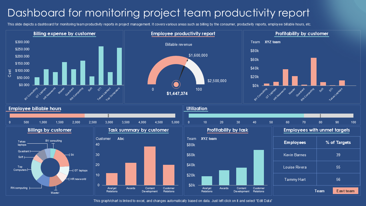
Template 1: Dashboard for Monitoring Project Team Productivity Report PPT Template
This "Brand Performance Dashboard" delivers several Operational Metrics Dashboards to assess brand health and the effectiveness of the strategy implemented. From the top down, we see the total website traffic (100K+) believed to be the amount of visitors, new customers gained (5,000+), the website conversion rate (5%), total revenue generated ($250K+), as well as customer lifetime value ($500+). In addition, we have Social media engagement (250K+) and brand mentions (10K+) below the metrics. This dashboard is putting quantitative results in a single page, allowing businesses to observe and trace how their brand strategy has affected the brand's performance as well as point out strengths and opportunities that were well optimized.
Template 2: Sales and Operations Dashboard To Drive Effective Productivity
The picture presents "The Brand Funnel," a marketing framework that describes the customer journey from awareness to brand loyalty. It begins with "Awareness" (e.g., brand impressions, ad reach), and proceeds through "Consideration" (e.g., traffic to website, lead generation), "Purchase" (e.g., sales, conversion rates). There are also "Loyalty" (e.g., customer retention, repeat purchases), and "Advocacy" (e.g., referrals, positive reviews). The funnel provides a visual way of seeing how your brand strategy is moving potential customers through a good number of stages of development, over time, towards becoming loyal advocates for your brand. Each stage also provides metrics for businesses to measure their progress and optimise their brand building objectives.

Template 3: RPA and Hyper Automation RPA Dashboard With Automated Process and Productivity
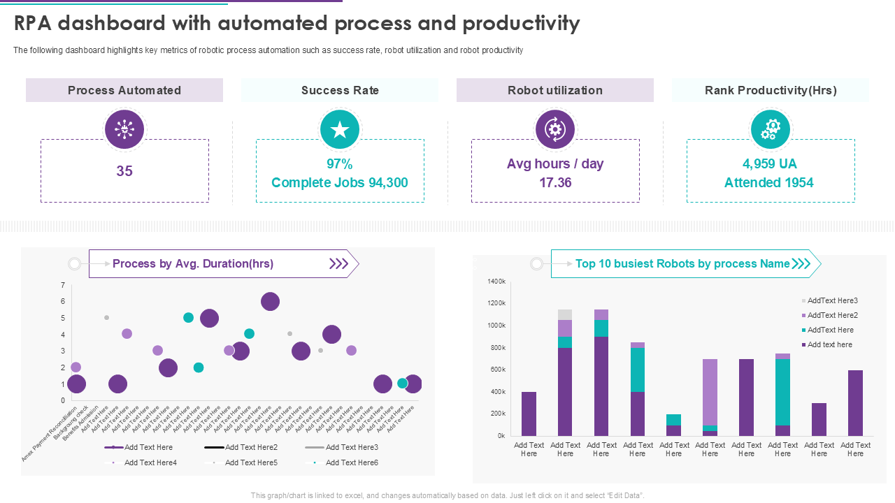
The executive RPA dashboard presents key metrics about automation. This dashboard displays 35 automations implemented, a success rate of 97% for 94,300 completed jobs, and robots averaged an amount of 17.36 hours of work each day. Productivity metrics include 4,959 unattended automations, including 1,954 attended automations. The graphs depict the average duration of the process, and the ten busiest robots by process name. Overall, the dashboard provides insight into the Employee Efficiency Report, usage and performance of robotic process automation systems.
Template 4: OKR Dashboard To Measure Productivity of Multiple Departments
This image shows an OKR (Objectives and Key Results) dashboard for measuring productivity from all departments. This dashboard is designed to assist managers in monitoring business performance using indicators such as, "business OKR in Q2", and "engineer OKR in Q2". The OKR dashboard allows for data to be displayed in one screen for multiple OKRs, including: progress (Key results), Task Management Dashboards, confidence level, dates, and current stage (Completed or Incomplete). This visual display provides a quick overview into department productivity and goal achievement.

Template 5: Warehouse Productivity Tracking KPI Dashboard
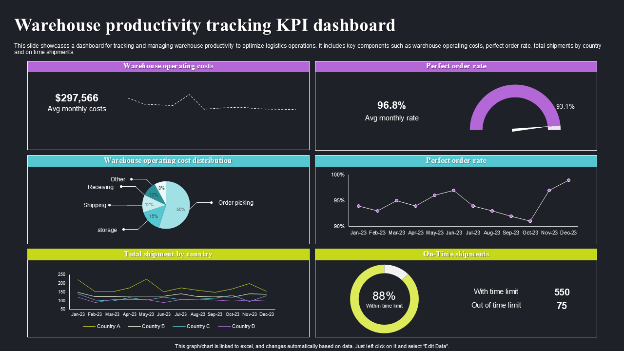
This image depicts a "KPI Dashboard for warehouse productivity tracking" which is made to help improve logistics operations. It incorporates indicators including "warehouse operations cost" (showing average monthly costs by month, and averaged costs by activity, eg shipping/receiving/order picking etc.), "perfect order rate" (showing average monthly rate and trend over time), "total shipment by country" and "on-time shipments" (with a percentage and counts of "with time limit" and "out of time limit"). This gives a complete picture of warehouse effectiveness.
Create an effective presentation
Template 6: Warehouse Productivity Tracking and Management System Dashboard
This is a "Warehouse productivity tracking and management system dashboard." It is meant to help warehouse operational processes more effectively, which is shown in the components on the dashboard such as "registered users" (232), "subscription requests" (61), "orders" (85), and "total sales" (342). There is also a "transaction summary" widget for session information and an "August September" summary with "top profiles" and also "monthly sales". There are respective users like Lilly Blossom and Rosie White, providing strategies for a sampling of operational and/or sales measures.

Template 7: Warehouse Orders Productivity Management Dashboard
This image features a "Warehouse orders productivity management dashboard." It manages and tracks order productivity. The dashboard's primary pieces of information include - "Collecting time in mins" (average 83.35, max 109.35), "orders per day" (average 63.5, max 80), and "number of workers per shift" (average 2.51, max 3.53). The dashboard also features "top most ordered products" and "least ordered products" which includes "distance in seconds to wrapping area" and " avg # of times ordered daily".

Template 8: Warehouse Logistics and Productivity Management Dashboard
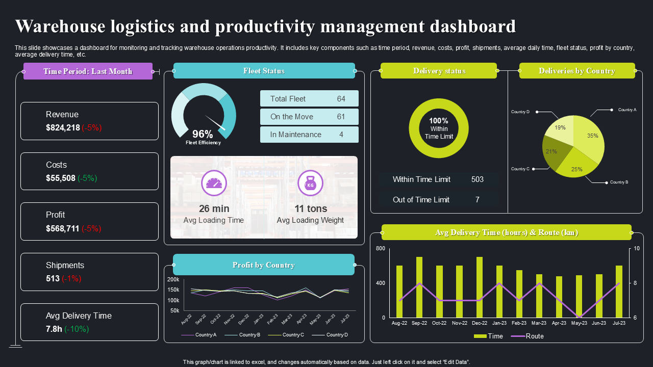
This is an image of a "Warehouse logistics and productivity management dashboard." It tracks and keeps a record of warehouse operations productivity by employing variables like "time period last month" as well as showing "revenue" ($824,218), "costs" ($55,508), "profit" ($568,711), "shipments" (513), and "avg delivery time" (7.8h). It gives "fleet status" - total, on the move, in maintenance, "delivery status" - 100% within time limit, "avg loading time" (26 min.), and "avg loading weight" (11 tons). Also "dues wise by country" and "profit by country."
Template 9: Editable Production Dashboard Template for Business Insights PPT
This slide explains how important production dashboards are for real time data visibility. They help a business quickly identify weaknesses, track key performance indicators, and provide valuable information to aid decisions. This proactive approach to data can help streamline processes, improve productivity, and follow a strategic growth plan to ensure that companies can react effectively to market demand.
[product_image id=1430879]
Template 10: Engaging Production Dashboard Template for Strategic Decision Making PPT
This dashboard allows the reporting of key performance indicators and trends, granting access to stakeholders, such as "John Doe, Lead Analyst," to provide a clear operational status, identify potential bottlenecks, and allow for decisions to be made based upon the statistics available. By providing clarity visually and being easy to understand, it provides the basis for proactive strategic planning within the organization, allowing for optimized resource allocation and an overall business efficiency tracker.
[product_image id=1430737]
Conclusion
No matter whether you're a goal-hitter, time-keeper, or just trying to survive a never-ending to-do list, the right productivity dashboard can be your guiding light. These top 10 templates are not just systems; they are your back-of-house crew that keeps the show going as planned. Choose one, make it yours, and see your chaos burst into productivity clarity. Remember, Employee Productivity Metrics is not about getting more done, but about getting the right things done. Are you ready to take back your time? Your dashboard is waiting for you! Time to get focused!
PS: Take a look at these Must-have Project Reporting Dashboard Templates with Samples and Examples.
Productivity Dashboard FAQs
-
What is a productivity dashboard?
A productivity dashboard is a tool that visually displays important metrics, Task Completion Dashboards, and performance indicators to help you track and improve productivity. A dashboard provides the tools and information you need to gather real-time information on the workflows, goals, and progress monitoring you have in your day. By providing a snapshot of data in one place that is easy to understand, a dashboard will allow you to make decisions and manage time better.
-
What are the three types of dashboards?
There are three main types of dashboards: operational dashboards, strategic dashboards, and analytical dashboards. Operational dashboards are used to track day-to-day activities and current processes in real time. Strategic dashboards examine long-term goals and provide a high-level overview of results and metrics. Analytical dashboards facilitate the exploration of trends and patterns in data for deep analysis and insightful decision making.
-
What is the 5 second rule for dashboards??
The rule of thumb for dashboards comprises five seconds. The user should "see" and understand the insights in five seconds of being on the dashboard. As such, it implies simplicity, clarity, and prioritizing main points of information. A good dashboard conveys the data and important information without bombarding the user too quickly while still being efficient and effective to support quick and effective decisions.