


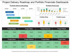
Project delivery roadmap and portfolio financials dashboards






Try Before you Buy Download Free Sample Product
 Impress Your
 Audience
 100%
100% Editable
 Save Hours
 of Time


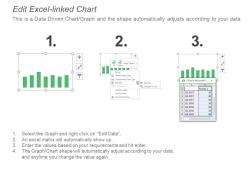
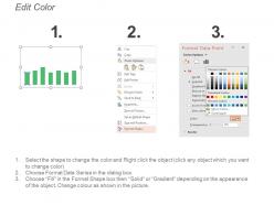
Check out our project delivery roadmap and portfolio financials dashboards PPT template. There are a variety of different kinds of business dashboards that you can use to display the information compiled in your reports. Bar charts, Gantt charts and tables are used for making comparisons and showing proportions. These are very effective when you visually compare a few categories. Our project delivery roadmap and portfolio financials dashboards PowerPoint graphic make it extremely easy to convert your business information into editable charts. The PPT slide has professional graphs and charts which are linked to excel sheets. So, you can change the values of these charts and graphs as per the information you want to represent. Also, ample space has been provided beside the charts so that you can enter important points related to the chart and its categories. This project delivery roadmap Presentation diagram assists you to display your financial information in the best possible manner. Gauge the future with our Project Delivery Roadmap And Portfolio Financials Dashboards. Decide on which avenue to follow.
People who downloaded this PowerPoint presentation also viewed the following :
Project delivery roadmap and portfolio financials dashboards with all 6 slides:
Get your audience shaken and stirred. Our Project Delivery Roadmap And Portfolio Financials Dashboards are licensed to thrill.
FAQs for Project delivery roadmap and
Start with the basics: schedule variance, budget burn, and milestone completion rates. Risk indicators are huge too - I can't tell you how many times I've seen projects crash because nobody was tracking those. Resource utilization matters, obviously. If you're doing agile, sprint velocity is clutch. Quality stuff like defect rates depends on your project but usually worth including. Oh, and stakeholder satisfaction scores help keep everyone from complaining later. You can always layer on more specific metrics once you see what your team actually pays attention to.
So basically, charts and color coding turn your dashboard from this overwhelming mess of numbers into something you can actually read quickly. Red/yellow/green indicators? Game changer - you'll know instantly which projects are screwed. Timeline charts show you dependencies too, which honestly saves so much time vs digging through spreadsheets. Bar charts work great for tracking progress, and heat maps are perfect for seeing who's swamped with work. Just don't go crazy with fancy visuals right away. Start with the basics your team actually uses, then add more later.
Honestly, real-time data is what makes project dashboards actually useful instead of just pretty pictures of old information. You'll catch problems while you can still fix them - like budget issues or team bottlenecks before they explode. Finding out about a missed deadline three days later? Totally useless. I'd focus on getting your most important stuff updating daily at minimum. Other metrics can refresh weekly or whatever works. The whole point is spotting trouble early enough to do something about it, not just documenting disasters after they happen.
Here's the thing - every industry cares about totally different stuff on their dashboards. Construction companies are obsessed with safety numbers and deadlines because one delay costs them a fortune. Healthcare? They're tracking patient outcomes and making sure they don't get hit with compliance issues. Tech teams live and die by sprint velocity and bug counts since they need to ship fast. Honestly, just figure out what makes your bosses panic first. Those are the metrics that should be huge on your dashboard. Everything else can be smaller or buried in tabs.
Stick to the "5-second rule" - people should get the project status instantly. Put your most critical stuff at the top, use those classic red/yellow/green colors for status updates, and don't cram everything onto one screen. I swear, some dashboards look like Excel threw up everywhere. Keep your metrics simple and actually useful for decisions people need to make. Oh, and definitely test it with real users first - they'll find confusing stuff you never thought of. The visual hierarchy thing is huge too. Short story: less is more when it comes to data overload.
Okay so basically these dashboards give everyone one place to check project status instead of drowning in update emails. Real-time progress, who's doing what, where things are stuck - all right there. No more "remind me what the deadline was again" conversations every week. Your stakeholders can see what's happening without constantly bothering your team (which honestly saves everyone's sanity). Team members catch problems early before they blow up. The only catch? You've gotta actually update the thing regularly or people will just ignore it. I learned that one the hard way.
So for project management stuff, Microsoft Project and Smartsheet are pretty solid - Monday.com too. If you want fancier charts and analytics, Tableau and Power BI are where it's at (though they can get pricey). Excel works fine if you're not doing anything too crazy, honestly. Asana and Trello have decent dashboard views for team collaboration - oh, and Notion's gotten really good lately. I'd probably just stick with whatever project tool you're already using first and see how their dashboards work for you. No point switching everything up if what you have does the job, you know?
So first figure out what "winning" actually means for your projects - stuff like staying on schedule, budget variance, how you're using resources. Connect your dashboard to pull live data from whatever project tools you're already using. Charts are basically mandatory because everyone's obsessed with pretty visuals these days. Set up alerts so you know when things go sideways without constantly checking. Oh, and don't go crazy with metrics at first - pick like 3-5 important ones. You can always add more later but starting with too many just confuses people.
Honestly, the biggest thing is getting automated data feeds set up instead of making people update stuff manually - that always falls apart eventually. You'll want clear rules about who owns what data and when they need to update it. Regular audits are super helpful too, like having someone check the numbers weekly. I'd start by mapping out where your data actually comes from right now and figure out what's causing the biggest headaches. Cross-checking between systems catches a lot of issues. Oh, and make sure everyone knows their specific role in keeping things accurate - accountability makes a huge difference.
Honestly, weekly is the bare minimum but daily's way better if you can pull it off. High-pressure projects especially need that constant pulse check. Pick a schedule and actually stick to it though - like if you say Tuesdays and Fridays, your team will start expecting it then. Real-time would be amazing but let's be real, who has those resources? I'd say start with whatever you can actually maintain without burning out, then ramp up once you've got the routine down. Consistency beats ambition here. Oh and make sure people know when to actually look for updates.
Honestly, the data stuff will drive you crazy - everyone tracks things differently so you'll spend forever just cleaning it up instead of making anything useful. Getting people to actually use it after? Good luck with that. Stakeholders never agree on which metrics matter, and there's always some team that just... never updates their status. Super fun. Start with just one team though, get their data working smoothly first. Don't try to build some massive thing right away or you'll hate your life. Once you nail the basics with one group, then you can think about expanding it out.
Honestly, dashboards are a game-changer for Agile teams. Real-time sprint tracking means you'll instantly spot blockers and see if you're actually gonna hit your goals. The visual aspect makes standups so much better - no more awkward "uh, what did I work on yesterday?" moments. Burndown charts and velocity tracking help with future sprint planning too. Oh, and definitely set yours to auto-refresh during reviews. Stakeholders love seeing live progress without you scrambling to update PowerPoint slides last minute. Trust me on that one.
Honestly, dig into your old project data - it's a goldmine for future planning. Check out where you went over budget, missed deadlines, or had resource issues. I swear this would've saved me from so many disasters if I'd started earlier! Different team setups and methods will show clear patterns of what works. Templates based on real outcomes (not wishful thinking) are huge. Oh, and comparing similar project types helps set realistic expectations instead of just guessing. Short version: let your past failures teach you something useful.
Dashboards are clutch for catching problems before they blow up. You'll spot timeline slips and budget issues right away instead of digging through boring status reports. Honestly, the visual stuff just clicks better - like when you see sprint velocity tanking or everyone's overloaded at once. Missing milestones start forming patterns you can actually see. Dependencies pile up fast (learned that the hard way). Set alerts for your critical numbers so you're not refreshing the thing every hour like a maniac. Way better than finding out about disasters in weekly meetings.
Honestly, you'll want something with widgets you can move around easily. Configurable dashboards are clutch - drag-and-drop sections, timeline views that update automatically when deadlines shift. Smart filtering is a lifesaver too, especially when your boss randomly wants different data breakdowns (happens way more than it should). Real-time sync is pretty much non-negotiable now. Role-based permissions let your team update their stuff without breaking your main view. Oh, and make sure you can tweak layouts and KPIs yourself - waiting for IT every time scope creep hits will drive you insane.
No Reviews