



 0 Comment
 Customer Reviews

Are you having problems collating the scattered information from different research sources? It is the same challenge experienced by many research teams who want to make well-informed and on-time decisions. The research dashboard is capable of resolving this situation by pulling together all important data in one analytics dashboard, which will simplify the process of monitoring performance indicators without having to switch between numerous tools. It streamlines the work of conducting research and gives a complete picture of key points of information delivered by different sources at a glance.
A research dashboard is more than an organization; it enables action. It turns words into valuable information by using smart data visualization and adopting built-in reporting tools. It enables teams to run effective data analysis, identify trends, and take advantage of real-time business intelligence to achieve more strategic results. This dashboard is a necessary resource for researchers who want to be precise and quick.
Access our Top 10 templates for market research dashboards for good data storytelling and analysis. It will help you visualize insights, track KPIs, and make better choices.
Core Value of a Research Dashboard
The research dashboard, unlike the static report, is interactive and real-time, which implies that the user becomes more active in studying its data. It helps to present survey results and conclusions in an interactive format and to make them clear and updated, transforming numeric data into valuable information. Rather than sorting through infinite spreadsheets, the stakeholders are able to monitor the performance and results, assess their impact, and analyze them with the help of a wide range of charts and visualizations.
Do you wish to uncover important business insights? Discover our blog on the Top 10 Insights Dashboard Templates for clarity in making data-driven decisions.
Editable PPT templates by SlideTeam are practical and include both the aspects of gaining insights through the research dashboards into building clear and focused strategies as well as engagement. Using these templates will allow you to have an organized, ready-made template that will make your whole research presentation much easier. Let’s explore!
Template 1: Innovation Portfolio Performance Dashboard with Research Quotient
This PowerPoint Slide shows an innovation portfolio performance dashboard, including a research quotient. It incorporates critical indicators such as the Vitality Index that shows revenue of new products during the past 3 years. It also deals with product releases, pipeline (until market use) of innovation, and allocation types, incremental and disruptive. It creates massive value to aid groups in visualizing innovation pipelines, prioritizing the conceptions with the highest effect, and arranging product development against technique strategies. It becomes much simpler to drive knowledgeable decisions and inundate multi-functional cooperation.

Template 2: Consumer Purchasing Behavior Research Dashboard
This PPT Preset underlines the consumer purchasing behaviour research dashboard. It focuses on monthly deliverables for different devices such as Desktop, Mobile, and Tablet. The layout also shares details about the top 5 rated products. Moreover, it also brings out information for the top 5 search products and an emphasis on sessions per user for different regions. The following visual enhances trend analysis, maximizes strategy planning, and assists effective presentations.

Template 3: International Photonics Market Research Dashboard
The presented international photonics market research dashboard is featured in this PPT Template. It describes the major principles and big players such as Intel Corporation, Hamamatsu Photonics K.K., IBM, and Molex LLC. It also covers rankings of products according to 2022 revenue. This kind of arrangement is capable of determining trends, assessing opportunities, allowing data-driven courses of action, and enhancing the significance and magnitude of decision-making.

Template 4: Market Research Dashboard for Customer Demographics
This PowerPoint displays the market research dashboard for customer demographics. It exhibits the customer gender ratio for the last 5 years, from 2019 to 2023. Additionally, the presentation design illustrates technology adopters, which include innovators, early adopters, early majority, late majority and laggards with varying percentages. It also shows the education level of customers for five years. It makes data storytelling uncomplicated, increases strategic focus, and enhances clarity in decision-making.

Template 5: Market Research Dashboard for Customer Feedback Analysis
This market research dashboard focuses on customer feedback analysis. It displays people, age range categories and user locations for demographics. It also presents how much time one used it and your satisfaction rate. Further, the presentation image shows which products bought and which aspects one considers buying: price, brand name, quality, features, or anything else. Use it in deciphering consumer behavior, finetuning positioning, and shaping meaningful brand choices. Download now.

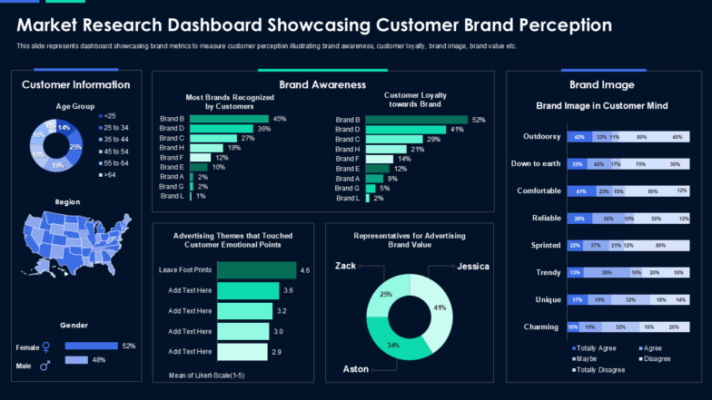
Template 6: Market Research Dashboard Showcasing Customer Brand Perception
This PPT Dashboard visually displays customer brand perception. It provides important information using organized Data Management. It also disaggregates the customers according to their age, with the 25-34 group constituting 25 percent of the total, with the male and female populations almost evenly represented. In addition, it is also mentioned that brand B has a lead in both awareness (45%) and loyalty (52%). The perceptions of brand image include comfortable (41%) and outdoorsy (42%). It aids in how to make the appeal emotional and spokesperson influential- providing information based on insights that support brand messages and participation.
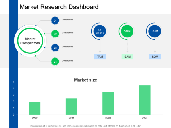
Template 7: Market Research Dashboard
This PowerPoint Graphic demonstrates a concise market research dashboard. It contains main data about market competitors (Competitor 1-4), TAM of 1.9B, SAM of 532M, and SOM of 10.6M. In addition, the gradual growth of market size from 2020 to 2023 is also indicated in the PPT diagram. This PPT figure will help in the simplification of complex data, alignment of business targets, and conveyance of information as a strategic decision. Download now.
Template 8: Business Market Research Dashboard for Customer Behavior Analysis
This presentation image displays the business market research dashboard. It has a Net Promoter Score that has 50 percent promoters, passives, and detractors. It also shows the Customer Purchase Effort Score, which means that 60 percent of people had reported small, 50 medium, and 40 high. The design also offers some ratings on the rating of 30 percent happy customers, 65 percent satisfied with prices, and eighty-three percent found the design appealing. The presentation slide helps in more planning, more targeting, and more value proposition communications between teams. Download now.

Template 9: Quantitative Research Dashboard of Brand Awareness and Image
This PPT Slide displays the brand awareness and image qualitative research dashboard. It starts with some sample insights such as age segmentation (<25 to >64), gender breakdown (52% female, 48% male), and regional segmentation. It is a well-visible dashboard in terms of brand recall performance and audience perception, which allows more accurate change in the campaign. Monitoring the trends of awareness and locating the potential areas of growth allows for making decisions based on the numbers.

Download This Presentation Now
Template 10: Market Research Survey Analysis Dashboard
The presentation slide puts into emphasis a market research survey analysis dashboard. It provides usable data information. Also, it includes other important surveys such as Customer Contentment, Product Feedback, and Employee Experience revealed in the PPT image. The specified presentation model is useful in the identification of the principal trends, in the simplification of the reporting, and in the provision of the adjustment of the insights to the strategic objectives of the business. Download now.

Template 11: Education and Research KPI Dashboard Showing Research Project Allocation
This PowerPoint Presentation presents the dashboard of an education and research KPI dealing with research project allocation. It monitors the number of proposals handed in between 2014 and 2018, with the highest figure being 500 in 2018. It indicates that the proposal acceptance rate went downwards to 50 percent, and the program success rate went upwards to 100 percent. Structure analysis, enhanced planning, and the streamlining of education goals can be facilitated with the help of this PowerPoint image.

Template 12: Advance Product Pilot Market Research Survey Dashboard
This PPT slide highlights an advanced product pilot market research survey dashboard. It shows that the pilot survey overview includes 13 surveys, 30 collectors, 0.88K responses, 133 partial responses, and 5.02 average time taken. It also shows the rate of survey completion, surveys by departments and brings out a survey summary which comprises employee demographic survey, employee satisfaction survey, along with employee performance and organisation survey. It allows more efficient tracking of insight, interpretation of data, and simplification of the presentation of strategies.

Research Smarter with Dynamic Dashboards
The faster and more efficient development of a Research Dashboard has been achieved, and there is no need to feel the complexity of any setting and costly outsourcing. Use SlideTeam’s PPT Templates to track performance metrics, discover trends, and visualize the results in real-time. They make research analysis easier and complex research clearer to adhere to as a team.
Go through our blog on Top 10 Analytics Dashboard Templates, where you will find a shed of good ideas on how to take your data monitoring and data reporting to the next level.
FAQs on Research Dashboard
What types of research data can be visualized in a dashboard?
The types of data include different numerical data, categorical, and spatial ones. Some of the standard types of visualization include charts (bar, line, pie, scatter), maps, tables, and gauges that are designed to promote the interpretation and action of complex information.
Who are the primary users of a research dashboard?
The main audience of a research dashboard can be different, yet quite often, it consists of PIs, researchers, research administrators, and, sometimes, external individuals and funding sources. Through the interface, they monitor their research work, manage projects, and derive information through the analysis of data.
What are the key features of an effective research dashboard?
An effective research dashboard is a focused, graphical interface for monitoring, interpreting, and reporting research data in real-time. Its main features are interactive and adjustable data visualization (charts, graphs, heatmaps), filters that can be used to narrow down to an insight immediately, and integrations with multiple data dormitories, be it a survey, experiment, or database, per se.