Healthcare, Medical, Hospital KPI Dashboard, Metrics PowerPoint Templates
-
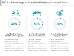 Kpi for percentage of admitted patients occupied beds first attendances ppt slide
Presenting kpi for percentage of admitted patients occupied beds first attendances ppt slide. This presentation slide shows three Key Performance Indicators or KPIs in a Dashboard style design. The first KPI that can be shown is percentage of Day Only Patients Admitted to Overnight Stay. The second KPI is percentage of Time That Hospital Beds Remains Occupied and the third is percentage of First Attendances in Emergency Room. These KPI Powerpoint graphics are all data driven, and the shape automatically adjusts according to your data. Just right click on the KPI graphic, enter the right value and the shape will adjust automatically. Make a visual impact with our KPI slides.
-
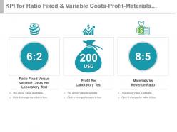 Kpi for ratio fixed and variable costs profit materials vs revenue ratio ppt slide
Presenting kpi for ratio fixed and variable costs profit materials vs revenue ratio ppt slide. This presentation slide shows three Key Performance Indicators or KPIs in a Dashboard style design. The first KPI that can be shown is Ratio Fixed Versus Variable Costs Per Laboratory Test. The second KPI is Profit Per Laboratory Test and the third is Materials Vs Revenue Ratio. These KPI Powerpoint graphics are all data driven, and the shape automatically adjusts according to your data. Just right click on the KPI graphic, enter the right value and the shape will adjust automatically. Make a visual impact with our KPI slides.
-
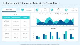 Healthcare Administration Analysis With KPI Dashboard
The following slide depicts the KPAs of medical and healthcare administration to manage and remit services. It includes KPIs such as numbers of doctors, numbers of patients, monthly patient analysis, upcoming appointments etc. Presenting our well-structured Healthcare Administration Analysis With KPI Dashboard. The topics discussed in this slide are Healthcare Administration Analysis, KPI Dashboard. This is an instantly available PowerPoint presentation that can be edited conveniently. Download it right away and captivate your audience.
-
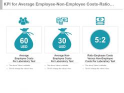 Kpi for average employee non employee costs ratio cost per test ppt slide
Presenting kpi for average employee non employee costs ratio cost per test ppt slide. This presentation slide shows three Key Performance Indicators or KPIs in a Dashboard style design. The first KPI that can be shown is Average Employee Costs Per Laboratory Test. The second KPI is Average Non Employee Costs Per Laboratory Test and the third is Ratio Employee Costs Versus Non Employee Costs Per Laboratory Test. These KPI Powerpoint graphics are all data driven, and the shape automatically adjusts according to your data. Just right click on the KPI graphic, enter the right value and the shape will adjust automatically. Make a visual impact with our KPI slides.
-
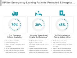 Kpi for emergency leaving patients projected and hospital bed occupancy powerpoint slide
Presenting kpi for emergency leaving patients projected and hospital bed occupancy powerpoint slide. This presentation slide shows three Key Performance Indicators or KPIs in a Dashboard style design. The first KPI that can be shown is percentage of Emergency Patients Hospitalized. The second KPI is Projected Versus Actual Hospital Bed Occupancy and the third is Percentage of Patients Leaving Against Medical Advise. These KPI Powerpoint graphics are all data driven, and the shape automatically adjusts according to your data. Just right click on the KPI graphic, enter the right value and the shape will adjust automatically. Make a visual impact with our KPI slides.
-
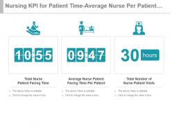 Nursing kpi for patient time average nurse per patient total visits presentation slide
Presenting nursing kpi for patient time average nurse per patient total visits presentation slide. This presentation slide shows three Key Performance Indicators or KPIs in a Dashboard style design. The first KPI that can be shown is Total Nurse Patient Facing Time. The second KPI is Average Nurse Patient Facing Time Per Patient and the third is Total Number of Nurse Patient Visits. These KPI Powerpoint graphics are all data driven, and the shape automatically adjusts according to your data. Just right click on the KPI graphic, enter the right value and the shape will adjust automatically. Make a visual impact with our KPI slides.
-
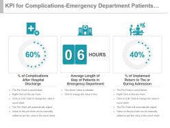 Kpi for complications emergency department patients unplanned return powerpoint slide
Presenting kpi for complications emergency department patients unplanned return powerpoint slide. This presentation slide shows three Key Performance Indicators or KPIs in a Dashboard style design. The first KPI that can be shown is Percentage of Complications After Hospital Discharge. The second KPI is Average Length of Stay of Patients in Emergency Department and the third is percentage of Unplanned Return to The or During Admission. These KPI Powerpoint graphics are all data driven, and the shape automatically adjusts according to your data. Just right click on the KPI graphic, enter the right value and the shape will adjust automatically. Make a visual impact with our KPI slides.
-
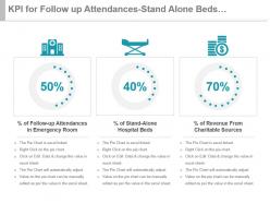 Kpi for follow up attendances stand alone beds charitable revenue ppt slide
Presenting kpi for follow up attendances stand alone beds charitable revenue ppt slide. This presentation slide shows three Key Performance Indicators or KPIs in a Dashboard style design. The first KPI that can be shown is Percentage of Follow up Attendances in Emergency Room. The second KPI is Percentage of Stand Alone Hospital Beds and the third is Percentage of Revenue From Charitable Sources. These KPI Powerpoint graphics are all data driven, and the shape automatically adjusts according to your data. Just right click on the KPI graphic, enter the right value and the shape will adjust automatically. Make a visual impact with our KPI slides.
-
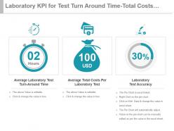 Laboratory kpi for test turn around time total costs test accuracy ppt slide
Presenting laboratory kpi for test turn around time total costs test accuracy ppt slide. This presentation slide shows three Key Performance Indicators or KPIs in a Dashboard style design. The first KPI that can be shown is Average Laboratory Test Turn Around Time. The second KPI is Average Total Costs Per Laboratory Test and the third is Laboratory Test Accuracy. These KPI Powerpoint graphics are all data driven, and the shape automatically adjusts according to your data. Just right click on the KPI graphic, enter the right value and the shape will adjust automatically. Make a visual impact with our KPI slides.
-
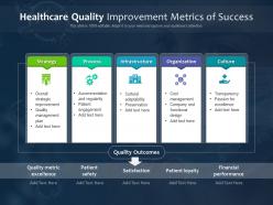 Healthcare quality improvement metrics of success
Introducing our premium set of slides with Healthcare Quality Improvement Metrics Of Success. Elucidate the five stages and present information using this PPT slide. This is a completely adaptable PowerPoint template design that can be used to interpret topics like Strategy, Process, Infrastructure, Organization, Culture, Quality Metric Excellence, Patient Safety, Satisfaction, Patient Loyalty, Financial Performance. So download instantly and tailor it with your information.
-
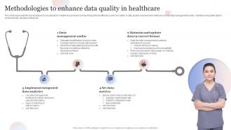 Methodologies To Enhance Data Quality In Healthcare
This slide represents the best practices to be adopted by healthcare providers to help change the healthcare system for better. It data quality improvement methods such as data management audits, maintain and update data in correct format, set data metrics etc. Introducing our premium set of slides with Methodologies To Enhance Data Quality In Healthcare. Elucidate the four stages and present information using this PPT slide. This is a completely adaptable PowerPoint template design that can be used to interpret topics like Data Management Audits, Set Data Metrics, Implement Integrated Data Analytics. So download instantly and tailor it with your information.
-
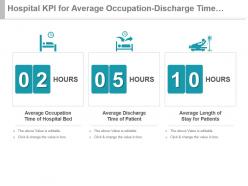 Hospital kpi for average occupation discharge time patient stay time ppt slide
Presenting hospital kpi for average occupation discharge time patient stay time ppt slide. This presentation slide shows three Key Performance Indicators or KPIs in a Dashboard style design. The first KPI that can be shown is Average Occupation Time of Hospital Bed. The second KPI is Average Discharge Time of Patient and the third is Average Length of Stay for Patients. These KPI Powerpoint graphics are all data driven, and the shape automatically adjusts according to your data. Just right click on the KPI graphic, enter the right value and the shape will adjust automatically. Make a visual impact with our KPI slides.
-
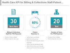 Health care kpi for billing and collections staff patient retention tests presentation slide
Presenting health care kpi for billing and collections staff patient retention tests presentation slide. This presentation slide shows three Key Performance Indicators or KPIs in a Dashboard style design. The first KPI that can be shown is Billing And Collections Staff Per FTE Physician. The second KPI is Patient Retention Percentage and the third is Number of Tests Per FTE Physician. These KPI Powerpoint graphics are all data driven, and the shape automatically adjusts according to your data. Just right click on the KPI graphic, enter the right value and the shape will adjust automatically. Make a visual impact with our KPI slides.
-
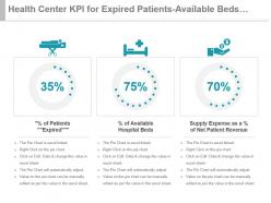 Health center kpi for expired patients available beds supply expense powerpoint slide
Presenting health center kpi for expired patients available beds supply expense powerpoint slide. This presentation slide shows three Key Performance Indicators or KPIs in a Dashboard style design. The first KPI that can be shown is Percentage of Patients Expired. The second KPI is Percentage of Available Hospital Beds and the third is Supply Expense as a percentage of Net Patient Revenue. These KPI Powerpoint graphics are all data driven, and the shape automatically adjusts according to your data. Just right click on the KPI graphic, enter the right value and the shape will adjust automatically. Make a visual impact with our KPI slides.
-
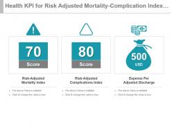 Health kpi for risk adjusted mortality complication index expense per discharge ppt slide
Presenting health kpi for risk adjusted mortality complication index expense per discharge ppt slide. This presentation slide shows three Key Performance Indicators or KPIs in a Dashboard style design. The first KPI that can be shown is Risk Adjusted Mortality Index. The second KPI is Risk Adjusted Complications Index and the third is Expense Per Adjusted Discharge. These KPI Powerpoint graphics are all data driven, and the shape automatically adjusts according to your data. Just right click on the KPI graphic, enter the right value and the shape will adjust automatically. Make a visual impact with our KPI slides.
-
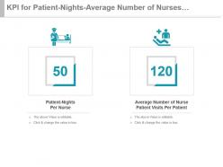 Kpi for patient nights average number of nurses per patient presentation slide
Presenting kpi for patient nights average number of nurses per patient presentation slide. This presentation slide shows two Key Performance Indicators or KPIs in a Dashboard style design. The first KPI that can be shown is Patient Nights Per Nurse. The second KPI is Average Number of Nurse Patient Visits Per Patient. These KPI Powerpoint graphics are all data driven, and the shape automatically adjusts according to your data. Just right click on the KPI graphic, enter the right value and the shape will adjust automatically. Make a visual impact with our KPI slides.
-
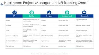 Healthcare Project Management KPI Tracking Sheet
Introducing our Healthcare Project Management KPI Tracking Sheet set of slides. The topics discussed in these slides are Healthcare Project Management KPI Tracking Sheet. This is an immediately available PowerPoint presentation that can be conveniently customized. Download it and convince your audience.
-
 Kpi for patient cost nosocomial infection hospital beds cycle time powerpoint slide
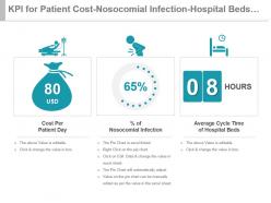
Presenting kpi for patient cost nosocomial infection hospital beds cycle time powerpoint slide. This presentation slide shows three Key Performance Indicators or KPIs in a Dashboard style design. The first KPI that can be shown is Cost Per Patient Day. The second KPI is percentage of Nosocomial Infection and the third is Average Cycle Time of Hospital Beds. These KPI Powerpoint graphics are all data driven, and the shape automatically adjusts according to your data. Just right click on the KPI graphic, enter the right value and the shape will adjust automatically. Make a visual impact with our KPI slides.
-
 Kpi for utilization cost use of cleaning agents narcotic documentation presentation slide
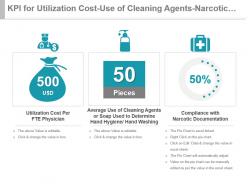
Presenting kpi for utilization cost use of cleaning agents narcotic documentation presentation slide. This presentation slide shows three Key Performance Indicators or KPIs in a Dashboard style design. The first KPI that can be shown is Utilization Cost Per FTE Physician. The second KPI is Average Use of Cleaning Agents or Soap Used to Determine Hand Hygiene Hand Washing and the third is Compliance with Narcotic Documentation. These KPI Powerpoint graphics are all data driven, and the shape automatically adjusts according to your data. Just right click on the KPI graphic, enter the right value and the shape will adjust automatically. Make a visual impact with our KPI slides.
-
 Healthcare management kpi dashboard showing incident by type healthcare management system ppt ideas
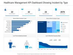
Present the topic in a bit more detail with this Healthcare Management KPI Dashboard Showing Incident By Type Healthcare Management System Ppt Ideas. Use it as a tool for discussion and navigation on Serious Incidents, Lost Time Incidents, Reported Injuries, Total Incidents. This template is free to edit as deemed fit for your organization. Therefore download it now.
-
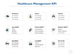 Healthcare management kpi dashboard ppt powerpoint presentation gallery shapes
Presenting this set of slides with name Healthcare Management Kpi Dashboard Ppt Powerpoint Presentation Gallery Shapes. This is a nine stage process. The stages in this process are Healthcare, Management, Kpi Dashboard, Strategy, Planning. This is a completely editable PowerPoint presentation and is available for immediate download. Download now and impress your audience.
-
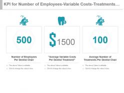 Kpi for number of employees variable costs treatments per dentist chair presentation slide
Presenting kpi for number of employees variable costs treatments per dentist chair presentation slide. This presentation slide shows three Key Performance Indicators or KPIs in a Dashboard style design. The first KPI that can be shown is Number of Employees Per Dentist Chair. The second KPI is Average Variable Costs Per Dentist Treatment and the third is Average Number of Treatments Per Dentist Chair. These KPI Powerpoint graphics are all data driven, and the shape automatically adjusts according to your data. Just right click on the KPI graphic, enter the right value and the shape will adjust automatically. Make a visual impact with our KPI slides.
-
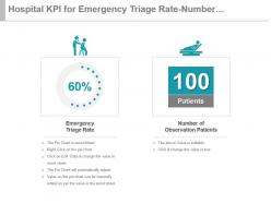 Hospital kpi for emergency triage rate number of observation patients presentation slide
Presenting hospital kpi for emergency triage rate number of observation patients presentation slide. This presentation slide shows two Key Performance Indicators or KPIs in a Dashboard style design. The first KPI that can be shown is Emergency Triage Rate. The second KPI is Number of Observation Patients. These KPI Powerpoint graphics are all data driven, and the shape automatically adjusts according to your data. Just right click on the KPI graphic, enter the right value and the shape will adjust automatically. Make a visual impact with our KPI slides.
-
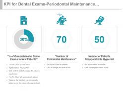 Kpi for dental exams periodontal maintenance reappointed patients ppt slide
Presenting kpi for dental exams periodontal maintenance reappointed patients ppt slide. This presentation slide shows three Key Performance Indicators or KPIs in a Dashboard style design. The first KPI that can be shown is Percentage of Comprehensive Dental Exams to New Patients. The second KPI is Number of Periodontal Maintenance and the third is Number of Patients Reappointed to Hygienist. These KPI Powerpoint graphics are all data driven, and the shape automatically adjusts according to your data. Just right click on the KPI graphic, enter the right value and the shape will adjust automatically. Make a visual impact with our KPI slides.
-
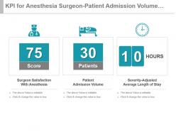 Kpi for anesthesia surgeon patient admission volume severity adjusted powerpoint slide
Presenting kpi for anesthesia surgeon patient admission volume severity adjusted powerpoint slide. This presentation slide shows three Key Performance Indicators or KPIs in a Dashboard style design. The first KPI that can be shown is Surgeon Satisfaction With Anesthesia. The second KPI is Patient Admission Volume and the third is Severity Adjusted Average Length of Stay. These KPI Powerpoint graphics are all data driven, and the shape automatically adjusts according to your data. Just right click on the KPI graphic, enter the right value and the shape will adjust automatically. Make a visual impact with our KPI slides.
-
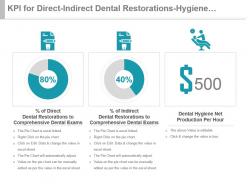 Kpi for direct indirect dental restorations hygiene production per hour presentation slide
Presenting kpi for direct indirect dental restorations hygiene production per hour presentation slide. This presentation slide shows three Key Performance Indicators or KPIs in a Dashboard style design. The first KPI that can be shown is Percentage of Direct Dental Restorations to Comprehensive Dental Exams. The second KPI is Percentage of Indirect Dental Restorations to Comprehensive Dental Exams and the third is Dental Hygiene Net Production Per Hour. These KPI Powerpoint graphics are all data driven, and the shape automatically adjusts according to your data. Just right click on the KPI graphic, enter the right value and the shape will adjust automatically. Make a visual impact with our KPI slides.
-
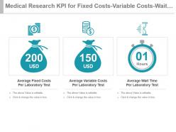 Medical research kpi for fixed costs variable costs wait time per test powerpoint slide
Presenting medical research kpi for fixed costs variable costs wait time per test powerpoint slide. This presentation slide shows three Key Performance Indicators or KPIs in a Dashboard style design. The first KPI that can be shown is Average Fixed Costs Per Laboratory Test. The second KPI is Average Variable Costs Per Laboratory Test and the third is Average Wait Time Per Laboratory Test. These KPI Powerpoint graphics are all data driven, and the shape automatically adjusts according to your data. Just right click on the KPI graphic, enter the right value and the shape will adjust automatically. Make a visual impact with our KPI slides.
-
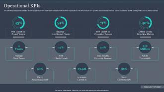 Operational KPIS Pureprofile Company Profile Ppt Powerpoint Presentation Ideas Graphics Download
The following slide showcases the business operations KPI to illustrate the performance of the organization.The KPIs include YOY growth, repeat clients revenue, survey completion growth, client growth, and incentives earned.Deliver an outstanding presentation on the topic using this Operational KPIS Pureprofile Company Profile Ppt Powerpoint Presentation Ideas Graphics Download. Dispense information and present a thorough explanation of Survey Healthcare, Quantum Market, Hall Partners using the slides given. This template can be altered and personalized to fit your needs. It is also available for immediate download. So grab it now.
-
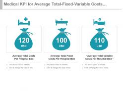 Medical kpi for average total fixed variable costs per hospital bed powerpoint slide
Presenting medical kpi for average total fixed variable costs per hospital bed powerpoint slide. This presentation slide shows three Key Performance Indicators or KPIs in a Dashboard style design. The first KPI that can be shown is Average Total Costs Per Hospital Bed. The second KPI is Average Total Fixed Costs Per Hospital Bed and the third is Average Total Variable Costs Per Hospital Bed. These KPI Powerpoint graphics are all data driven, and the shape automatically adjusts according to your data. Just right click on the KPI graphic, enter the right value and the shape will adjust automatically. Make a visual impact with our KPI slides.
-
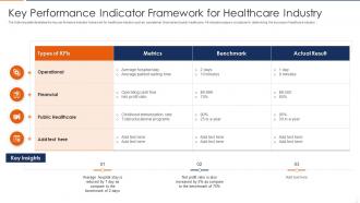 Key Performance Indicator Framework For Healthcare Industry
The following slide illustrates the key performance indicator framework for healthcare industry such as operational, financial and public healthcare. All indicators plays a crucial part in determining the success of healthcare industry. Introducing our Key Performance Indicator Framework For Healthcare Industry set of slides. The topics discussed in these slides are Operational, Public Healthcare, Financial. This is an immediately available PowerPoint presentation that can be conveniently customized. Download it and convince your audience.
-
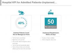 Hospital kpi for admitted patients unplanned readmission within 28 days presentation slide
Presenting hospital kpi for admitted patients unplanned readmission within 28 days presentation slide. This presentation slide shows two Key Performance Indicators or KPIs in a Dashboard style design. The first KPI that can be shown is Admited Patients Could Not be Managed at Home. The second KPI is Unplanned Readmission Within 28 Days. These KPI Powerpoint graphics are all data driven, and the shape automatically adjusts according to your data. Just right click on the KPI graphic, enter the right value and the shape will adjust automatically. Make a visual impact with our KPI slides.
-
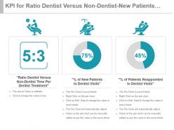 Kpi for ratio dentist versus non dentist new patients reappointed presentation slide
Presenting kpi for ratio dentist versus non dentist new patients reappointed presentation slide. This presentation slide shows three Key Performance Indicators or KPIs in a Dashboard style design. The first KPI that can be shown is Ratio Dentist Versus Non Dentist Time Per Dentist Treatment. The second KPI is Percentage of New Patients to Dentist Visits and the third is Percentage of Patients Reappointed to Dentist Visits. These KPI Powerpoint graphics are all data driven, and the shape automatically adjusts according to your data. Just right click on the KPI graphic, enter the right value and the shape will adjust automatically. Make a visual impact with our KPI slides.
-
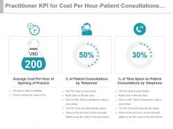 Practitioner kpi for cost per hour patient consultations time spent powerpoint slide
Presenting practitioner kpi for cost per hour patient consultations time spent powerpoint slide. This presentation slide shows three Key Performance Indicators or KPIs in a Dashboard style design. The first KPI that can be shown is Average Cost Per Hour of Opening of Practice. The second KPI is percentage of Patient Consultations by Telephone and the third is Percentage of Time Spent on Patient Consultations by Telephone. These KPI Powerpoint graphics are all data driven, and the shape automatically adjusts according to your data. Just right click on the KPI graphic, enter the right value and the shape will adjust automatically. Make a visual impact with our KPI slides.
-
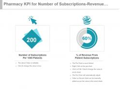 Pharmacy kpi for number of subscriptions revenue from patients ppt slide
Presenting pharmacy kpi for number of subscriptions revenue from patients ppt slide. This presentation slide shows two Key Performance Indicators or KPIs in a Dashboard style design. The first KPI that can be shown is Number of Subscriptions Per 1000 Patients. The second KPI is percentage of Revenue From Patient Subscriptions. These KPI Powerpoint graphics are all data driven, and the shape automatically adjusts according to your data. Just right click on the KPI graphic, enter the right value and the shape will adjust automatically. Make a visual impact with our KPI slides.
-
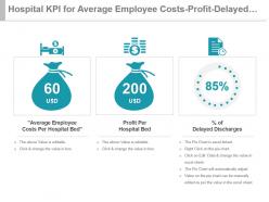 Hospital kpi for average employee costs profit delayed discharges powerpoint slide
Presenting hospital kpi for average employee costs profit delayed discharges powerpoint slide. This presentation slide shows three Key Performance Indicators or KPIs in a Dashboard style design. The first KPI that can be shown is Average Employee Costs Per Hospital Bed. The second KPI is Profit Per Hospital Bed and the third is percentage of Delayed Discharges. These KPI Powerpoint graphics are all data driven, and the shape automatically adjusts according to your data. Just right click on the KPI graphic, enter the right value and the shape will adjust automatically. Make a visual impact with our KPI slides.
-
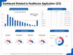 Dashboard related to healthcare application test ppt outline
This slide shows the dashboard of healthcare application which includes average length to stay Lab test details Patient metrics etc. Presenting this set of slides with name Dashboard Related To Healthcare Application Test Ppt Outline. The topics discussed in these slides are Lab Test Turnaround, Customer Satisfaction, Patient Metrics. This is a completely editable PowerPoint presentation and is available for immediate download. Download now and impress your audience.
-
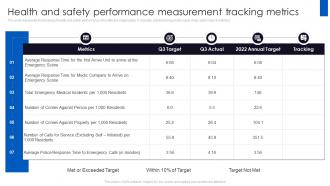 Health And Safety Performance Measurement Tracking Metrics
This slide represents the tracking of health and safety performance of healthcare organization. It includes safety tracking on the basis of key performance indictors. Presenting our well structured Health And Safety Performance Measurement Tracking Metrics. The topics discussed in this slide are Health And Safety, Performance Measurement, Tracking Metrics. This is an instantly available PowerPoint presentation that can be edited conveniently. Download it right away and captivate your audience.
-
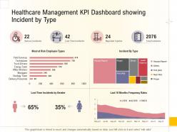 Hospital business plan healthcare management kpi dashboard showing incident by type ppt deck
Present the topic in a bit more detail with this Hospital Business Plan Healthcare Management KPI Dashboard Showing Incident By Type Ppt Deck. Use it as a tool for discussion and navigation on Risk, Frequency Rates, Team, Technicians. This template is free to edit as deemed fit for your organization. Therefore download it now.
-
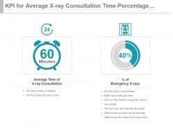 Kpi for average x ray consultation time percentage of emergency x rays presentation slide
Presenting kpi for average x ray consultation time percentage of emergency x rays presentation slide. This presentation slide shows two Key Performance Indicators or KPIs in a Dashboard style design. The first KPI that can be shown is Average Time of X ray Consultation. The second KPI is percentage of Emergency X rays. These KPI Powerpoint graphics are all data driven, and the shape automatically adjusts according to your data. Just right click on the KPI graphic, enter the right value and the shape will adjust automatically. Make a visual impact with our KPI slides.
-
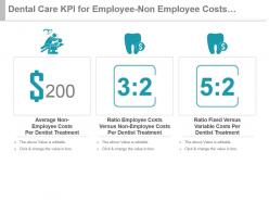 Dental care kpi for employee non employee costs fixed variable costs powerpoint slide
Presenting dental care kpi for employee non employee costs fixed variable costs powerpoint slide. This presentation slide shows three Key Performance Indicators or KPIs in a Dashboard style design. The first KPI that can be shown is Average Non Employee Costs Per Dentist Treatment. The second KPI is Ratio Employee Costs Versus Non Employee Costs Per Dentist Treatment and the third is Ratio Fixed Versus Variable Costs Per Dentist Treatment. These KPI Powerpoint graphics are all data driven, and the shape automatically adjusts according to your data. Just right click on the KPI graphic, enter the right value and the shape will adjust automatically. Make a visual impact with our KPI slides.
-
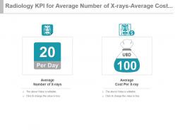 Radiology kpi for average number of x rays average cost per x ray presentation slide
Presenting radiology kpi for average number of x rays average cost per x ray presentation slide. This presentation slide shows two Key Performance Indicators or KPIs in a Dashboard style design. The first KPI that can be shown is Average Number of X rays. The second KPI is Average Cost Per X ray. These KPI Powerpoint graphics are all data driven, and the shape automatically adjusts according to your data. Just right click on the KPI graphic, enter the right value and the shape will adjust automatically. Make a visual impact with our KPI slides.
-
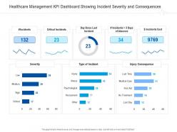 Healthcare management kpi dashboard showing incident severity and consequences ppt grid
Deliver an outstanding presentation on the topic using this Healthcare Management KPI Dashboard Showing Incident Severity And Consequences Ppt Grid. Dispense information and present a thorough explanation of Severity, Type Of Incident, Injury Consequence using the slides given. This template can be altered and personalized to fit your needs. It is also available for immediate download. So grab it now.
-
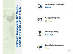 Healthcare management kpi metrics showing incidents length of stay satisfaction ppt slides
Presenting this set of slides with name Healthcare Management Kpi Metrics Showing Incidents Length Of Stay Satisfaction Ppt Slides. This is a four stage process. The stages in this process are Management, Incidents, Satisfaction, Business, Management. This is a completely editable PowerPoint presentation and is available for immediate download. Download now and impress your audience.
-
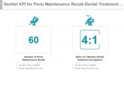 Dentist kpi for perio maintenance recall dental treatment acceptance ppt slide
Presenting dentist kpi for perio maintenance recall dental treatment acceptance ppt slide. This presentation slide shows two Key Performance Indicators or KPIs in a Dashboard style design. The first KPI that can be shown is Number of Perio Maintenance Recall. The second KPI is Ratio of 3 Months Dental Treatment Acceptance. These KPI Powerpoint graphics are all data driven, and the shape automatically adjusts according to your data. Just right click on the KPI graphic, enter the right value and the shape will adjust automatically. Make a visual impact with our KPI slides.
-
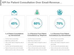 Kpi for patient consultation over email revenue from telephone internet ppt slide
Presenting kpi for patient consultation over email revenue from telephone internet ppt slide. This presentation slide shows three Key Performance Indicators or KPIs in a Dashboard style design. The first KPI that can be shown is percentage of Patient Consultations by Internet email. The second KPI is percentage of Revenue From Patient Consultations by Telephone and the third is percentage of Revenue From Patient Consultations by Internet email. These KPI Powerpoint graphics are all data driven, and the shape automatically adjusts according to your data. Just right click on the KPI graphic, enter the right value and the shape will adjust automatically. Make a visual impact with our KPI slides.
-
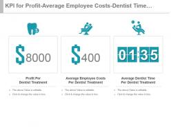 Kpi for profit average employee costs dentist time per treatment powerpoint slide
Presenting kpi for profit average employee costs dentist time per treatment powerpoint slide. This presentation slide shows three Key Performance Indicators or KPIs in a Dashboard style design. The first KPI that can be shown is Profit Per Dentist Treatment. The second KPI is Average Employee Costs Per Dentist Treatment and the third is Average Dentist Time Per Dentist Treatment. These KPI Powerpoint graphics are all data driven, and the shape automatically adjusts according to your data. Just right click on the KPI graphic, enter the right value and the shape will adjust automatically. Make a visual impact with our KPI slides.
-
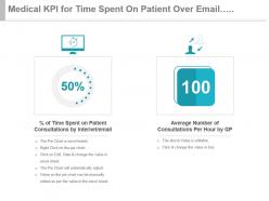 Medical kpi for time spent on patient over email consultation per hour ppt slide
Presenting medical kpi for time spent on patient over email consultation per hour ppt slide. This presentation slide shows two Key Performance Indicators or KPIs in a Dashboard style design. The first KPI that can be shown is percentage of Time Spent on Patient Consultations by Internet email. The second KPI is Average Number of Consultations Per Hour by GP. These KPI Powerpoint graphics are all data driven, and the shape automatically adjusts according to your data. Just right click on the KPI graphic, enter the right value and the shape will adjust automatically. Make a visual impact with our KPI slides.
-
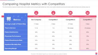 Comparing Hospital Metrics With Competitors Healthcare Inventory Management System
This slide shows the comparison of hospital metrics with competitors such as average length of patient stay, time to service, patient satisfaction, physician performance, patient readmission rate, operating margin, etc.Deliver an outstanding presentation on the topic using this Comparing Hospital Metrics With Competitors Healthcare Inventory Management System Dispense information and present a thorough explanation of Patient Satisfaction, Physician Performance, Patient Readmission using the slides given. This template can be altered and personalized to fit your needs. It is also available for immediate download. So grab it now.
-
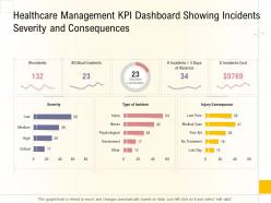 Healthcare management kpi dashboard showing incidents severity and consequences ppt grid
Present the topic in a bit more detail with this Healthcare Management KPI Dashboard Showing Incidents Severity And Consequences Ppt Grid. Use it as a tool for discussion and navigation on Healthcare Management KPI Dashboard Showing Incidents Severity And Consequences. This template is free to edit as deemed fit for your organization. Therefore download it now.
-
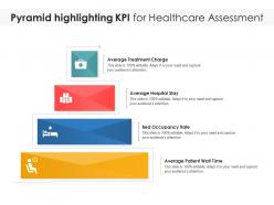 Pyramid highlighting kpi for healthcare assessment
Presenting our set of slides with name Pyramid Highlighting KPI For Healthcare Assessment. This exhibits information on four stages of the process. This is an easy-to-edit and innovatively designed PowerPoint template. So download immediately and highlight information on Average Treatment Charge, Average Hospital Stay, Bed Occupancy Rate, Average Patient Wait Time.
-
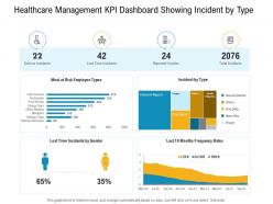 E healthcare management healthcare management kpi dashboard showing incident by type
Present the topic in a bit more detail with this E Healthcare Management Healthcare Management KPI Dashboard Showing Incident By Type. Use it as a tool for discussion and navigation on Serious Incidents, Lost Time Incidents, Reported Injuries, Total Incidents. This template is free to edit as deemed fit for your organization. Therefore download it now.
-
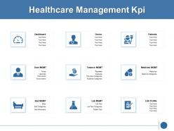 Healthcare management kpi marketing ppt powerpoint presentation icon aids
Presenting this set of slides with name Healthcare Management Kpi Marketing Ppt Powerpoint Presentation Icon Aids. This is a nine stage process. The stages in this process are Healthcare, Management, Planning, Business, Strategy. This is a completely editable PowerPoint presentation and is available for immediate download. Download now and impress your audience.
-
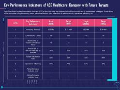 Key performance indicators overcome challenge cyber security healthcare ppt outline slides
The slide shows the key Performance Indicator KPIs which will help the company to track the success rate of implemented strategies. Some of the KPIs are number of cybersecurity cases, patient satisfaction rate, mean time to resolve threats, operational efficiency etc. Deliver an outstanding presentation on the topic using this Key Performance Indicators Overcome Challenge Cyber Security Healthcare Ppt Outline Slides. Dispense information and present a thorough explanation of Performance, Target using the slides given. This template can be altered and personalized to fit your needs. It is also available for immediate download. So grab it now.
-
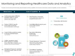 Monitoring and reporting healthcare data and analytics vendors ppt professional
This slide covers the actions performed to deploy data and analytics monitoring capabilities which focuses on market actions, assets and capabilities, and other considerations.Deliver an outstanding presentation on the topic using this Monitoring And Reporting Healthcare Data And Analytics Vendors Ppt Professional. Dispense information and present a thorough explanation of Data Protection Framework, Threats Assessment Framework, Key Metrics Monitoring And Reporting using the slides given. This template can be altered and personalized to fit your needs. It is also available for immediate download. So grab it now.
-
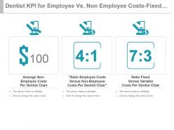 Dentist kpi for employee vs non employee costs fixed variable costs powerpoint slide
Presenting dentist kpi for employee vs non employee costs fixed variable costs powerpoint slide. This presentation slide shows three Key Performance Indicators or KPIs in a Dashboard style design. The first KPI that can be shown is Average Non Employee Costs Per Dentist Chair. The second KPI is Ratio Employee Costs Versus Non Employee Costs Per Dentist Chair and the third is Ratio Fixed Versus Variable Costs Per Dentist Chair. These KPI Powerpoint graphics are all data driven, and the shape automatically adjusts according to your data. Just right click on the KPI graphic, enter the right value and the shape will adjust automatically. Make a visual impact with our KPI slides.
-
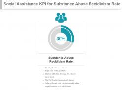 Social assistance kpi for substance abuse recidivism rate ppt slide
Presenting social assistance kpi for substance abuse recidivism rate ppt slide. This presentation slide shows one Key Performance Indicators or KPIs in a Dashboard style design. The first KPI that can be shown is Substance Abuse Recidivism Rate. These KPI Powerpoint graphics are all data driven, and the shape automatically adjusts according to your data. Just right click on the KPI graphic, enter the right value and the shape will adjust automatically. Make a visual impact with our KPI slides.
-
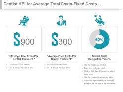 Dentist kpi for average total costs fixed costs occupation time presentation slide
Presenting dentist kpi for average total costs fixed costs occupation time presentation slide. This presentation slide shows three Key Performance Indicators or KPIs in a Dashboard style design. The first KPI that can be shown is Average Total Costs Per Dentist Treatment. The second KPI is Average Fixed Costs Per Dentist Treatment and the third is Dentist Chair Occupation Time percentage. These KPI Powerpoint graphics are all data driven, and the shape automatically adjusts according to your data. Just right click on the KPI graphic, enter the right value and the shape will adjust automatically. Make a visual impact with our KPI slides.
-
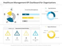 Healthcare management kpi dashboard for organizations hospital management ppt ideas
Deliver an outstanding presentation on the topic using this Healthcare Management KPI Dashboard For Organizations Hospital Management Ppt Ideas. Dispense information and present a thorough explanation of Healthcare Management KPI Dashboard For Organizations using the slides given. This template can be altered and personalized to fit your needs. It is also available for immediate download. So grab it now.
-
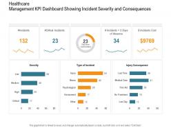 Healthcare management kpi dashboard showing incident severity consequences nursing ppt elements
Present the topic in a bit more detail with this Healthcare Management KPI Dashboard Showing Incident Severity Consequences Nursing Ppt Elements. Use it as a tool for discussion and navigation on high, low, medium. This template is free to edit as deemed fit for your organization. Therefore download it now.
-
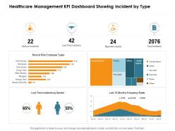 Healthcare management kpi dashboard showing incident by type nursing management ppt sample
Deliver an outstanding presentation on the topic using this Healthcare Management KPI Dashboard Showing Incident By Type Nursing Management Ppt Sample. Dispense information and present a thorough explanation of serious incidents, lost time incidents, reported injuries, total incidents using the slides given. This template can be altered and personalized to fit your needs. It is also available for immediate download. So grab it now.


