Transportation, Airline KPI Dashboard PowerPoint Templates
-
 Transportation Metrics Truck Monotone Icon In Powerpoint Pptx Png And Editable Eps Format
Make your presentation profoundly eye-catching leveraging our easily customizable Transportation metrics truck monotone icon in powerpoint pptx png and editable eps format. It is designed to draw the attention of your audience. Available in all editable formats, including PPTx, png, and eps, you can tweak it to deliver your message with ease.
-
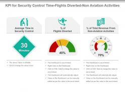 Kpi for security control time flights diverted non aviation activities presentation slide
Presenting KPI For Security Control Time Flights Diverted Non Aviation Activities Presentation Slide. This presentation design has been professionally designed, is fully editable in PowerPoint and is compatible with Google slides as well. The font type, font size, colors of the diagrams, background color are customizable, and the company logo can be added too. High quality graphs, charts, tables and icons ensure that there is no deteriorating in quality on enlarging their size. Fast download at click of a button.
-
 Transportation kpi dashboard snapshot showing revenue costs profit fleet status
Presenting KPI dashboard snapshot showing revenue costs profit fleet status slideshow. Change PowerPoint structure, font, text, color and design as per your requirements. Easy to input data with excel linked charts, just right to click to input data. This presentation theme is totally attuned with Google slides. Easy conversion to other software’s like JPG and PDF formats. Image quality of these PPT diagram remains the unchanged even when you resize the image or portray on large screens.
-
 Transportation Dashboard Powerpoint Ppt Template Bundles
Engage buyer personas and boost brand awareness by pitching yourself using this prefabricated set. This Transportation Dashboard Powerpoint Ppt Template Bundles is a great tool to connect with your audience as it contains high-quality content and graphics. This helps in conveying your thoughts in a well-structured manner. It also helps you attain a competitive advantage because of its unique design and aesthetics. In addition to this, you can use this PPT design to portray information and educate your audience on various topics. With fifteen slides, this is a great design to use for your upcoming presentations. Not only is it cost-effective but also easily pliable depending on your needs and requirements. As such color, font, or any other design component can be altered. It is also available for immediate download in different formats such as PNG, JPG, etc. So, without any further ado, download it now.
-
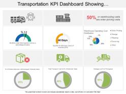 Transportation kpi dashboard snapshot showing warehouse operating cost distribution
Presenting transportation KPI dashboard snapshot showing warehouse operating cost distribution PPT slide. Simple data input like company logo, name or trademark. User can edit the data in linked excel sheet and graphs and charts gets customized accordingly. Picture quality of these slides does not change even when project on large screen. Fast downloading speed and formats can be easily changed to JPEG and PDF applications. This template is suitable for marketing, sales persons, business managers and entrepreneurs.
-
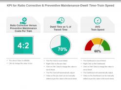 Kpi for ratio corrective and preventive maintenance dwell time train speed ppt slide
Presenting kpi for ratio corrective and preventive maintenance dwell time train speed ppt slide. This presentation slide shows Three Key Performance Indicators or KPIs in a Dashboard style design. The first KPI that can be shown is Ratio Corrective Versus Preventive Maintenance Costs Per Train. The second KPI is Dwell Time as Percentage of Transit Time. The third is AVG Train Speed. These KPI Powerpoint graphics are all data driven, and the shape automatically adjusts according to your data. Just right click on the KPI graphic, enter the right value and the shape will adjust automatically. Make a visual impact with our KPI slides.
-
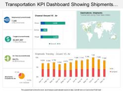 Transportation kpi dashboard snapshot showing shipments ground vs air channel
Presenting our transportation KPI dashboard snapshot showing shipments ground vs. air channel PPT slide. This layout is compatible with Google slides and data can be updated with excel linked file. This template is Excel linked just right click to input your information. Images do no blur out even when they are projected on large screen.PPT template can be utilized by sales and marketing teams and business managers. Instantly downloadable slide and supports formats like JPEG and PDF.
-
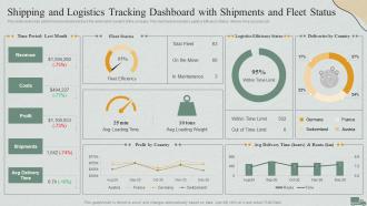 F611 Shipping And Logistics Tracking Dashboard With Shipments Logistics Management Steps Delivery Transportation
This slide covers Key performance indicators to track the automation system of the company. This dashboard includes Logistics Efficiency Status, delivery time accuracy etc. Present the topic in a bit more detail with this F611 Shipping And Logistics Tracking Dashboard With Shipments Logistics Management Steps Delivery Transportation. Use it as a tool for discussion and navigation on Dashboard, Shipments, Logistics Tracking. This template is free to edit as deemed fit for your organization. Therefore download it now.
-
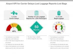 Airport kpi for carrier delays lost luggage reports lost bags ppt slide
Presenting airport kpi for carrier delays lost luggage reports lost bags ppt slide. This presentation slide shows three Key Performance Indicators or KPIs in a Dashboard style design. The first KPI that can be shown is Percentage of Air Carrier Delays. The second KPI is Number of Lost Luggage Reports Per 1,000 Passengers and the third is Percentages of Lost Bags Luggage. These KPI Powerpoint graphics are all data driven, and the shape automatically adjusts according to your data. Just right click on the KPI graphic, enter the right value and the shape will adjust automatically. Make a visual impact with our KPI slides.
-
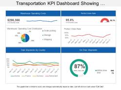 Transportation kpi dashboard showing warehouse operating costs perfect order rate
Presenting transportation KPI dashboard showing warehouse operating costs perfect order rate PPT slide. This layout is fully compatible with Google slides and data driven. User can edit the data in linked excel sheet and graphs and charts gets customized accordingly. Easy to put in company logo, trademark or name; accommodate words to support the key points. Images do no distort out even when they are projected on large screen. Adjust colors, text and fonts as per your business requirements.
-
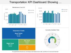 Transportation kpi dashboard showing maintenance cost insurance cost available fleet
Presenting transportation KPI dashboard showing maintenance cost insurance cost available fleet PowerPoint slide. Simple data input with linked Excel chart, just right click to input values. This PowerPoint theme is fully supported by Google slides. Picture quality of these slides does not change even when project on large screen. Fast downloading speed and formats can be easily changed to JPEG and PDF applications. This template is suitable for marketing, sales persons, business managers and entrepreneurs. Adjust PPT layout, font, text and color as per your necessity.
-
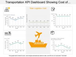 Transportation kpi dashboard showing cost of good sold logistics cost and gross profit
Presenting KPI dashboard showing cost of goods sold logistics cost and gross profit PPT slide. This layout is fully compatible with Google slides and data driven. User can edit the data in linked excel sheet and graphs and charts gets customized accordingly. Easy to put in company logo, trademark or name; accommodate words to support the key points. Images do no distort out even when they are projected on large screen. Adjust colors, text and fonts as per your business requirements
-
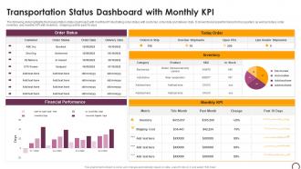 Transportation Status Dashboard With Monthly Kpi
The following slide highlights the transportation status dashboard with monthly KPI illustrating order status with customer, order date and delivery date. It shows financial performance for four quarters as well as todays order, inventory and monthly KPI with Inventory, shipping cost for past 30 days Introducing our Transportation Status Dashboard With Monthly Kpi set of slides. The topics discussed in these slides are Dashboard, Financial, Performance. This is an immediately available PowerPoint presentation that can be conveniently customized. Download it and convince your audience.
-
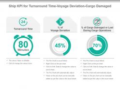 Ship kpi for turnaround time voyage deviation cargo damaged presentation slide
Presenting ship kpi for turnaround time voyage deviation cargo damaged presentation slide. This presentation slide shows three Key Performance Indicators or KPIs in a Dashboard style design. The first KPI that can be shown is Turnaround Time. The second KPI is percentage of Voyage Deviation and the third is percentage of Cargo Damaged or Lost During Cargo Operations. These KPI Powerpoint graphics are all data driven, and the shape automatically adjusts according to your data. Just right click on the KPI graphic, enter the right value and the shape will adjust automatically. Make a visual impact with our KPI slides.
-
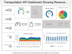
 Transportation kpi dashboard snapshot showing fleet delivery status loading time and weight
Presenting transportation KPI dashboard snapshot showing fleet delivery status loading time and weight PPT slide. Simple data input with linked Excel chart, just right click to input values. This PowerPoint theme is fully supported by Google slides. Picture quality of these slides does not change even when project on large screen. Fast downloading speed and formats can be easily changed to JPEG and PDF applications. This template is suitable for marketing, sales persons, business managers and entrepreneurs.
-
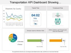 Transportation kpi dashboard showing shipments by country and transit time
Presenting transportation KPI Dashboard showing shipments by country and transit time PPT slide. This deck offers you plenty of space to put in titles and subtitles. This template is Excel linked just right click to input your information. High resolution based layout, does not change the image even after resizing. This presentation icon is fully compatible with Google slides. Quick downloading speed and simple editing options in color text and fonts.PPT icons can easily be changed into JPEG and PDF applications
-
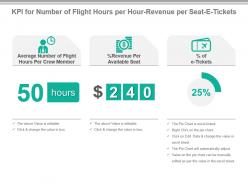 Kpi for number of flight hours per hour revenue per seat e tickets powerpoint slide
Presenting kpi for number of flight hours per hour revenue per seat e tickets powerpoint slide. This presentation slide shows Three Key Performance Indicators or KPIs in a Dashboard style design. The first KPI that can be shown is Average Number of Flight Hours Per Crew Member. The second KPI is Percentage Revenue Per Available Seat. The third is Percentage of e Tickets. These KPI Powerpoint graphics are all data driven, and the shape automatically adjusts according to your data. Just right click on the KPI graphic, enter the right value and the shape will adjust automatically. Make a visual impact with our KPI slides.
-
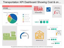 Transportation kpi dashboard showing cost and on time final delivery
Presenting transportation KPI dashboard showing cost and on time final delivery PPT slide. This deck offers you plenty of space to put in titles and sub titles. This template is Excel linked just right click to input your information. High resolution based layout, does not change the image even after resizing. This presentation icon is fully compatible with Google slides. Quick downloading speed and simple editing options in color text and fonts.PPT icons can easily be changed into JPEG and PDF applications.
-
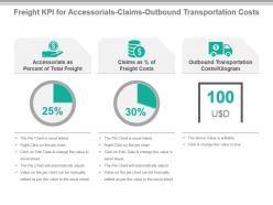 Freight kpi for accessorials claims outbound transportation costs presentation slide
Presenting freight kpi for accessorials claims outbound transportation costs presentation slide. This presentation slide shows three Key Performance Indicators or KPIs in a Dashboard style design. The first KPI that can be shown is Accessorials as Percent of Total Freight. The second KPI is Claims as percentage of Freight Costs and the third is Outbound Transportation Costs Kilogram. These KPI Powerpoint graphics are all data driven, and the shape automatically adjusts according to your data. Just right click on the KPI graphic, enter the right value and the shape will adjust automatically. Make a visual impact with our KPI slides.
-
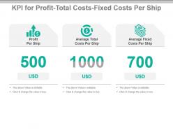 Kpi for profit total costs fixed costs per ship ppt slide
Presenting kpi for profit total costs fixed costs per ship ppt slide. This presentation slide shows three Key Performance Indicators or KPIs in a Dashboard style design. The first KPI that can be shown is Profit Per Ship. The second KPI is Average Total Costs Per Ship and the third is Average Fixed Costs Per Ship. These KPI Powerpoint graphics are all data driven, and the shape automatically adjusts according to your data. Just right click on the KPI graphic, enter the right value and the shape will adjust automatically. Make a visual impact with our KPI slides.
-
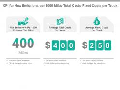 Kpi for nox emissions per 1000 miles total costs fixed costs per truck presentation slide
Presenting kpi for nox emissions per 1000 miles total costs fixed costs per truck presentation slide. This presentation slide shows Three Key Performance Indicators or KPIs in a Dashboard style design. The first KPI that can be shown is Nox Emissions Per 1000 Revenue Ton Miles. The second KPI is Average Total Costs Per Truck. The third is Average Fixed Costs Per Truck. These KPI Powerpoint graphics are all data driven, and the shape automatically adjusts according to your data. Just right click on the KPI graphic, enter the right value and the shape will adjust automatically. Make a visual impact with our KPI slides.
-
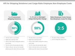 Kpi for shipping solutions lost cargo ratio employee non employee costs ppt slide
Presenting kpi for shipping solutions lost cargo ratio employee non employee costs ppt slide. This presentation slide shows three Key Performance Indicators or KPIs in a Dashboard style design. The first KPI that can be shown is percentage of Customized Shipping Solutions. The second KPI is percentage of Lost or Damaged Cargo During Sea Voyage and the third is Ratio Employee Costs Versus Non Employee Costs Per Ship. These KPI Powerpoint graphics are all data driven, and the shape automatically adjusts according to your data. Just right click on the KPI graphic, enter the right value and the shape will adjust automatically. Make a visual impact with our KPI slides.
-
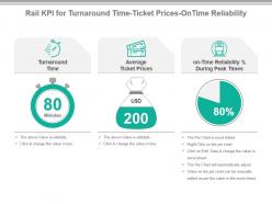 Rail kpi for turnaround time ticket prices on time reliability presentation slide
Presenting rail kpi for turnaround time ticket prices on time reliability presentation slide. This presentation slide shows Three Key Performance Indicators or KPIs in a Dashboard style design. The first KPI that can be shown is Turnaround Time. The second KPI is Average Ticket Prices. The third is on Time Reliability Percentage During Peak Times. These KPI Powerpoint graphics are all data driven, and the shape automatically adjusts according to your data. Just right click on the KPI graphic, enter the right value and the shape will adjust automatically. Make a visual impact with our KPI slides.
-
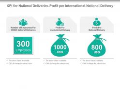 Kpi for national deliveries profit per international national delivery powerpoint slide
Presenting kpi for national deliveries profit per international national delivery powerpoint slide. This presentation slide shows Three Key Performance Indicators or KPIs in a Dashboard style design. The first KPI that can be shown is Number of Employees Per 100000 National Deliveries. The second KPI is Profit Per International Delivery. The third is Profit Per National Delivery. These KPI Powerpoint graphics are all data driven, and the shape automatically adjusts according to your data. Just right click on the KPI graphic, enter the right value and the shape will adjust automatically. Make a visual impact with our KPI slides.
-
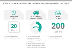 Kpi for turnaround time truckload capacity utilized profit per truck ppt slide
Presenting kpi for turnaround time truckload capacity utilized profit per truck ppt slide. This presentation slide shows Three Key Performance Indicators or KPIs in a Dashboard style design. The first KPI that can be shown is Turnaround Time. The second KPI is Percentage of Truckload Capacity Utilized. The third is Profit Per Truck. These KPI Powerpoint graphics are all data driven, and the shape automatically adjusts according to your data. Just right click on the KPI graphic, enter the right value and the shape will adjust automatically. Make a visual impact with our KPI slides.
-
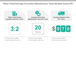 Ratio fixed average corrective maintenance time variable costs kpi presentation slide
Presenting ratio fixed average corrective maintenance time variable costs kpi presentation slide. This presentation slide shows Three Key Performance Indicators or KPIs in a Dashboard style design. The first KPI that can be shown is Ratio Fixed Versus Variable Costs Per Truck. The second KPI is Average Corrective Maintenance Time Per Truck. The third is Average Variable Costs Per Truck. These KPI Powerpoint graphics are all data driven, and the shape automatically adjusts according to your data. Just right click on the KPI graphic, enter the right value and the shape will adjust automatically. Make a visual impact with our KPI slides.
-
 Kpi for average maintenance costs time aircraft emissions presentation slide
Presenting kpi for average maintenance costs time aircraft emissions presentation slide. This presentation slide shows three Key Performance Indicators or KPIs in a Dashboard style design. The first KPI that can be shown is Average Maintenance Costs Per Airplane. The second KPI is Average Maintenance Time Per Airplane and the third is Aircraft Emissions Per Payload Capacity. These KPI Powerpoint graphics are all data driven, and the shape automatically adjusts according to your data. Just right click on the KPI graphic, enter the right value and the shape will adjust automatically. Make a visual impact with our KPI slides.
-
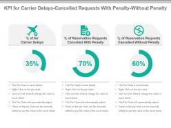 Kpi for carrier delays cancelled requests with penalty without penalty ppt slide
Presenting kpi for carrier delays cancelled requests with penalty without penalty ppt slide. This presentation slide shows three Key Performance Indicators or KPIs in a Dashboard style design. The first KPI that can be shown is Percentage of Air Carrier Delays. The second KPI is Percentage of Reservation Requests Cancelled With Penalty and the third is Percentage of Reservation Requests Cancelled Without Penalty. These KPI Powerpoint graphics are all data driven, and the shape automatically adjusts according to your data. Just right click on the KPI graphic, enter the right value and the shape will adjust automatically. Make a visual impact with our KPI slides.
-
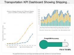 Transportation kpi dashboard showing shipping revenue and outbound shipping costs
Presenting transportation KPI dashboard showing shipping revenue and outbound shipping costs PPT slide. Simple data input like company logo, name or trademark. User can edit the data in linked excel sheet and graphs and charts gets customized accordingly .This PPT slide offers you plenty of space to put in titles and sub titles. High resolution based presentation layout, does not change the image even after resizing. This presentation icon is data driven and template can be downloaded via excel file to incorporate data.
-
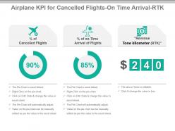 Airplane kpi for cancelled flights ontime arrival rtk powerpoint slide
Presenting airplane kpi for cancelled flights ontime arrival rtk powerpoint slide. This presentation slide shows three Key Performance Indicators or KPIs in a Dashboard style design. The first KPI that can be shown is percentage of Cancelled Flights. The second KPI is percentage of on Time Arrival of Flights and the third is Revenue Tone kilometer RTK. These KPI Powerpoint graphics are all data driven, and the shape automatically adjusts according to your data. Just right click on the KPI graphic, enter the right value and the shape will adjust automatically. Make a visual impact with our KPI slides.
-
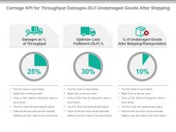 Carriage kpi for throughput damages olf undamaged goods after shipping ppt slide
Presenting carriage kpi for throughput damages olf undamaged goods after shipping ppt slide. This presentation slide shows three Key Performance Indicators or KPIs in a Dashboard style design. The first KPI that can be shown is Damages as percentage of Throughput. The second KPI is Optimize Load Fulfilment OLF percentage and the third is percentage of Undamaged Goods After Shipping Transportation. These KPI Powerpoint graphics are all data driven, and the shape automatically adjusts according to your data. Just right click on the KPI graphic, enter the right value and the shape will adjust automatically. Make a visual impact with our KPI slides.
-
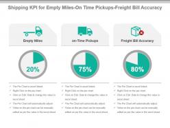 Shipping kpi for empty miles on time pickups freight bill accuracy powerpoint slide
Presenting shipping kpi for empty miles on time pickups freight bill accuracy powerpoint slide. This presentation slide shows three Key Performance Indicators or KPIs in a Dashboard style design. The first KPI that can be shown is Empty Miles. The second KPI is on Time Pickups and the third is Freight Bill Accuracy. These KPI Powerpoint graphics are all data driven, and the shape automatically adjusts according to your data. Just right click on the KPI graphic, enter the right value and the shape will adjust automatically. Make a visual impact with our KPI slides.
-
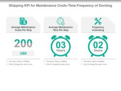 Shipping kpi for maintenance costs time frequency of docking ppt slide
Presenting shipping kpi for maintenance costs time frequency of docking ppt slide. This presentation slide shows three Key Performance Indicators or KPIs in a Dashboard style design. The first KPI that can be shown is Average Maintenance Costs Per Ship. The second KPI is Average Maintenance Time Per Ship and the third is Frequency of Docking. These KPI Powerpoint graphics are all data driven, and the shape automatically adjusts according to your data. Just right click on the KPI graphic, enter the right value and the shape will adjust automatically. Make a visual impact with our KPI slides.
-
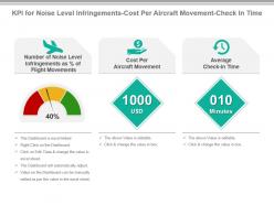 Kpi for noise level infringements cost per aircraft movement check in time ppt slide
Presenting kpi for noise level infringements cost per aircraft movement check in time ppt slide. This presentation slide shows Three Key Performance Indicators or KPIs in a Dashboard style design. The first KPI that can be shown is Number of Noise Level Infringements as Percentage of Flight Movements. The second KPI is Cost Per Aircraft Movement. The third is Average Check in Time. These KPI Powerpoint graphics are all data driven, and the shape automatically adjusts according to your data. Just right click on the KPI graphic, enter the right value and the shape will adjust automatically. Make a visual impact with our KPI slides.
-
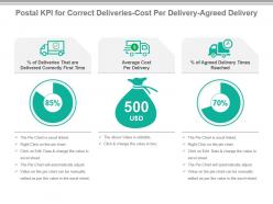 Postal kpi for correct deliveries cost per delivery agreed delivery ppt slide
Presenting postal kpi for correct deliveries cost per delivery agreed delivery ppt slide. This presentation slide shows Three Key Performance Indicators or KPIs in a Dashboard style design. The first KPI that can be shown is Percentage of Deliveries That are Delivered Correctly First Time. The second KPI is Average Cost Per Delivery. The third is Percentage of Agreed Delivery Times Reached. These KPI Powerpoint graphics are all data driven, and the shape automatically adjusts according to your data. Just right click on the KPI graphic, enter the right value and the shape will adjust automatically. Make a visual impact with our KPI slides.
-
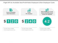 Flight kpi for available seat profit ratio employee and non employee costs powerpoint slide
Presenting flight kpi for available seat profit ratio employee and non employee costs powerpoint slide. This presentation slide shows three Key Performance Indicators or KPIs in a Dashboard style design. The first KPI that can be shown is Cost of Available Seat Kilometers. The second KPI is Profit Per Airplane and the third is Ratio Employee Costs Versus Non Employee Costs Per Airplane. These KPI Powerpoint graphics are all data driven, and the shape automatically adjusts according to your data. Just right click on the KPI graphic, enter the right value and the shape will adjust automatically. Make a visual impact with our KPI slides.
-
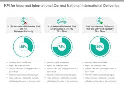 Kpi for incorrect international correct national international deliveries ppt slide
Presenting kpi for incorrect international correct national international deliveries ppt slide. This presentation slide shows three Key Performance Indicators or KPIs in a Dashboard style design. The first KPI that can be shown is percentage of International Deliveries That are Not Delivered Correctly. The second KPI is percentage of National Deliveries That are Delivered Correctly First Time and the third is percentage of International Deliveries That are Delivered Correctly First Time. These KPI Powerpoint graphics are all data driven, and the shape automatically adjusts according to your data. Just right click on the KPI graphic, enter the right value and the shape will adjust automatically. Make a visual impact with our KPI slides.
-
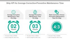 Ship kpi for average corrective preventive maintenance time powerpoint slide
Presenting ship kpi for average corrective preventive maintenance time powerpoint slide. This presentation slide shows three Key Performance Indicators or KPIs in a Dashboard style design. The first KPI that can be shown is Average Corrective Maintenance Time Per Ship. The second KPI is Average Preventive Maintenance Time Per Ship and the third is Ratio Corrective Versus Preventive Maintenance Time Per Ship. These KPI Powerpoint graphics are all data driven, and the shape automatically adjusts according to your data. Just right click on the KPI graphic, enter the right value and the shape will adjust automatically. Make a visual impact with our KPI slides.
-
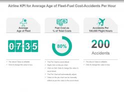 Airline kpi for average age of fleet fuel cost accidents per hour presentation slide
Presenting airline kpi for average age of fleet fuel cost accidents per hour presentation slide. This presentation slide shows three Key Performance Indicators or KPIs in a Dashboard style design. The first KPI that can be shown is Average Age of Fleet. The second KPI is Fuel Cost as Percentage of Total Costs and the third is Accidents Per 100,000 Flight Hours. These KPI Powerpoint graphics are all data driven, and the shape automatically adjusts according to your data. Just right click on the KPI graphic, enter the right value and the shape will adjust automatically. Make a visual impact with our KPI slides.
-
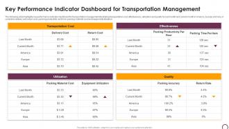 Key Performance Indicator Dashboard For Transportation Management
The following slide highlights key performance indicator dashboard for transportation management illustrating transportation cost, effectiveness, utilization and quality for last month and current month in America, Europe and Asia, it considers delivery and return cost, packing productivity and time, packing material cost and equipment utilization Presenting our well structured Key Performance Indicator Dashboard For Transportation Management. The topics discussed in this slide are Performance, Dashboard, Management. This is an instantly available PowerPoint presentation that can be edited conveniently. Download it right away and captivate your audience.
-
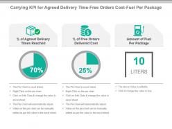 Carrying kpi for agreed delivery time free orders cost fuel per package presentation slide
Presenting carrying kpi for agreed delivery time free orders cost fuel per package presentation slide. This presentation slide shows three Key Performance Indicators or KPIs in a Dashboard style design. The first KPI that can be shown is percentage of Agreed Delivery Times Reached. The second KPI is percentage of Free Orders Delivered Cost and the third is Amount of Fuel Per Package. These KPI Powerpoint graphics are all data driven, and the shape automatically adjusts according to your data. Just right click on the KPI graphic, enter the right value and the shape will adjust automatically. Make a visual impact with our KPI slides.
-
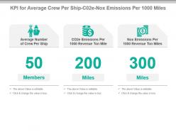 Kpi for average crew per ship c02e nox emissions per 1000 miles ppt slide
Presenting kpi for average crew per ship c02e nox emissions per 1000 miles ppt slide. This presentation slide shows three Key Performance Indicators or KPIs in a Dashboard style design. The first KPI that can be shown is Average Number of Crew Per Ship. The second KPI is CO2e Emissions Per 1000 Revenue Ton Mile and the third is Nox Emissions Per 1000 Revenue Ton Miles. These KPI Powerpoint graphics are all data driven, and the shape automatically adjusts according to your data. Just right click on the KPI graphic, enter the right value and the shape will adjust automatically. Make a visual impact with our KPI slides.
-
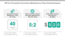 Kpi for preventive corrective maintenance time co2e emissions powerpoint slide
Presenting kpi for preventive corrective maintenance time co2e emissions powerpoint slide. This presentation slide shows Three Key Performance Indicators or KPIs in a Dashboard style design. The first KPI that can be shown is Average Preventive Maintenance Time Per Truck. The second KPI is Ratio Corrective Versus Preventive Maintenance Time Per Truck. The third is CO2e Emissions Per 1000 Revenue Ton Miles. These KPI Powerpoint graphics are all data driven, and the shape automatically adjusts according to your data. Just right click on the KPI graphic, enter the right value and the shape will adjust automatically. Make a visual impact with our KPI slides.
-
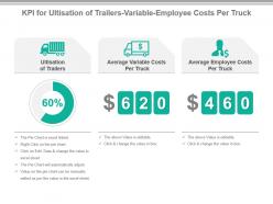 Kpi for ultisation of trailers variable employee costs per truck presentation slide
Presenting kpi for ultisation of trailers variable employee costs per truck presentation slide. This presentation slide shows Three Key Performance Indicators or KPIs in a Dashboard style design. The first KPI that can be shown is Ultisation of Trailers. The second KPI is Average Variable Costs Per Truck. The third is Average Employee Costs Per Truck. These KPI Powerpoint graphics are all data driven, and the shape automatically adjusts according to your data. Just right click on the KPI graphic, enter the right value and the shape will adjust automatically. Make a visual impact with our KPI slides.
-
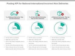 Posting kpi for national international incorrect non deliveries powerpoint slide
Presenting posting kpi for national international incorrect non deliveries powerpoint slide. This presentation slide shows Three Key Performance Indicators or KPIs in a Dashboard style design. The first KPI that can be shown is Percentage of National Deliveries That are Not Delivered. The second KPI is Percentage of International Deliveries That are Not Delivered. The third is of National Deliveries That are Not Delivered Correctly. These KPI Powerpoint graphics are all data driven, and the shape automatically adjusts according to your data. Just right click on the KPI graphic, enter the right value and the shape will adjust automatically. Make a visual impact with our KPI slides.
-
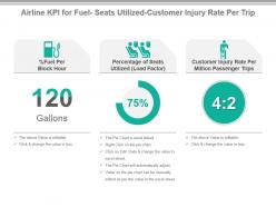 Airline kpi for fuel seats utilized customer injury rate per trip ppt slide
Presenting airline kpi for fuel seats utilized customer injury rate per trip ppt slide. This presentation slide shows three Key Performance Indicators or KPIs in a Dashboard style design. The first KPI that can be shown is Percentage Fuel Per Block Hour. The second KPI is Percentage of Seats Utilized Load Factor and the third is Customer Injury Rate Per Million Passenger Trips. These KPI Powerpoint graphics are all data driven, and the shape automatically adjusts according to your data. Just right click on the KPI graphic, enter the right value and the shape will adjust automatically. Make a visual impact with our KPI slides.
-
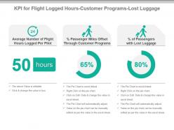 Kpi for flight logged hours customer programs lost luggage powerpoint slide
Presenting kpi for flight logged hours customer programs lost luggage powerpoint slide. This presentation slide shows three Key Performance Indicators or KPIs in a Dashboard style design. The first KPI that can be shown is Average Number of Flight Hours Logged Per Pilot. The second KPI is percentage Passenger Miles Offset Through Customer Programs and the third is percentage of Passengers with Lost Luggage. These KPI Powerpoint graphics are all data driven, and the shape automatically adjusts according to your data. Just right click on the KPI graphic, enter the right value and the shape will adjust automatically. Make a visual impact with our KPI slides.
-
 Transportation Metrics Graph Chart Monotone Icon In Powerpoint Pptx Png And Editable Eps Format
Make your presentation profoundly eye-catching leveraging our easily customizable Transportation metrics graph chart monotone icon in powerpoint pptx png and editable eps format. It is designed to draw the attention of your audience. Available in all editable formats, including PPTx, png, and eps, you can tweak it to deliver your message with ease.
-
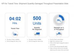 Kpi for transit time shipment quantity damaged throughout presentation slide
Presenting kpi for transit time shipment quantity damaged throughout presentation slide. This presentation slide shows three Key Performance Indicators or KPIs in a Dashboard style design. The first KPI that can be shown is Transit Time. The second KPI is Quantity Per Shipment and the third is Damages as percentage of Throughput. These KPI Powerpoint graphics are all data driven, and the shape automatically adjusts according to your data. Just right click on the KPI graphic, enter the right value and the shape will adjust automatically. Make a visual impact with our KPI slides.
-
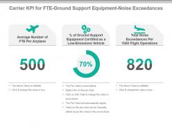 Carrier kpi for fte ground support equipment noise exceedances powerpoint slide
Presenting carrier kpi for fte ground support equipment noise exceedances powerpoint slide. This presentation slide shows three Key Performance Indicators or KPIs in a Dashboard style design. The first KPI that can be shown is Average Number of FTE Per Airplane. The second KPI is percentage of Ground Support Equipment Certified as a Low Emissions Vehicle and the third is Total Noise Exceedances Per 1000 Flight Operations. These KPI Powerpoint graphics are all data driven, and the shape automatically adjusts according to your data. Just right click on the KPI graphic, enter the right value and the shape will adjust automatically. Make a visual impact with our KPI slides.
-
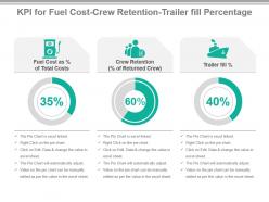 Kpi for fuel cost crew retention trailer fill percentage powerpoint slide
Presenting kpi for fuel cost crew retention trailer fill percentage powerpoint slide. This presentation slide shows three Key Performance Indicators or KPIs in a Dashboard style design. The first KPI that can be shown is Fuel Cost as percentage of Total Costs. The second KPI is Crew Retention percentage of Returned Crew and the third is Trailer fill percentage. These KPI Powerpoint graphics are all data driven, and the shape automatically adjusts according to your data. Just right click on the KPI graphic, enter the right value and the shape will adjust automatically. Make a visual impact with our KPI slides.
-
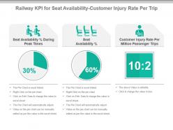 Railway kpi for seat availability customer injury rate per trip ppt slide
Presenting railway kpi for seat availability customer injury rate per trip ppt slide. This presentation slide shows Three Key Performance Indicators or KPIs in a Dashboard style design. The first KPI that can be shown is Seat Availability Percentage During Peak Times. The second KPI is Seat Availability Percentage. The third is Customer Injury Rate Per Million Passenger Trips. These KPI Powerpoint graphics are all data driven, and the shape automatically adjusts according to your data. Just right click on the KPI graphic, enter the right value and the shape will adjust automatically. Make a visual impact with our KPI slides.
-
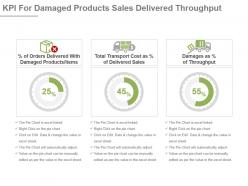 Kpi for damaged products sales delivered throughput presentation slide
Presenting kpi for damaged products sales delivered throughput presentation slide. This presentation slide shows Three Key Performance Indicators or KPIs in a Dashboard style design. The first KPI that can be shown is Percentage of Orders Delivered With Damaged Products Items. The second KPI is Total Transport Cost as Percentage of Delivered Sales. The third is Damages as Percentage of Throughput. These KPI Powerpoint graphics are all data driven, and the shape automatically adjusts according to your data. Just right click on the KPI graphic, enter the right value and the shape will adjust automatically. Make a visual impact with our KPI slides.
-
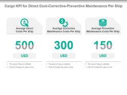 Cargo kpi for direct cost corrective preventive maintenance per ship powerpoint slide
Presenting cargo kpi for direct cost corrective preventive maintenance per ship powerpoint slide. This presentation slide shows three Key Performance Indicators or KPIs in a Dashboard style design. The first KPI that can be shown is Average Direct Costs Per Ship. The second KPI is Average Corrective Maintenance Costs Per Ship and the third is Average Preventive Maintenance Costs Per Ship. These KPI Powerpoint graphics are all data driven, and the shape automatically adjusts according to your data. Just right click on the KPI graphic, enter the right value and the shape will adjust automatically. Make a visual impact with our KPI slides.
-
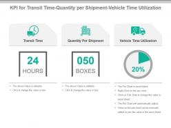 Kpi for transit time quantity per shipment vehicle time utilization presentation slide
Presenting kpi for transit time quantity per shipment vehicle time utilization presentation slide. This presentation slide shows three Key Performance Indicators or KPIs in a Dashboard style design. The first KPI that can be shown is Transit Time. The second KPI is Quantity Per Shipment and the third is Vehicle Time Utilization. These KPI Powerpoint graphics are all data driven, and the shape automatically adjusts according to your data. Just right click on the KPI graphic, enter the right value and the shape will adjust automatically. Make a visual impact with our KPI slides.
-
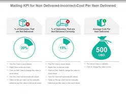 Mailing kpi for non delivered incorrect cost per item delivered ppt slide
Presenting mailing kpi for non delivered incorrect cost per item delivered ppt slide. This presentation slide shows Three Key Performance Indicators or KPIs in a Dashboard style design. The first KPI that can be shown is Percentage of Deliveries That are Not Delivered. The second KPI is Percentage of Deliveries That are Not Delivered Correctly. The third is Average Cost Per Item Delivered. These KPI Powerpoint graphics are all data driven, and the shape automatically adjusts according to your data. Just right click on the KPI graphic, enter the right value and the shape will adjust automatically. Make a visual impact with our KPI slides.
-
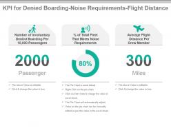 Kpi for denied boarding noise requirements flight distance ppt slide
Presenting kpi for denied boarding noise requirements flight distance ppt slide. This presentation slide shows three Key Performance Indicators or KPIs in a Dashboard style design. The first KPI that can be shown is Number of Involuntary Denied Boarding Per 10,000 Passengers. The second KPI is percentage of Total Fleet That Meets Noise Requirements and the third is Average Flight Distance Per Crew Member. These KPI Powerpoint graphics are all data driven, and the shape automatically adjusts according to your data. Just right click on the KPI graphic, enter the right value and the shape will adjust automatically. Make a visual impact with our KPI slides.
-
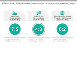 Kpi for ratio fixed variable direct indirect corrective preventive costs presentation slide
Presenting kpi for ratio fixed variable direct indirect corrective preventive costs presentation slide. This presentation slide shows three Key Performance Indicators or KPIs in a Dashboard style design. The first KPI that can be shown is Ratio Fixed Versus Variable Costs Per Ship. The second KPI is Ratio Direct Versus Indirect Costs Per Ship and the third is Ratio Corrective Versus Preventive Maintenance Costs Per Ship. These KPI Powerpoint graphics are all data driven, and the shape automatically adjusts according to your data. Just right click on the KPI graphic, enter the right value and the shape will adjust automatically. Make a visual impact with our KPI slides.
-
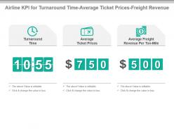 Airline kpi for turnaround time average ticket prices freight revenue presentation slide
Presenting airline kpi for turnaround time average ticket prices freight revenue presentation slide. This presentation slide shows three Key Performance Indicators or KPIs in a Dashboard style design. The first KPI that can be shown is Turnaround Time. The second KPI is Average Ticket Prices and the third is Average Freight Revenue Per Ton Mile. These KPI Powerpoint graphics are all data driven, and the shape automatically adjusts according to your data. Just right click on the KPI graphic, enter the right value and the shape will adjust automatically. Make a visual impact with our KPI slides.
-
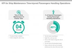 Kpi for ship maintenance time injured passengers handling operations powerpoint slide
Presenting kpi for ship maintenance time injured passengers handling operations powerpoint slide. This presentation slide shows two Key Performance Indicators or KPIs in a Dashboard style design. The first KPI that can be shown is Time of Ship Maintenance Vs Charter Time. The second KPI is percentage of Injured Passengers During Passenger Handling Operations. These KPI Powerpoint graphics are all data driven, and the shape automatically adjusts according to your data. Just right click on the KPI graphic, enter the right value and the shape will adjust automatically. Make a visual impact with our KPI slides.


