 Customer Reviews
Human brains have evolved to appreciate and retain visual cues with astonishing efficiency in a world where information bombards us from every angle. When scrolling through a page filled with text and graphs, an eye-catching chart displaying data through vibrant colors and clear visual patterns captivates your attention like a lake in a desert. The visual element becomes etched into your memory. This is because of the Picture Superiority Effect, a psychological concept that highlights our innate ability to process, retain, and recall visual information in a more effective way than textual content alone.
Multiple studies reveal that our minds are wired to process images and graphics far better than plain text alone. In fact, our brains see words or alphabets as images, process them, and give them context based on the previous data stored. Research has shown that we retain merely 10-20% of written or spoken information after three days, but retention rates surge to 65% when combined with relevant visuals. Our brains are hardwired (literally) to absorb and comprehend visual data with greater ease and speed (60,000 times faster), making it a vital component in how we perceive and understand the world around us.
From Insights to Impact!
One of the business tools that capitalizes on the picture superiority effect and allows users to read, monitor, track, and visualize data and business health at a glance is the metrics dashboard.
These dashboards transform intricate data sets and complex numbers into meaningful insights and captivating visual representations with interactive charts, graphs, and visually appealing widgets. From Key Performance Indicators (KPIs) to marketing campaign progress and sales trends, the metrics dashboard brings the most essential business information in a single snapshot.
Dashboards eliminate the need for hours of data analysis, allowing you to focus on the strategic aspects of your business. The visual nature of dashboards facilitates the quick identification of trends, anomalies, and correlations that might otherwise remain buried in spreadsheets. As a result, stakeholders and executives can make swift decisions and seize opportunities with confidence.
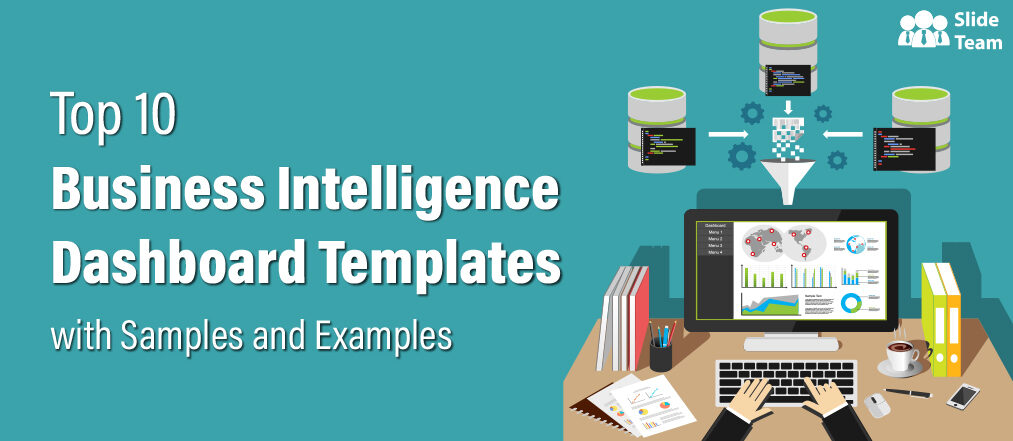
Metrics Dashboard Templates for Smarter Business Decision-Making
Dashboards foster transparency and collaboration within organizations. Understanding and alignment become second nature when teams share a common visual platform. Miscommunications are minimized as everyone is on the same page, literally.
While metrics dashboards offer a unified view of performance metrics, budgets, and targets, enabling departments to work together toward shared objectives, creating them from scratch is not easy. From collecting data to deciding on a practical design that offers an easy view of the required information, creating a metrics dashboard from scratch takes a lot of time and effort. That's where our metrics dashboard templates come into play.
These content-ready dashboard layouts provide a structured framework for organizing and visualizing data, making it easier for teams to monitor performance, identify trends, and take prompt action. Whether tracking financial performance, analyzing website traffic, or evaluating customer engagement, our PPT Slides empower you to present your data with impact and clarity.
With the 100% customizable nature, these PowerPoint Designs allow you to infuse your brand's identity, select the most relevant charts, and arrange widgets in an intuitive way.
Let's explore these metrics dashboard templates and find what your business needs.
1. Metrics Dashboard Template To Measure Automation Performance
Transform your business's automation performance monitoring with our state-of-the-art metrics dashboard template. This PPT Layout has been crafted with user convenience in mind, ensuring you can gauge your success in real-time. It organizes essential metrics like the percentage of answered requests, total request count, overall revenue, and the ratio of support costs to revenue in a neat manner with vivid, easy-to-understand pie charts and line graphs. Delve even deeper with insights into request volume versus service level, empowering you to make resource allocation decisions with confidence. Track your team's efficiency with an average measure of how long it takes to resolve issues. Our metrics dashboard template gives you the tools to supercharge automation performance, elevate customer satisfaction, and fuel sustainable growth. Download it now!

2. Customer Service Metrics Dashboard Presentation Template
This dashboard layout has customer service metrics like the number of support incidents this week, average first response time, average resolution time, abandon rate, average waiting time, and first contact resolution. It presents the previous week's daily abandon rate with the help of a multicolor line chart. Operation managers can track and compare the resolution time of different channels with the help of a bar chart in this dashboard design. The two tables at the bottom of this PowerPoint Slide will empower you to recognize the top and bottom fives of your team and guide them. Get it now!

3. Marketing KPI Metrics Dashboard Presentation Template
Take advantage of this KPI dashboard to monitor and regulate your marketing campaigns with data-driven decisions. It is a home for key marketing metrics like total revenue (MTD), average revenue per lead, number of leads in a day and month, and total website traffic. Present your traffic data along with their source with the help of an area graph to stakeholders. This PPT Layout helps marketing professionals understand the leads funnel and find the improvement areas to increase conversions. Grab it today!

4. HR Operations Performance Metrics Dashboard PPT Template
Unlock the potential of your HR operations with our metrics dashboard PPT Layout. This innovative and research-backed PowerPoint Slide empowers your management team to assess and elevate human resource performance in an effortless manner. With visually captivating infographics, it simplifies the measurement of crucial HR efficiency parameters, including salary structures, departmental workforce size, the average length of service, and retirement age, among other key metrics. Measure performance and foster an environment that values employees, promotes retention, and curbs turnover rates using this PowerPoint Set. What's more? You can leverage these insights to develop robust HR strategies and policies that align with your business performance objectives. Download it now!

5. Human Resource KPI Dashboard Presentation Template
This dashboard layout showcases four key human resource metrics with the help of visual infographics. It represents the number of total employees over a period of time and compares it with the same period in a consecutive year using a line chart. The Human Resource KPI Dashboard presentation slide has a double-sided bar chart plotted on the x-axis to show employee churn rate as gains and losses. Hiring managers can compare employee turnover rates, speed of hire, and promotion rates using bar graph strips given in this PPT Layout that will help them find the improvement areas in the employee lifecycle. It has a pie chart that presents open positions per department, allowing hiring teams to determine the organization's human capital needs. Get it now!

6. HR Metrics Dashboard Template With Recruitment Performance
Elevate your HR strategy with our recruitment performance dashboard layout that transforms complex data into actionable insights. Track the evolution of your workforce over time and make year-over-year comparisons with a dynamic line chart. Dive deeper into your HR performance analysis with a double-sided bar chart, which illustrates employee churn rates, gains, and losses. Uncover valuable insights into employee turnover rates, speed of hire, and promotion rates through easy-to-read bar graph strips, enabling you to pinpoint areas for improvement in the employee lifecycle. The pie chart displaying open positions per department empowers your hiring teams to identify and address your organization's human capital needs. Grab it today!

7. Key Human Resource Metrics Dashboard Presentation Template
Use this PPT Design to create a human resource dashboard that tracks and compares turnover rates over quarters. It has a bar chart that marks the employees' number who left the organization voluntarily and involuntarily. You can also share the current quarter turnover rate and Year-on-year change in the turnover rate. Share feedback backed by data with managers about the instability rate in their team using this PowerPoint Set. Hiring managers and HR professionals can use this metrics dashboard template to determine the flow-through rate, direct compensation rate, and the top three concern areas that need improvement in top talent turnover. Download it now!

8. HR KPI Dashboard Template With Multiple Performance Metrics
Empower your organization and streamline human resource management with this all-inclusive metrics dashboard design. It provides a bird's-eye view of your HR operations and flexibility. This user-friendly HR dashboard PPT Layout makes creating impactful presentations a breeze. Shed light on critical HR KPIs and metrics, like employee hired, open positions, days-to-hired, cost per hire, recruitment funnel, pipeline efficiency, and more. Get it now!

9. SaaS Customer Lifecycle Metrics Dashboard PPT Template
In the Software as a Service (SaaS) industry, it's crucial to enhance customer value throughout their journey continually; this dashboard is your key to achieving that. Boosting customer lifetime value counteracts revenue loss due to churn and optimizes the customer acquisition-cost-to-revenue ratio, laying the foundation for sustainable success. This presentation design simplifies the process of transforming your business data into dynamic, editable charts. The expert-designed graphs and charts are easy to link to Excel sheets, allowing users to update values and showcase desired information. The spacious layout of this design, alongside the charts, offers ample room for you to input essential details and insights related to the data and its categories. This PPT Slide empowers you to present your business financial information and helps you navigate economic challenges to generate new avenues for success. Grab it today!

10. DevOps KPI Metrics Dashboard Presentation Template
This dashboard design offers a comprehensive solution that brings clarity to your DevOps operations and helps you stay on top of the KPIs. With a focus on central processing unit statistics, input-output metrics, and network traffic volume during recorded sessions, this template provides invaluable insights into the heart of your operations. Track and analyze the data that matters most, enabling you to optimize resource allocation and enhance system efficiency. The PPT Slide sheds light on the number of sessions with waiting time, giving operation managers a deeper understanding of system performance and potential bottlenecks. This user-friendly and visually appealing presentation template simplifies the complex world of DevOps metrics, making it easy to convey vital information to your team and stakeholders. Download it now!

One Stop for Your Business Data Visualization Needs!
Metrics Dashboards are indispensable tools for businesses seeking to make data-driven decisions, streamline operations, and achieve their strategic goals. These dashboards provide a visually intuitive representation of KPIs, allowing executives and teams to assess the health of various aspects of their organization in a quick way. By consolidating data from multiple sources, metrics dashboards offer a comprehensive view of sales, marketing, finance, and operational data, among others. In today's fast-paced business landscape, metrics dashboards guide companies toward data-driven success.
Our metrics dashboard templates combine the art of design with the science of data visualization and give you the ultimate business tools. These PPT designs offer efficiency and clarity that can enhance your decision-making process. Whether you are a small business or a big enterprise, these dashboard layouts will be a game-changer for your data visualization.
Download these metrics dashboard templates today and empower your team to make informed, data-backed choices that will propel your organization forward.
FAQs on Metrics Dashboards
What is a metrics dashboard?
A metrics dashboard visualizes key performance indicators (KPIs) and data points that provide an overview of the performance, progress, and business health, project, or process. It is presented in graphs, charts, and other visual elements to make complex data understandable at a glance.
How do I create a metrics dashboard?
To create a metrics dashboard, follow these steps:
- Define Goals and KPIs: Determine the specific goals you want to track and the KPIs reflecting progress towards those goals.
- Select Data Sources: Identify the data sources that provide the necessary information for your KPIs.
- Choose Visualization Tools: Select appropriate data visualization tools or software.
- Design Layout: Design your dashboard layout, arranging charts and graphs in a logical way for easy interpretation. Use SlideTeam’s Metrics Dashboard Templates.
- Collect and Prepare Data: Gather data from your sources, clean and format it for analysis.
- Create Visualizations: Use the chosen tools to create various visualizations like line charts, bar graphs, pie charts, etc., based on your KPIs.
- Assemble the Dashboard: Put together the visualizations on a single dashboard canvas.
- Add Context and Insights: Include annotations, captions, or descriptions that provide context and insights about the data.
- Regular Updates: Set up mechanisms to ensure the data on the dashboard is regularly updated.
- Share and Collaborate: Depending on your needs, share the dashboard with relevant stakeholders so they can monitor the metrics and make informed decisions.
What are the benefits of a metrics dashboard?
Metrics dashboards offer benefits like:
- Data Visualization: Complex data becomes more understandable and actionable when presented visually.
- Real-time Insights: Dashboards provide up-to-date information, enabling quick decision-making.
- Performance Tracking: Monitoring progress towards goals and identifying improvement areas is easy.
- Identify Trends: Spot trends and patterns in data over time, aiding in forecasting.
- Data Centralization: Bring together data from various sources into a single view.
- Collaboration: Share insights and findings across teams and stakeholders.
- Efficiency: Save time by eliminating the need to compile and analyze data by manual methods.
- Customization: Tailor dashboards to your specific needs and goals.
What are the four main business metrics?
The specific metrics considered "main" can vary depending on the context, industry, and goals. However, four common categories of main metrics are
- Financial Metrics: These include metrics related to revenue, profit margins, return on investment (ROI), and other financial indicators.
- Operational Metrics: Metrics that assess the efficiency and effectiveness of operational processes, such as production cycle time, lead time, and resource utilization.
- Customer Metrics: These focus on customer satisfaction, loyalty, retention rates, and Net Promoter Score (NPS).
- Employee Metrics: Metrics related to employee performance, engagement, turnover rates, and training effectiveness.