


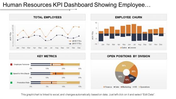
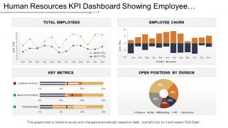
Kpi dashboard showing employee churn key metrics and open positions





Try Before you Buy Download Free Sample Product
 Impress Your
 Audience
 100%
100% Editable
 Save Hours
 of Time


Handle attempts to instigate dissent with our Kpi Dashboard Showing Employee Churn Key Metrics And Open Positions. Counter any irksome interference.
People who downloaded this PowerPoint presentation also viewed the following :
Kpi dashboard showing employee churn key metrics and open positions with all 6 slides:
Enable folks to experience the glory of God with our Kpi Dashboard Showing Employee Churn Key Metrics And Open Positions. Instill joy in their hearts.



FAQs for Kpi dashboard showing employee churn key metrics
Start with overall turnover rate - that's your main number. Break it down by department, how long people have been there, and performance ratings to see what's going on. Definitely separate voluntary vs involuntary because losing good people stings way more than cutting dead weight. Time-to-fill for open roles matters too, plus themes from exit interviews. Employee satisfaction scores can give you early warning signs. Cost per departure is gold if you can calculate it - executives eat that stuff up. Honestly, don't overthink it at first. Get these basics working and add fancier metrics once people are actually looking at the thing regularly.
Honestly, charts make patterns pop way better than staring at endless spreadsheet rows. Heat maps will show you exactly which departments are bleeding people or if certain months are consistently brutal. Trend lines? Game changer for seeing if things are actually improving or just getting worse. I'd definitely use bar charts to compare why people leave - you might discover that one toxic manager is driving everyone away. Oh, and cohort analysis visuals are clutch for tracking how long different employee groups stay. Just pick whatever chart type matches your specific question, then don't let the insights collect dust.
Honestly, engagement scores are your best early warning system for who's about to quit. People mentally check out way before they actually leave - and the numbers back this up. Disengaged employees are like 2-3x more likely to bounce within 6 months. I'd track it alongside manager relationships and career development stuff too. Oh, and definitely set up alerts when scores drop below whatever threshold makes sense for your team. That way you can actually do something about it instead of just watching people walk out the door. Trust me, by the time someone's actively job hunting, it's usually too late.
Monthly updates work great for most companies - gives you solid trend data without all the daily chaos. Weekly might be better if you're in retail or something with crazy turnover though. Daily tracking? That'll just stress you out watching numbers bounce around for no reason. Whatever timeline you pick, just stick with it. And honestly, automate the data pulls if you can - manually updating dashboards every month gets old fast. The consistency matters way more than whether you're doing it weekly or monthly anyway.
Start with your HR stuff - employee records, when people quit, how long they stayed, basic demographics. Performance reviews are actually super useful here, way more than most people think. Grab engagement survey results if you've got them. Attendance data helps too, plus tracking who moved between departments. The trick is connecting all this so you're seeing someone's whole story at the company, not just random pieces. Even if you only have basic HR data to start with, you'd be surprised what patterns show up when you actually dig into it.
Basically you're looking at employee data to catch flight risks before they bail. The algorithms dig into engagement scores, performance dips, crazy overtime patterns, promotion gaps - all that stuff. Honestly, it's wild how much these systems pick up that we'd totally miss. Your dashboard spits out probability scores for who's most likely to leave, so you can jump in with retention tactics early. You'll want at least 12-18 months of solid historical data though - otherwise the predictions are pretty much garbage. Oh, and update quarterly since workplace vibes shift constantly.
Honestly, it's the same stuff everywhere - bad pay, no growth opportunities, and terrible managers. Those three are huge. Tech and finance folks jump ship for better money or because they're burning out. Retail/hospitality? They want flexible schedules and actual work-life balance. Healthcare is a nightmare right now - they're so understaffed that everyone's drowning. Manufacturing sees people leave over safety issues and boring, repetitive work. Start your dashboard with those main categories since they apply everywhere. Then you can add industry-specific stuff later based on what you're dealing with.
Honestly, just start by tagging the exit interview feedback - compensation, bad managers, work-life balance, growth stuff. Even a basic spreadsheet works if you don't have fancy HR software. Create some charts showing why people actually leave, maybe split by department. The cool part is when you match this with your turnover data - like suddenly you'll notice everyone bailing at 18 months mentions zero career advancement. I'd focus on getting consistent tagging down first though. Once you have that running smoothly, the patterns basically jump out at you.
Look, this dashboard basically lets you catch turnover issues before they blow up in your face. You can see which departments or managers are bleeding people, track patterns over time - stuff like seasonal trends or how new policies are actually working out. The predictive part is pretty cool too, flags employees who might bail soon so you can actually do something about it. Way better than scrambling after half your team already quit. Oh, and don't just stare at the data - use it to build real action plans instead of playing catch-up all the time.
So honestly, most places shoot for under 15% annually - anything over 20% gets pretty scary. Tech usually hits around 13-15%, but retail and hospitality? They're stuck dealing with 20-25% which sucks but makes sense given those industries. Here's the thing though - comparing yourself to industry averages is kinda pointless. Company size matters way more than people think. Track your own patterns instead and see how different departments stack up against each other. Break it down by how long people have been there, their performance, even their manager. That's where you'll actually find stuff you can fix.
Ugh, high churn is the worst - it basically destroys everything. Your remaining people get stuck doing way too much work, which obviously kills morale fast. All that knowledge just walks out the door too. I swear, watching new hires fumble through stuff the last person could do in their sleep is so frustrating. Plus nobody can build real relationships when half your team vanishes every year. The culture just feels... unstable, you know? And don't get me started on constantly recruiting and training people. Check your dashboard for patterns though - catching this early makes a huge difference before everything falls apart.
So for your churn dashboard - Tableau and Power BI are definitely where I'd start. Both handle HR stuff really well and look professional. Google Data Studio's decent if you're trying to save money, just not as feature-rich. Excel works too honestly, assuming your data isn't huge. I mean, sometimes the simple route is fine. First thing though - figure out exactly what metrics you want to track. Then pick whatever fits your budget and how tech-savvy your team is. Just make sure it'll actually connect to your HR system or you'll be doing manual updates forever.
The dashboard's great for catching patterns early - watch for departments with climbing churn rates or managers who keep losing people. Predictive stuff shows you who's likely to bail soon, so you can actually talk to them before they're out the door. Honestly, the exit reasons breakdown by team is probably my favorite feature because it's so obvious where you're bleeding talent. Set up alerts when turnover hits your danger zone, then dive into demographics to see if you're losing specific groups. Oh, and definitely start with whatever's hurting most right now.
Honestly, onboarding makes or breaks retention. I've watched so many companies mess this up - new hires show up confused, don't get proper training, and boom they're gone within three months. The smart move? Track your onboarding completion rates against 90-day retention data. You'll spot patterns fast. When people feel supported from day one with clear expectations and decent training, they actually want to stay. It's wild how many places skip this step then wonder why turnover is brutal. Your dashboard should definitely include onboarding satisfaction scores too.
So I'd do sentiment analysis first - categorize everything into positive/negative/neutral buckets and track percentages over time. Word clouds are honestly great for this stuff, especially if you're presenting to execs who love visual data. You can also break feedback into themes like "management issues" or "workload problems" and see how each area trends. Pull from exit interviews, pulse surveys, whatever anonymous tools you've got running. Oh and focus on patterns rather than individual comments - that's where the real insights are. Trending themes tell a way better story than random one-offs anyway.
-
The Designed Graphic are very professional and classic.
-
Design layout is very impressive.