

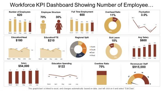
Workforce kpi dashboard showing number of employee overhead ratio and salary





Try Before you Buy Download Free Sample Product
 Impress Your
 Audience
 100%
100% Editable
 Save Hours
 of Time


Execute flawlessly with our Workforce Kpi Dashboard Showing Number Of Employee Overhead Ratio And Salary. They ensure errors don't creep in.
People who downloaded this PowerPoint presentation also viewed the following :
Workforce kpi dashboard showing number of employee overhead ratio and salary with all 6 slides:
Bell the cat with our Workforce Kpi Dashboard Showing Number Of Employee Overhead Ratio And Salary. Get your audience abreast of it all.
FAQs for Workforce kpi dashboard showing number of employee overhead
Focus on four main buckets: productivity stuff (output per employee, utilization rates), engagement (retention, turnover, satisfaction scores), performance tracking (goal completion, quality metrics), and basic operational data like headcount and absenteeism. Honestly though? Dashboards get messy super quick if you track everything. Pick maybe 8-12 metrics that actually move the needle for your business. I'd start with whatever your leadership team bugs you about most often - that's usually where you'll see the biggest wins. Keep it simple and update regularly. Oh, and don't forget time-to-fill for open positions if hiring's a priority right now.
Honestly, these dashboards are game-changers because you get instant visibility into what's actually happening. Bottlenecks become obvious fast. You'll spot who needs help and see what your star players are doing right. Here's the thing though - employees hate being the worst performer on display, so they naturally step up their game. Just don't go overboard with metrics (been there). Pick maybe 3-5 that actually connect to your main goals, not just random numbers that look impressive. Once people can see their own performance in real-time, they start fixing issues themselves. It's wild how competitive people get.
Honestly, you really need good visuals for those workforce dashboards. Raw spreadsheets are brutal to look at - nobody wants to dig through rows of turnover data. Charts and graphs make everything click instantly. You'll spot trends in engagement scores or productivity way faster. Plus leadership actually pays attention when you're not just throwing numbers at them. I'd say pick your most important KPIs first, then figure out which chart types tell the best story. Makes presenting so much easier too.
You definitely want different dashboards for different people. Executives just need the big picture - headcount trends, turnover rates, cost per hire. Middle managers care more about team productivity and retention in their specific departments. The worst thing you can do is dump everything into one massive dashboard (I've seen this disaster so many times). Front-line supervisors need real-time stuff like attendance and overtime. Set up permissions so everyone only sees what matters for their job. Trust me, less is more here.
Honestly, just start with your HRIS - that's where all the good stuff already sits anyway. From there you can pull payroll data, time tracking, performance reviews for your basic headcount and turnover numbers. Survey tools are clutch for engagement scores (seriously, retention goldmine). Also grab recruiting platform data for hiring metrics and your LMS for training KPIs. Oh and automate those data feeds if you can - updating spreadsheets manually every month is the worst. I'd say pick like 5-7 core metrics first. Get those dialed in before you go crazy adding more.
Honestly, you'll want to check those workforce KPIs at least weekly - daily is even better for stuff like attendance and productivity. Monthly? Way too slow. I learned this the hard way when our team got caught off guard by a trend we totally missed. Employee satisfaction surveys and training metrics can be weekly or bi-weekly, that's fine. But here's the thing - whatever schedule you pick, just stick with it. Try setting up automated feeds if you can (saves you from manually updating everything). Trust me, consistency beats perfection here.
Don't cram everything onto one screen - it's just overwhelming. Focus on maybe 5-7 metrics that actually matter for your business decisions. Skip the vanity stuff that looks cool but doesn't help anyone. And please, no rainbow dashboards that blind people lol. Keep your data fresh and accurate because outdated numbers make you look sloppy. Start simple first. Test it with real users, then tweak based on what they tell you. Honestly, most dashboards try to do way too much - yours doesn't have to be fancy to be useful.
Honestly, start with something simple like predicting who might quit - way easier than you'd think. Tools like Tableau already have the ML stuff built in, so you're not coding from scratch. Just feed your current data (turnover rates, performance scores, whatever) into their algorithms and let them find the patterns. Say someone's engagement drops while they're pulling crazy overtime - boom, the system flags them as a burnout risk. I'd probably avoid getting too fancy at first though. Pick one thing to predict, see how it goes, then add more later. The historical data you already have is honestly doing most of the heavy lifting here.
KPIs can definitely help with retention if you set them up right. Most people want to know how they're doing at work - it's kind of human nature. Dashboards give them that transparency they're craving. The key is picking metrics that actually matter, not just random numbers that'll stress everyone out. I've seen teams get way more engaged when they can track their progress and see how their daily work ties into the bigger picture. Makes them feel like they're part of something, you know? Just don't make the KPIs feel like you're watching over their shoulder all the time - that backfires fast.
Look, these dashboards are game-changers for actually seeing what's happening with your team in real time. No more waiting around for monthly reports or just guessing based on vibes. You'll instantly spot where productivity's dropping, staffing issues, how happy employees are - and whether that connects to people leaving. The visual setup makes it way easier to connect dots between different metrics. Like, you can finally see if that training budget actually moved the needle on performance (spoiler: sometimes it doesn't). My advice? Pick your top 3-5 priorities first, then build everything around those specific metrics. Don't try to track everything at once - you'll just overwhelm yourself.
Honestly depends on your budget and how tech-savvy your team is. Tableau and Power BI are amazing for complex stuff - they'll crush any HR data you throw at them. Google Data Studio works great if you're already using Google everything and don't want to spend much. I've actually seen people do crazy things with just Excel, though it gets messy quick with big datasets. BambooHR and Workday have their own dashboards built in too, which is pretty convenient. Start by figuring out what metrics you actually need to track first. Then just pick whatever matches your data size and team's comfort level - no point getting something fancy if nobody knows how to use it.
Talk to your actual users first - don't just guess what they want. Some people are total spreadsheet nerds, others need pretty charts. Keep it simple and don't make it look like a fighter jet control panel (seriously, I've seen some disasters). Mobile is huge since everyone's constantly checking stuff on their phones. Test with real people before you launch anything - they'll catch things you missed. Oh, and set up different views for different roles. Your CEO doesn't need to see the same nitty-gritty details that operations does.
Start with industry benchmarks - turnover rates, time-to-hire, employee satisfaction for your sector. But honestly, your own historical data matters just as much for spotting trends. Leadership always loves seeing revenue per employee too. Don't overwhelm yourself with like 20 different metrics though, you'll lose track of what actually moves the needle. I'd go with maybe 5-7 key ones first. Once that's humming along, then add more. Oh and make sure you're comparing similar companies when you look at external stuff - otherwise the numbers won't mean much.
Real-time data is honestly a game changer - instead of looking backward at what already happened, you're actually steering in the moment. Catch productivity drops right when they happen, not days later when it's too late. Like if your team hits a wall at 2pm, you can jump in with a quick fix instead of discovering it next week's report (ugh, the worst). Makes managing way less stressful since you're not constantly playing catch-up. I'd start tracking productivity and attendance first - those give you the biggest bang for your buck.
Honestly, start with the basics - turnover rates, how often people call out sick, and how long it takes to fill empty spots. Performance stuff matters too, like whether people are actually hitting their goals and learning new skills. I've made the mistake of creating dashboards that look impressive but are totally useless for making real decisions. Focus on what actually moves the needle - engagement scores, who's working crazy overtime, internal promotions. Maybe throw in some retention patterns if you're feeling ambitious. Pick like 5-7 things max. Any more and you'll drown in data you'll never look at again.
-
Unique design & color.
-
Topic best represented with attractive design.