


KPI Dashboard Snapshot Showing Workforce Headcount Analysis




Try Before you Buy Download Free Sample Product
 Impress Your
 Audience
 100%
100% Editable
 Save Hours
 of Time


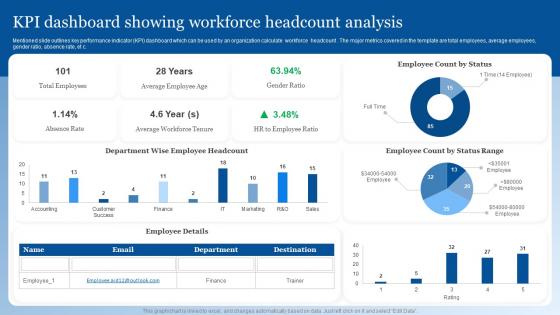
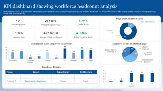
Mentioned slide outlines key performance indicator KPI dashboard which can be used by an organization calculate workforce headcount . The major metrics covered in the template are total employees, average employees, gender ratio, absence rate, et c.
People who downloaded this PowerPoint presentation also viewed the following :
KPI Dashboard Snapshot Showing Workforce Headcount Analysis with all 7 slides:
Use our KPI Dashboard Snapshot Showing Workforce Headcount Analysis to effectively help you save your valuable time. They are readymade to fit into any presentation structure.





FAQs for KPI Dashboard Snapshot Showing
Pick 4-5 metrics that actually matter to your goals - seriously, don't go overboard tracking everything. Color coding helps tons (red/yellow/green) plus those little trend arrows for quick scanning. I've watched people create these insane dashboards that look like slot machines, blinking everywhere! Context is huge though. Show your targets or compare to last month so the numbers aren't just floating there meaninglessly. Try fitting it all on one screen if you can. Oh, and update regularly or people stop trusting it. Start with this: what would you desperately need to know if you only had 30 seconds to check how things are going?
Oh man, visual design totally makes or breaks dashboards. Clean layouts with consistent colors? Game changer - people can actually find what they need. Random colors everywhere just create visual chaos honestly. White space is your friend here, plus readable fonts and logical groupings so users aren't playing hide-and-seek with metrics. The really good ones flow naturally - your eye hits the important stuff first without thinking about it. I always tell people to ditch the clutter first, then group things by priority. Makes such a difference.
Figure out what actually moves the needle in your space first - like revenue per customer for SaaS companies, patient satisfaction if you're in healthcare, inventory turnover for retail. Don't get caught up in vanity metrics that just look good on paper. Honestly, most dashboards I've seen are total disasters with way too much clutter. Stick to maybe 5-7 metrics tops. Make sure your team can actually do something about these numbers day-to-day, otherwise what's the point? Also worth checking what competitors track - gives you a good reality check on whether you're measuring the right stuff.
Honestly? Monthly works for most stuff, but it totally depends on what you're tracking. Sales numbers and web traffic - that's daily territory since things move fast. But those bigger strategic goals? Quarterly's probably fine. I've worked with teams who obsessively refresh their dashboards every hour and it drives everyone nuts. Short sentences get annoying too though. Match your review frequency to how quickly stuff actually changes and whether you can do anything about it right away. Monthly's a solid starting point - just tweak it based on your team's vibe.
Tableau and Power BI are solid picks if you've got the budget and want something powerful. Google Data Studio's free though, which is nice. Excel actually works better than people think for basic stuff - I've built some decent dashboards there when I was being cheap. For real-time stuff, Klipfolio's pretty good. Honestly though? Just start with whatever you already have sitting around. Get your main numbers working first, then worry about fancy tools later. Your team needs to actually use the thing or it's pointless. You can always upgrade once you figure out what you really need.
Honestly, data integration is a game changer for dashboards. Instead of having random charts everywhere, you actually get a clear picture when everything's connected - your CRM, analytics, finance stuff, all of it. Real-time updates mean no more outdated spreadsheets (thank god). You'll start seeing patterns between departments that weren't obvious before. Like, marketing spend might correlate with support tickets in ways you never noticed. Drilling down from big picture to details becomes super smooth. Plus you catch problems way earlier. I'd say start with whatever data sources are most critical to your daily decisions first.
Look, your dashboard is only as good as the feedback you get from people actually using it. Ask stakeholders what decisions they're trying to make first, then build around that. I can't tell you how many beautiful dashboards I've seen that just sit there collecting digital dust because nobody finds them useful. Check in regularly - not just once during setup. What questions are they trying to answer? Are the metrics helping or just adding clutter? Oh, and don't get caught up making it look perfect if it's not solving real problems. Function beats form every time.
Honestly, keep it simple and get feedback from real users - that's the secret sauce. Clean layouts work best. Only show the most critical stuff upfront instead of cramming everything together. I swear, some dashboards look like someone threw data at a wall and called it a day! Test your charts with people who actually use them daily, not just the higher-ups who glance at it occasionally. Their complaints will tell you exactly what needs fixing. Short sentences hit different sometimes. Keep tweaking based on what they're telling you.
Honestly, the worst thing you can do is cram everything onto one screen - I've seen dashboards that look like airplane cockpits. Also avoid vanity metrics that just make you feel good but don't actually help you decide anything. Context is huge too. Like showing "3.2% conversion rate" means nothing if I don't know whether that's up or down from last month, you know? Pick maybe 5-7 metrics that actually matter for decisions. Keep colors consistent so people aren't confused, and make sure your data actually updates when it's supposed to. Trust me, dashboard paralysis is a real thing.
I'd stick to 5-7 KPIs max – trust me on this one. More than 10 and people's eyes glaze over, then nobody looks at anything useful. But too few (like 2-3) means you're flying blind. Think about what decisions you actually need to make first, then figure out which numbers help with those choices. Oh, and definitely test it with whoever's gonna use it daily. Watch them click around – you'll know pretty quick if it's too cluttered or missing something important. Their actual behavior tells you way more than asking "does this look good?"
Dude, real-time data totally changes everything. Instead of finding out about problems days later, you catch them instantly. Your team can actually fix stuff as it breaks rather than playing catch-up all the time. Plus you'll spot opportunities the second they pop up - way better than those static dashboards that just sit there looking pretty. Honestly, once you go real-time, going back feels like driving with a blindfold on. Focus on the KPIs that matter most first, like anything touching customer experience or your day-to-day operations.
So operational KPIs are your daily stuff - sales numbers, how often your site crashes, response times. Strategic ones track the big picture over months, like are you actually gaining market share or improving customer lifetime value. Here's the thing: operational metrics will literally ruin your sleep when something breaks at 2am. Strategic KPIs? Those show if you're moving toward goals that actually matter long-term. I'd put the daily ones where your team can see them constantly. Save the strategic dashboard for monthly executive reviews - honestly, checking those weekly just creates unnecessary stress.
Honestly, dashboards work because people can finally see how their daily grind actually impacts the big stuff. Your team stops wasting time on random tasks once they realize what's actually moving the company forward. I've watched entire teams do a complete 180 on priorities after seeing the real numbers. Just don't fall into the trap of tracking vanity metrics that look impressive but mean nothing. Map your team's KPIs to actual business goals first. Then update weekly so nobody's working in the dark. It's pretty simple but makes a huge difference.
Start with NPS and CSAT - those are your bread and butter metrics. Customer Effort Score is solid too since it shows how hard you're making things for people. Track your churn rate obviously, plus how fast you're resolving support tickets. First-call resolution is huge, trust me on that one. Customer lifetime value tells you if happy customers actually stick around and spend more (they do). Oh, and repeat purchase rates are pretty telling. Sentiment analysis from reviews is nice if you have the bandwidth, but honestly? Get the basics locked down first, then add the fancy stuff later.
So basically you can add predictive stuff to your dashboards to see what's coming next, not just what already happened. Like predicting when customers might bail or forecasting sales numbers. Start with your biggest KPIs first - don't go crazy trying to predict everything at once. Machine learning does the heavy lifting here. Test one or two predictions for a few months to see how accurate they are. I swear it's worth the setup time once you get rolling. Way better than just staring at last quarter's numbers and hoping for the best.
-
The slides come with appealing color schemes and relevant content that helped me deliver a stunning presentation without any hassle!
-
Happy to incorporate such stunning templates in my presentation. Made my presentation look professional and engaging.