

KPI Dashboard Of Organizational Headcount Comparison





Try Before you Buy Download Free Sample Product
 Impress Your
 Audience
 100%
100% Editable
 Save Hours
 of Time


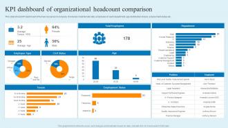
This slide shows KPI dashboard of human resources in company. It includes male female ratio, employees in each department, age distribution, tenure, employment status etc.
People who downloaded this PowerPoint presentation also viewed the following :
KPI Dashboard Of Organizational Headcount Comparison with all 7 slides:
Use our KPI Dashboard Of Organizational Headcount Comparison to effectively help you save your valuable time. They are readymade to fit into any presentation structure.





FAQs for KPI Dashboard Of
Start with metrics that actually matter to your goals - don't just throw numbers on a screen. Clean charts and graphs work best, nothing fancy. Real-time data feeds are cluttered honestly, but near real-time is perfect. Put your most important stuff at the top where people look first. I've watched teams ignore dashboards because they're complete messes with too much going on. Stick to 5-7 key metrics max when you're starting out. Use consistent colors so trends jump out at you. Once people get comfortable using it, then you can add more stuff.
Figure out what you're actually trying to accomplish first - growing revenue, keeping customers happy, whatever matters most to your business. Work backwards from there to pick metrics that actually track those goals. Too many people (myself included, honestly) go overboard and track like 15 different things. You'll just get buried in numbers that don't matter. Stick to maybe 3-5 KPIs max. Here's my test: if one of your metrics suddenly changed, would you actually change what you're doing? No? Then it's probably useless and you should find something that'll drive real decisions.
Dude, data viz totally transforms KPI dashboards. You know how staring at spreadsheets makes your eyes glaze over? Charts fix that instantly. Your brain just processes visual stuff way faster than rows of numbers. Pick bar charts for comparing things, line graphs when you want to see trends over time. Gauges work great for single metrics - though honestly, they can look a bit cheesy sometimes. Color-coding helps you catch patterns and weird outliers you'd never notice otherwise. Figure out your most important KPIs first, then choose visuals that make the insights jump out at you.
Honestly, monthly is a good baseline for most KPIs. But it really comes down to how fast your stuff changes. Daily sales or website traffic? Yeah, check those weekly. Customer satisfaction scores though - those don't shift overnight, so monthly or even quarterly works fine. I've watched too many teams build these beautiful dashboards that just sit there with outdated numbers. Totally useless. Match your review schedule to when the data actually moves and when you need to make decisions. Oh, and set those calendar reminders or you'll definitely forget!
Don't cram everything onto one screen - that's like the
-
Definitely recommend SlideTeam to all who need help with PowerPoint presentations. Their design team can create anything you need.
-
Use of different colors is good. It's simple and attractive.