


Kpi Dashboard For Tracking Project Team Performance Playbook For Developers




Try Before you Buy Download Free Sample Product
 Impress Your
 Audience
 100%
100% Editable
 Save Hours
 of Time


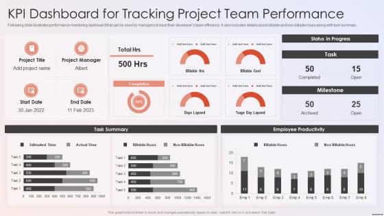
Following slide illustrates performance monitoring dashboard that can be used by managers to track their developers team efficiency. It also includes details about billable and non-billable hours along with task summary.
People who downloaded this PowerPoint presentation also viewed the following :
Kpi Dashboard For Tracking Project Team Performance Playbook For Developers with all 7 slides:
Use our Kpi Dashboard For Tracking Project Team Performance Playbook For Developers to effectively help you save your valuable time. They are readymade to fit into any presentation structure.





FAQs for Kpi Dashboard For Tracking Project Team Performance
Focus on metrics that actually move the needle for your business - vanity numbers are just distracting. Clean visuals are everything since people need to understand stuff instantly. Real-time data is non-negotiable; stale dashboards are basically useless (learned this the hard way). Context matters too - add your targets and benchmarks so you can actually spot when things are trending up or down. Oh, and don't try cramming everything onto one screen. Start with maybe 5-7 key metrics. You can always add more later, but cluttered dashboards just overwhelm everyone.
Okay so first thing - your KPIs need to actually connect to what your company's trying to accomplish. Otherwise you're just tracking random stuff that looks busy but doesn't matter. Focus on metrics that predict what's coming, not just what already happened. Most dashboards I see are honestly just packed with impressive-looking numbers that nobody actually uses to make decisions. Keep it tight - maybe 5-7 metrics tops per view. Here's my test: if one of these numbers went crazy overnight, would someone immediately do something about it? No? Then ditch it. Run it by your stakeholders first and see what they'd actually use. You'll probably be surprised what they ignore versus what they obsess over.
Don't cram everything on one screen - that's like dashboard suicide. Pick 5-7 metrics that actually matter to your business, not just the ones that look impressive. Pie charts for time series? Hard no. Colors should mean something, not just be rainbow vomit. Context is huge too - include targets so people know if they're winning or losing. Oh, and update frequency matters way more than you'd think. Daily works for most stuff, weekly for the slower-moving metrics. Start small and add more later when you figure out what people actually use.
Honestly, it depends on what you're tracking. Sales stuff? Yeah, daily updates make sense. But customer satisfaction scores can wait a week or two - nobody's making split-second decisions off that data. I'd say real-time to daily for your operational metrics, weekly to monthly for the bigger picture stuff. Here's the thing though - I've watched teams burn out from checking dashboards that update every hour. Total information overload. Match your refresh rate to when people actually make decisions. If your team plans quarterly, monthly updates work fine. Just ask your users how often they're even looking at it first.
Honestly, visualization makes all the difference with KPIs. Raw spreadsheet data is just painful to look at - who has time to hunt through rows trying to spot what's happening? The right charts and color coding let you see problems immediately. Like, trends that would take forever to notice in Excel become obvious when they're visualized properly. Pick charts that actually match your data type though. And keep colors consistent so your team can glance at the dashboard and instantly know if things are going well or if something's on fire. It's basically the difference between guessing and knowing.
Honestly, just talk to people first - find out what decisions they're making daily and build around that. Executives want the big picture stuff they can scan in 30 seconds. Your department heads need the nitty-gritty on their teams. Sales people live and breathe pipeline numbers, finance cares about money in/money out. Pretty obvious when you think about it. Set up role-based access so everyone sees their relevant stuff without drowning in metrics they don't need. Customizable widgets are your friend here - let people move things around how they want.
Honestly, most people I know use Tableau, Power BI, or Google Data Studio for their KPI dashboards. Excel's still everywhere but it's pretty clunky for this stuff. If you're already using Microsoft products, Power BI makes sense - integrates well and isn't too expensive. Tableau's got the fanciest visualizations but you'll pay for it. Google Data Studio won't cost you anything and handles basic dashboards fine. There's also Looker and Qlik Sense if you want something different. Oh, and those specialized ones like Klipfolio are decent too. Start with Power BI or Google Data Studio though - way easier to figure out.
Honestly, the key is hitting your data at multiple checkpoints before it even reaches the dashboard. Set up automated checks that catch missing values and weird outliers early. Document where every single metric comes from - I learned this the hard way when my boss questioned everything during a presentation. Regular manual audits are boring but necessary for your sanity. When source systems crash (and they will), have backups ready. Also set up alerts so you're not blindsided by wonky numbers during important meetings.
Charts beat tables every time - way easier to scan quickly. Don't cram more than 3-5 key metrics on one screen or people's eyes will glaze over. Always add context like targets or last month's numbers so the data actually means something. Red for bad, green for good (basic but it works). Honestly, tooltips save your life when you have weird abbreviations that nobody remembers. Ditch the corporate speak - just say "customer satisfaction" instead of "CSAT." Lead with the actual story first, then show the numbers. Oh, and test it with someone who isn't a data nerd before you launch it.
Dude, real-time data is a total game changer. You're seeing what's actually happening instead of getting stuck with old info that doesn't help anymore. So like if your conversion rate suddenly drops at 2pm, you can jump on it right away instead of finding out weeks later when it's too late. I learned this the hard way honestly. You can switch up campaigns mid-stream, move budget around, respond to what customers are doing while they're still doing it. Just set up alerts for your biggest metrics so you're not glued to your screen all day refreshing dashboards.
Honestly, mobile access is a game changer for KPI dashboards. You can check your numbers from anywhere instead of being stuck at your desk all day. Real-time alerts hit your phone instantly when something goes wrong - super helpful. The touch interface works surprisingly well for diving into data, though scrolling through a million charts on your phone screen gets old fast (learned that one the hard way). Set up notifications for your most critical metrics. That way you'll catch issues even when you're grabbing coffee or whatever.
Colors are huge for KPI dashboards - red makes people think something's broken, green means we're good. Mess that up and your team will either freak out or ignore real problems. Put your most important stuff top-left since that's where everyone looks first. I once saw a dashboard where critical alerts were shoved in the bottom corner... took weeks before anyone caught major issues, which was pretty embarrassing honestly. Keep colors consistent across everything and group similar metrics together. Makes it way easier to spot trends quickly.
Honestly, if you're early stage, just track the basics - customer acquisition cost, monthly recurring revenue, burn rate, and how long your runway is. The whole point is proving you've got product-market fit before the money runs out (which is terrifying but whatever). Companies that are already established? They can get fancy with stuff like lifetime value, churn rates by segment, employee productivity metrics. Lucky them - they're just optimizing instead of frantically trying to figure out what even works. Keep it simple though. Pick 3-5 metrics that actually matter for your next funding round or hitting profitability. Don't overthink it.
Honestly, KPI dashboards are game-changers for figuring out what's actually working in your business. You'll start seeing patterns in your data that help predict where things are going. Way better than drowning in random spreadsheets - trust me on that one. Real-time updates mean you can catch problems early instead of scrambling later. The best part? You can finally tell if your strategies are worth a damn or if you need to switch things up. Oh, and definitely set up alerts for your most important metrics so nothing slips through the cracks.
Honestly, rotating your KPIs is game-changing - people get bored seeing the same stuff constantly. Fresh data is everything too. Stale numbers kill engagement faster than anything else. Interactive features like drill-downs let people dig into what they actually care about. I'd definitely connect metrics to personal goals when you can. Oh, and try doing regular dashboard reviews with your team - turns it from just staring at screens into real conversations. Makes a huge difference in getting everyone engaged vs just having it sit there unused.
-
Excellent template with unique design.
-
Unique and attractive product design.