Project Management Dashboard To Track Essential Activities Project Planning Playbook

Rating:
100%
Project Management Dashboard To Track Essential Activities Project Planning Playbook
Slide 1 of 7
Favourites Favourites

Try Before you Buy Download Free Sample Product

Audience Impress Your
Audience
Editable 100%
Editable
Time Save Hours
of Time
The Biggest Sale is ending soon in
0
0
:
0
0
:
0
0
Rating:
100%
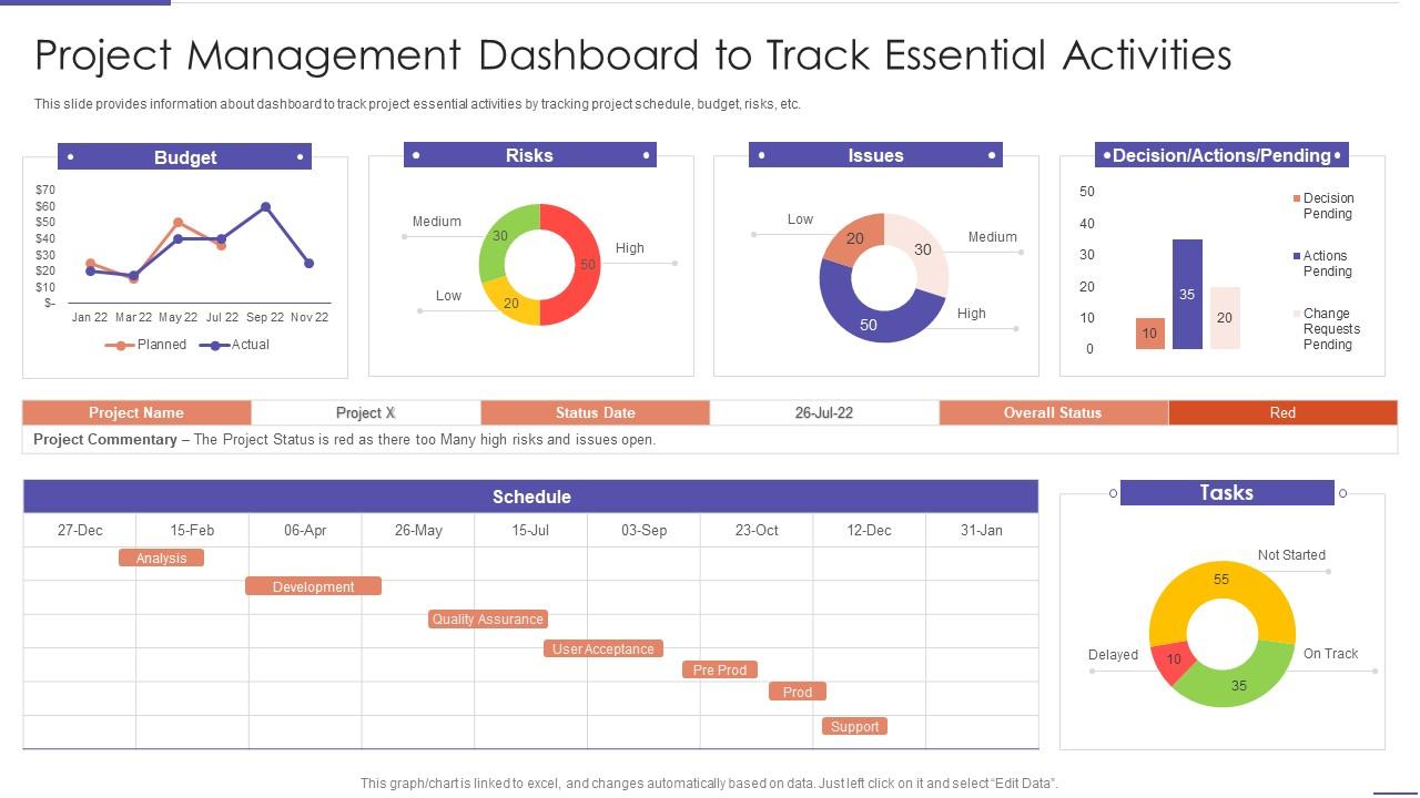
This slide provides information about dashboard to track project essential activities by tracking project schedule, budget, risks, etc. Deliver an outstanding presentation on the topic using this Project Management Dashboard To Track Essential Activities Project Planning Playbook. Dispense information and present a thorough explanation of Project Management Dashboard To Track Essential Activities using the slides given. This template can be altered and personalized to fit your needs. It is also available for immediate download. So grab it now.

FAQs for Project Management Dashboard To Track Essential Activities

Honestly, start with the basics - timeline with milestones, budget tracking, and who's doing what. Task ownership is huge because nothing's worse than "I thought you were handling that" moments. Throw in some kind of visual progress bar that executives can actually understand at a glance. Risk alerts are clutch too. Oh, and if you're juggling multiple projects, resource allocation becomes super important - like, who's overloaded and who's got bandwidth. The whole thing should answer "where are we" and "what's on fire" without making people click around forever. Build that foundation first, then add whatever your team keeps bugging you about.

Honestly, data visualization is a game changer for project management. You know how you normally waste time scrolling through endless spreadsheets? Skip that. Good dashboards show you everything at once - budget issues, timeline problems, where your team's getting stuck. Spotting problems becomes way easier before they blow up in your face. Plus stakeholders actually understand what you're showing them instead of glazing over at numbers. I started with basic charts for the stuff that mattered most. Decision-making got so much faster it's ridiculous.

Focus on the big four: timeline/milestones, budget burn rate, resource allocation, and risk indicators. Timeline shows if you're hitting deadlines. Budget burn tells you if money's disappearing too fast. Resource allocation spots where people are slammed or sitting around doing nothing. Risk indicators catch problems early - honestly, this one's saved my butt more times than I can count. If you're doing agile stuff, throw in team velocity too. But here's the thing - resist the urge to track everything. Pick maybe 5-6 metrics max and actually keep them updated, or nobody will bother checking the dashboard.

So basically, just ask each person what they actually need to see every day. Executives want the big picture stuff - budget burns, milestone status. Team members need task details and what's blocking them. Project managers? They're the worst because they want to see literally everything lol. Most dashboard tools let you create different views from the same data anyway. Set up role-based filters so people don't get overwhelmed with irrelevant stuff. Focus on what decisions they're making daily, then build views that show exactly that info. Way easier than trying to cram everything into one messy dashboard.

Power BI and Tableau are amazing if you don't mind the learning curve - seriously powerful stuff. Monday.com or Asana might be better though since their dashboards are way easier to pick up and your team probably won't hate you for it. Google Data Studio works great too, especially if you're already using Google everything. Honestly? Start with whatever feels familiar to your team. Half these projects fail because nobody wants to learn something totally new. Just make sure it connects to your data without being a huge pain. Oh, and don't overthink it - you can always switch later if it sucks.

Honestly, automated syncs are your best friend here - connect your Jira, Slack, time trackers, whatever you're using. Pull fresh data every 15-30 minutes instead of relying on people to update stuff manually (spoiler: they won't). Build in some basic validation to catch weird errors like negative hours. Oh, and make each team own their data - if they know it's their responsibility, they'll actually care about keeping it current. I do a quick sanity check on the big metrics each morning just to make sure nothing's broken.

Look, customization is what separates dashboards people actually use from the ones that just sit there looking nice. Your team will ditch it fast if it doesn't match their workflow - trust me, I've watched this happen too many times. Project managers need to see critical path stuff, while execs want the big picture view. Totally different needs, right? Here's what works: ask everyone what numbers they check every single day. Then build around that. Don't try to cram everything into one generic view because honestly, those never work anyway.

Honestly, you need a project management dashboard - it's like having everything in one place so you don't lose your mind. Everyone can see what's happening, who's doing what, deadlines, all that stuff. No more of those annoying "hey what's the update" messages every five minutes (though people will probably still send them anyway lol). The visual stuff is actually really helpful - way better than staring at boring spreadsheets. Just make sure everyone actually uses it and keeps their tasks updated. You'll spot problems early and can ditch half your check-in meetings.

Honestly, the worst thing you can do is cram everything onto one screen - users will just bounce. Those vanity metrics are trash too, like when companies show off these gorgeous charts that literally tell you nothing useful. Focus on what actually moves the needle: timeline, budget, resources, blockers. Skip the generic templates completely. Your team's workflow is probably weird in its own way (mine definitely is), so customize for that. I'd start with maybe 4-5 core metrics, then build from there based on what people actually ask for.

Yeah, most dashboards can connect through APIs or direct integrations - super straightforward. Tools like Monday.com and Smartsheet already play nice with Jira, Asana, Trello, all that stuff. If yours doesn't have a direct connector, Zapier usually fills the gaps (though honestly it's one more thing to manage). Real-time syncing is clutch when you've got it. I'd make a list of what tools you're actually using first, then see which dashboard handles the most without needing workarounds. Way easier than trying to force connections later.

Update your dashboard weekly, or daily if things move fast. Honestly, the biggest mistake I see is cramming every possible metric in there - total nightmare to read. Stick to what your stakeholders actually care about. Automate your data sources so you're not manually copying numbers and screwing up. Clean formatting helps too, makes it way easier to scan. Oh, and definitely review it monthly with your team! You'd be surprised how many widgets just sit there being useless. Don't hesitate to axe anything that isn't earning its spot.

Honestly, mobile access is a game changer for project management. Your team can update stuff on the go - whether they're at client meetings, working from home, or wherever. Real-time updates mean no more waiting around for someone to get back to their desk to approve something. Everyone stays in the loop, decisions happen faster, and nothing gets stuck in limbo. I'd definitely turn on mobile notifications for the big milestones though. Otherwise you'll miss important stuff. It's especially clutch if you've got people working remotely or traveling a lot.

Oh man, dashboards are a lifesaver for catching problems early. They track stuff like budget overruns and timeline delays in real-time. I always set up alerts so I know immediately when things go wrong - honestly can't tell you how many disasters this prevented. The visual setup makes it super easy to spot weird patterns before they blow up. You can even track how well your fixes are working, which is pretty neat. My advice? Set everything up from day one and actually check it daily instead of just glancing at it during meetings.

Honestly, KPIs are what make dashboards actually useful instead of just fancy eye candy. Pick maybe 5-7 metrics that directly connect to your project goals - stuff like budget variance, timeline stuff, team velocity. More than that and people's eyes glaze over. Figure out what "winning" looks like for your project first, then find the numbers that track whether you're getting there. I've watched so many teams build these gorgeous dashboards that don't tell you anything meaningful about project health. Short ones work better - budget on track? Timeline good? Team moving fast enough? That's the stuff that matters.

Add comment sections and rating widgets right in your dashboard - makes it way easier for people to actually give input. Schedule regular meetings where teams review the data together (otherwise it just sits there collecting dust). Set up automated alerts when metrics hit certain thresholds so people get pinged to weigh in. Simple feedback forms that pop up when project phases wrap up work great too. But here's the thing - you've gotta close the loop. Show people how their previous feedback actually changed processes or influenced current projects. That's what gets them invested long-term.

Ratings and Reviews

100% of 100
Review Form
Write a review
Most Relevant Reviews
  1. 100%

    by Harry Williams

    Fantastic collection of visually appealing PowerPoint templates. They certainly uplift the look of the presentation.
  2. 100%

    by Eddy Guerrero

    Superb! The innovative and inspiring template designs provide an edge to the presentation.

2 Item(s)

per page: