


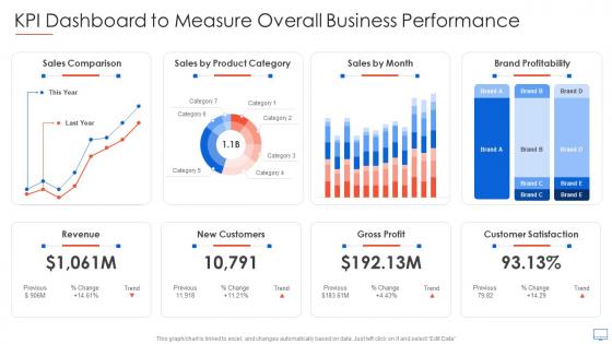
KPI Dashboard To Measure Overall Business Performance Guide For Web Developers




Try Before you Buy Download Free Sample Product
 Impress Your
 Audience
 100%
100% Editable
 Save Hours
 of Time


Our KPI Dashboard To Measure Overall Business Performance Guide For Web Developers are topically designed to provide an attractive backdrop to any subject. Use them to look like a presentation pro.
People who downloaded this PowerPoint presentation also viewed the following :
KPI Dashboard To Measure Overall Business Performance Guide For Web Developers with all 7 slides:
Use our KPI Dashboard To Measure Overall Business Performance Guide For Web Developers to effectively help you save your valuable time. They are readymade to fit into any presentation structure.





FAQs for KPI Dashboard To Measure Overall Business Performance Guide
Key components include clear visual hierarchy, relevant metrics selection, real-time data integration, intuitive navigation, and responsive design across devices. These elements work together by ensuring stakeholders can quickly identify performance trends, make data-driven decisions, and monitor progress effectively, with many organizations finding that well-designed dashboards significantly enhance operational visibility and strategic decision-making speed.
KPIs align effectively with organizational goals through strategic mapping, cascading objectives across departments, regular review cycles, and stakeholder buy-in processes. Financial services and retail organizations streamline this alignment by connecting high-level strategic targets to departmental metrics, team performance indicators, and individual contributions, ultimately delivering measurable progress tracking and enhanced accountability across all organizational levels.
Common pitfalls in KPI dashboard creation include overwhelming users with too many metrics, displaying irrelevant data that doesn't align with business objectives, poor visual design that obscures insights, lack of real-time updates, and inadequate stakeholder input during development. These issues often result in dashboards that confuse rather than clarify, with many organizations finding that simplified, strategically-focused designs ultimately deliver better decision-making outcomes.
Data visualization improves KPI dashboard interpretation by transforming complex datasets into intuitive charts, graphs, and visual indicators that enable faster pattern recognition and trend analysis. Through strategic use of color coding, interactive elements, and real-time displays, organizations streamline decision-making processes, enhance stakeholder comprehension, and ultimately deliver more responsive business strategies across departments.
Real-time data transforms KPI dashboards from static reports into dynamic decision-making tools, enabling immediate performance monitoring, instant anomaly detection, and rapid response to emerging trends or issues. With live data feeds, organizations can identify bottlenecks faster, optimize resource allocation continuously, and make strategic adjustments before problems escalate, ultimately delivering competitive advantage through enhanced operational agility.
**INPUT**: What are some best practices for selecting KPIs relevant to different industries? **OUTPUT**: Best practices include aligning KPIs with strategic objectives, ensuring measurability and actionability, focusing on leading rather than lagging indicators, and maintaining stakeholder relevance across organizational levels. Different industries emphasize sector-specific metrics, with retail tracking conversion rates and inventory turnover, healthcare monitoring patient satisfaction and readmission rates, while manufacturing focuses on operational efficiency and quality control, ultimately delivering competitive advantage. **Word count: 60 words**
User feedback shapes KPI dashboard improvement by identifying usability issues, highlighting missing metrics, revealing data visualization preferences, and uncovering workflow inefficiencies. Through regular surveys, user interviews, and usage analytics, organizations can refine dashboard layouts, add relevant performance indicators, and streamline navigation, ultimately delivering more intuitive interfaces and actionable insights that enhance decision-making across departments.
Popular KPI dashboard tools include Tableau, Power BI, Google Data Studio, Qlik Sense, and Looker, along with specialized platforms like Klipfolio and Sisense. These solutions streamline data visualization by offering drag-and-drop interfaces, real-time connectivity, and customizable templates, with many organizations finding that cloud-based options deliver faster implementation and enhanced collaboration across departments.
KPI dashboards should be reviewed daily for operational metrics, weekly for departmental performance, monthly for strategic indicators, and updated quarterly for long-term objectives. This tiered approach enables organizations to maintain real-time visibility into critical operations while strategically adjusting goals, with many companies finding that regular review cycles enhance decision-making speed and ultimately deliver sustained competitive advantage.
KPI dashboards promote accountability by providing transparent performance visibility, establishing clear ownership of metrics, enabling real-time progress tracking, and facilitating regular performance reviews. Through centralized data access, teams can monitor individual and collective contributions, identify performance gaps, and take corrective actions, with many organizations finding that this transparency drives stronger commitment to achieving strategic objectives.
Data integrity in KPI dashboards is ensured through automated data validation, regular source system audits, implementing data governance protocols, establishing clear data lineage tracking, and setting up real-time monitoring alerts. These measures streamline accuracy by detecting anomalies, preventing manual errors, and maintaining consistent data flow, with many organizations finding that robust validation frameworks ultimately deliver reliable insights and enhanced decision-making confidence.
Operational KPI dashboards focus on day-to-day metrics like production rates, customer service response times, and inventory levels, while strategic dashboards track long-term goals such as market share, revenue growth, and customer satisfaction. Operational dashboards enable managers to address immediate issues and optimize workflows, whereas strategic dashboards help executives make informed decisions about resource allocation, ultimately delivering both tactical efficiency and competitive advantage.
KPI dashboards are tailored by adjusting metrics, detail levels, and presentation formats to match each management layer's decision-making needs and time horizons. Executive dashboards focus on high-level strategic KPIs with trend summaries, while operational managers receive detailed, real-time metrics for daily oversight, ultimately enabling faster, more informed decisions across organizational levels.
KPIs reveal team performance through metrics like task completion rates, quality scores, collaboration effectiveness, resource utilization, and goal achievement percentages. These measurements enable managers to identify productivity bottlenecks, recognize high-performing individuals, and optimize workflow processes, with many organizations finding that data-driven insights ultimately enhance team efficiency and strategic outcomes.
Specialized KPI dashboards enable retail, healthcare, and finance sectors to monitor industry-specific metrics like inventory turnover, patient outcomes, and loan performance, while providing real-time insights tailored to regulatory requirements and operational priorities. These targeted solutions streamline decision-making by consolidating relevant data sources, ultimately delivering faster responses to market changes, improved compliance tracking, and enhanced competitive positioning across diverse business environments.
-
Mesmerized with the fantastic collection! Super sleek, relevant infographics.
-
Topic best represented with attractive design.