


Devops KPI Metrics Dashboard Powerpoint PPT Template Bundles





Try Before you Buy Download Free Sample Product
 Impress Your
 Audience
 100%
100% Editable
 Save Hours
 of Time


Our Devops KPI Metrics Dashboard Powerpoint PPT Template Bundles are topically designed to provide an attractive backdrop to any subject. Use them to look like a presentation pro.
People who downloaded this PowerPoint presentation also viewed the following :
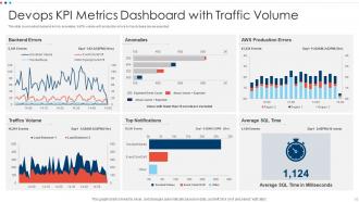
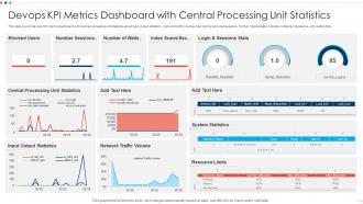
Devops KPI Metrics Dashboard Powerpoint PPT Template Bundles with all 17 slides:
Use our Devops KPI Metrics Dashboard Powerpoint PPT Template Bundles to effectively help you save your valuable time. They are readymade to fit into any presentation structure.

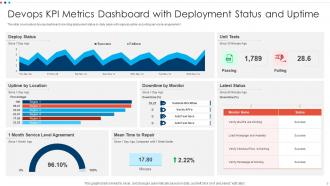
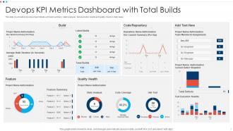
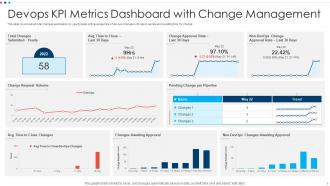
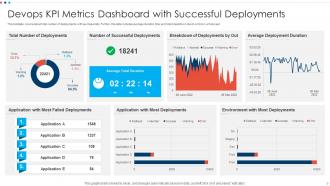






FAQs for Devops KPI Metrics Dashboard Powerpoint
Start with the DORA metrics - deployment frequency, lead time, MTTR, and change failure rate. They're basically the industry standard for a reason. Then add system uptime, code coverage, and pipeline success rates. Customer stuff matters too though - page load times, error rates, anything users actually notice. Honestly, I've seen teams go crazy trying to track like 20 different things and it just becomes noise. Pick maybe 5-7 that actually align with what you're trying to achieve. You can always expand later once you've got the basics down.
Dude, get a DevOps dashboard up and running - it's honestly a game changer for breaking down that whole dev vs ops drama. Both teams end up staring at the same metrics (deployment frequency, lead times, incident recovery rates) instead of arguing about who screwed what up. Teams naturally start working together when they can actually see where the bottlenecks are happening. The transparency is huge too. Everyone gets how their work affects the whole pipeline, not just their little corner of it. Oh, and set up regular meetings where both sides review the dashboard together - way more productive than finger-pointing sessions.
Real-time data is a game changer for DevOps dashboards. When deployment issues or performance problems hit, you want to know immediately - not three hours later when users are already complaining. Fast feedback loops mean faster fixes, which keeps everything running smoothly. Honestly, I've seen too many teams rely on stale metrics that are basically worthless for actual decision-making. Your dashboard needs frequent refreshes to be useful. Otherwise you're just looking at yesterday's mess while today's problems pile up. Security incidents especially can't wait - every minute counts when you're trying to contain damage.
First thing - figure out what your business actually wants before picking any metrics. Customer satisfaction goals? Go with deployment frequency and lead time. Cost reduction? MTTR and change failure rates are your friends. Most teams mess this up by tracking everything at once. Seriously, I've seen dashboards that look like airplane cockpits. Pick 3-4 metrics that leadership gives a damn about, prove they're useful, then add more later. Here's what worked for me: get everyone in a room, hash out what "winning" looks like, then reverse-engineer the metrics from there. Way easier than guessing.
Honestly, data overload is gonna be your biggest headache. You'll have metrics everywhere - different tools, different teams calling the same thing by different names. Like, what even counts as a "deployment failure" anyway? Pick 4-5 metrics that actually move the needle for your business. Skip the vanity stuff that just looks pretty. Grafana or DataDog work great for pulling everything into one place, but first get everyone to agree on what things mean. Watch trends, not just raw numbers. Your dashboards should tell a story - random charts scattered around help nobody.
So basically, a DevOps KPI dashboard shows you what's happening with your CI/CD pipeline in real time. Super helpful for catching issues before they blow up your deployments. Build success rates, deployment frequency, lead times - all that stuff gets tracked in one spot. Honestly makes it way easier to see if you're actually getting faster at shipping code or just telling yourself you are. Your team stays more accountable too, which is nice. Oh, and don't go crazy with metrics at first - pick maybe 3 or 4 that actually matter to your setup, then add more later.
Your DevOps dashboard basically becomes this smart system that actually watches things for you instead of just sitting there. No more manually digging through metrics - you'll get pinged when deployment failures jump or lead times go crazy. Honestly, catching problems before they blow up is worth it alone. The cool part? It spots patterns across sprints and can even predict where you might hit bottlenecks later. Saves your team from the boring report-building stuff too (which everyone secretly hates). I'd start with alerts on your most critical metrics first.
Split your dashboard into two sections - hard metrics like deployment frequency on one side, soft stuff like team surveys on the other. Make them equally visible or people ignore the qualitative feedback (which is honestly the most valuable part). Traffic light indicators work great for team health - way easier than dense paragraphs. You can even score sentiment to make the fuzzy data feel more concrete. Oh, and actually schedule time to talk through both the numbers AND what's happening behind them, otherwise it's just pretty charts no one acts on.
So SLIs and SLOs basically turn your messy dashboard into something that actually shows if users are having a good time. You're not just staring at random uptime percentages anymore - you're tracking stuff that matters, like keeping API responses under 200ms or hitting 99.9% availability. It's way better than those vanity metrics we used to obsess over (guilty as charged). Your dashboard starts focusing on user experience instead of just "is the server still breathing?" When an SLO goes red, boom - your team knows what to fix first. Start small though. Pick maybe 2-3 key SLIs that'll actually make users angry if they break, then set realistic targets around those.
Red and orange alerts are your best friend here - they jump out immediately when something's wrong. I always set up different levels like warning vs critical because not everything needs to be a five-alarm fire, you know? Make sure anomalies automatically trigger these visual cues when your metrics hit certain thresholds. Trend arrows next to the numbers are clutch too since you can see if things are improving or tanking. Bold borders work great for this stuff. The goal is spotting problems in under 5 seconds of glancing at the screen.
Honestly, Grafana + Prometheus is your best bet for DevOps dashboards - they're pretty much the industry standard at this point. If you want something more hands-off, Datadog or New Relic are great but they'll definitely hit your wallet harder. You can pull CI/CD metrics straight from Jenkins, GitLab, or GitHub APIs. Oh, and the ELK stack is perfect for digging into logs and tracking errors. My advice? Start small with one tool first. Get your basic metrics working - deployment frequency, lead time, MTTR - then build from there. Don't try to set up everything at once or you'll just overwhelm yourself.
So for your dashboard, definitely track the main DORA metrics - deployment frequency, lead time, change failure rate, and recovery time. Basically how fast you ship stuff and how often it breaks. But honestly? Don't stop there. Throw in some business metrics too like customer satisfaction or revenue impact. Technical numbers are cool but they're kinda meaningless without context. Start with maybe two metrics and automate the data collection if you can. Oh, and look at monthly trends instead of obsessing over daily changes - that'll drive you nuts. Keep it simple at first.
Honestly, you've gotta do KPI reviews way more often than most people think - monthly if you can swing it, quarterly bare minimum. I'd start by getting everyone in a room (or Zoom, whatever) to figure out if what you're measuring actually matters anymore. Business stuff changes so damn fast, and I've literally watched teams obsess over metrics that became pointless like six months ago. Set up some kind of regular check-in between your DevOps folks and the business side. Write down why each metric exists and what it's supposed to accomplish. When priorities shift, your KPIs need to shift too. Just schedule the first meeting this week and go from there.
Honestly, good UX is what separates dashboards people actually use from ones that just look nice in demos. Make navigation dead simple - nobody's got time to click through a maze just to check deployment stats. Different roles need different views, so build that in from the start. Developers and ops folks care about totally different metrics. Color coding should be consistent, and for the love of all things holy, make alerts pop visually so you can't miss them. Oh, and don't forget mobile - half your team will be checking this stuff from their phones anyway. Tooltips help too when someone needs quick context without opening another tab.
Oh man, don't cram everything onto one screen - I've seen dashboards that look like airplane cockpits and they're useless. Skip the vanity metrics too, like those impressive numbers that don't actually help anyone make decisions. Your dev team wants completely different stuff than what the C-suite cares about, so think about who's actually using this thing. Also make sure your data updates often enough to matter (stale data is basically pointless). Honestly, just start with maybe 3-5 metrics that actually move the needle for your goals. You can always add more later once you've got those dialed in.
-
“I required a slide for a board meeting and was so satisfied with the final result !! So much went into designing the slide and the communication was amazing! Can’t wait to have my next slide!”
-
I am really satisfied with their XYZ products. Used their slides for my business presentations and now I am taking their help for my son's high-school assignments. Super satisfied!!