

Headcount Growth Employee Overview Dashboard




Try Before you Buy Download Free Sample Product
 Impress Your
 Audience
 100%
100% Editable
 Save Hours
 of Time


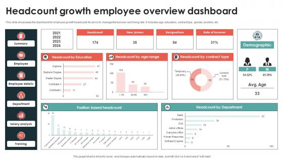
This slide showcases the dashboard for employee growth headcount. Its aim is to manage the turnover and hiring rate. It includes age, education, contract type, gender, position, etc.
People who downloaded this PowerPoint presentation also viewed the following :
Headcount Growth Employee Overview Dashboard with all 10 slides:
Use our Headcount Growth Employee Overview Dashboard to effectively help you save your valuable time. They are readymade to fit into any presentation structure.









FAQs for Headcount Growth
Start with total headcount, then slice it by department, location, and full-time vs contractors. New hires and terminations are obvious ones. Turnover rate is huge - executives love that number for some reason. I'd definitely add headcount trends over time so you can catch weird patterns. Open positions and recruiting pipeline stuff helps too. Oh, and diversity metrics if your company's into that. Charts make everything look way better than spreadsheets. Keep the data fresh or people will call you out on it. Honestly, start simple and build from there based on what everyone keeps bugging you about.
So basically, an Employee Headcount Dashboard shows you hiring patterns and turnover rates visually instead of drowning in spreadsheets. Way easier to spot trends. You'll catch seasonal hiring spikes, see which departments are growing like crazy, and track if retention is actually getting better. The timeline view is clutch for connecting workforce changes to business events or market stuff. Plus you can spot red flags early - like when people suddenly start bailing. I'd definitely track 12-18 months of data though, otherwise the trends won't mean much.
Honestly, dashboards are so much better than drowning in spreadsheets all day. You can see everything at once - headcount, turnover, hiring progress, whatever you need. Your boss won't bug you for custom reports every week because they can just look themselves. Real-time updates keep everyone on the same page too. I'd start with maybe 3-4 metrics you already check anyway, then add more later. It's kind of addictive once you get used to seeing patterns jump out at you. Way faster for spotting trends when you're trying to make decisions quickly.
So basically, these dashboards show you what's happening with your team in real time - who's coming, who's going, where you need more people. Super helpful for spotting problems early, like if one department keeps losing people or you're about to get slammed without enough staff. You can actually plan ahead instead of just reacting to chaos (which honestly feels like most of HR sometimes). The data helps with budgets too since you'll see growth patterns and can forecast hiring needs. Pro tip: set up alerts for the big stuff so you don't miss anything important.
Honestly, I'd go with Power BI for headcount dashboards. Connects super easily to your existing HR systems and Excel files. Tableau's incredible but probably way too much tool for basic headcount stuff - feels like using a Ferrari to drive to the grocery store. Google Data Studio's solid too and free, which your finance team will definitely appreciate. Start by figuring out what you actually need to track though. Department headcounts, turnover, new hires, that kind of thing. Then just pick whichever tool talks nicest to your current data setup. Power BI usually wins there.
Dude, demographic breakdowns are a game changer - you'll catch patterns that raw numbers totally hide. Like maybe your marketing team is all 25-year-olds or certain departments have terrible retention for women. Pretty wild what you discover. Age groups clustering in weird places, diversity efforts that aren't actually working at higher levels, turnover rates that vary like crazy by demo. Honestly helps you make way better calls on recruiting and retention stuff. I'd throw maybe 2-3 key demographics into whatever dashboard you're using now and just see what jumps out. Fair warning though - once you start looking at this data, you can't unsee some of the gaps.
You definitely need turnover data on there. Can't just track who's joining - gotta see who's bailing too. Track voluntary vs involuntary separately, that's huge. Break it down by department so you can spot which teams are hemorrhaging people. Monthly turnover rates are your friend here, plus how long it takes to backfill roles. Trust me, execs eat this stuff up when they see retention numbers. Without it you're basically guessing at your hiring needs. Oh and it'll save you from those awkward "why didn't we see this coming" conversations when half a team quits.
So the HR integration thing basically pulls all your employee data straight into the dashboard automatically. No more manual updates every time someone gets hired or quits - it just happens. Honestly, if you've ever had to deal with those nightmare headcount spreadsheets, you'll love this. You get real numbers by department, location, whatever, without waiting around or finding weird discrepancies later. Oh and connect your HRIS first, then maybe add payroll if you want the really detailed stuff. Trust me on this one.
Honestly, those headcount dashboards are pretty clutch for tracking diversity stuff. You can break down representation by gender, ethnicity, age - whatever you need across different departments and levels. Makes it super easy to spot where you're missing people or if certain groups are stuck in lower roles. Way better than digging through endless spreadsheets, trust me. The visual format makes patterns jump out at you immediately. I'd probably set up monthly automated reports so your D&I team can catch trends early and pivot strategies before things get worse. Plus it helps with setting realistic hiring targets based on actual data.
Honestly, the worst mistake is shoving way too much data onto one screen. Users get overwhelmed and can't find anything useful. Focus on metrics that actually help people make decisions - sounds obvious but you'd be surprised how often this gets ignored. Also heads up about data lag - headcount stuff sometimes takes forever to update in systems, so just tell people upfront. Oh and different users want totally different things. HR needs all the detailed breakdowns while execs just want the big picture trends. I'd start by actually talking to your main users first, figure out what questions they're really trying to answer.
So start by mapping out who actually needs to see what - managers should only see their team, HR gets the company-wide view, execs see everything. Role-based permissions are your friend here. Don't show personal stuff beyond basic headcount numbers. Trust me, I've watched dashboards turn into total chaos when everyone has access to everything (nightmare to clean up later). Keep it simple - different permission levels for different roles. Also check if your company has any data policies you need to follow. Build the access controls from the ground up based on actual need, not just seniority.
Dude, real-time data is a total game-changer for headcount stuff. You'll catch problems right away instead of waiting weeks for those boring monthly reports. Like if turnover suddenly spikes in one department or you're about to blow your budget - you know immediately. Makes workforce planning way less stressful honestly. You can actually get ahead of issues instead of scrambling to fix them later. Set up alerts for whatever metrics matter most to your team (trust me on this one) so you're not glued to dashboards all day. Being proactive beats reactive every single time.
Honestly, those headcount dashboards are pretty clutch for staying compliant. You get real-time tracking of overtime limits, staffing minimums, break schedules - all that regulatory stuff across your locations. Super handy during audits too. The best part? It flags issues before they blow up, like when someone's hitting max hours or you're running dangerously understaffed. Reports generate way faster than doing everything manually. I'd definitely set up alerts for the common triggers so you're not babysitting the system 24/7. Game changer, especially if you've got multiple departments to juggle.
Focus on visual hierarchy and progressive disclosure first. Put your big picture stuff up top - headcount, growth rates, department splits. Users can drill down from there into locations, roles, whatever. I've watched so many people absolutely bomb this by shoving everything onto one screen. It's chaos. Keep colors simple - green for good, red for bad, you know the drill. Make your filters easy to spot and ensure the data loads fast. Oh, and test it with real users before going live. They'll catch stuff you'd never think of.
Honestly, just throw a quick rating widget right on each dashboard page - thumbs up/down takes maybe 30 seconds to set up and people will actually use it. Monthly walkthroughs work great too where your stakeholders can point out confusing stuff in real time. I'd probably start with something super simple first though. Maybe add a comment box later if the ratings aren't giving you enough detail? The main thing is making it so easy that people don't have to leave what they're doing. Once you get that feedback flowing, you can always build on it.
-
Very unique, user-friendly presentation interface.
-
I faced no difficulty while searching for the slide I wanted. Honestly, the website’s interface is easy to use and can be navigated easily!