

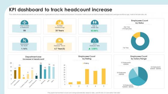
KPI Dashboard To Track Headcount Increase




Try Before you Buy Download Free Sample Product
 Impress Your
 Audience
 100%
100% Editable
 Save Hours
 of Time


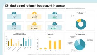
This slide shows dashboard which can be used by organizations to track headcount increase. It includes metrics such as total increase in headcount, average workforce age, male to female ratio, etc.
People who downloaded this PowerPoint presentation also viewed the following :
KPI Dashboard To Track Headcount Increase with all 7 slides:
Use our KPI Dashboard To Track Headcount Increase to effectively help you save your valuable time. They are readymade to fit into any presentation structure.





FAQs for KPI Dashboard To
Honestly, just pick 5-8 metrics that actually move the needle for your business. Revenue growth, customer acquisition cost, conversion rates - the obvious stuff that matters. Don't fall into the trap of tracking everything under the sun because then nobody pays attention to anything. Mix it up with some forward-looking metrics (like lead gen or traffic) and backwards-looking ones (actual sales). I always tell people to start with their biggest goal first, then figure out what drives that number. Way easier than trying to boil the ocean with dashboards that look like NASA mission control.
Dude, good visual design is a game changer for KPIs. Color coding and smart layouts instantly show what's important - your eye just goes there naturally. Charts make trends super obvious, and those red/green status indicators? Perfect for quick checks. I always group similar metrics together so people don't have to mentally connect everything themselves. Honestly, some dashboards I've seen are just data chaos - like someone threw numbers at a wall. But when you do it right, stakeholders get the story immediately. Oh, and stick to 2-3 colors tops. Put your biggest KPIs front and center.
Honestly, just pick KPIs that actually matter for your industry. Retail? Focus on conversion rates and customer lifetime value. Manufacturing needs OEE and defect rates. We got burned at my last SaaS gig obsessing over vanity metrics instead of tracking MRR and churn properly - don't make that mistake! Financial services obviously has to balance compliance with profit metrics. Start small with maybe 3-5 that your team can actually move the needle on. Way too many companies track stuff that looks impressive in slides but doesn't help anyone make real decisions.
First thing - figure out who actually owns what data and stick to ONE source per metric. Don't pull sales numbers from three different systems or you'll go crazy trying to reconcile everything. Set up automated quality checks because honestly, manual verification never happens consistently. Regular audits are your friend for catching weird spikes or drops early. If people are entering stuff by hand, train them properly upfront (saves so much headache later). Oh, and make data accuracy everyone's job, not just something you dump on IT. I've watched perfectly good dashboards turn into garbage because nobody bothered checking if the inputs made sense.
You really need real-time data for KPI dashboards - otherwise you're finding out about problems way too late. Think of it like driving while staring at your rearview mirror, which is honestly terrifying when you think about it. With live updates, your team can jump on issues immediately and pivot when needed. Quick decisions become possible. Customer problems get handled fast. The whole point is staying agile, right? Just make sure your dashboard actually refreshes often enough to be useful for decisions, not just looking pretty for meetings.
Just build different views for different people based on what they actually need to see. Executives want the big picture stuff - revenue trends, customer costs, that kind of thing. Sales teams need to dig into pipeline data and see how they're performing individually. Marketing will obsess over campaign ROI and lead quality (seriously, they love that attribution stuff). Operations cares about efficiency and where things are getting stuck. Ask each group what decisions they're making every day, then design dashboards around that. Don't dump everything on everyone - it's just noise at that point.
Don't cram everything onto one screen - I learned this the hard way when my first dashboard looked like mission control. Pick 5-7 metrics that actually tie to business goals, not just stuff that sounds impressive. Users get overwhelmed fast without clear focus. Make sure your data updates often enough to matter. Oh, and actually think about who's using this thing daily - what do they need to get their job done? Vanity metrics are tempting but useless if they don't help decisions. Start small, then add more later.
Honestly, dashboards are game-changers because you can see what's actually moving the needle vs what's just busy work. No more guessing if that new campaign worked or arguing with your team about results - the numbers don't lie. You'll catch problems before they blow up and spot opportunities way earlier. The trick is being picky about your metrics though. I'd start with maybe 5-6 KPIs that directly connect to your main business goals. Don't go overboard with fancy charts at first - just focus on the stuff that actually matters to your bottom line.
Honestly depends on your budget and how techy you are. Tableau and Power BI are crazy powerful but have a learning curve - worth it though if you're handling big datasets. Looker Studio's free and pretty decent for most stuff. Excel works but gets messy real quick with live data (learned that the hard way). I've actually seen some impressive dashboards built in Google Sheets when people are just testing things out. Grafana's solid too if you're into that. Start with whatever plays nice with your current setup - integration headaches aren't worth it.
Check your KPIs monthly but update them every quarter - that's what works for most people anyway. Fast-moving industries might need monthly changes, but honestly? Quarterly gives you enough time to spot real trends without obsessing over every tiny shift. Daily adjustments will make you lose your mind. Set a regular schedule and actually stick to it. I block time each quarter to see if my KPIs still make sense with my goals. Sometimes you'll find ones that aren't really telling you anything useful anymore - just swap those out.
So basically, leading KPIs are like your early warning system - stuff like pipeline volume or training hours that hints at what's coming. Lagging ones? That's revenue, churn, all the stuff that already went down. For your dashboard, definitely prioritize the leading indicators since those actually let you do something about problems. I'd put them front and center with some eye-catching colors, maybe alerts too. Then toss the lagging ones underneath for reference. Most people I know do like a 70/30 split - honestly makes sense since you can't change what already happened anyway.
Your dashboard needs a story arc, not just random numbers thrown together. Start big picture, then zoom into the metrics that actually matter. I always add little notes explaining weird spikes or dips - trust me, people will ask anyway so save yourself the meetings! Throw in some trend arrows and compare to last quarter or whatever makes sense. The goal? Make it feel like you're walking someone through what happened, why it happened, and what's next. Most dashboards are honestly just confusing number dumps without any context to guide you through.
Netflix tracks viewer behavior to predict who's about to cancel - honestly pretty clever. Target's dashboards mix sales data with weather forecasts to nail inventory levels. Kaiser Permanente built patient flow systems tracking ER waits and bed counts across facilities. Manufacturing companies are going crazy with IoT dashboards showing machine health and maintenance alerts in real-time. Here's the thing though - check out what other industries are doing. They've got solutions you can totally steal for your own metrics.
Track your before and after numbers - that's the only way to know if this thing actually works. Look at how fast people make decisions, whether you're hitting goals better, and how much time gets wasted on reporting stuff. Honestly, the hardest part is figuring out what's from the dashboard versus everything else changing. But focus on the obvious wins: shorter meetings about metrics, catching problems faster, better KPI performance. Survey your team too - are they more confident making calls? I'd set your baseline now and check again in like 3-6 months. Otherwise you're just guessing.
So there's a few ways to figure this out. Check your user analytics first - login frequency, time spent browsing around, which KPIs people actually click on. That stuff tells you what's really useful vs what's just sitting there looking pretty. Surveys work great too, though sometimes people just tell you what they think you want to hear. Ask if it's actually helping them make decisions faster. The real proof though? Whether your business metrics improve after rolling it out. I usually do quarterly check-ins mixing all three methods, then tweak based on the feedback.
-
Fantastic collection of visually appealing PowerPoint templates. They certainly uplift the look of the presentation.
-
SlideTeam, Please don’t stop sharing discount coupons! I love your occasional discounts and tend to buy your products around that corner.