


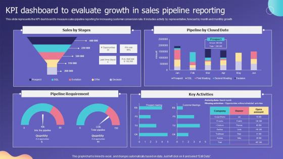
KPI Dashboard To Evaluate Growth In Sales Pipeline Reporting




Try Before you Buy Download Free Sample Product
 Impress Your
 Audience
 100%
100% Editable
 Save Hours
 of Time


This slide represents the KPI dashboard to measure sales pipeline reporting for increasing customer conversion rate. It includes activity by representative, forecast by month and monthly growth.
People who downloaded this PowerPoint presentation also viewed the following :
KPI Dashboard To Evaluate Growth In Sales Pipeline Reporting with all 7 slides:
Use our KPI Dashboard To Evaluate Growth In Sales Pipeline Reporting to effectively help you save your valuable time. They are readymade to fit into any presentation structure.






FAQs for KPI Dashboard To Evaluate Growth In
Start with KPIs that actually matter to your business goals - measurable stuff, not vanity metrics. Real-time data is crucial, plus you need visualizations that aren't confusing to look at. Filtering and drill-down features are a must so people can investigate weird spikes or dips. I swear, half the dashboards I see are just colorful decoration! Context is everything - add targets, benchmarks, comparisons over time. Otherwise your team's just staring at random numbers. Don't overcrowd the screen either. Yeah, it's tempting to show everything, but focus beats clutter every time.
Honestly, just pick 3-5 KPIs that actually matter for your goals. Like if you want more revenue, track conversion rates or average order value - not how many people visited your site (that's just ego boosting). I swear half the metrics people obsess over are totally useless. Ask yourself: "If this number improves, am I actually closer to my goal?" If not, ignore it. Oh and make sure you can influence these numbers through stuff you actually do. There's no point tracking something you can't control, right? Keep the data collection simple too.
Dude, keep your KPIs super simple. Gauge charts are clutch for showing how close you are to hitting targets. Bar charts and line graphs work perfectly for tracking stuff over time. Those red/yellow/green traffic light things are kinda cheesy but honestly they still work well for quick status checks. Don't use pie charts though - they're annoying to read fast. Your goal is making it dead simple so people can immediately see what's working or what's broken. Oh, and pick one chart style per KPI. Consistency makes everything look way cleaner across your whole dashboard.
Honestly, it depends on what you're tracking. Daily works great for stuff like sales numbers or web traffic. Strategic metrics? Maybe weekly or monthly is fine. I've seen teams get crazy with real-time updates for everything - total overkill if you ask me. Match your update schedule to when people actually make decisions. Your team does weekly reviews? Then weekly updates make sense. Oh, and don't overthink it at first. Start with whatever feels doable and tweak from there based on how often folks actually look at the thing.
Dude, you absolutely have to segment your audience for dashboards or they'll totally bomb. Your CEO wants big picture stuff and trends. Meanwhile, ops teams need nitty-gritty real-time data they can actually use. I've watched so many dashboards crash and burn because they tried pleasing everyone - honestly, it's painful to see. Figure out your main users first, then build everything around how they actually work. The drill-down features, the whole hierarchy, all of it. Start by just talking to 3-4 key people about what decisions they're making with your data.
Honestly, just think about your most confused coworker and design for them. Group similar stuff together, pick colors that make sense, don't make the text microscopic - I hate when I can't read the damn numbers! Skip the corporate jargon too. Nobody knows what "operational efficiency metrics" means anyway. Test it with real people first, not just your team. Oh, and make sure it works on phones since everyone checks everything mobile now. But here's the thing - actually ask what data people want to see. Half the dashboards I've used show metrics that literally nobody cares about.
Depends on your budget honestly. Power BI and Tableau are amazing but they'll hit your wallet hard once you scale. Google Data Studio is free and works great - especially if you're already using Google stuff. I know it sounds old school, but I've seen some decent dashboards built in Excel (not gonna win any beauty contests though). Klipfolio and Geckoboard are pretty user-friendly if you want something cleaner. My advice? Pick whatever plays nice with your current data setup first. Trust me, you don't want to deal with integration nightmares later.
Dude, real-time data integration is a total game changer for KPI dashboards. You'll catch problems the second they pop up instead of finding out days later when it's too late. Live data means you can actually pivot when things go sideways - no more making calls based on stale numbers from yesterday. Honestly, I learned this the hard way at my last job. Connect your dashboard to live sources and set up alerts for the critical stuff. That way you're not glued to your screen all day but you'll know instantly when metrics tank.
Don't cram everything onto one screen - I see this constantly and it's overwhelming. Focus on maybe 5-6 metrics that actually tie to your business goals, not vanity stuff that looks cool but doesn't help you make decisions. Like, conversion rates are pointless if they don't connect to revenue somehow. Your data needs to be current too because stale numbers just make you look incompetent. Here's my test: after each metric, ask yourself "so what?" If you can't immediately explain why it matters or what you'd do about it, ditch it. Simple beats comprehensive every time.
You gotta connect your dashboard KPIs directly to whatever your company's actually trying to achieve. Like if you're focused on keeping customers around, track churn rate and NPS - not some meaningless vanity metrics that look pretty but don't tell you anything useful. I've honestly seen way too many dashboards that measure a million things but don't tie back to actual business goals. Pretty pointless, right? Each metric should answer "does this help us hit our targets?" Also, don't just set it and forget it. Your strategy changes, so your dashboard needs to evolve too.
Honestly, I'd do quarterly reviews at minimum - monthly if your industry moves super fast. Get feedback from whoever actually uses the dashboard because they'll catch useless metrics way before you will. One thing I've learned is to track which KPIs people actually use for decisions vs. the ones they just scroll past. Those ignored ones? Cut them. Try to time your reviews with business planning cycles so everything stays aligned with whatever priorities are hot right now. Dashboards aren't set-it-and-forget-it things, they need constant tweaking.
Make that dashboard visible to everyone and link it to personal goals. I'd do regular check-ins where people can actually see how their work moves the numbers - creates some healthy peer pressure when everyone knows who's crushing it. Pick metrics that actually matter though, not just stuff that looks impressive but means nothing. Keep it fresh with frequent updates or people zone out. When someone hits a milestone, celebrate it loud. Oh and use the data for coaching conversations, not to throw people under the bus - way more effective when it's "let's figure this out together" instead of blame games.
Skip the vanity stuff that looks cool but tells you nothing - page views, follower counts, total revenue without any context. That hourly traffic data? Nobody cares about those tiny fluctuations on a dashboard. Focus on metrics tied to actual business goals that help people make decisions. I always ask myself "so what?" when I see a number - if there's no good answer, it doesn't belong there. Too granular is just noise. Stick with what actually matters for moving your business forward, not what makes pretty charts.
Honestly, I'd start with comment boxes or those little color-coded status dots next to your main numbers. Customer feedback snippets are gold - they actually explain why your metrics look the way they do. Dropdown menus work too if you want people to categorize their thoughts. Just don't go overboard with text walls (learned that the hard way). Maybe try one qualitative thing per big metric first? I'm a big fan of having a small section for team observations or stakeholder notes. Keeps things real instead of just staring at charts all day.
Tell the story behind your numbers - execs want to know what's actually happening and what they should do about it. Stick to 5-7 key metrics tops. Clean visuals work way better than cramming everything onto one screen (learned that the hard way). Start with the summary: what's working, what's broken, your recommendations. They can dig into details later if they want. Always show context like targets and trends so the numbers actually mean something. Oh, and test it with real executives first - you'll catch stuff you'd never think of. The drill-down data is crucial but don't lead with it.
-
Great templates that you can use in your next keynote or conference. They are perfect for quick and visually-engaging delivery.
-
Delighted to see unique and eye-catching PowerPoint designs that are so easy to customize.