


KPI Dashboard To Monitor Sales Performance Structuring A New Product Launch Campaign




Try Before you Buy Download Free Sample Product
 Impress Your
 Audience
 100%
100% Editable
 Save Hours
 of Time


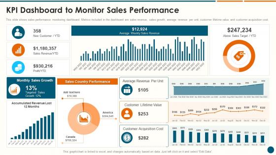
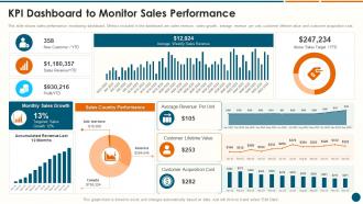
This slide shows sales performance monitoring dashboard. Metrics included in the dashboard are sales revenue, sales growth, average revenue per unit, customer lifetime value and customer acquisition cost.
People who downloaded this PowerPoint presentation also viewed the following :
KPI Dashboard To Monitor Sales Performance Structuring A New Product Launch Campaign with all 7 slides:
Use our KPI Dashboard To Monitor Sales Performance Structuring A New Product Launch Campaign to effectively help you save your valuable time. They are readymade to fit into any presentation structure.





FAQs for KPI Dashboard To Monitor Sales Performance Structuring A New
Honestly, most KPI dashboards are hot garbage because people try to cram everything on one screen. Pick your top 3 business priorities first, then build around those. You'll want maybe 5-7 metrics max that actually connect to your goals. Real-time data updates are clutch, and throw in some charts or gauges so trends jump out immediately. Oh, and this is huge - always include targets or benchmarks. Otherwise people just stare at numbers wondering if 47% conversion is amazing or terrible. Keep the visual design clean. Nobody needs seventeen different colored pie charts competing for attention.
Honestly, just pick 5-7 metrics that actually matter to your goals. Don't go crazy trying to track everything - learned that the hard way. Work backwards from what you're trying to achieve. Mix some predictive stuff with actual results. Your boss probably wants to see different numbers than your day-to-day team does, which is annoying but true. Run it for a couple weeks, then ditch anything that isn't sparking real conversations or decisions. Most dashboards end up being total vanity projects if you're not careful about this.
Ugh, the worst thing you can do is cram everything onto one screen - it's just visual chaos. Also, those 3D pie charts? Pure garbage for readability. Make sure your KPIs actually match what the business cares about, not just random metrics that look impressive. Your data needs to be fresh and accurate too, because stale numbers make you look incompetent. Oh, and remember execs want different info than managers do. I'd definitely test it with actual users first - saves you from embarrassing surprises later. Keep it focused on stuff that actually helps people make decisions.
Look, data visualization is a total game-changer for KPI dashboards. Raw spreadsheet numbers? Ugh, nobody has time to dig through all that. Charts and graphs let you spot trends instantly - like, I'm talking seconds instead of staring at rows of data forever. Color coding is clutch for showing when you're hitting targets or completely missing them. Progress bars work great too. The trick is matching the right chart to your data - use bars when you're comparing stuff, lines for tracking changes over time. Trust me, once you see how fast you can catch problems with good visuals, you'll never go back to plain numbers.
Look, you want to catch problems while you can actually do something about them, not find out your conversion rates crashed last week when it's already too late. Real-time data is a game changer for that - like if things tank on Tuesday afternoon, you'll know immediately instead of waiting for some weekly report. Honestly, static reports feel pretty useless once you get used to live dashboards. You can spot trends early, make quick decisions, and actually know what's happening right now. Oh, and definitely set up alerts for your biggest metrics so you're not constantly checking everything manually.
So basically, you pick the metrics that actually make or break your business. Retail companies obsess over conversion rates and inventory turnover - makes sense since that's their bread and butter. Healthcare's all about patient satisfaction and readmission rates. Manufacturing? They're tracking defect rates and production efficiency like crazy. Tech companies focus on user engagement and churn (honestly, churn is probably their biggest nightmare). The trick is figuring out what success looks like in your specific industry first. Then you just build the dashboard around those numbers that keep your stakeholders happy.
So for KPI dashboards, Tableau and Power BI are probably your best bet - super easy to use and they handle messy data really well. Google Data Studio is free and honestly works great for basic stuff. Now if you're into coding, D3.js or React with Chart.js will let you build whatever you want, but that's way more work. I've watched people spend weeks tweaking colors and animations when their old Excel chart was doing the job fine lol. Start with figuring out where your data lives and what you can spend. Then just pick whatever connects easiest to your existing setup.
Keep it simple and actually ask users what they think - that's the secret sauce. Show fewer KPIs at once, put the important stuff where people look first. I've seen so many dashboards that try to cram everything in and they're just... overwhelming? Test with real users regularly - their "wait, where's the..." moments are gold. Short sentences help. Don't start every bullet point the same way either. Do quarterly cleanups to ditch metrics nobody cares about anymore. Oh and visual hierarchy matters way more than you'd think.
Honestly, automate your data feeds from the start - trust me on this one. Manual updates will drive you insane and you'll definitely forget to do them. Every few months, take a hard look at your KPIs because priorities shift constantly. Make sure someone owns each metric, otherwise you'll get that awkward "I thought you were tracking that" situation. Oh, and please delete old dashboards instead of hoarding them like some kind of data packrat. But really, the biggest thing is actually using it regularly and asking your team what sucks about it. Their feedback's usually spot-on.
Start by connecting each KPI directly to what you're actually trying to achieve - like if you want better retention, focus on churn rate and NPS instead of flashy metrics that look cool but don't matter. Honestly, half the dashboards I see are total eye candy with zero impact on real decisions. Be brutal about cutting anything that doesn't drive action toward your main goals. Everyone needs to see how their numbers tie back to the quarterly targets - maybe make a simple doc that draws those connections? Otherwise people just optimize for whatever's easiest to move.
Here's what's worked for me - executives just want the big picture stuff and business impact, but your ops teams need all the nitty-gritty details they can actually do something with. Start with the "so what" instead of diving into numbers right away. Trust me, it keeps people way more engaged. Clean dashboards are everything - stick to maybe 5-7 key metrics because nobody can process more than that anyway. Visual storytelling with good charts makes a huge difference. Always throw in some context like benchmarks or where you were last quarter so people can quickly figure out if things are good or bad. Oh, and definitely end with clear next steps based on what the data's telling you.
Dude, having dashboards that actually work on your phone is a total game changer. I'm constantly checking ours now - way more than when I had to be at my desk. Quick performance checks during my commute, approving stuff while I'm out, catching problems early. Your whole team gets the same real-time data instead of relying on stale email updates from yesterday. Everyone's making better decisions because of it. Honestly, test yours on mobile first - if it sucks to use, fix that before anything else. You'll be surprised how much more you actually use it.
Honestly, start with the big four: revenue growth, profit margins, cash flow, and burn rate if you're not making money yet. Customer acquisition cost and lifetime value are clutch too - I swear those two have gotten me out of so many awkward investor meetings when numbers looked weird. For B2B stuff, throw in accounts receivable turnover. But seriously, don't go crazy with metrics or you'll drown in data. Six to eight max is plenty. You can always add the fancy industry-specific ones later once you've got these basics dialed in.
So KPI dashboards are pretty great - they turn all your team's numbers into visuals that actually make sense. No more scrambling through spreadsheets during those awkward monthly meetings (you know the ones). Your team can see in real-time who's killing it and where someone might need backup. Plus people can connect their daily work to the bigger picture, which honestly makes everyone feel more invested. You'll catch problems before they blow up and celebrate wins right when they happen. Oh, and start small - pick like 3-5 metrics that genuinely matter to your team's success.
Honestly, visual storytelling is a game-changer for getting people to actually care about your KPI data instead of glazing over when they see another spreadsheet. Walk them through the story - here's the problem, here's what we found, here's what it means for us. Way better than just dumping numbers on them, right? I've noticed meetings go so much smoother when everyone gets the narrative flow. Plus decisions happen faster since people aren't confused about what they're looking at. Structure your dashboard logically and put the biggest insights up front where they can't miss them.
-
Great templates that you can use in your next keynote or conference. They are perfect for quick and visually-engaging delivery.
-
SlideTeam is my one-stop destination for templates. Highly recommended!