


Product performance dashboard new product performance evaluation


Try Before you Buy Download Free Sample Product
 Impress Your
 Audience
Editable
of Time


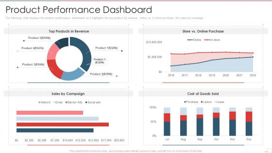
The following slide displays the product performance dashboard as it highlights the top product by revenue, online vs in store purchase, the sales by campaign
People who downloaded this PowerPoint presentation also viewed the following :
Product performance dashboard new product performance evaluation with all 7 slides:
Use our Product Performance Dashboard New Product Performance Evaluation to effectively help you save your valuable time. They are readymade to fit into any presentation structure.


FAQs for Product performance dashboard new
Honestly, start with user stuff - DAU/MAU, how long people stick around, which features they actually use. Then track the money side: revenue, conversions, churn rates. Don't forget the boring but crucial health metrics like load times and error rates. Cohort analysis is where things get interesting though - that's what shows you the real patterns. Oh, and focus on leading indicators like sign-ups, not just the lagging revenue stuff. Balance what your stakeholders want to see with metrics that actually tell you if things are working. Maybe 8-10 core ones so you don't drown everyone in spreadsheets.
Dude, visuals are a game changer for product data. Charts and heat maps let you spot patterns way faster than scrolling through endless spreadsheets. Heat maps show exactly where users click most, and line charts track your KPIs over time - honestly beats staring at numbers any day. You'll see which features actually work and where people bail out. I probably spend too much time playing with different chart types, but whatever. Just start with your biggest metrics first and pick whatever visual tells the story best.
Ugh, data inconsistencies will be your worst enemy. Sales updates hourly but customer feedback is real-time? Good luck with that mess. Plus every source uses different formats - marketing's idea of a "lead" is totally different from what sales calls one. API rate limits will slow you down too, which is honestly the most annoying part. Oh, and naming conventions are all over the place. Start by mapping your data sources first though. Figure out what refresh rates you actually need vs what sounds cool but isn't worth the headache.
So basically you can drag and drop widgets around to show whatever metrics actually matter to you. Most dashboards these days have pretty solid filtering - you can slice by product, user segments, date ranges, whatever. I'd start by figuring out your top 3-5 numbers that actually drive decisions, then build around those. You can set up alerts too when things hit certain thresholds, which is clutch. Oh and save different views - like I have one for weekly check-ins and another for quarterly stuff. The customization options are honestly way better than they used to be.
Honestly, real-time data makes or breaks a dashboard. You want to catch problems as they're happening, not find out about them three days later when it's too late to fix anything. It's like... imagine driving but only checking your speed after you get home - totally useless, right? Old data means you're always playing catch-up. Missed chances, bigger problems, the whole mess. Just make sure your data sources can actually handle live updates first. I've seen too many dashboards that claim "real-time" but are basically showing yesterday's news.
Check if people are actually logging into the thing first - empty dashboards are basically expensive paperweights. Decisions should happen way faster once you've got good data flowing. I've watched teams slash their meeting time because they weren't debating basic numbers anymore. Are you spotting problems before they blow up? That's huge. Cross-team stuff should feel less chaotic too. Honestly though, just ask your stakeholders straight up - do they feel better about making calls now? Throw together a quick survey after 3 months. Sometimes the soft stuff matters more than the metrics.
Set up daily pulls for sales stuff, then do weekly deep dives into the other metrics. APIs are your friend here - manually downloading data every day will make you want to quit lol. Clean house regularly by ditching KPIs that aren't useful anymore and adding new ones as things change. Alerts save your butt when something goes sideways. Oh, and actually sit down with your team to review this thing! Half the dashboards I've seen are just pretty charts nobody looks at. Figure out what's actually helping people make decisions vs what's digital clutter.
Honestly, user personas are everything when building dashboards. They decide which metrics matter, how you lay things out, even your chart types. Executives need quick KPI overviews they can scan fast. Product managers? They want detailed data to dig into. I've watched so many teams just throw every metric possible onto one screen - total disaster. Nobody uses them. Map each section to actual user workflows instead. Like, what does Sarah from marketing really need to see first thing Monday morning? Build for that person, not some imaginary "general user." You'll end up with something people actually open daily.
Tableau and Power BI are your best bets if you need something heavy-duty - they crush complex data and the visualizations look solid. Google Data Studio works too, plus it's free which is clutch for smaller budgets. Got a technical team? Grafana or custom D3.js builds give way more flexibility. But honestly, the tool's not even the main thing - you need clean data coming in and actual clarity on which metrics matter. I'd just start with whatever your team already uses, then level up once you've shown the dashboard actually helps people make better calls.
Honestly, having a dashboard that shows how your features are actually performing is a total game-changer. You can see which ones users love and where they're dropping off - way better than just guessing what's working. Real-time data means you'll spot problems before they blow up and can fix roadmap priorities based on what's actually moving your KPIs. I'd definitely set up alerts for the important metrics too. Flying blind with just gut feelings is rough, especially when you could be making decisions backed by real user behavior instead.
Look, bad data will mess up literally every decision you make from that dashboard. I learned this the hard way when our conversion rates were totally off for like three weeks. Your stakeholders will stop trusting you super fast if they catch wrong numbers - and they always do, usually in the most important meetings. Good data lets you spot real trends and actually know where problems are happening. But when it's unreliable? You'll be chasing fake issues and missing the stuff that actually matters. Set up some alerts for weird spikes and double-check your sources regularly.
Honestly, just get everyone in a room with the actual dashboard and real data. Way more effective than PowerPoint hell. Tailor what you show each team - sales cares about revenue, product wants user metrics, you know? Screen-sharing sessions work great because people can ask questions in real time instead of pretending they get it. Oh, and definitely set up office hours for like a month after. Trust me, questions will come up. Pick someone on each team to be the go-to person - they'll catch issues you miss and can help their teammates without bugging you constantly.
So basically just throw some A/B test widgets right into your main dashboard - show conversion rates, which version won, all that good stuff. Those green/red winner indicators are honestly my favorite part because you can spot successes instantly. Also try overlaying your historical test data on your regular metrics so you can actually see how past experiments moved the needle. Oh and don't keep this stuff buried in some separate testing tool - it should live with your other KPIs. Makes way more sense that way. Start small though, just add one simple test widget this week and build from there.
Honestly, real-time AI insights are where everything's heading - dashboards that actually spot problems and tell you what to do about them instead of just dumping charts on you. Teams are also demanding way more self-service stuff so they don't have to wait around for IT to build every little widget. Mobile-first is finally happening (took long enough). Plus everyone expects integration with feedback tools and social listening now, not just your basic metrics. I'd probably take a hard look at what you've got versus these features. You might be surprised how dated your setup looks compared to what's out there.
Get regular user interviews going and throw in some feedback widgets. Usage analytics will show you where people bail out - that's gold. Here's the thing though: everyone's gonna have hot takes about button colors and fonts, but ignore most of that noise. What you really want is feedback about missing data, confusing charts, or stuff that actually blocks their work. I'd say start with quarterly reviews? Then just prioritize based on how many users are hitting the same wall and whether it hurts the business. The workflow blockers always win over cosmetic stuff.
-
Informative design.
-
Best way of representation of the topic.