


Product Performance Dashboards Annual Product Performance Report Ppt Rules


Try Before you Buy Download Free Sample Product
 Impress Your
 Audience
Editable
of Time


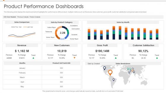
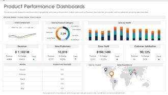
The following slide displays the dashboard which highlights the performance of the product, multiple metrics such as Revenues, New customer, gross profit, customer satisfaction and global sales breakdown.
People who downloaded this PowerPoint presentation also viewed the following :
Product Performance Dashboards Annual Product Performance Report Ppt Rules with all 7 slides:
Use our Product Performance Dashboards Annual Product Performance Report Ppt Rules to effectively help you save your valuable time. They are readymade to fit into any presentation structure.


FAQs for Product Performance Dashboards Annual Product Performance
Focus on metrics that actually matter for your product. Daily/monthly active users and retention rates show if people care. Business stuff like revenue per user and churn rate matter too. Oh, and don't ignore technical metrics - slow load times will tank everything else. I've seen way too many dashboards that are just metric soup. Nobody looks at 47 different numbers. Stick to maybe 6-8 KPIs your team actually checks. Pick ones tied to your goals that'd make you panic or celebrate if they shifted. Feature adoption rates are underrated btw.
Charts and graphs are total game-changers for understanding your product data quickly. Instead of drowning in spreadsheets, you can spot trends right away with heat maps and color coding. I'm telling you - conversion funnels become so much clearer when visualized. You'll actually see where users drop off instead of guessing from raw numbers. Bar charts work great for comparisons, line graphs for tracking changes over time. Progress bars are clutch for showing goal completion too. Start with your most important metrics and pick visuals that make sense for each one. Way better than staring at endless rows of data all day!
So for product dashboards, Tableau and Power BI are probably your best bet if you need heavy-duty stuff, but honestly the learning curve kinda sucks. Looker Studio's way easier if you don't need anything too crazy. Mixpanel's solid for product metrics specifically. We actually ended up using Grafana at my last job and it worked fine - sometimes the simple route is better than going overboard. Even Google Sheets can work if you set it up right (though your data team might judge you lol). Really depends what systems you're pulling from. I'd start there and see what plays nice together. No point getting the fanciest tool if your team won't touch it.
Honestly, daily updates are your sweet spot for dashboards - real-time is even better if you can swing it. Weekly is bare minimum territory though. Any less and you'll miss stuff that actually matters. Just don't become that person refreshing every 5 minutes (guilty as charged). Match your update schedule to how often your team makes decisions. Daily decisions = daily updates. Weekly strategy reviews? Weekly works fine. I'd start with daily and see what sticks based on how people actually use the thing.
Honestly, user feedback is everything for dashboards. Most people build what they think users want, but executives need totally different stuff than product managers or support teams. I've watched so many beautiful dashboards just sit there unused - such a waste of time. Survey your main users first about their daily decisions and what frustrates them. After you launch, keep checking what's actually getting used. Treat the whole thing like you're building a product. Iterate based on real feedback, not your gut feeling about what looks good.
Honestly, data storytelling is a game changer - it turns those messy dashboards into something people actually understand. You're basically walking them through what the numbers mean instead of dumping a bunch of charts and hoping for the best. Like, nobody wants to stare at random metrics trying to figure out what's going on. Connect the dots for them! Show why that spike happened or what caused the dip. I'd start small - just add some callout boxes explaining the weird stuff in your current dashboard. Once people see the "why" behind the data, they'll actually do something about it.
Dude, don't cram everything onto one screen - people get overwhelmed and just give up. Also, skip the vanity metrics that make you feel good but don't actually help anyone decide anything. I swear, half the dashboards I see are obsessed with page views when conversion rates are what actually matter. Make sure it refreshes often enough to be useful. Context is huge too - throw in some time comparisons or benchmarks so people know if numbers are good or terrible. Oh, and start by asking what decisions people need to make first, then work backwards.
Honestly, connect everything to one main source - your data warehouse, not random places. I set up validation checks that catch weird stuff like sudden spikes. Trust me, I once had a dashboard showing conversion rates doubled overnight and freaked out for nothing. Spot-check your math manually sometimes against the raw data. Alerts help when metrics go crazy outside normal ranges. Oh, and timestamps on dashboards are clutch so people know if they're looking at yesterday's numbers or last week's.
Marketing dashboards are all about those top-funnel numbers - campaign performance, lead gen, cost per acquisition. Sales teams? They want the bottom-funnel stuff. Pipeline health, conversion rates, deal velocity. I've actually seen teams get into arguments over shared dashboards lol. Marketing gets excited about impression numbers while sales just wants to know which leads are closing deals. You'll save yourself so much headache by creating separate views for each team. Match the dashboard to what they actually care about day-to-day instead of forcing everyone to use the same thing.
Honestly, you gotta split that dashboard up by who's actually using it. Executives just want the big picture stuff - clean KPIs and trends. Product managers need to see feature adoption and user feedback. Engineers? They're all about performance metrics and error rates. I made this mistake once and built this monster dashboard that literally nobody liked lol. Either create different views for each group or just make separate ones entirely. Also think about how each person actually works - execs love those pretty charts, but analysts want tables they can really dig into. Just ask each group what decisions they're trying to make first, then work backwards.
Honestly, just pick the metrics that actually matter for decisions - don't throw every random data point on there. Set up alerts for the critical stuff, like when conversion rates tank or your servers start choking. Most metrics can refresh every 15-30 minutes, but the really important ones should update more often. Just make sure your data sources can handle it without crashing (learned that one the hard way). The key thing though? Define what to DO when each metric changes. Otherwise you'll just have a pretty dashboard that nobody acts on.
Set up side-by-side sections for your test variants with conversion rates, confidence intervals, and statistical significance. Make the winning variant super obvious - people hate squinting at tiny numbers to figure out what won. Timeline views are clutch so stakeholders can see how things played out over time. Sample sizes matter too since they show if your data's actually reliable. Oh, and definitely include status indicators (running/done/launched) because there's nothing worse than presenting results from a test that's already been implemented. Bottom line: make it brain-dead simple to see which version crushed it.
Start with role-based access so only the right people see sensitive stuff. Connect it to your company's SSO and stick with view-only permissions unless someone actually needs to edit. Data masking is clutch - hide real revenue numbers or customer names if external folks will see it. Don't accidentally leak competitive info either! Turn on audit logs to track who's looking at what. Honestly, some companies get way too loose with this. Just treat your performance data like it's worth protecting because it definitely is.
Dashboards help you catch trends you'd totally miss otherwise - like when user engagement starts tanking before it hits your revenue. I'd set up alerts for the big stuff so you're not scrambling later. Honestly, most teams only check these during quarterly reviews which is nuts. You should be looking weekly at least. Track things like feature adoption rates since they'll tell you where you're headed way before the money metrics do. Oh and connect everything to actual business outcomes - if retention drops 15%, that's your cue to fix user experience instead of building new features.
Yeah, mobile dashboards are a must-have these days. Most product decisions happen when you're away from your computer anyway - stuck in some meeting or working from a coffee shop. People expect to check metrics on their phones now, and honestly, we're all scrolling constantly so might as well put it to good use. The trick is not cramming everything onto that tiny screen though. Pick your top 3-5 KPIs that actually matter for decisions and build the mobile view around those. I learned this the hard way after trying to fit like 12 charts on one screen - total disaster.
-
Unique design & color.
-
Easily Editable.