


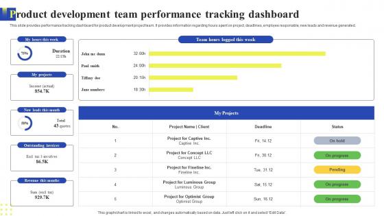
Product Development Team Performance Tracking Dashboard




Try Before you Buy Download Free Sample Product
 Impress Your
 Audience
 100%
100% Editable
 Save Hours
 of Time


This slide provides performance tracking dashboard for product development project team. It provides information regarding hours spent on project, deadlines, employee responsible, new leads and revenue generated.
People who downloaded this PowerPoint presentation also viewed the following :
Product Development Team Performance Tracking Dashboard with all 7 slides:
Use our Product Development Team Performance Tracking Dashboard to effectively help you save your valuable time. They are readymade to fit into any presentation structure.





FAQs for Product Development Team
Start with KPIs that actually move the needle - not vanity metrics. Real-time data's crucial, plus visualizations that won't make everyone's brain hurt. I swear, half the dashboards I see are just pretty noise! Good filtering helps people dig into weird spikes or dips. Context matters too - show targets and benchmarks so folks know if they should celebrate or panic. Don't cram everything on one screen though. That's where most people mess up. Clean beats cluttered every time. Test with real users before you launch it.
Honestly, visuals are huge for dashboards because your brain picks up on patterns way faster than reading through tons of data. I'd go with color coding first - green when you're crushing it, red when things need attention. Charts show trends instantly, and those progress bars? Pure gold for quick status checks. Icons work great too, especially if people are checking on mobile. One thing though - don't go overboard with the visual stuff or you'll just confuse everyone. Pick your most important metrics and build around those. Clean beats fancy every time.
Start with the big three: monthly recurring revenue, customer acquisition cost, and lifetime value. Those are your growth goldmine. Add some leading indicators like conversion rates and pipeline velocity after that. Seriously, most dashboards I've seen are a hot mess - way too many flashing numbers that don't actually help. Stick to 5-7 core KPIs max. You want stuff that tells you what's coming, not just what already went down. Once you've got those dialed in, then throw in churn rate and expansion revenue. But honestly? Master the basics first or you'll just confuse yourself.
Honestly, dashboards are all over the place depending on what you do. Healthcare people obsess over patient wait times and outcomes. Retail? They're watching sales numbers and how fast stuff moves off shelves. Manufacturing is totally different - they care about production speed and whether things are breaking. Financial companies get super nerdy about risk and staying compliant with regulations (which makes sense I guess). Tech bros are always staring at user metrics and making sure their servers don't crash. Bottom line: your dashboard should track whatever actually matters for YOUR business, not just fancy-looking numbers that don't mean anything.
Honestly, Tableau and Power BI are your best bets for anything complex - they're both solid but Power BI's way cheaper if you're using Microsoft stuff already. Looker's good too but pricier. Google Data Studio is free and actually works pretty well for basic dashboards (I was surprised). Oh, and Grafana's perfect if you're doing time-series data. Don't get stuck researching forever though. Just grab free trials of 2-3 and see what your team actually likes using. Sometimes the "best" tool on paper is the one nobody wants to touch.
Real-time data integration basically turns your dashboard into something that actually shows what's happening now instead of last week's numbers. You connect it straight to your data sources through APIs or streaming - then boom, everything updates instantly when stuff changes. No more waiting around for batch updates that take forever. Honestly, it's pretty wild how much faster you can catch problems before they get messy. Your team stops making decisions based on old info and can actually react to what's going down in the moment. Way better than those static reports that feel ancient by the time you see them.
Don't cram everything onto one screen - it's overwhelming. Focus on metrics that actually matter to your users, not vanity stuff like total page views when you really care about conversions. Rainbow dashboards? Hard pass, they're just distracting. Keep colors simple. Auto-refresh drives me crazy unless the data genuinely needs to be real-time. Most people are checking weekly trends anyway, not watching numbers tick by. Before you launch anything, test it with the folks who'll actually use it daily. They'll catch stuff you missed and save you from building something nobody wants to look at.
So basically, dashboards let you see what's actually going down in your business right now instead of just guessing. All your important stuff - sales numbers, how things are running, whatever - sits in one spot. Think of it like mission control but for your team (which is honestly pretty neat). Problems jump out at you way faster when everything's visual like that. Plus you can catch good opportunities before they slip by. Oh, and everyone sees the same data when you're in meetings, so no more arguing about numbers. Makes those strategy conversations way smoother.
Okay so dashboards are actually pretty clutch for tracking productivity stuff. You can see task completion rates, project timelines, who's killing it vs who needs help - all in one spot instead of drowning in spreadsheets (which honestly sucks). They're great for spotting trends and comparing how different teams are doing over time. The visual setup makes it way easier to catch bottlenecks before they become a huge mess. My advice? Start small with maybe 3-5 metrics that actually align with what your team's trying to accomplish, then expand once you get the hang of it.
Honestly, getting stakeholder input is like 80% of whether your dashboard will actually get used or just collect digital dust. Talk to them first - find out what decisions they're making and what keeps them stressed about the data. I've watched people build these gorgeous dashboards that nobody touches because they assumed what users wanted. Interview your key people before you start coding anything. Figure out their favorite KPIs and how they like viewing stuff. Then do a couple feedback rounds while you're building it - trust me, you'll catch issues early that way.
Dude, visualization changes everything. You'll spot trends and weird outliers instantly instead of drowning in spreadsheet hell. Line charts work great for tracking stuff over time, gauges are perfect for hitting targets. Heat maps? Super useful when you're comparing tons of different things at once. Honestly, stakeholders eat this stuff up way more than boring data tables (learned that the hard way lol). Pick your most important metrics first and just mess around with different chart types. You'll figure out what clicks pretty fast.
Track who's actually logging in and using the thing - are people ignoring features or diving deep? But honestly, the usage stats don't mean much if it's not helping. Ask your users straight up: are you making decisions faster? Hitting goals better? I'd set up quick quarterly chats to get real feedback. The dashboard could have amazing engagement numbers but if teams aren't performing better, what's the point? Focus on whether it's genuinely making their jobs easier, not just pretty charts they glance at.
Check out Netflix's real-time streaming dashboards - they auto-adjust video quality based on your connection. Pretty smart stuff. Tesla's in-car displays are insane too, showing energy use and autopilot data live. Spotify's "Wrapped" thing? Honestly genius - people obsess over those yearly stats like it's Christmas morning. Tableau and Power BI now have these storytelling features where dashboards walk you through insights step by step. Oh, and definitely peek at what competitors are doing dashboard-wise. Sometimes the best ideas are hiding in plain sight.
First thing - check your data sources and make sure your ETL isn't messing things up. We got burned once when our conversion rates looked incredible, turns out we were double-counting users (so embarrassing). Set up automated checks for weird spikes or missing data. Cross-reference your dashboard with the actual source systems regularly - like monthly or whatever works. Document where your numbers come from too. Honestly, stakeholders trust you way more when they can see exactly how you calculated everything. Short version: transparency beats everything else.
Honestly, less is more with dashboards - cap it at like 5-7 metrics or people's eyes will glaze over. Bar charts work great for comparing stuff, line graphs for tracking changes over time (basic but it works). Color coding is your friend - red/green is pretty universal for bad/good performance. Don't go crazy with fancy graphics that look cool but tell you nothing useful. Oh, and definitely customize what different teams see since sales doesn't care about the same numbers as operations. I'd test it with a few people first before you launch it to everyone - saves headaches later.
-
Excellent work done on template design and graphics.
-
I was never satisfied with my own presentation design but SlideTeam has solved that problem for me. Thank you SlideTeam!