


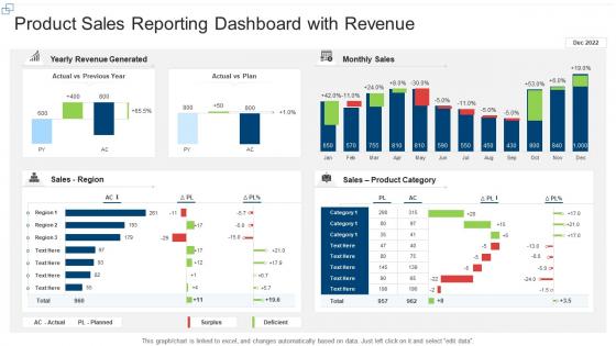
Product sales reporting dashboard snapshot with revenue


Try Before you Buy Download Free Sample Product
 Impress Your
 Audience
Editable
of Time


Our Product Sales Reporting Dashboard With Revenue are topically designed to provide an attractive backdrop to any subject. Use them to look like a presentation pro.
People who downloaded this PowerPoint presentation also viewed the following :
Product sales reporting dashboard snapshot with revenue with all 7 slides:
Use our Product Sales Reporting Dashboard With Revenue to effectively help you save your valuable time. They are readymade to fit into any presentation structure.


FAQs for Product sales reporting dashboard
Start with the basics - total sales, conversion rates, and sales by product line. Average order value and customer acquisition cost show you if you're actually making money. Sales velocity is huge too since it shows momentum way better than just looking at snapshots. Month-over-month and year-over-year comparisons are clutch for spotting trends. Geographic breakdowns usually reveal some surprises about where your real opportunities are hiding. Top-performing products too. Pipeline metrics if you're doing lead tracking, obviously. Honestly, you can always layer on more specific stuff later based on what decisions you're actually trying to make.
Honestly, charts beat spreadsheets every time for spotting sales patterns. Line graphs show you trends super quickly - whether you're going up or down. Bar charts? Perfect for comparing different products or regions side by side. Heat maps are clutch for seasonal stuff (hello, holiday rush). Pick the right visual for what you're trying to show though. I'd start simple - basic charts first, then get fancy if you actually need to. Fun fact: your brain processes visuals like 60,000 times faster than reading numbers. Pretty wild, right?
Honestly, real-time data is a game changer. You can actually catch problems while there's still time to fix them instead of finding out after everything's already gone wrong. Like, imagine trying to prevent stockouts when you're seeing yesterday's inventory numbers - not gonna work. Live dashboards let you spot which products are suddenly taking off, adjust your strategy as things happen, and basically stay ahead of the curve. Just make sure your data refreshes match how fast your business actually moves. Oh and set up alerts for big changes so you're not glued to your screen all day.
So you know how you see Product X sales dropped 20% but have no clue why? Customer feedback data fills in those gaps. You'll suddenly connect the dots - oh, people are pissed about shipping delays or whatever. Game changer, honestly. Set up feeds from your survey tools, review sites, support tickets straight into your dashboard. Now you're tracking sentiment, not just numbers. Which is way more useful tbh. Start with your top 3 feedback sources and watch the patterns pop up. You might be surprised what you find.
Put your biggest metrics top-left - that's where people look first. I'd group similar stuff together too, like revenue and conversion rates in one spot so you're not jumping around the screen. Simple colors work way better (trust me, I made this hideous rainbow thing once that nobody could read). Don't cram your charts together - give them room to breathe. Date filters should be super obvious since everyone uses those constantly. Think about how your team actually works when you're deciding what goes where. Oh, and definitely test it with real people before you think you're done!
Honestly, just ask each team what 3 metrics they actually check every day - that'll tell you everything. Sales wants pipeline stuff and conversion rates right up top. Marketing's all about campaign ROI and lead attribution. Finance lives for profit margins and cost breakdowns, no surprise there. Set up role-based permissions so people aren't drowning in irrelevant data. Most tools have templates you can customize by department that pull the right KPIs automatically. Let teams save their own filters and date ranges too - they'll thank you later. It's way easier than you'd think once you get the hang of it.
Tableau and Power BI are your best bets for interactive sales dashboards. Power BI's awesome if you're already using Microsoft stuff - everything just clicks together. Tableau handles complex visuals better though, and yeah I definitely get carried away making everything look perfect in it. Google Data Studio works great for basic needs and it's free, which is nice. Your more technical people might want Plotly or D3.js for custom stuff. Honestly just figure out what data sources you're working with first and how much you want to spend. That'll make the choice pretty obvious.
Honestly, daily updates are your sweet spot for most sales dashboards. Real-time is even better if you've got the tech for it. I mean, unless you're doing flash sales or something crazy, sales don't usually swing wildly hour by hour anyway. Weekly is like... bare minimum territory. Go less than that and people start making decisions off old data, which kinda defeats the point, right? Match it to how fast your business actually moves and how often folks check the thing. Oh, and definitely set up auto-refreshes – nobody wants to be stuck manually pulling data like it's 2005.
Honestly, the biggest pain points are getting people to actually use it and dealing with messy data. Sales teams hate change - they'll stick with whatever spreadsheet they've been using forever if the new dashboard seems complicated. Plus if your CRM data is trash (and let's be real, it usually is), your dashboard will just display prettier garbage and everyone will stop trusting it. Different departments always want their own special metrics too, which gets messy fast. I'd start small with maybe 5-10 people who are actually excited about it, clean up your data first, then expand from there.
Just grab some forecasting widgets that tap into your historical sales data - Tableau and Power BI both have ML models baked right in. Way simpler than I expected honestly. Make sure you've got at least 12-18 months of clean data to work with first. Throw in seasonal adjustments and confidence intervals so your team knows when the predictions might be off. I'd start basic with linear forecasting before diving into the crazy complex stuff. Oh, and definitely include trend lines - those are clutch for spotting patterns your team might miss otherwise.
Honestly, get a sales dashboard. Both teams can finally look at the same numbers instead of arguing over different spreadsheets - those meetings are the worst. You'll see which campaigns actually bring in good leads, conversion rates, how fast deals move through your pipeline. Real-time data beats waiting a month for reports. Plus you can spot where leads get stuck and figure out what marketing stuff deserves more money. My friend's company started doing this and now their teams actually work together instead of pointing fingers. Game changer for sure.
Dude, your historical sales data is basically a crystal ball. Check out those seasonal spikes and see which products always crush it. Year-over-year comparisons are where the magic happens - seriously, I get weirdly excited about that stuff. Set up your dashboard to track customer behavior changes and how different regions perform. Product lifecycle stages matter too. Here's the thing though - create alerts when current numbers go way off from what you'd expect based on history. Then pivot your inventory, marketing budget, and sales priorities. It's like having a cheat sheet for what's coming next.
Dude, mobile dashboards are seriously clutch for sales teams. You can pull up your numbers anywhere - client meetings, coffee runs, whatever. Real-time data means you'll catch problems or wins way faster instead of waiting till you're back at your computer. Your team can update deals on the spot too, which honestly customers just expect now. I mean, it's kinda wild how impatient everyone's gotten, but that's reality. Just make your dashboard work smoothly on phones and tablets first. Test it out on different devices so nothing breaks when people actually need it.
User feedback is seriously the only way to know if your dashboard actually makes sense. I'd start with quick user interviews and check your analytics to see what people actually click on. Surveys work too, but honestly? Just watching someone try to use it tells you everything. People will surprise you with the weird workarounds they create when something doesn't work right. Focus on the complaints that keep coming up and tackle those first. Oh, and don't wait months to ask again - set up regular check-ins so you're not stuck with a dashboard everyone secretly hates.
Look, I'd focus on four main things for your dashboard. Sales velocity and weekly revenue growth show if you're actually gaining momentum. New customer acquisition is huge - not just browsers, actual buyers. Conversion rates are honestly everything when it comes to whether your messaging works or totally bombs. Oh, and don't sleep on feedback scores plus return rates. Those predict long-term success way better than flashy launch numbers. Set up some alerts so you know when things dip below your targets. That way you can course-correct before it gets messy.
-
Great designs, Easily Editable.
-
Innovative and Colorful designs.
-
Much better than the original! Thanks for the quick turnaround.
-
Easily Understandable slides.
-
Appreciate the research and its presentable format.