

Sales performance dashboard sales comparison sales by product category





Try Before you Buy Download Free Sample Product
 Impress Your
 Audience
 100%
100% Editable
 Save Hours
 of Time


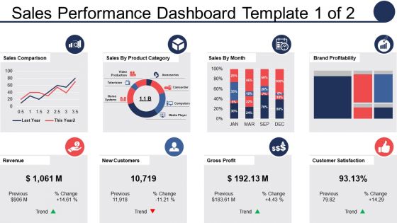
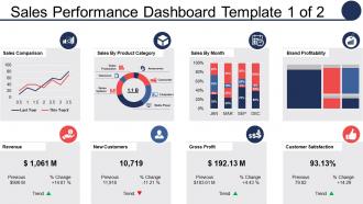
Measure the sales performance product wise using this professionally designed presentation slide. This PowerPoint template assists you to analyze the sales numbers you achieved according to the product sold. You can use it understand which all products are performing well and helping you to achieve your goals and objectives and which products require some change in terms of quality improvement, marketing strategy etc. With our PPT design, you can evaluate every aspect of sales performance dashboard such as sales components, sales by product category, new customers, gross profit, brand profitability, sales by metrics and customer satisfaction. Every component of your sales can be shared with this innovative PowerPoint diagram. The presentation graphic is available in excel format which enables you to edit the data with your company details, replace the titles if required and then present it among your audience. Evaluating sales performance on regular basis assists you to understand the strengths and weaknesses of your product and allows you to make changes in your work strategy accordingly. Download sales performance dashboard now. Take their breath away with our Sales Performance Dashboard Sales Comparison Sales By Product Category. They will gulp in the oxygen of your thoughts.
People who downloaded this PowerPoint presentation also viewed the following :
Sales performance dashboard sales comparison sales by product category with all 5 slides:
Guard against disappointments with our Sales Performance Dashboard Sales Comparison Sales By Product Category. They ensure you continue to achieve.
FAQs for Sales performance dashboard sales comparison sales
Focus on metrics that actually help you decide stuff - conversion rates per funnel stage, pipeline velocity, average deal size, win/loss by rep. Most dashboards I see are missing the obvious ones like MRR and customer acquisition cost, which is wild. Lead source performance matters too, plus sales cycle length to catch bottlenecks early. Oh and keep it simple! Start with maybe 6-8 core metrics so your team doesn't ignore it. You can always add more later once people are actually using the thing daily.
Honestly, charts are a game-changer for sales data. You'll spot trends in seconds instead of drowning in spreadsheet hell. Like, seasonal patterns just pop out in line graphs - way better than scrolling through endless rows trying to do mental math. Heat maps show you which regions are crushing it and which ones... aren't. Bar charts make it super obvious when a product's tanking. I probably sound like a data nerd right now, but seriously - pick your most important metrics first and build visuals around those. Your brain processes pictures way faster than numbers anyway.
Dude, real-time data is what separates a useful sales dashboard from expensive digital art on your wall. You'll catch trends while they're actually happening instead of finding out about problems way too late. Nobody wants to waste time calling leads that went cold three hours ago - been there, done that. Your team stays pumped when they watch their numbers climb throughout the day. Short version: make sure that thing refreshes often enough so you're dealing with what's happening now, not ancient history from this morning.
Dude, dashboards are seriously a game changer for tracking your numbers. I check mine way too often now - conversion rates, pipeline, all that stuff. What's cool is you start noticing patterns, like maybe you crush the initial calls but then deals die during demos. Or your close rate tanks on bigger deals for some reason. Once you figure out where you're actually struggling (not where you think you are), you can fix those specific problems. Real-time data just hits different than guessing, you know?
Honestly, just focus on what each team actually looks at every day. SDRs obsess over call volume and conversion rates. Account managers? They're all about renewals and upsells. Ask each team for their top 3-5 metrics they check religiously, then build custom views around those. I've watched so many companies create these "universal" dashboards that nobody ends up using - total waste. Make sure you can filter by territory and timeframe so managers can dig deeper when they need to. Oh, and set up permissions so people aren't drowning in irrelevant data they don't care about.
Honestly, a sales dashboard is a game-changer for figuring out if your marketing budget is actually working. It tracks stuff like conversion rates and customer acquisition costs - basically shows you which campaigns are bringing in real money versus just pretty clicks. Real-time ROI data means you can spot your winners fast and put more money there. I'd set up weekly automated reports so you're not constantly wondering "is that pricey Google Ads campaign worth it?" Trust me, vanity metrics are useless when you're trying to hit revenue goals.
Honestly, I'd go with Power BI if you're already in the Microsoft ecosystem - the Excel integration alone is clutch. Tableau's visualizations are gorgeous but damn, it gets expensive fast. For basic stuff, Google Data Studio won't cost you anything and does the job fine. Oh, and there's Salesforce Analytics Cloud too if that fits your setup. I'd probably just grab a Power BI trial first since it's pretty straightforward to learn. You can always switch later if it doesn't click with your data sources.
Honestly, dashboards are lifesavers for this. Both teams can finally stop arguing and look at the same data. You'll see which campaigns actually bring in good leads, conversion rates, where people drop off - all that stuff. Marketing finally gets honest feedback (hint: nobody cares about that expensive whitepaper). Sales can point to exactly what lead types work best for them. The trick is getting everyone to actually check it regularly - maybe do weekly reviews together? Otherwise it just sits there looking pretty while everyone goes back to fighting.
Start with big, fat buttons that are actually easy to tap - you know how frustrating tiny mobile interfaces can be. Put your most important metrics right at the top since nobody wants to scroll forever on their phone. Offline access is huge too, especially when your sales team's driving through dead zones all day. Charts need to load fast, and honestly? Keep data entry super simple - pinching and zooming to update deals is the worst. Figure out what 3 metrics your team actually cares about and design everything around those first.
Honestly, your old sales data is like a crystal ball if you actually dig into it. Check out those seasonal dips and spikes from last year - they'll probably repeat. I'd set up alerts for when things go way off track from your usual patterns. Some trends are weirdly predictable once you map them out properly. Your dashboard needs that historical layer underneath current numbers so you can tell if you're killing it or falling behind. Growth rates from past quarters? That's your roadmap right there. Then just tweak your targets based on what the data's telling you.
Start with role-based access - junior people don't need to see commission data, you know? Use secure links that expire instead of emailing reports everywhere. Trust me, screenshots sitting in random inboxes are just asking for trouble. Your dashboard needs proper authentication and encryption (obviously). Watermark the sensitive stuff so people know what they're dealing with. Oh, and set up quarterly access reviews - it's crazy how many former employees still have access months later. I swear companies forget about this stuff all the time.
So B2B dashboards are all about tracking those longer sales cycles - pipeline health, deal stages, average deal size, that kind of stuff. Takes forever to close anything, right? B2C is totally different though. Way more focused on volume since things move fast. You're looking at conversion rates, daily sales numbers, customer acquisition costs. The relationship piece is huge for B2B too since you're nurturing accounts for months. B2C? Pretty transactional usually. Time frames are night and day - B2B shows quarterly forecasts while B2C tracks daily performance. Just build yours around how you actually sell, not whatever template looks fancy.
Biggest mistake? Cramming everything onto one screen. Your team will take one look and nope right out of there. Focus on KPIs that actually matter for decisions - not every single metric you can think of. Make sure data updates make sense too (daily sales refreshing weekly is just annoying). Skip those fancy charts that look impressive but take forever to decode. Oh, and this should be obvious but apparently isn't - test it with actual sales reps first. They're the ones checking it between calls, so it better be dead simple to see if they're on track.
Honestly, dashboards are a game-changer for setting targets. You can pull up your last 6 months of data and actually see what realistic goals look like instead of just guessing. Real-time tracking beats waiting around for those monthly reports - way less stressful. The visual stuff is clutch too; charts show you exactly how you're trending against targets. Break it down by territory or product, whatever works. Oh, and set up alerts so you know right away if things go sideways. I wish I'd started using one sooner, would've saved me from some pretty awkward quota conversations with my boss.
Honestly, dashboard design can make or break user engagement. People bounce if it's messy or confusing - I've seen it happen so many times. Put your most critical metrics up front with clean layouts. Group related stuff together logically. Colors should help focus attention, not blind people (although weirdly some of the ugliest dashboards I've used actually worked great). White space helps a ton. Your sales team needs to find info fast without digging around. Really though, test it with real users first. They'll catch problems you totally missed.
-
Easy to edit slides with easy to understand instructions.
-
Commendable slides with attractive designs. Extremely pleased with the fact that they are easy to modify. Great work!