


 0 Comment
 Customer Reviews

Sales teams live and breathe by the numbers. But when those numbers are buried in spreadsheets, spread across reports, or updated inconsistently, performance drops—and decisions get delayed. That’s where daily sales dashboards step in.
Unlike reports, these dashboards act as real-time control centers, giving you a quick overview of the pipeline, conversions, revenue goals, team achievements and deal progress. They help leaders identify trends early, make changes more quickly and unite teams around the most critical metrics. A daily dashboard helps you manage inside sales, retail or B2B accounts, so you don’t miss any opportunities.
Yet, creating these dashboards from square one can be challenging, especially if you are pressed for time and need to be clear. That’s why SlideTeam’s Daily Sales Dashboard Templates are useful. These templates, created by experts, allow you to turn your data into attractive visuals that are easy to present and use.
SlideTeam’s best-in-class Daily Dashboard Templates are just a click away. Grab these today!
From simple daily KPIs to multi-metric dashboards for large teams, these templates are built for speed, precision, and insight.
Each template is 100% editable and customizable so you don't have to rely on your design-buddy to help tailor the presentation to fit your purpose.
Need a Sales Report that does the job every time? SlideTeam has just that for you. Access our handpicked Sales Report Templates with a click here!
Let’s explore the PPT Presentations that help you stay in control, drive accountability, and make every sales day count.
Template 1: Supermarket Retail Daily Sales Dashboard Report
This PPT Slide shows a supermarket retail daily sales dashboard, providing up-to-date information on customer additions, average order values, revenue and customer growth, as well as average growth at different times. It has a table and charts that display the company’s performance metrics. The dashboard helps with strategy by showing how order values change and when sales are highest. Bar and pie charts are used to display data, so you can see how revenue grows and how the business runs during the day.

Template 2: Daily Sales Pipeline Management Dashboard
This PPT Set highlights a daily sales pipeline management dashboard which provides an overview of key lead metrics from the past 30 days and the overall performance. It points out that 79% of leads are active, 54% are engaged and 2,492 new leads were added in the past month. The overall results are 210,043 new leads, 72% of leads being active and 15% engagement. The graph on the right displays the daily number of leads added in January, highlighting changes in lead activity and helping teams track sales, evaluate campaigns and decide on pipeline improvements.

Template 3: Sales Metrics Dashboard PPT Template
With this sales metrics dashboard template, you can easily see the most important KPIs for monitoring and enhancing sales. It includes live dashboards that monitor ticket volume, lead-to-win conversion, sales performance by campaign and how representatives are working. The deck breaks down sales by market and communication channels, making it easy to analyze email, phone, in-person and self-serve interactions. It also shows growth numbers for each campaign and each representative, highlighting the best performers and sales trends. The presentation is made for sales managers and business leaders, as it breaks down data into useful insights using bar graphs, funnel charts, pie diagrams and line graphs. With this dashboard, teams can use data to decide how to use resources, make improvements and increase their revenue. The slide helps teams achieve goals and improve sales performance.
[product_image id=723857]
Template 4: Overall Sales Metrics for Team Performance
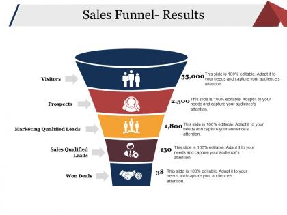
This slide presents an overview of team sales performance metrics. It highlights indicators, such as total revenue ($127.6K), average sale value ($1,699), and a 3.25% lead-to-win conversion rate. The sales pipeline breakdown includes leads, marketing qualified leads (MQL), sales qualified leads (SQL), and wins. Additionally, rep activity is tracked through metrics on deals closed, activities per representative, and average lead response time (2 hours). This dashboard enables managers to assess individual contributions, optimize pipeline performance, and identify opportunities to improve efficiency.

Template 5: Sales Growth Metrics by Market Segment
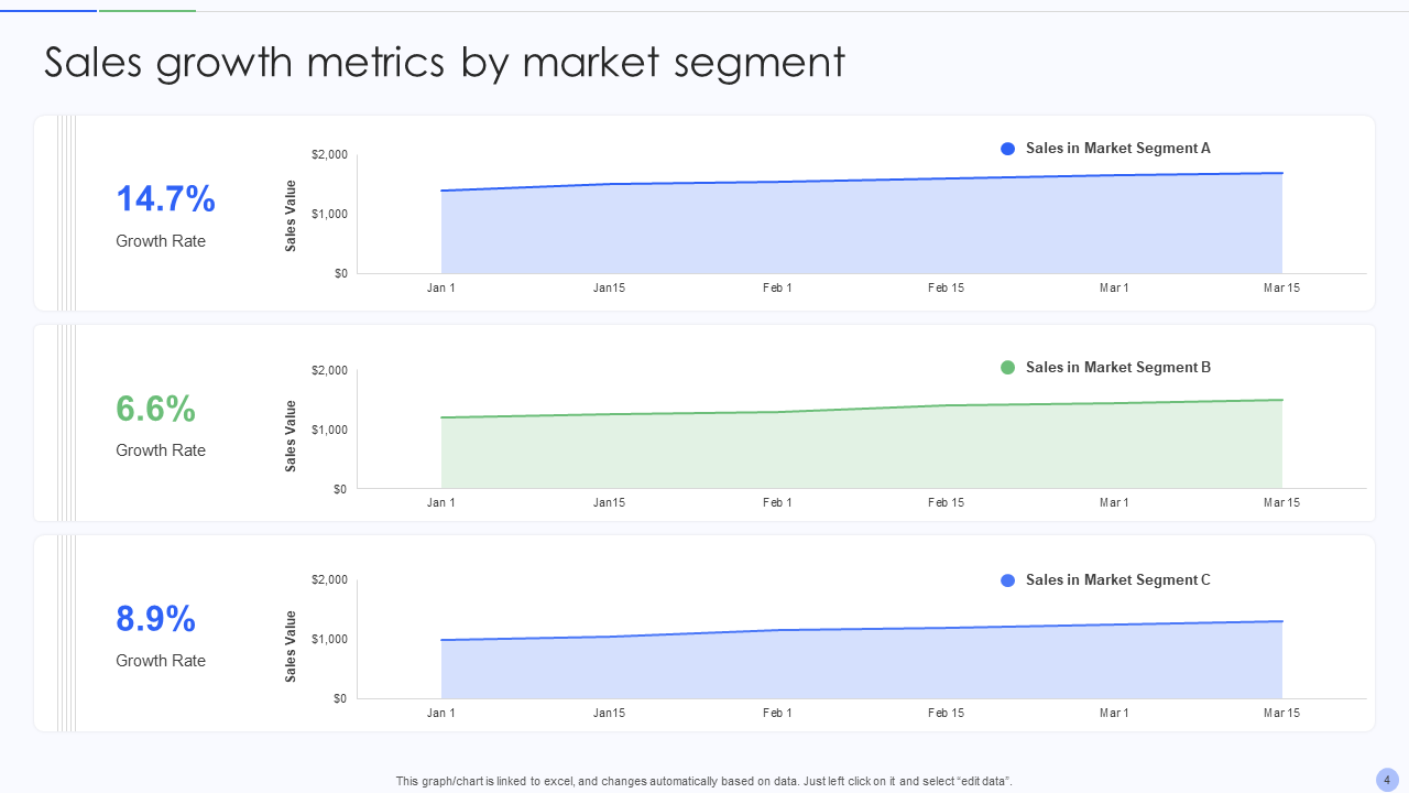
This PPT Preset shows how sales growth changed in three market segments over three months. Segment A showcases strong market traction, as it has grown by 15%. Segment C comes next, with 9% of the total, showing moderate and steady results. The 6.6% growth rate in Segment B means there is potential for improvement in strategy. The upward trend in each segment’s sales value helps companies measure their performance, spot promising areas and plan strategies to improve results for each segment.
Template 6: Product Performance Sales Metrics by Campaign
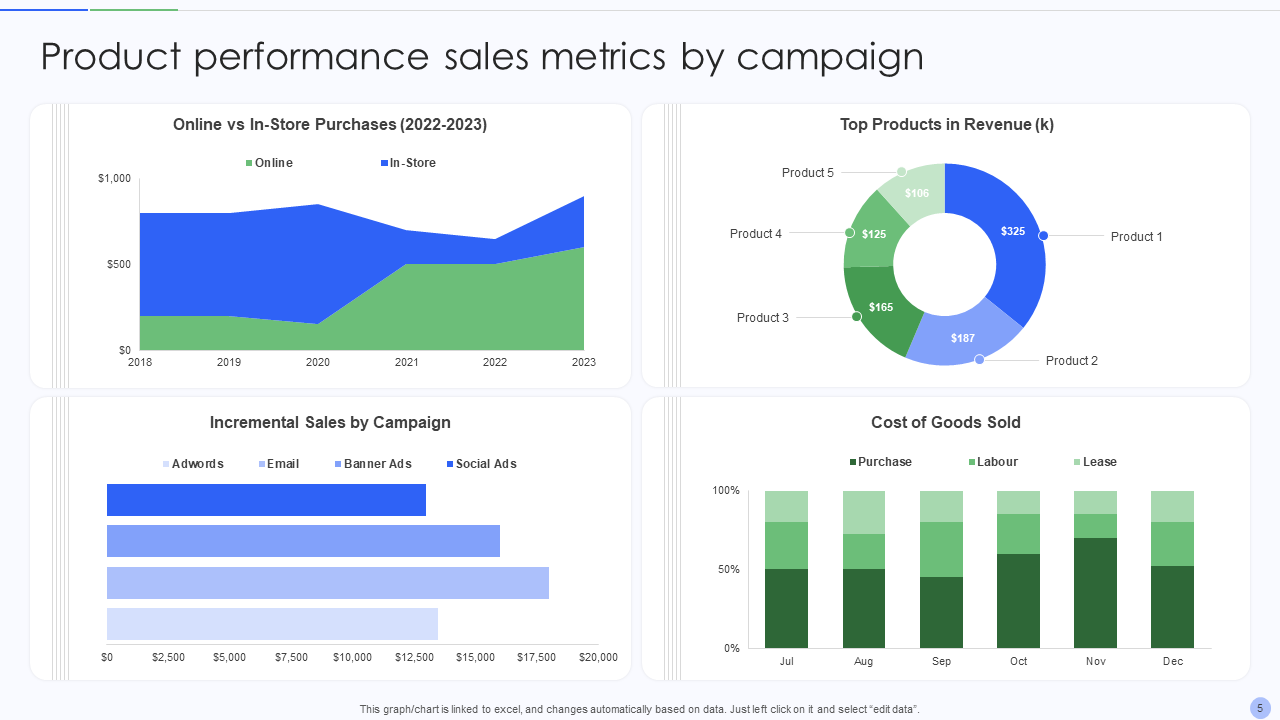
This PPT Design shows how product performance sales are measured by campaign. It demonstrates that more people are choosing to buy online rather than in stores from 2018 to 2023. The donut chart shows that Product 1 brings in the most revenue at $325k. Adwords, Email, Banner Ads and Social Ads all help increase sales, but Social Ads have the biggest impact. The Cost of Goods Sold (COGS) is shown monthly, separating purchase, labour and lease costs to give a clear picture of product profitability and marketing ROI.
Template 7: Sales Metrics for Leads Generated by Agents
This PPT Set highlights the performance of agents in generating leads, focusing on how they move leads through the funnel. It points out that for every 17 leads, only one becomes a closed win, with 2,130 leads turning into 134 closed wins. Examples of metrics are opportunities (643), negotiation (501) and proposals (295). The conversion rates of each agent—Daniel (3%), Anna (11%) and Max (7%)—are shown on line charts. The extra dials also show that 34% of leads become opportunities and 22% of opportunities are won which helps evaluate how well the company manages and converts leads.

Template 8: Sales Metrics with Growth Representatives
This PPT Slide highlights the sales metrics that growth representatives monitor, with a 30% rise in sales growth being the main point. The company’s revenue has increased from $1,180,357 in the previous period to $1,475,446 this period. A line graph shows the sales revenue for representatives X, Y and Z over the last 12 weeks, making it easy to see their performance patterns. Thanks to these insights, teams can make informed decisions, improve their strategies and better prepare for future success.

Template 9: Sales Metrics with email and Phone
This PPT Framework shows how sales are measured by the way customers communicate—email, self-serve, phone and in-person. The highest sales value of $72,310 came from email leads, followed by self-serve at $32,453, phone at $28,565 and in-person at $17,522. The funnel chart included here makes it clear that email is the most successful method. Such insights show which customer interactions are most effective and direct resources where they will have the greatest effect on sales.

Template 10: Sales Metrics with Gross Profit Margin
This PPT Slide looks at sales performance by analyzing gross profit margins for Gringotts, Osccp and Works. It shows that the company’s GPM is 28.89% and the total profit is $1,101K. The GPM for Gringotts is 29.62%, while Works has the highest margin at 38.18%. Osccp shows a GPM of 15.25% and a major decrease in value (-245.82%). Using a line chart, you can see how GPM has changed over time and compare and evaluate the performance of the entities.

Sales Moves Fast—Your Data Should Too
In sales, where things move quickly, decisions must be made right away, not just when weekly or monthly reports are available. You need visibility now. Sales dashboards (that are updated daily) give you a clear view of your results, showing what’s working well, what’s slowing you down and what you can improve.
With SlideTeam’s Daily Sales Dashboard Templates, you get more than clean visuals—you get a framework for daily accountability, faster action, and smarter strategy. Whether you’re managing a lean startup team or overseeing a large sales operation, these templates help you track what matters and pivot when needed.
Because when your team knows where they stand, they know where to go next.
Go ahead—ditch the cluttered spreadsheets. Download these templates and give your sales process the clarity it deserves, one dashboard at a time.
FAQs on Daily Sales Dashboard
1. What to include in a sales dashboard?
A sales dashboard needs to display KPIs that give a current overview of how sales are doing. Important elements include total sales revenue, sales by region or product, sales growth trends, lead conversion rates and pipeline stages. It is important that the dashboard compares both individual and team goals with actual performance, the cost of acquiring customers and the average amount of each deal. Adding charts and graphs to your writing makes it easier to understand. You can use filters by time, location and sales rep to analyze your data more thoroughly.
2. What is a KPI in a sales dashboard?
KPIs allow you to see how you are doing, spot trends and make better decisions. Some common sales KPIs are:
- Total Sales Revenue
- Number of New Customers
- Sales Growth Rate
- Conversion Rate
- Average Deal Size
- Customer Acquisition Cost
- Sales Target Achievement
3. What is the sales effectiveness dashboard?
A sales effectiveness dashboard tracks how well a sales team turns leads into customers and meets revenue targets.
Key metrics often included:
- Lead-to-close conversion rate
- Win rate by sales rep or team
- Sales cycle length
- Quota attainment
- Average revenue per rep
- Customer retention rate
- Time spent on selling vs. non-selling tasks