

Supermarket Retail Daily Sales Dashboard Report




Try Before you Buy Download Free Sample Product
 Impress Your
 Audience
 100%
100% Editable
 Save Hours
 of Time


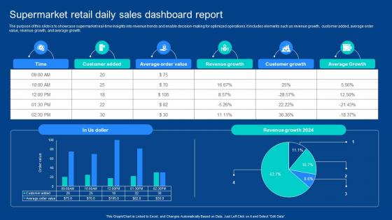
The purpose of this slide is to showcase supermarket real-time insights into revenue trends and enable decision-making for optimized operations. It includes elements such as revenue growth, customer added, average order value, revenue growth, and average growth.
People who downloaded this PowerPoint presentation also viewed the following :
Supermarket Retail Daily Sales Dashboard Report with all 10 slides:
Use our Supermarket Retail Daily Sales Dashboard Report to effectively help you save your valuable time. They are readymade to fit into any presentation structure.









FAQs for Supermarket Retail Daily
Start with the obvious stuff - total sales, units sold, average transaction value, profit margins by category. Traffic and conversion rates though? That's where the real insights are. Sometimes those tell you way more than raw sales numbers. Track your inventory turnover and which products are killing it vs. totally bombing in each department. Year-over-year comparisons help you catch trends early. Oh, and peak hours data is clutch for scheduling staff - learned that one the hard way. Once you get comfortable with these basics, you can dive deeper into basket analysis and seasonal stuff.
So you know how staring at spreadsheets makes your eyes bleed? Charts actually make sense of all those sales numbers. You'll spot which products are crushing it, your busiest hours, seasonal patterns - stuff that's impossible to catch in raw data. Plus it's way easier to show your boss what's working (and what isn't). Honestly, once I started using simple dashboards for key metrics, decisions became so much clearer. You can even predict when you'll run out of inventory, which is pretty sweet. Just pick your most important numbers and throw them into some basic visuals first.
Honestly, real-time monitoring is a game changer - you'll catch problems and opportunities right when they happen instead of learning about them through some boring report later. Like when a product's selling super fast and you need to restock ASAP, or when something's just sitting there and needs a price cut. Traffic patterns help with staffing too. I actually find it weirdly addictive watching those numbers update live (maybe that's just me though). Set up alerts for stuff that actually moves the needle so you're not glued to dashboards constantly. Way better than waiting until end of day to see how things went.
So basically seasonal trends are like those obvious patterns - ice cream sells crazy well in summer, soup when it's cold, you know? Line charts are perfect for this stuff since you can see the monthly cycles across different years. Heat maps are solid too, especially if you're tracking multiple product categories. Those holiday shopping spikes always crack me up when they show up in the data! For your dashboard, definitely add year-over-year comparisons. Maybe throw in some forecasting based on what happened before. That way you can actually plan ahead for inventory and staffing instead of scrambling later.
Honestly, customer demographics are like your cheat code for figuring out sales patterns. Break down who's buying what by age, income, location - you'll start seeing crazy trends. Maybe your Gen Z shoppers are obsessed with organic stuff while boomers stick to name brands they trust. Use that intel to move products around the store differently, stock locations based on their neighborhoods, time your sales better. I'd probably start with your bestsellers first and just see what demographic splits look like. The patterns usually smack you in the face once you actually look at the data.
Honestly, adding forecasting widgets to your dashboard isn't too complicated. Start with basic trend forecasting - like 30-90 day sales projections and seasonal demand stuff. Power BI and Tableau both have ML features baked in, which is super convenient. Connect your POS data, weather info, and promo calendars to feed everything. Set up stockout alerts too - those are lifesavers. I'd probably skip the fancy predictions at first though. Get comfortable with simple forecasting accuracy, then you can get weird with more complex models later. The key is just making sure your historical data is actually feeding the predictions properly.
Don't cram everything onto one screen - seriously, it's like information overload. Stick to maybe 5-7 metrics that actually matter for decisions: sales by category, inventory turnover, profit margins. Weekly views work way better than monthly ones since grocery shopping has those weird patterns (like everyone going crazy on Sundays). Quick tangent but pie charts are usually terrible for this stuff. Make sure it loads fast too because nobody's waiting around when they're swamped. I'd start by asking what decisions people actually make daily, then build around that. Oh and avoid those generic date ranges - they hide the real patterns you need to see.
A/B testing shows what actually works vs what you *think* works - big difference! Track conversion rates and basket sizes from different scenarios like endcap vs shelf placement. I swear, so many "brilliant" gut decisions just flop completely. Your dashboard needs test results right next to regular sales data so you can spot the patterns. Look for statistical significance markers too - that's how you know it's real, not just random noise. Then you can roll out winners to other stores instead of crossing your fingers and hoping. Way better than the old "let's try this and see" approach.
Bar charts are your go-to for comparing sales between categories or months. Line graphs show trends really well too - I use those constantly for tracking performance over time. Heat maps are solid for seeing which store locations or product sections are crushing it. Honestly, avoid pie charts unless you've got like 3-5 segments max for market share stuff. They get messy fast. Tables work when people need the actual numbers in front of them. I'd start with a line chart showing overall trends, then break it down with bar charts for specific products or categories that are doing well.
Honestly, real-time tracking widgets are a game changer - they'll show you current stock, reorder points, and how fast things are moving. Set up color alerts so red flags the critical stuff and yellow means pay attention. ABC analysis is clutch because it shows which products actually make you money vs just taking up space. I'd definitely track your sell-through rates too. Oh, and comparing actual vs what you projected helps you get better at this over time. Automated alerts save you from obsessively checking everything - just set minimums and let the system ping you when you're running low.
Honestly, I'd go with Power BI or Tableau for your supermarket dashboard. Power BI's cheaper if you're already in the Microsoft ecosystem - connects to POS systems pretty smoothly. Tableau gives you more fancy visualization options though, which is nice if you're into that stuff. Both handle retail data well. My cousin actually uses Google Data Studio for his store and likes it fine, way cheaper too. Excel's Power Query could work if your data isn't crazy huge. I'd start with Power BI's free trial first, see how it plays with your actual sales numbers.
Promotions mess with your data big time. You'll see crazy spikes in units sold and revenue jumps, but profit margins usually tank because of all the discounting. The annoying thing is these spikes hide your normal baseline trends - like trying to figure out regular shopping patterns when Black Friday is throwing everything off. Inventory moves way faster during promos too. Honestly, I'd create separate dashboard views that filter out promotional periods. That way you can see what's actually happening day-to-day versus when you're running deals. Makes the data way cleaner to read.
Dude, your sales dashboard is only as good as the data feeding it. Wrong product codes or messed up sales figures? You're basically flying blind and making terrible decisions. I've seen companies think a product's crushing it when it's actually dying - then they order way too much inventory. Small mistakes get huge when you're looking at trends across stores and months. Also random thought but why do so many systems still use those awful product code formats from like 2005? Anyway, set up some validation checks and audit your data sources regularly. Trust me on this one.
Honestly, user feedback is everything - it's what separates dashboards people actually use from the pretty ones that just sit there. Ask stuff like "what takes forever to find?" or "which reports do you check first thing?" You'll figure out fast which metrics actually matter to different teams and where people are getting stuck. I've watched so many gorgeous dashboards flop because the important data was buried. Monthly feedback sessions work great, but here's the thing - you've got to actually make the changes or people just stop bothering to tell you anything.
Start with your in-store POS data as the base, then add everything else - online orders, mobile purchases, curbside pickup. Third-party stuff like Instacart and DoorDash matters too. Your loyalty program data is honestly where you'll find the good stuff. Don't skip click-and-collect, subscriptions, even social commerce if you're doing that. The tricky part is connecting the same person across all these touchpoints. Get your unified customer IDs sorted first - that's way more important than jumping into complex analytics right away. Otherwise you're just looking at disconnected data points.
-
Graphics are very appealing to eyes.
-
Illustrative design with editable content. Exceptional value for money. Highly pleased with the product.