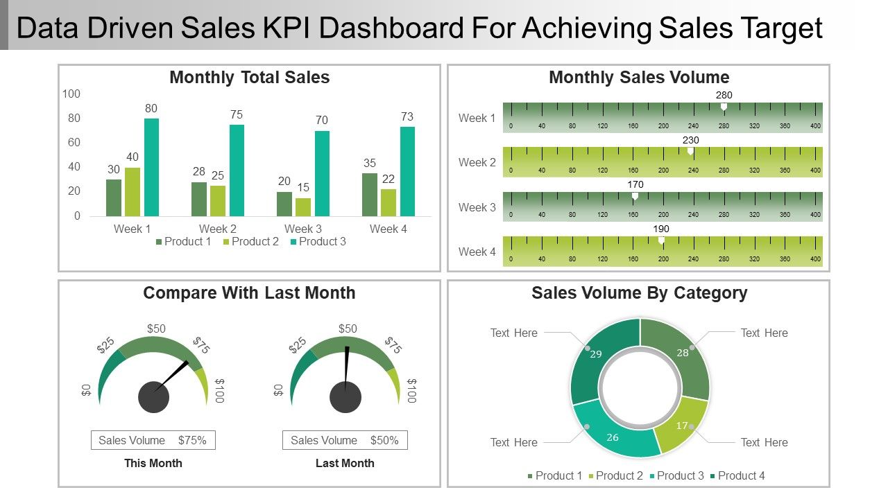
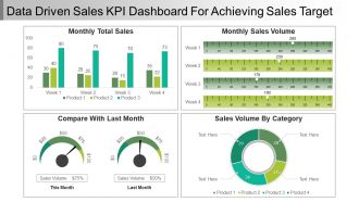
Data Driven Sales Kpi Dashboard Snapshot For Achieving Sales Target Ppt Samples

Rating:
90%
Slide 1 of 5
Favourites Favourites

Try Before you Buy Download Free Sample Product

Audience Impress Your
Audience
Editable 100%
Editable
Time Save Hours
of Time
The Biggest Sale is ending soon in
0
0
:
0
0
:
0
0
Rating:
90%
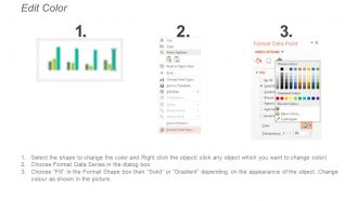
This PPT can be downloaded very conveniently on a click of a button. Your business presentation looks very professional with its use. The images used in this PPT template are 100% editable. The color, size and orientation of any icon can easily be changed in this presentation as you wish. The excel-linked chart can be edited as the shapes automatically adjusts according to your data. You can select from thousands of editable icons on each and every topic. Personalize the presentation with individual company name and logo. It can be viewed and saved in JPG or PDF format. It is fully compatible with Google slides as well.

FAQs for Data Driven Sales Kpi Dashboard Snapshot For Achieving Sales

Okay so definitely track your revenue stuff first - monthly/quarterly targets vs what you actually hit. Then conversion rates at each stage, average deal size, how long your sales cycles take. Lead sources matter too, and honestly rep performance is huge - you can't manage what you don't measure, right? Customer acquisition cost and lifetime value will show if you're actually making money. Oh and activity metrics like calls and meetings booked are good leading indicators. Start there, then add whatever specific stuff makes sense for your industry. Without this data you're basically just guessing.

Dude, charts are a game-changer for sales data. You'll spot trends in seconds instead of hunting through endless spreadsheet rows. Bar charts show which reps are killing it. Line graphs reveal those seasonal patterns you totally missed. Heat maps? They'll expose blind spots in your territory coverage. It's honestly like the difference between reading sheet music versus hearing the actual song. Way easier to make decisions when you can see the story your numbers are telling. Oh, and start simple - basic charts first, then get fancy once everyone's on board.

Honestly, Tableau and Power BI are your best bets if you want something robust - they'll connect to pretty much anything. Google Data Studio is free and way better than you'd expect, especially if you're using Google stuff already. HubSpot's got dashboards built in but they're kinda meh in my experience. Don't sleep on Excel either - throw some pivot tables in there and you're golden for basic tracking. Oh, and figure out what metrics actually matter to you first. Then just pick whatever plays nice with your current setup. No point overcomplicating it.

Daily updates are your bare minimum - though real-time is way better if you can swing it. Most teams I know do overnight refreshes so everything's ready by morning. Real-time hits different though, watching those numbers jump when deals actually close is pretty addictive lol. Weekly updates? That's basically useless now. The sales world moves too fast for that old-school approach. Try setting up automated pulls so you're not stuck doing manual updates every day. Nobody's got time for that tedium. Honestly, anything less than daily and you might as well be guessing about your pipeline.

Look back at your sales data from the past 12-18 months - that's where all the good stuff is hiding. You'll see which products killed it during certain seasons, what customer types actually spend money, and how outside events messed with your numbers. Honestly, it's way better than guessing what might work. I always tell people to look for those patterns first because they're like having insider info for next year. Set up your dashboard to show these trends so you can copy what worked and ditch what didn't. Makes setting realistic targets so much easier.

So basically, your KPI dashboard shows sales performance over time visually - way better than staring at endless spreadsheet rows. You'll catch seasonal patterns, see which products are taking off, track if your team's trending up or down. Super helpful for spotting what's actually working. I mean, sometimes the data surprises you in ways you wouldn't expect from just monthly reports. Set up trend views for your biggest metrics first. Then you can dig into the details when something looks off. Makes it really easy to see where you need to focus your attention next.

Oh man, the classic mistake? Shoving way too many metrics on one screen. Nobody wants to stare at a Christmas tree of numbers. Skip the vanity stuff too - like who cares about total calls if they're not converting? Focus on what your team can actually control. Also, your data better be clean or you're just looking at pretty lies all day lol. Honestly, start with maybe 4-5 metrics that directly hit revenue. Once people are using it daily, then you can add more bells and whistles.

Honestly, the dashboard shows you exactly where you're screwing up and what's actually working. I'd track conversion rates, call activity, and deal velocity against team averages - seeing those numbers side by side is brutal but helpful. What's cool is spotting weird patterns, like maybe your demos kill it on Tuesdays or tech companies hate your pitch while healthcare loves it. Instead of waiting for those monthly reviews (ugh), you can set your own benchmarks and watch progress happen. Pick 2-3 metrics that actually affect your paycheck and check weekly.

Track your conversion rates between stages first - that's where you'll spot bottlenecks fast. Average deal size and sales cycle length matter too, obviously. Lead velocity rate is clutch for seeing momentum (honestly this one's underrated). You'll want to watch your pipeline coverage ratio so you're not panicking at quarter-end like everyone else does. Win rates by source show what's actually working vs. what just looks pretty in reports. Set alerts when these drop below your targets. Way better than finding out you're screwed after it's too late to fix anything.

Honestly, color-coding is your best friend here - makes different customer types pop instantly. Heat maps are clutch for showing how segments perform across metrics. Pie charts work too for basic distribution stuff. Interactive filters are where it gets fun though, you can drill down into specific groups. Just don't go crazy with too many segments or it'll look like a mess. Maybe stick to 4-6 max? Oh, and definitely add those little hover tooltips with key details. Throw in a simple legend so anyone jumping in won't be totally lost trying to figure out what's what.

Dude, real-time integration is a total game changer. Instead of finding out about problems weeks later, you'll catch trends and issues right as they're happening. Your reps get instant feedback, and you can see exactly which deals are going nowhere. Honestly, I think monthly reports are pretty useless at this point - by the time you see the data, it's already too late to fix anything. You can pivot fast when something's not working. Start simple though - just connect your CRM to a dashboard and focus on whatever metrics actually matter for revenue.

Hey! So for sales forecasts, I'd start with some basic forecast widgets that compare your predictions against what actually happens. Most CRMs have decent forecasting already built in, or you can do weighted pipeline stuff based on deal probability. Honestly, forecast accuracy trackers are pretty clutch - stops people from being overly optimistic with their numbers. Set it to refresh automatically so it stays current with pipeline changes. Show both monthly and quarterly views so you can catch trends before they bite you. Oh, and don't go crazy at first - pick one solid metric and expand from there once it's working well.

Set up automated rules that catch weird outliers before they mess up your reports. I do weekly spot checks on stuff like conversion rates - sounds boring but saves me so much headache later. Don't pull data from random spreadsheets if you can help it, standardized systems are way cleaner. Cross-reference between different sources to spot problems early. The best thing though? Alerts when your KPIs go crazy outside normal ranges. Catches errors right away instead of you finding out weeks later looking like an idiot.

Honestly, it all comes down to your sales model. Transactional sales? Track calls, conversion rates, deal velocity - the volume stuff. Enterprise with those brutal long cycles? Focus on pipeline health and deal size instead. SaaS is totally different - you need MRR, churn, expansion revenue. I've seen too many dashboards that look impressive but don't actually predict anything useful. Map out how your team sells first, then pick maybe 5-7 KPIs that actually tell you if you're winning. Don't just throw metrics up there because they look fancy.

Dude, KPI dashboards are game-changers for this exact reason. No more awkward meetings where sales and marketing are throwing around totally different numbers. Everyone sees the same data - conversion rates, pipeline stuff, revenue targets. The finger-pointing just stops because nobody can pull the "well MY spreadsheet says..." card anymore. Your weekly meetings actually become about strategy instead of figuring out whose numbers are right. I swear it cuts those endless email chains by like 90%. Oh, and make sure everyone has access from the start - don't be that person who forgets to share permissions. Trust me, your syncs will run so much smoother.

Ratings and Reviews

90% of 100
Review Form
Write a review
Most Relevant Reviews
  1. 80%

    by Chester Kim

    Helpful product design for delivering presentation.
  2. 100%

    by Dylan Richards

    Appreciate the research and its presentable format.

2 Item(s)

per page: