

Sales Reports Powerpoint Presentation Slides






Try Before you Buy Download Free Sample Product
 Impress Your
 Audience
 100%
100% Editable
 Save Hours
 of Time


Deliver sales presentation with confidence with this Sales Reports PowerPoint Presentation slide. This 65 designs PPT template has been designed for the use of sales managers and executives. Every quarter you have to present your sales report with senior management team. This multipurpose presentation deck ensures that you don’t miss out on anything important it contains all the essential information which you need when you have to pitch in front of your team. Certain aspects related to sales such sales performance, reports, review are included in this deck which gives you the liberty to save your valuable time and effort which you may have to spend while working on the complete deck. A sales report includes a record of products sold during the specific timeframe by the organization and highlight the sales volume observed per item or group of items. In this PowerPoint deck, all basics related to the sales are covered and that will provides a much needed boost to the sales person as all what is required is to edit the data, make changes in the text, add and remove any slide that you require and then share it. Drive away dark clouds with our Sales Reports Powerpoint Presentation Slides. Endeavour to make it bright and clear again.
People who downloaded this PowerPoint presentation also viewed the following :
Content of this Powerpoint Presentation
Slide 1: This slide introduces Sales Reports with imagery. State company name here.
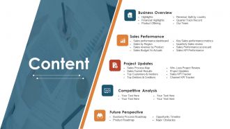
Slide 2: This is a Content slide stating- Business Overview, Sales Performance, Project Updates, Competitive Analysis, Future Perspective.
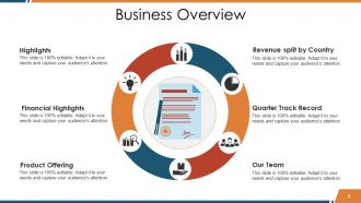
Slide 3: This slide presents Business Overview in a circular form which includes- Revenue split by Country, Quarter Track Record, Our Team, Product Offering, Financial Highlights, Highlights.
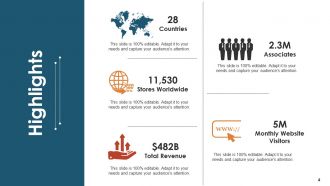
Slide 4: This slide presents company Highlights with Stores Worldwide, Total Revenue etc. as examples. Add your own data here.
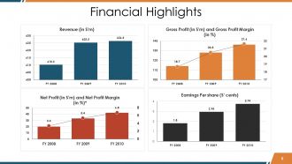
Slide 5: This slide states Financial Highlights in charts and graphs.
Slide 6: This is Products Offering slide with creative imagery and icons.
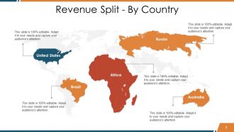
Slide 7: This slide displays Revenue Split - By Country on a world map image form.
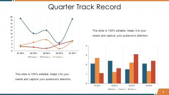
Slide 8: This slide showcases Quarter Track Record in charts and graphs.
Slide 9: This is Our Team slide with name, designation etc. to state.
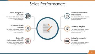
Slide 10: This slide displays Sales Performance with the following sub headings- Sales Budget Vs Actuals, Quarterly Sales Review, Sales KPI Performance Matrix, Sales Performance Dashboard, Sales By Region, Sales Revenue By Product.
Slide 11: This slide displays Sales Performance Dashboard in charts and graphs.
Slide 12: This slide showcases yearly Sales By Region.
Slide 13: This slide displays Sales Revenue - Product in charts and graphs which includes- Productwise Revenue, Profit % of Total Revenue, Total Income/ Product.
Slide 14: This is Sales Budget Vs Actual slide in a bar graph/ chart form to state comparison etc.
Slide 15: This slide presents Quarterly Sales Summary Review with Q1, Q2, Q3, Q4 as its parameters.
Slide 16: This slide showcases Key Sales Performance Metrics in a funnel form having four levels. These levels include- Campaigns To Drive Traffic, Visitors, Trials, Closed Deals.
Slide 17: This slide displays Sale Rep Performance Scorecard in a matrix form.
Slide 18: This is Sales KPI Performance - Summary slide in charts and graphs depicting- Top 4 Markets, Top 4 Products, Top 4 Sales Channel, Quantity Comparison, Revenue Comparison, Product Sales Mix, Regional Sales Mix.
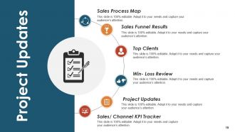
Slide 19: This slide presents Project Updates with- Sales Process Map, Sales Funnel Results, Top Clients, Win- Loss Review, Project Updates, Sales/ Channel KPI Tracker.
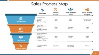
Slide 20: This slide displays Sales Process Map in a funnel image form consisting of 4 levels which include- Solution, Lead Generation, Program Launch, Deal Closing. We have categorized to four most common categories just to give a basic idea which can be altered by you as per your requirement.
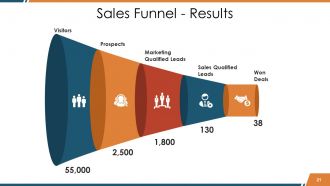
Slide 21: This is Sales Funnel - Results slide.
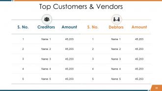
Slide 22: This slide displays Top Customers & Vendors in a tabular form. State them here.
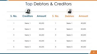
Slide 23: This slide presents Top Debtors & Creditors in a tabular form.
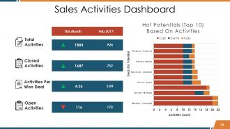
Slide 24: This slide displays Sales Activities Dashboard which includes- Closed Activities, Total Activities, Activities Per Won Deal, Open Activities.
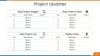
Slide 25: This slide presents Project Updates.
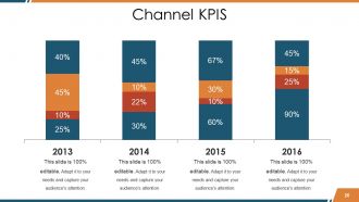
Slide 26: This slide presents Channel KPIS in a bar graph/ chart form.
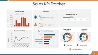
Slide 27: This slide displays Sales KPI Tracker in charts and graphs.
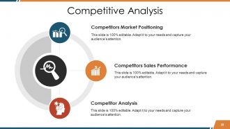
Slide 28: This slide presents Competitive Analysis with icons. This includes- Competitors Market Positioning, Competitor Analysis, Competitors Sales Performance.
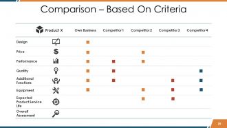
Slide 29: This is Comparison – Based On Criteria slide.
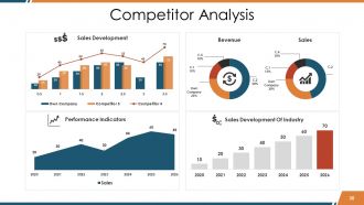
Slide 30: This slide showcases Competitor Analysis in charts and graphs.
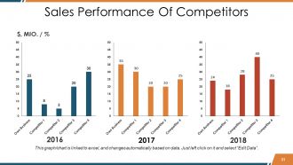
Slide 31: This slide showcases Sales Performance Of Competitors in a bar graph/ chart form.
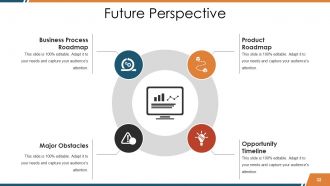
Slide 32: This is Future Perspective slide in a circular image form. This showcases the following- Business Process Roadmap, Major Obstacles, Product Roadmap, Opportunity Timeline.
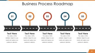
Slide 33: This slide displays Business Process Roadmap to state information, milestones etc.
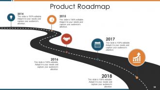
Slide 34: This slide also displays Product Roadmap.
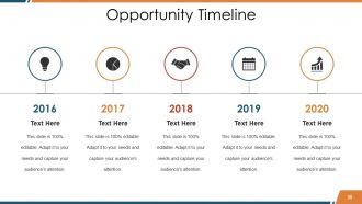
Slide 35: This is an Opportunity Timeline slide to state opportunities, achievements etc.
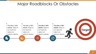
Slide 36: This slide showcases Major Roadblocks Or Obstacles in people silhouttes and target imagery form.
Slide 37: This is Sales Reports Icon Slides showcasing various icons. Use/ edit as per need.
Slide 38: This is also Sales Reports Icon Slides.
Slide 39: This is a Coffee Break image slide to halt. You may change it as per requirement.
Slide 40: This slide is titled Charts & Graphs to move forward. Change/alter image as per need.
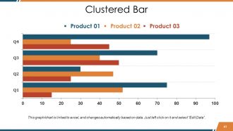
Slide 41: This is a Clustered Bar chart/ graph slide to present product/entity comparison, specifications etc.
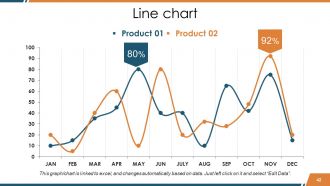
Slide 42: This is a Line Chart to present product/entity comparison, specifications etc.
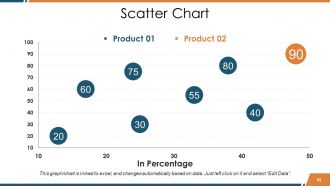
Slide 43: This slide presents Scatter Chart to state product/entity comparison, specifications etc.
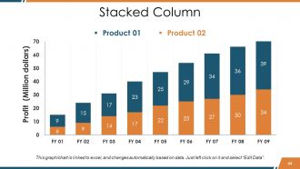
Slide 44: This is a Stacked Column slide to state Product 01, Product 02 comparison, information etc.
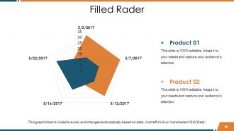
Slide 45: This is a Filled Radar chart/ graph slide to state Product 01, Product 02 comparison, information etc.
Slide 46: This slide is titled Additional Slides. You can change the slide content as per your needs.
Slide 47: This slide contains Our Mission with text boxes to state.
Slide 48: This is an About Us slide. State company or team specifications here.
Slide 49: This is a Business Quotes slide to quote something you believe in.
Slide 50: This slide shows Our Main Goal. State your goals here.
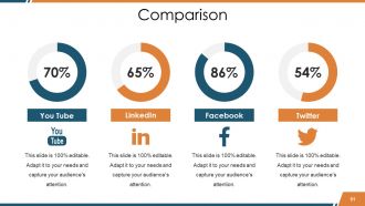
Slide 51: This is a Comparison slide. Compare different aspects here.
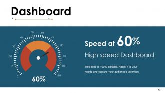
Slide 52: This is Dashboard slide to show information in percentages etc.
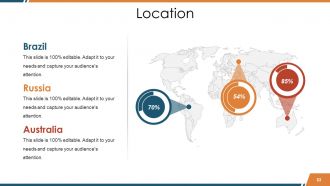
Slide 53: This slide showcases Locations with a World map and text boxes to make it explicit.
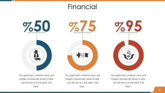
Slide 54: This is a Financial score slide. State financial aspects etc. here.
Slide 55: This is a Puzzle image slide to show information, specification etc.
Slide 56: This is a Target slide to show targets, plans etc.
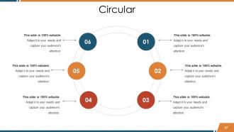
Slide 57: This is a Circular image slide to show information, specifications etc.
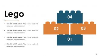
Slide 58: This is a Lego image slide to show information, specifications etc.
Slide 59: This is a Mind Map image slide to show information, specifications etc.
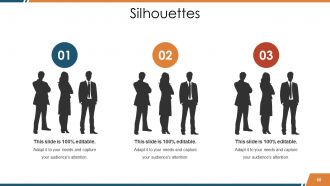
Slide 60: This is creative Silhouettes image slide to present people specific information, specifications etc.
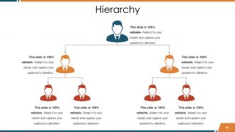
Slide 61: This is a Hierarchy slide to present team, specifications etc.
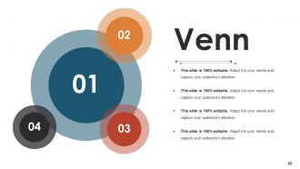
Slide 62: This is a Venn diagram image slide to show information, specifications etc.
Slide 63: This is a Magnifying glass image slide to show information, scoping aspects etc.
Slide 64: This is a Bulb or Idea slide to state a new idea or highlight specifications/information etc.
Slide 65: This slide displays Thank You slide with address, contact numbers and email address.
Sales Reports Powerpoint Presentation Slides with all 65 slides:
Each one of our Sales Reports Powerpoint Presentation Slides inspire brilliance. It is jampacked with ideas.
-

Sales Reports
-
Content
-
Business Overview
-
Highlights
-
Financial Highlights
-
Products Offering
-
Revenue Split By Country
-
Quarter Track Record
-

Our Team
-
Sales Performance
-
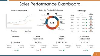
Sales Performance Dashboard
-
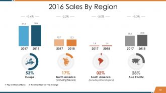
2016 Sales By Region
-
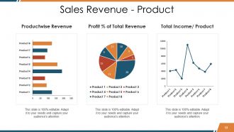
Sales Revenue Product
-
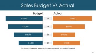
Sales Budget Vs Actual
-
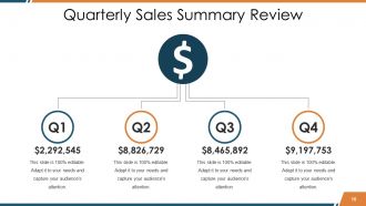
Quarterly Sales Summary Review
-
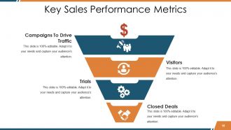
Key Sales Performance Metrics
-
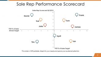
Sale Rep Performance Scorecard Q2 2012
-
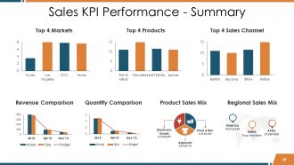
Sales KPI Performance Summary
-
Project Updates
-
Sales Process Map
-
Sales Funnel Results
-
Top Customers Vendors
-
Top Debtors Creditors
-
Sales Activities Dashboard
-
Project Updates
-
Channel KPIS
-
Sales KPI Tracker
-
Competitive Analysis
-
Comparison Based On Criteria
-
Competitor Analysis
-
Sales Performance Of Competitors
-
Future Perspective
-
Business Process Roadmap
-
Product Roadmap
-
Opportunity Timeline
-
Major Roadblocks Or Obstacles
-
Sales Reports Icon Slides
-
Sales Reports Icon Slides
-

Coffee Break
-

Charts Graphs
-
Clustered Bar
-
Line chart
-
Scatter Chart
-
Stacked Column
-
Filled Radar
-

Additional Slides
-
Our Mission
-
About Us
-

Sales Reports
-

Our Main Goal
-
Comparison
-
Dashboard
-
Location
-
Financial
-
Puzzle
-

Target
-
Circular
-
Lego
-

Mind Map
-
Silhouettes
-
Hierarchy
-
Sales Reports
-

Magnifying Glass
-

Bulb Idea
-

Sales Reports
FAQs for Sales Reports
Honestly, start with the obvious stuff - revenue and units sold. But don't sleep on conversion rates and average deal size, those tell you way more about what's actually working. Sales cycle length is huge too. Oh and pipeline metrics are total lifesavers when you're trying to forecast (learned that the hard way). Customer acquisition cost vs lifetime value matters if you care about profitability. Activity stuff like calls and demos are good for tracking individual reps. Just pick like 5-7 max that match your goals. You can always add more when new questions come up.
Look at your sales data like it's telling you a story about what's coming next. Patterns jump out when you study at least a year's worth - seasonal dips, which products are hot vs. dying off, how outside stuff messed with your numbers. Don't get caught up in month-to-month noise though. I learned this the hard way when I kept panicking over single bad months. Focus on the bigger trends instead. Once you see those consistent patterns, you can actually set targets that make sense and tweak your approach. It's honestly like having insider info for planning ahead.
Don't overthink it or you'll end up with a massive data dump nobody wants to read. Pick the metrics that actually matter to whoever's looking at this thing. I've seen way too many reports with every possible number crammed in - total waste of time. Make sure your date ranges are right because showing old data by accident makes you look sloppy. Charts help but don't use colors that make people's eyes bleed. Oh and start with the story first, then figure out what data supports it. Way easier than trying to find meaning in random numbers later.
Dude, visuals are a game-changer for sales reports. People absorb charts way faster than staring at endless spreadsheet rows (honestly, my eyes glaze over after like 30 seconds). Bar charts work great for comparisons, line graphs show trends over time, and heat maps are perfect for regional stuff. The trick is matching the right visual to whatever story you're trying to tell. First figure out your main point, then pick charts that make it obvious. I learned this the hard way after presenting boring number tables to executives who clearly weren't paying attention.
Look, sales reports are basically how you figure out if your team's actually hitting their numbers or just talking a good game. You'll see who's crushing it and who needs help - plus all the patterns in conversion rates and deal cycles. Without them, you're flying blind honestly. They break down individual stuff like calls made and deals closed, but also show team trends over time. I always tell people the real magic happens when you dig into the story behind the numbers. Then you can have actual conversations with your reps about what's working instead of just hoping for the best.
Weekly's the way to go for most sales teams. Daily reports? Total overkill - your people will hate you and probably ignore half of it anyway. Monthly leaves you wandering around clueless for weeks. With weekly, you'll catch trends before they become disasters. Plus there's actually time to do something about problems. Now, if you're running some crazy campaign or it's crunch time, then yeah, switch to daily temporarily. But honestly? Start weekly and see how it feels. You can always tweak it later based on what actually works for your team.
Honestly, Excel's probably your best bet to start - yeah it's basic but everyone can figure it out without wanting to throw their laptop. If you're already using Salesforce or HubSpot, just use their built-in stuff first since your data's sitting right there anyway. Power BI and Tableau make gorgeous dashboards that'll impress your boss, but fair warning - they're kind of a pain to learn. I spent way too many hours on YouTube tutorials last year figuring out Tableau. Start simple with whatever CRM you've got, then get fancy later if you actually need it.
Honestly, it depends what kind of business you're running. Retail folks obsess over how fast inventory moves and seasonal spikes - makes sense since cash flow is everything. SaaS companies? They're all about monthly recurring revenue and keeping customers from bailing. Manufacturing cares more about order volumes and how long stuff takes to produce. Real estate tracks pipeline deals and commission splits, obviously. The thing is, your reports should match whatever actually drives revenue for you. Like, don't waste time on vanity metrics that look pretty but won't help you make better decisions. Figure out what moves the needle in your industry first, then build around those core numbers.
Dude, real-time data is a total game-changer for sales reports. No more working with last week's stale numbers - you're seeing what's actually happening right now. Trends become obvious way faster, and you can catch problems before they blow up. My old manager used to swear by it, said it was like having x-ray vision or whatever. The thing is, your data sources need to be synced properly first. Otherwise you're just getting real-time junk instead of useful info. Once you get used to making decisions based on current reality instead of old snapshots, there's honestly no going back.
Your sales reports are basically a cheat sheet for pricing decisions. Look at what's selling well versus what's just sitting there - the patterns tell you everything. I'd start with your top 10 products from last quarter and see how they performed at different price points. You'll spot seasonal trends, figure out where demand drops off, and honestly? You might find you're undercharging for some stuff. Historical data shows how volume changed when you adjusted prices before. It's way better than guessing what customers will actually pay.
Honestly, just give people what they actually want to see. Your CEO doesn't need to know every single sales rep's numbers - stick to big picture KPIs and trends. But your sales manager? They'll want all that granular stuff broken down by territory. Charts are your best friend here because nobody (and I mean nobody) wants to decode rows of spreadsheet data. Start with your main insights right up front, then back it up with the numbers. Throw in some comparisons to last quarter or whatever benchmarks make sense. Oh, and always end with what to do next - people get annoyed when you just dump data on them without any direction.
Look, sales reports are basically your cheat sheet for figuring out what's actually happening with your business. They'll show you trends before they smack you in the face - like when summer sales always tank or when a new market's heating up. You can see which team members are crushing it and steal their playbook. Plus they're clutch for budgets and forecasting next quarter. I swear, half the bad business decisions I've witnessed could've been avoided if someone had just looked at their damn reports. Pull them weekly and dig into the patterns. Trust me, you'll make way better calls when you've got real data backing you up instead of just gut feelings.
Honestly, it's all about knowing your audience. Executives want the big picture stuff - KPIs, trends, what it all means for the business. They don't care about the nitty-gritty details. Sales teams are the opposite though. They need the granular stuff they can actually use: individual numbers, pipeline data, customer specifics. Think of it like execs want the bird's-eye view while sales reps need turn-by-turn directions. I usually just ask each group what decisions they're trying to make first, then work backwards from there. Makes it way easier to figure out what to show them.
Look at your sales data month-to-month and year-over-year first - that's where you'll find your baseline patterns. Once you've got those down, spotting seasonal trends becomes obvious. You can see which products are actually taking off (versus the ones slowly dying) and catch problems early. Honestly, the best part is how much better your forecasting gets when you have real historical context. Plus you'll finally know if your marketing campaigns or whatever economic craziness is happening actually moved the needle. Way better than just guessing what should work, you know?
Look for the obvious stuff first - which products are killing it vs. tanking, territories that suck, seasonal dips. Q3 always slow? Plan promotions ahead of time. Got a rep who's crushing their numbers? Make them teach everyone else their tricks. Honestly, most people just glance at reports and call it a day. Big mistake. Set up monthly meetings where you literally ask "okay, what are we changing based on this?" Don't just talk about the data - actually decide what you're doing differently. Otherwise you're just making pretty charts for no reason.
-
Being in sales, I need to present our numbers to our superiors, and SlideTeam has made that so much easier. The number of templates they have just for sales reports is baffling. I’m drowning in choices.
-
very nice
-
Designs have enough space to add content.
-
Out of the box and creative design.