


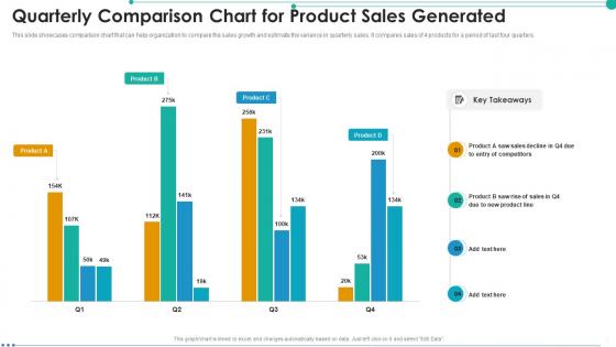
Quarterly Comparison Chart For Product Sales Generated




Try Before you Buy Download Free Sample Product
 Impress Your
 Audience
 100%
100% Editable
 Save Hours
 of Time


This slide showcases comparison chart that can help organization to compare the sales growth and estimate the variance in quarterly sales. It compares sales of 4 products for a period of last four quarters
People who downloaded this PowerPoint presentation also viewed the following :
Quarterly Comparison Chart For Product Sales Generated with all 7 slides:
Use our Quarterly Comparison Chart For Product Sales Generated to effectively help you save your valuable time. They are readymade to fit into any presentation structure.






FAQs for Quarterly Comparison Chart For
Start with the obvious stuff - revenue growth quarter over quarter and year over year, plus units sold and average deal size. Conversion rates are clutch too. Pipeline value and win/loss ratios show you what's actually coming down the line next quarter. Oh, and customer acquisition cost, though honestly finance always argues about how we calculate that one. Break everything down by product, region, and rep so you can spot the patterns. Some reps are just crushing it while others... well, you know. Get these basics locked down first, then add whatever else based on questions that come up.
Your sales history is like a cheat sheet for what actually moves vs what you hope will work. Seasonal stuff becomes super obvious - plus you'll see which products are your reliable moneymakers. I get weirdly into spotting these patterns, but customer behavior is way more predictable than you'd think! Compare the same quarters across different years so you're not fooled by seasonal dips. Don't ignore those random spikes either - maybe a competitor ran out of stock and you can plan for that timing again. Use all this to tweak your inventory and figure out when to push harder on sales.
Honestly, just go with bar charts or line graphs for quarterly sales stuff. Bar charts are perfect when you want to compare the actual numbers side by side. Line graphs? Way better for spotting trends over time. Oh, and combo charts are pretty cool too - you can show your sales numbers AND growth percentages together, which looks super professional. Tables are fine if you absolutely need exact figures, but they're kinda meh for presentations. Quick tip: label your quarters clearly and stick with the same colors throughout. If you're totally stuck, start with a basic bar chart - can't really go wrong there!
Dude, seasonal stuff totally messes with your quarterly numbers. Retail goes crazy in Q4 because of holidays, but B2B usually dies down when everyone's on vacation. January's always weird - budgets reset and people are basically zombies getting back to work. Really depends on your industry though. Swimwear companies are killing it summer months while tax software peaks right after New Year's (makes sense, right?). I'd track your patterns for like 2-3 years minimum. That way you can tell what's actually seasonal vs. something being genuinely broken that you need to fix.
Honestly, there's a bunch of stuff that can mess with your quarterly numbers. Holiday shopping spikes are obvious ones, or summer dips if you're in certain industries. Economic weirdness, supply chain issues, competitors doing something stupid - all that creates ripples. Your own moves matter too though. New products, marketing pushes, price changes. Sometimes it's just dumb timing - like when a huge client deal closes in Q3 instead of Q2 and suddenly your quarters look totally different. I'd track these things separately so you can actually explain the ups and downs to people instead of just shrugging.
Honestly, quarterly data is your best friend for this stuff. Check your last 4-8 quarters to see the real patterns - like maybe January always sucks because people are broke after the holidays (happens to everyone). Seasonal trends tell you way more than random guessing. Take your strongest recent quarter and bump it up 10-15%. That's way smarter than making up numbers. You want targets that push your team but aren't totally unrealistic based on what you've actually pulled off before. Don't forget to factor in any big changes coming up - new products, market shifts, whatever.
Dude, you gotta compare yourself to competitors when looking at quarterly numbers. Can't just stare at your own data - that tells you nothing. Like if your sales dropped 5% but everyone else tanked 15%? You're actually crushing it. This helps you figure out if you're dealing with market-wide issues or if your strategy actually sucks. I usually check 2-3 main competitors minimum. Honestly, it's the only way to know if that "bad" quarter was really bad or just looks bad on paper. Plus you might spot where they're struggling and you can swoop in.
So check out your customers' quarterly spending patterns - that's where the real insights are. Plot your top buyers' quarterly spend and you'll see natural clusters form. Maybe 3-4 segments will pop up. Some are holiday shoppers, others buy consistently year-round, then you've got the deal hunters who only show up for sales. Purchase frequency tells you a ton too. Honestly, this beats demographic segmentation any day because you're working with actual behavior. Your "loyal" customers might surprise you - they could have totally different quarterly rhythms once you dig in. Then target each group differently.
Seasonality will mess you up every time - Q4 vs Q1 is basically useless because of holiday spikes. One-time stuff skews everything too, like when we launched that product or had the supply chain nightmare. Business days matter more than people think - some quarters just have more selling time. You've gotta use the same data sources or you're comparing totally different things. Oh, and actually dig into why numbers changed instead of just saying "sales went up 10%." That's where the real insights are hiding.
Honestly, automation is a game-changer here. Your CRM can pull all that sales data automatically instead of you wrestling with spreadsheets every quarter. Set up some dashboards so you can actually see trends right away - saves so much time. AI tools are pretty good at catching weird numbers you'd probably miss anyway. Oh, and use predictive analytics to compare against realistic forecasts, not just last year's numbers. The trick is getting your data setup right from the beginning. Once that's done, you'll have clean quarter-to-quarter comparisons without wanting to throw your laptop out the window.
Dude, you really need other departments for this stuff. Marketing knows which campaigns actually worked. Operations can explain why orders got screwed up and hurt your conversion rates. Customer success has the real story on why people left or bought more. Without finance, you're basically guessing about profit margins - and that never ends well. I can't tell you how many times I've sat through sales presentations where it's just numbers on a slide and nobody knows what actually happened. Get everyone involved early and maybe build some kind of shared tracker they can all update.
Honestly, dig into your quarterly numbers first - that's where the real story is. See what's actually working vs what's just burning cash (seriously, I've watched teams dump money into dead channels for months). Pivot hard toward whatever's performing well. Seasonal stuff? Yeah, you'll need to time your pipeline and inventory around those patterns. Look, being stubborn about your original plan when the data says otherwise is just expensive pride. Get everyone in a room next week to hash out the numbers and figure out what needs to change for next quarter.
Look, you're basically checking if you're on track to hit your yearly numbers. Each quarter should be around 25% of your annual target - unless you're seasonal, then that math gets weird. Here's the thing though: Q2 is your real wake-up call. Way behind by then? Time to pivot your strategy or lower expectations instead of banking on some crazy Q4 miracle (spoiler: doesn't usually happen). These comparisons help you spot trends early and decide where to put your resources. Don't just use them for reporting - use them to fix problems before they get worse.
Quarter-over-quarter comparisons are honestly a goldmine for building team morale. Focus on individual improvements - maybe someone's conversion rate jumped 15% or their average deal size grew. That stuff hits different than just looking at total revenue, you know? Frame it as "check out how much you've crushed it" instead of pointing out gaps. I'd do a quick team huddle where you celebrate the biggest improvements and let people share what's been working. Gets everyone hyped and sharing tips. Oh, and those specific metrics always land better than the big-picture numbers - people can actually see their personal wins that way.
Definitely go with bar charts or line graphs - they're way easier to read than endless spreadsheet rows. Dashboards are your best friend here since people can spot trends instantly. I'd add year-over-year percentages right on the charts, maybe with some color coding (green up, red down, you know the drill). Oh and honestly? Focus more on what the numbers actually mean for the business going forward. That's what everyone really cares about anyway. Nobody wants to dig through data - they want the story behind it.
-
Excellent template with unique design.
-
Appreciate the research and its presentable format.