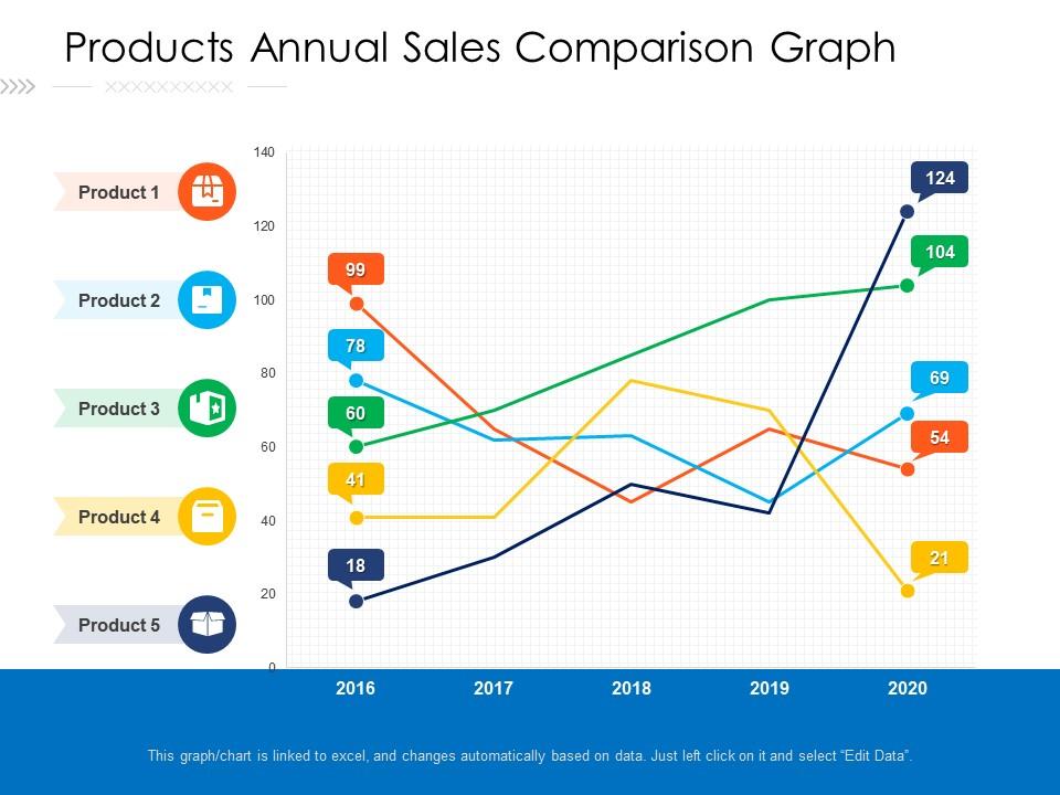
Products annual sales comparison graph
Try Before you Buy Download Free Sample Product
Audience
Editable
of Time
Our Products Annual Sales Comparison Graph are topically designed to provide an attractive backdrop to any subject. Use them to look like a presentation pro.
People who downloaded this PowerPoint presentation also viewed the following :
Products annual sales comparison graph with all 2 slides:
Use our Products Annual Sales Comparison Graph to effectively help you save your valuable time. They are readymade to fit into any presentation structure.
FAQs for Products annual
Honestly, just pick 3-4 metrics that actually matter for your goals right now. Revenue growth is the obvious one - check both month-over-month and year-over-year. Conversion rates show if your funnel's actually working. I'd definitely track sales cycle length too because it affects literally everything else, but most people ignore it for some reason. Average deal size tells you if you're going upmarket or down. Win/loss ratios and pipeline velocity are solid too. Don't try tracking everything at once though - you'll just get overwhelmed and won't focus on what's actually moving the needle.
Dude, seasonal trends will mess with your sales comparisons big time. Don't compare Q4 holiday numbers to like January sales - that's just setting yourself up for confusion. Way better to do Q4 2023 vs Q4 2022 instead. Year-over-year comparisons are honestly your friend here. Some industries have those predictable seasonal patterns, so maybe look into seasonally adjusted data if that applies to you. I learned this the hard way once lol. Just always think about what season you're comparing when you're trying to figure out if your business is actually growing or not.
Dude, you gotta know what you're up against if you want to sell anything effectively. Map out your top 3 competitors - their pricing, features, what they're pushing hardest. Once you've got that down, your sales convos get so much easier because you can actually address objections before they even come up. You'll spot exactly where you beat them and can highlight those wins. Honestly, it's like having their playbook in your back pocket. Without this stuff, you're just winging it and hoping for the best, which... yeah, doesn't usually work out great.
Honestly, your brain just processes visuals way faster than endless spreadsheet rows. Bar charts instantly show which products are killing it. Line graphs? Perfect for spotting seasonal trends. Heat maps reveal where teams are slacking (or crushing it). I swear, staring at Excel tables makes my eyes bleed after like 20 minutes. But here's the thing - you've gotta pick the right chart type or people will still be confused. When stakeholders can actually see the story in your data instead of drowning in numbers, suddenly everyone's on the same page. Way less painful than explaining pivot tables for the hundredth time.
Your CRM's probably got everything you need already - Salesforce, HubSpot, whatever you're using. I'd honestly just pull that into a basic spreadsheet first. Excel works fine, Google Sheets too. Power BI and Tableau are cool if you want those fancy visual dashboards, but honestly? Most people overcomplicate this stuff when a simple sheet gets the job done. Just make sure you're actually comparing the same timeframes and territories - otherwise your numbers will be all over the place. My old boss used to go crazy with complex tools when we could've answered everything in 20 minutes with basic charts.
Honestly, just look at what's already crushing it in your data and do more of that. Sounds stupid simple but most people totally ignore their own numbers. Maybe certain products are killing it, or specific channels, or even just timing - throw more resources at whatever's working. For the stuff that's tanking? Could be your messaging sucks, pricing's off, or you're hitting people at weird times. Don't overthink it though. Pick like 2-3 obvious patterns from your data and test some quick fixes this quarter. The worst part is when teams sit on clear signals for months instead of just pivoting fast.
Dude, the main thing is don't cherry-pick comps just because they hit your dream price. You want similar size, condition, location - the whole package. I see people grab that gorgeous house down the street all the time but it's like twice as nice, you know? Also skip anything older than 6 months since markets change so fast. And seriously adjust for differences - pool vs no pool, updated kitchen, whatever. Oh and honestly? Start with truly similar properties first, then get pickier from there. Otherwise you'll just fool yourself into bad numbers.
Look, sales comparisons beat guessing every time. Pull your last 12 months of data first - that's your starting point. Check what similar companies are hitting and watch for seasonal stuff that'll mess with your numbers. Nobody wants targets that are either a joke or totally unrealistic. Past quarters show you patterns, competitor benchmarks keep you grounded, and industry standards give you that realistic range to work in. Honestly, I've seen too many teams crash because they picked random numbers. Short bursts of analysis now save you months of headaches later.
So online sales are way easier to track - you get exact click rates, conversion data, all that good stuff in real time. Offline though? You're stuck with surveys and counting people walking in, which honestly feels like guesswork half the time. A/B testing online happens instantly, but offline you need months and tons of customers to see patterns. Oh and foot traffic counters are weirdly unreliable sometimes. If you're looking at both channels, stick to metrics that work everywhere - like how much it costs to get customers and what they're worth long-term. Makes comparisons actually meaningful.
Start with your CRM data - that's your best baseline since it's real performance, not guesswork. Then grab some industry reports from Gartner or IBD if you can access them. Tools like SimilarWeb and SEMrush are solid for checking out what competitors are doing. Public filings work too, though honestly digging through 10-Ks is pretty tedious. Don't skip customer surveys and win/loss analysis - those give you context the raw numbers can't. I'd pull 2-3 external sources on top of your internal stuff. You'll get a much clearer picture that way.
Honestly, monthly is the bare minimum but weekly's way better if you can pull it off. I've watched so many teams crash and burn waiting for quarterly check-ins - like, why would you do that to yourself? Weekly catches problems early, monthly at least shows you real patterns without all the daily chaos. Just pick something and actually stick with it instead of randomly diving deep when you panic. Oh and definitely compare to the same time last year or whatever, seasonal stuff will mess with your head otherwise. Automated reports are clutch if your system can handle it.
Honestly, you need to figure out what's actually broken first. Check your conversion rates and lead quality - could be your team just needs better training (seen this mess up good channels before). Quick fixes: tweak your messaging for each audience, move some budget from the worst performers to your winners temporarily. A/B test everything. Look at what your best channels do and copy that approach. Pick one underperforming channel and fix it completely before jumping around. Way more effective than trying to fix everything at once.
Look, historical data is basically your safety net for figuring out what's actually weird vs just normal ups and downs. Pull at least 2-3 years if you've got it - that'll show you seasonal stuff, typical growth patterns, all that cyclical noise that can mess with your head. Without it you're just staring at random numbers with zero context, which honestly is pretty useless. The more data you have, the easier it gets to spot real changes instead of getting distracted by normal fluctuations. Find those recurring patterns first, then you can actually trust what you're seeing in current performance.
Customer feedback is honestly your best friend when comparing products for sales. Two items might look identical on paper - same price, similar features, whatever. But reviews? They'll tell you the real story. Like if one breaks constantly or has garbage customer service. I always dig into the star ratings and actual written feedback before making any projections. Those complaint patterns reveal performance issues you'd never catch from just reading spec sheets. Trust me, that review sentiment can totally change which product you think will sell better.
Here's what I've learned the hard way: your comp data has to be fresh and actually comparable - none of that cherry-picking BS because it'll bite you later. Confidentiality matters if you're dealing with proprietary stuff, obviously. Document your sources and any weird limitations you ran into. I always write down exactly how I picked my comparables because someone will definitely ask. Oh and transparency is huge - people need to understand your methodology or they won't trust your analysis. Basically, keep good notes on everything so you can defend your work when questioned.
-
Easily Editable.
-
Informative presentations that are easily editable.
-
Easily Understandable slides.
-
Great designs, really helpful.