


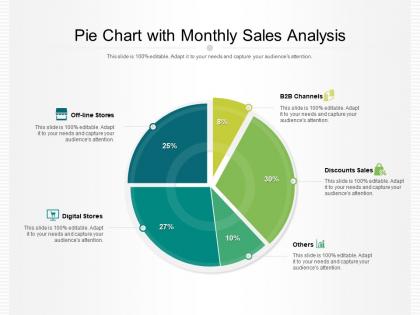
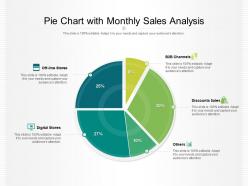
Pie chart with monthly sales analysis




Try Before you Buy Download Free Sample Product
 Impress Your
 Audience
 100%
100% Editable
 Save Hours
 of Time


Our Pie Chart With Monthly Sales Analysis are topically designed to provide an attractive backdrop to any subject. Use them to look like a presentation pro.
People who downloaded this PowerPoint presentation also viewed the following :
Pie chart with monthly sales analysis with all 2 slides:
Use our Pie Chart With Monthly Sales Analysis to effectively help you save your valuable time. They are readymade to fit into any presentation structure.
FAQs for Pie chart with
Start with the obvious stuff - total revenue, units sold, conversion rates. Average order value matters a ton too. Oh, and don't skip customer acquisition cost like half the reports I've seen do (seriously, how do you measure profitability without it?). Track your month-over-month and year-over-year changes to catch trends early. Sales by channel is clutch, plus your top products and funnel metrics. Customer lifetime value if you've got decent data on it. Honestly just nail these basics first - you can get fancy with the detailed breakdowns once your team actually knows what they want to dig into.
Your past sales data is like having a cheat sheet for what's coming next. I'd grab at least 12-24 months so you catch the full seasonal swing - holiday rushes, summer dead zones, all that stuff. You'll start noticing patterns pretty quickly, like when customers actually buy vs when they just browse. The algorithms get way better at predictions when they have more history to work with. Oh, and watch out for random spikes that won't repeat (remember when everyone panic-bought toilet paper?). Those one-off events can totally mess with your forecasting if you don't factor them out.
For monthly sales trends, go with line charts - they're perfect for showing how things change over time. You could also do bar charts if you want to compare specific months directly. Honestly, I love combo charts that show sales plus growth percentages on two different axes, but they can look pretty cluttered if you're not careful with the design. Area charts work great for cumulative stuff too. Got multiple product lines? Try small multiples so you can spot patterns across different categories. I'd start simple with just a basic line chart, then add more complexity depending on what story you're trying to tell.
Your monthly sales probably follow some kind of seasonal pattern - like everyone going nuts shopping in December or things getting quiet in summer if you're B2B. The tricky part is these swings can mess with your performance analysis big time. Instead of comparing January to December (which is kinda pointless), look at January 2024 vs January 2023. Rolling averages help smooth out the noise too. I'd honestly just map out your sales from last year first - you'll probably spot patterns you didn't even realize were there. That way you're not panicking when July looks slow if July's always slow, you know?
Okay so competitor trends are like your sanity check each month - they tell you if your numbers are actually good or bad in context. Like if your sales dropped 15% but everyone else dropped 20%, you're technically crushing it (weird flex but okay). But if competitors grew 10% while you stayed flat? That's when you need to panic a little. I usually track this stuff through industry reports or just stalking their social media for pricing changes. The real value is figuring out what opportunities they're sleeping on while you contextualize your own performance.
Honestly, just pull your top 10 products by revenue and profit margins first - that's your starting point. Compare stuff like units sold and growth rates across everything you're selling. I'd look at a few months of data though, not just one crazy good week or whatever. What's wild is the products you think are killing it sometimes aren't actually your best performers. Break it down by customer types or regions too since that changes everything. Seasonality matters way more than people realize. Once you see which ones are consistently winning, dig into why they're working so well.
Biggest mistake? Cherry-picking timeframes - you'll totally mislead yourself. Also watch out for seasonality stuff, weekends and holidays that bounce around different months mess with your data more than you'd expect. Make sure you're actually comparing similar things too, like don't mix product categories or regions unless that's the point. I learned this the hard way but always verify your data sources are using identical parameters. Oh and honestly? Skip the fancy charts until later. Clean data first, then worry about making it look good. Trust me on that one.
Yeah, external stuff totally messes with your monthly sales - it's like this invisible force you can't control. When the economy's shaky or people are scared about recession, they just stop spending. Period. Interest rates go up? Same thing. I've seen businesses freak out thinking they screwed something up when really it was just the market being weird. Unemployment in your area will hit your numbers faster than you think too. You should probably track some basic economic indicators next to your sales data - helps you figure out if it's actually your fault or just everything being crazy right now.
Ugh, declining sales are the worst. First thing - check your data to see what's actually tanking. Could be just one product dragging everything down. Then maybe switch up your marketing? New channels, different messaging, whatever. Sometimes I think we overthink this stuff when it's literally just seasonal dips. Try adjusting prices or hit up customers who haven't bought recently with a quick "hey, miss you" message. Oh, and fix any annoying parts of your customer service - people notice that crap. Test one thing at a time though, otherwise you won't know what's helping.
Honestly, just dump all that feedback data right into your sales dashboard – makes spotting trends so much easier. I always connect NPS scores with revenue numbers, or match up product complaints with sales drops in those categories. Happy customers definitely spend more (like, it's not even close), so segment your sales by satisfaction levels to prove it. Oh and set up automated reports so you're not doing this manually every month – learned that one the hard way. Customer sentiment scores next to sales metrics will make patterns jump out at you immediately.
Dude, start with whatever CRM you're already using - Salesforce and HubSpot both spit out decent reports automatically. If money's tight, honestly just use Google Sheets with pivot tables. I wasted so many nights pulling numbers manually before figuring this out lol. Power BI and Tableau are solid for the fancy visual stuff, though Tableau can be overkill sometimes. Multiple platforms giving you headaches? Zapier connects pretty much everything. Don't overthink it - pick whatever plays nice with your current setup and stops you from copy-pasting data like a robot every month.
Pick 3-4 metrics that actually move the needle for your business - revenue per customer, conversion rates, that kind of thing. Trade association reports are pure gold for benchmarks, though some are ridiculously expensive. Public company earnings in your space work too. Just make sure you're comparing similar sized companies, not your startup to Amazon or whatever. I'd set up a basic monthly tracker against these numbers. Oh, and don't freak out if you're 10-15% off either way - that's pretty normal.
Honestly, your spreadsheet only tells half the story. You gotta dig into the actual *why* behind those numbers. Chat with your sales team about what they're hearing from customers. Maybe that Q3 dip happened because a competitor slashed prices, or your team was fumbling through explaining that new product launch - happens to everyone. Customer reviews are gold for this stuff. So are win/loss reports and even random social media comments. All that qualitative stuff fills in the gaps your data can't touch. Oh, and definitely do quick debriefs with your reps after they close deals.
Honestly, digging into your monthly sales data is like having a crystal ball for your marketing. Look at the last 12 months first - you'll see which products are winners vs total duds, plus when people actually want to buy your stuff. Seasonal patterns jump out pretty quick. Then you know exactly when to boost ad spending and which audiences aren't just wasting your money. I've caught campaigns tanking way earlier this way too. The timing piece is huge - like, why blow budget in slow months? It's basically about putting your money where it'll actually work instead of just hoping for the best.
Here's what I'd do with that sales data - focus on your winners first. What products are actually moving? Double down there. Then dig into who's buying them and find more people like that for your marketing. Honestly, the obvious stuff usually works best. Check which regions or reps are struggling and get them the help they need. Seasonal patterns are gold for planning inventory (learned this the hard way). Oh, and skip those vague "grow 10%" goals. Set real targets based on what you're actually seeing in the numbers. Way more effective.
No Reviews