


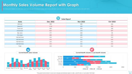
Monthly Sales Volume Report With Graph




Try Before you Buy Download Free Sample Product
 Impress Your
 Audience
 100%
100% Editable
 Save Hours
 of Time


The following slide highlights the monthly sales volume report with graph illustrating key headings which includes sales report, current month sales volume and current month volume vs last month volume
People who downloaded this PowerPoint presentation also viewed the following :
Monthly Sales Volume Report With Graph with all 7 slides:
Use our Monthly Sales Volume Report With Graph to effectively help you save your valuable time. They are readymade to fit into any presentation structure.






FAQs for Monthly Sales Volume
Definitely include your main numbers - revenue, units sold, conversion rates. Break it down by territory or team, then compare month-over-month or whatever timeframe makes sense. Pipeline data is clutch because execs are always asking what's coming up. Individual rep performance matters too, plus your top products and any big wins or roadblocks. Honestly, charts and graphs are your best friend here - raw data just puts people to sleep. Keep it tight but detailed enough that people can actually make decisions from it. Oh, and start with a template that matches however often you guys report. Makes life way easier.
Charts and graphs are total game-changers for sales data. Nobody wants to stare at spreadsheet rows forever – your brain just glazes over. Bar charts let you compare performance super quickly. Line graphs show trends over time. Heat maps? They'll highlight your rock stars and... well, the people who need help. The trick is picking the right visual for what you're trying to show. I made this mistake once and used pie charts for everything – looked ridiculous. Figure out what story your data's telling first, then choose visuals that make it obvious to whoever's reading your report.
Revenue's the obvious big one, but conversion rates and pipeline velocity are just as crucial - they'll tell you if you're actually moving deals or just treading water. Track lead quality too, like how many qualified leads became real opportunities. Average deal size matters since it can swing wildly and throw off your forecasts. Honestly, don't waste time on vanity metrics like total calls made. Focus on activities that actually correlate to closed deals. Those core metrics first, then you can add team-specific stuff later based on what drives your process.
Think about what each person actually does with the data. Executives want the big picture stuff - revenue, growth trends, how we're hitting targets. They're not gonna dig into daily details. Sales teams though? They need the weirdly specific stuff like which rep is crushing it, pipeline breakdowns, conversion rates. Same data underneath, just slice it different ways. Honestly, people tune out reports that don't help them do their job anyway. Best approach is asking what decisions they're trying to make first, then work backwards. Don't overthink it - just match the info to what they'll actually use.
Dude, if you're already using Salesforce, just go with their Reports & Dashboards - saves you a headache. HubSpot's got really clean reporting too, way less clunky than most options. Power BI and Tableau are crazy powerful but honestly? Total pain to learn. Google Data Studio is actually pretty decent for basic stuff and won't cost you anything. I'd probably start there unless you need something super complex. The main thing is making sure whatever you pick actually talks to your CRM without needing to hire some data wizard. Oh, and definitely pick based on what you're already using - switching systems later sucks.
Honestly, I'd go with weekly at minimum - that's the sweet spot for catching trends without drowning in data. Daily is even better if your market moves fast. Monthly? Nah, way too slow these days. You'll miss stuff that needs quick action. Match it to how your business actually works though. Running a big promotion or product launch? Definitely switch to daily during those crazy periods. I started with weekly reports and just adjusted from there based on how often we actually looked at the numbers. If your team isn't checking them regularly, what's the point of making them more frequent?
Think of historical data as your best friend for sales forecasting. Pull at least 2-3 years of sales numbers and hunt for patterns - holiday rushes, summer slumps, whatever keeps showing up. Obviously 2020 threw everyone's data out the window (still mad about that tbh), but normally you'll spot solid trends. Short bursts work great too. Look for quarterly cycles or seasonal stuff that repeats year after year. It beats making wild guesses, and honestly, once you see the patterns, forecasting becomes way less stressful. Your past sales basically tell you what's probably coming next.
Just add a section to your sales reports that pulls in the main themes from customer feedback - surveys, reviews, whatever you've got. I started doing this a few months back and honestly wish I'd done it sooner. Connect the feedback to actual sales data by region or product. Like if Northeast customers keep bitching about slow delivery and your sales are tanking there too, boom - there's your answer. Makes it way easier to see what's actually hurting your numbers vs what's just noise. Your team will know exactly what to fix first.
Honestly, interactive dashboards are a game changer - let people filter by dates, regions, whatever they need. Heat maps work great for territory stuff, and those animated trend charts? So much better than boring static graphs. Auto-updating data will save your sanity (no more weekly spreadsheet hell). Make sure execs can drill down from big picture to specifics with a click. I'd go with Tableau or Power BI - bit of a learning curve but worth it. Once you build it right, the dashboard basically runs itself and people actually want to use it.
Honestly, just go heavy on the visuals - charts will save your life here. Your executives will zone out if you dump paragraphs on them. Line charts work great for trends over time, bar charts for comparing different periods. Always throw in percentage changes with your raw numbers too. Start each section with your main point upfront, then back it up with the data. Compare against last quarter or same time last year so there's context. Oh, and definitely call out anything weird that happened - they'll ask anyway. The key thing? Make sure you're explaining why each trend matters, not just what happened.
Bar charts are your best bet for comparing quarters directly. Line graphs work great too if you want to show the trend over time. Honestly, I'm a sucker for those combo charts - you know, the ones with revenue bars plus a growth percentage line overlay? They're cluttered but somehow tell the whole story. Tables with actual numbers are boring but stakeholders love having those details to reference. Start with whatever chart tells your main story first. Then you can always add other views if people want more context.
Oh totally, you should include competitor analysis in your sales report. It explains why your numbers look the way they do. Track their pricing, product launches, marketing stuff - basically anything that could impact your sales. I'm lowkey obsessed with checking their LinkedIn for updates lol. When your sales dip or spike, competitor moves usually explain it. Just make sure you're actually comparing similar things and not random data. The whole point is giving your team something they can actually act on, not just interesting info to scroll past.
Ugh, the worst thing people do is dump EVERY single number they have into one report. Like, why? It just confuses everyone. Pick maybe 3-5 metrics that actually matter to whoever's reading it. Also, please make your charts readable - I swear some people think microscopic fonts look professional or something. Don't just throw data at people either. Tell them what it means, what's changing, why they should care. Oh and double-check your sources first because nothing's more embarrassing than realizing your data was wrong after everyone's seen it.
Sales reports work great for friendly competition - set up leaderboards and track everyone against their goals. When I was selling, those weekly rankings were everything! Nothing gets people moving like seeing where they stand. Make sure you're tracking both results AND the activities that drive them - calls made, demos booked, that stuff. Share the numbers in team meetings regularly. Celebrate the wins publicly too. The whole point is coaching people up, not just calling out who's behind. Actually, don't sleep on showing leading indicators - that's where people really learn what works.
Check your variances in both dollar amounts and percentages first - I've seen people panic over a 50% variance that's literally $200. Timing issues are usually the culprit, so dig there first. Then break it down by product, region, customer segments, whatever makes sense for your business. Don't let anyone get away with saying "market conditions" without actual data to prove it. That's just lazy analysis honestly. Compare against your forecast AND last year so you're not missing anything. Focus on what you can actually fix going forward instead of just playing detective on old numbers.
-
My search for complete decks ended with SlideTeam. Such a surplus collection of HD PowerPoints. Moreover, their standard and widescreen formats have helped me in delivering bullseye presentations.
-
“Immediate response, professional support, and effective solutions that were customized and immediately provided. Well done- Thank you!”