


Monthly Sales Report Dashboard Snapshot With Churn Rate




Try Before you Buy Download Free Sample Product
 Impress Your
 Audience
 100%
100% Editable
 Save Hours
 of Time


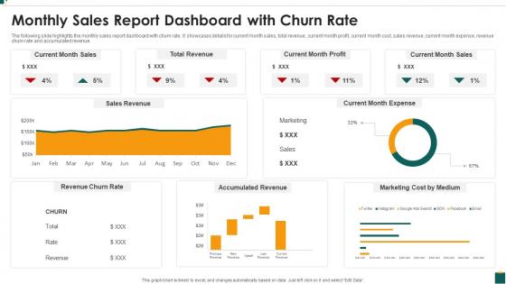
The following slide highlights the monthly sales report dashboard snapshot with churn rate. It showcases details for current month sales, total revenue, current month profit, current month cost, sales revenue, current month expense, revenue churn rate and accumulated revenue.
People who downloaded this PowerPoint presentation also viewed the following :
Monthly Sales Report Dashboard Snapshot With Churn Rate with all 7 slides:
Use our Monthly Sales Report Dashboard Snapshot With Churn Rate to effectively help you save your valuable time. They are readymade to fit into any presentation structure.





FAQs for Monthly Sales Report Dashboard Snapshot
Start with the basics - overall churn rate and monthly trends, plus segment breakdowns. Revenue churn matters way more than customer churn though, since one enterprise client leaving hurts more than ten small accounts. Add predictive metrics like health scores and usage patterns. Support ticket spikes are usually red flags too. Time-to-churn helps you spot patterns in when people typically bail. Oh, and declining usage or payment hiccups are solid early warning signs. Just make sure you can actually filter everything by product type or acquisition channel when you're digging into weird spikes.
Dude, visualizations are a game changer for churn stuff. Spreadsheets just make my eyes glaze over, but with the right charts you'll actually see what's happening. Heat maps show geographic trouble spots, cohort analysis tracks retention over months, and funnel charts? They're brutal but they'll show you exactly where people bail. I think seasonal spikes are way easier to catch visually too. Different customer segments basically tell their own stories when you plot them right. Honestly took me forever to figure out which chart types work best, but once you do it's like having x-ray vision for your data.
Put your big three right at the top - monthly churn, revenue churn, and CLV. Nobody wants to hunt for those. Break everything down by customer segments or plan tiers so you can actually see what's happening. I'm obsessed with adding trend lines because execs always ask if things are improving (saves you from awkward silence). Here's what most people miss - throw in some early warning signals like usage drops or support ticket surges. Way better than just reporting churn after it's done. Oh, and make everything filterable by dates and segments. Trust me, they'll want to dig into Q3 enterprise customers or whatever during every single review.
Weekly updates work best for most situations. Daily tracking makes sense if you're dealing with a crisis or testing new retention stuff, but honestly? I've watched teams get way too caught up in daily noise instead of looking at the bigger picture. Monthly is too slow though - churn can shift fast and you'll miss the warning signs. Start with weekly and see how it feels. If your churn's all over the place or your team needs to move quickly, maybe bump it to daily. Just stay consistent whatever you pick.
Okay so segmentation is just breaking down your churn data instead of looking at one big number. You'll want to slice it by things like subscription level, where customers came from, location, how much they actually use your product - stuff like that. Here's the thing though - you might find out your premium users stick around way longer, or maybe people from Facebook ads are terrible at staying. Without doing this, you're basically guessing and treating everyone the same. I'd start with maybe 2-3 categories that actually matter for your business.
Look for patterns that'll show you exactly when to act. Churn spikes in certain months? That's your cue to boost engagement campaigns beforehand. The real money maker though is breaking down which customer segments are bailing - like, this data is pure gold. Also watch if your product updates or pricing changes are pushing people away. Don't wait for people to actually leave - track stuff like dropping usage or more support tickets first. Oh, and set up alerts when churn hits certain levels so you're not playing catch-up later.
Honestly, churn dashboards are pretty clutch for catching why people bail before it's too late. Instead of finding out months later that half your customers ditched, you'll see patterns happening right now. Track the stuff that actually matters - like who hasn't logged in for a month or downgraded their plan recently. Different customer types usually drop off at predictable points too. Once you spot those red flags, hit them with retention campaigns before they're completely out the door. Way better than playing defense after they've already left, you know?
Honestly, Tableau and Power BI are your best bets - they look professional and handle messy data really well. Google Data Studio's solid too if you want something free that connects to everything easily. Looker's great but probably way more than you need for basic churn stuff. Excel works fine when you're starting out, though you'll definitely hit limits pretty quick. I'd probably just pick whatever plays nicely with your current data setup rather than overthinking it. Oh, and your executives will actually use dashboards that look good, so that matters more than you'd think.
So basically, churn dashboards watch customer behavior patterns and flag people who might bail. Login frequency drops, usage declines, feature adoption falls off - all red flags before they actually cancel. The system scores customer health automatically, which is pretty slick. When someone's risk score gets sketchy, you get alerts. Way smarter than waiting for them to complain or ghost you entirely. Your team can jump in with retention stuff or reach out personally while there's still time to fix things. Honestly beats scrambling after they've already made up their mind.
Honestly, you need those benchmarks or you're flying blind. Like, 5% monthly churn could be amazing or absolutely terrible depending on your industry. I've seen companies panic over numbers that were actually solid for their space. Industry comparisons help you set realistic goals and show leadership why retention stuff deserves budget. Plus it feels pretty good when you're beating competitors! Look for benchmarks that match your business model and company size though - not just generic industry averages. Trade association reports are goldmines for this, or check out ProfitWell's data.
So basically you want to add risk scores (like 0-100) right next to your existing metrics - shows which customers are likely to bail. Pull in ML stuff that looks at behavior changes, usage patterns, support complaints, payment issues. I'd segment by customer value or product type first since that's way more actionable. Set alerts for when your big spenders hit danger zones. Oh and throw in some forecasting for next quarter's projected churn rates. Honestly though, start simple - pick your biggest churn red flags and build basic widgets around those before getting fancy.
Don't look at churn by itself - you'll miss seasonal patterns or recent product updates that skew everything. Break it down by customer segments too, like how they found you or how long they've been around. Different groups act completely different, trust me on this. Oh and make sure you're measuring the same way across time periods, especially if billing changed. That's where people mess up constantly. Pick one specific cohort first and really dig into what happened with them. Way better than trying to understand everything at once.
So your dashboard shows 15% churn, but that doesn't tell you much, right? Exit surveys and customer calls give you the actual story - like maybe your onboarding sucks or pricing feels sketchy compared to competitors. Numbers show there's a fire somewhere, but talking to people tells you where to point the hose. I'd start with quick surveys for churned customers, honestly those are easier than calls but both work. You'll finally know which problems to fix first instead of just staring at percentages all day.
High churn is brutal - it kills your revenue growth and makes getting new customers cost way more. You're basically filling a leaky bucket when customers leave faster than they join. Your lifetime value tanks, so there's less money for marketing or building cool features. Honestly, it usually means something's wrong with your product or how happy people are using it. Those problems don't just disappear on their own. I'd dig into your dashboard first and figure out which customer groups are most likely to bail, then focus your retention efforts there.
Dude, execs hate getting buried in details - stick to the big picture stuff. Show overall churn rates, month-over-month trends, and break it down by customer segments or product lines. Revenue impact is huge too, not just percentages. Keep visuals clean because honestly? Too many charts will lose them fast. I'd do monthly check-ins where you highlight 3-4 key insights. Always connect it back to business goals - that's their language. Oh, and come with solutions ready because they'll definitely hit you with "okay so what do we actually do about this?" Trust me on that one.
-
Innovative and Colorful designs.
-
Editable templates with innovative design and color combination.