


Product Performance Dashboard Annual Product Performance Report Ppt Sample


Try Before you Buy Download Free Sample Product
 Impress Your
 Audience
Editable
of Time


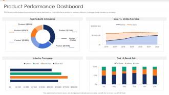
The following slide displays the product performance dashboard as it highlights the top product by revenue, online vs in store purchase, the sales by campaign.
People who downloaded this PowerPoint presentation also viewed the following :
Product Performance Dashboard Annual Product Performance Report Ppt Sample with all 7 slides:
Use our Product Performance Dashboard Annual Product Performance Report Ppt Sample to effectively help you save your valuable time. They are readymade to fit into any presentation structure.


FAQs for Product Performance Dashboard Annual Product Performance
Honestly, start simple with the basics - DAU/MAU, session time, how much people actually use your features. Revenue stuff is obvious but don't sleep on it: conversion rates, churn, lifetime value. I'd definitely throw in some tech metrics too like page load speed and error rates because slow apps are the worst. User satisfaction scores help, plus support tickets tell you when things go sideways. Oh and maybe I'm overthinking this, but start with like 5-6 metrics that actually matter to your business goals. You can get fancy with more advanced stuff once you've got the foundation down.
Dude, visualization is a game changer - it turns your boring product data into actual stories you can read instantly. Heat maps show you which features are flopping. Trend lines catch those seasonal quirks nobody notices otherwise. Comparison charts? Perfect for seeing how your different product versions measure up against each other. Honestly, I've gotten spoiled by good visuals - spreadsheets just make my brain shut down now. The trick is matching the right chart to whatever metric you're tracking, so your team can make fast calls without drowning in numbers.
You need real-time data or you're basically guessing. When stuff updates live, you'll catch problems immediately instead of finding out about a conversion crash three days later. Super annoying when that happens during team meetings, btw. Quick data lets you see what users are actually doing and connect it to changes you just made. Trending gets way easier to spot too. Set up automated feeds so everything stays fresh - I'd check it throughout the week instead of just waiting for those scheduled review sessions. Makes such a difference.
Look, it really comes down to what drives your specific business. Retail folks put conversion rates and inventory turnover right up top - makes total sense. SaaS companies are constantly watching churn and how engaged users actually are. Manufacturing is all about quality control and keeping production humming since any downtime absolutely kills them. Healthcare has to juggle performance stuff with staying compliant (which honestly seems exhausting). The trick is figuring out what actually moves the needle in your industry first. Then build your dashboard around those metrics instead of some cookie-cutter template that doesn't match your world.
Honestly, visual hierarchy is everything - people need to spot the important stuff immediately. Don't make them hunt for key metrics! I'd put your most critical KPIs right at the top and use consistent colors throughout. Group similar data together, but give everything room to breathe. Cramped dashboards are the worst. Make filtering options obvious without going overboard. Here's the thing though - what seems logical to you might totally confuse someone else. Test it with real users ASAP! Start simple with maybe 3-5 core metrics first. You can always add more complexity later based on actual feedback.
Pick metrics that actually match your business goals - that's the only thing that matters. Don't track more than 3-5 things or you'll just confuse yourself with data overload. I'd grab one business metric (revenue, retention, whatever), one user experience thing, and something that predicts what's coming next. Skip the vanity stuff that looks cool but won't help you make real decisions. Put your most important metric at the top of your dashboard, then stack the others underneath. Oh and definitely review these every quarter since priorities change constantly.
Tableau, Power BI, and Google Data Studio are your main options. Tableau's awesome for complex stuff, Power BI works great if you're already in the Microsoft ecosystem (which, let's be real, most places are). Data Studio's free and handles basic needs well. There's also Looker or Grafana if you want something different. Some teams build custom dashboards with D3.js but that's probably overkill unless you've got serious dev resources. Honestly? Start with whatever your company already pays for. Way easier than convincing finance to buy new software. You can always switch later if it doesn't work out.
Honestly, dashboards are game-changers because you can actually see what's working instead of just guessing. All your important stuff - user engagement, conversions, feature adoption - shows up in one spot. I can't tell you how much time this saves when you're trying to figure out what to fix first. You'll catch problems early and see if your latest updates actually made a difference. Oh, and definitely set up alerts for your most critical numbers - I learned that one the hard way from constantly checking mine. It's basically like having x-ray vision for your product decisions.
Honestly, the worst thing you can do is cram everything onto one screen. I see this mistake constantly - people think more data = better insights, but it just confuses everyone. Stick to maybe 5-7 metrics that actually matter for decisions. Also skip the vanity stuff that looks cool but doesn't help anyone do their job better. Make sure your data updates often enough to be useful, and give people benchmarks so they know if numbers are good or terrible. Oh, and definitely ask stakeholders upfront what decisions they're trying to make. Way easier than guessing what they want later.
So you'll need to hook up your dashboard to historical data - either through APIs or by querying databases directly. Then build time-series charts that show trends across weeks, months, whatever timeframe makes sense. Tools like Tableau and PowerBI are honestly pretty good at this once your data pipeline is working. Here's the thing though - messy historical data will absolutely wreck your day. You'll be stuck fixing random spikes and missing chunks forever. Set up automated refreshes so everything stays current, and definitely add year-over-year comparisons. Your team will thank you when they start catching seasonal patterns they would've totally missed otherwise.
Start with drill-downs and filtering - those are must-haves. People want to click on charts and actually see what's behind the numbers. Hover tooltips are clutch too for quick context without extra clicks. Real-time updates matter way more than you'd think - stale data kills trust fast. I'd probably add custom dashboards later where users can move widgets around and pick their own KPIs. Oh, and date range filters are basically expected now. Don't try to build everything at once though. Get the core stuff working first, then worry about the bells and whistles.
First thing - set up those automated refreshes, probably hourly or daily depending on your metrics. Someone needs to actually own the data accuracy though, otherwise you'll end up making decisions off garbage numbers (been there, not fun). Get alerts running for when stuff breaks or looks wonky. Do spot checks by comparing what your dashboard shows vs the actual source systems. Your team should know exactly who to bug when numbers seem off. Oh and do a monthly review where you manually validate some key metrics - sounds boring but it's saved me so many headaches.
User feedback is your best friend for fixing dashboards. I can't tell you how many times I've seen gorgeous dashboards that just sit there unused because nobody bothered asking what people actually need. Monthly check-ins work well, or throw a simple feedback widget on there. Different teams care about totally different metrics, and you'll discover which charts are just confusing people. The real trick though? Don't just collect feedback and let it pile up somewhere. Act on it. Short sentences work. Otherwise you're building something that looks good but doesn't help anyone get their work done.
Honestly, dashboards are game-changers for spotting where you can innovate. Look for patterns - like which features people actually use vs. ignore, or where they're bailing out of your product. Support tickets are goldmines too since they show you what's consistently breaking or confusing users. I love comparing different user groups because that's where the weird insights pop up. Oh, and don't get lost in all the pretty charts - start with your biggest problem areas first, then figure out what's really causing those numbers. Way better than drowning in endless Excel files!
Focus on metrics that actually move the needle - conversion rates, user engagement, and revenue per user are your holy trinity. Also track customer acquisition cost vs lifetime value, plus retention if you're subscription-based. Honestly, I used to obsess over page views but they're pretty useless for gauging real performance. Compare your numbers against your own history and competitors when you can find decent data. Oh, and set up alerts for when key metrics tank - way better than finding out about problems three weeks too late when you're scrambling to fix everything.
-
SlideTeam, Please don’t stop sharing discount coupons! I love your occasional discounts and tend to buy your products around that corner.
-
“I always have a wonderful experience with SlideTeam. It's my ""go to"" when I need a template.”